Chaz Photos
Jack Elam
- Messages
- 6,282
- Name
- Chaz
- Edit My Images
- Yes

")
Is there any particular message you're trying to get across here?
Why have you put each element in?
TBH mate, as nice as I try and put things...I feel I've been licking a rather big book of stamps laced with LSD.
Hey Chaz, Quite a bit of work gone into this, I really like the idea behind this, it works quite well and one gets a real depth to the project, I like that you have all the shadows in the correct position, however i do feel small parts let it down slightly.
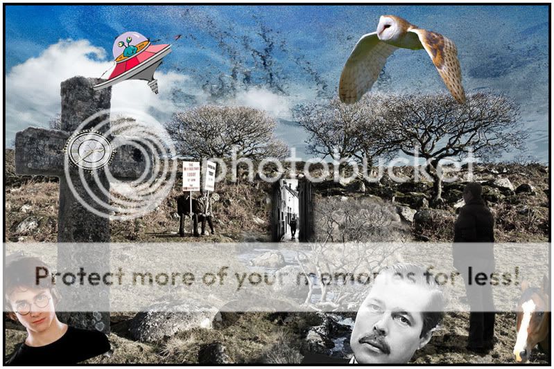
1; The top of the bush in the stream needs to be darked
2; The Owl stands out a little to much.
3; the whole image may look better a little darker or sepia.
Just my thoughts.
The message is the one You see :shrug:, not the one I have.........
That's fair enough, but what message do you see? I ask because I'm not really seeing one at all; it feels like there's something very clever going on that I just don't get!
I think "it's what you get out of it that counts" is all well and good, except that this one has too many specifics (the clock on the tombstone, or the banners which I can't read for example?) for you not to have had some idea what you were trying to say?
I think also that "no message in particular" is equally OK, but then the image has to be pleasing on a purely aesthetic level, and this one isn't. That doesn't make it bad; it just means it needs a message
AS for Photoshop Art??? well I was doing things like this in my darkroom back in the 70's maybe not as many images together, but still the same Imagery yes it is Surreal art but what is wrong with that. Does photography have to be just record shots?
All in this image is my photos so I have taking all of the image at different times and places, as many photos are, but done in a way as the view dose not know.Okay, I'll bite (and I don't often do this). A photograph is light that has been captured on paper - I guess it's like having frozen that moment in time.
Can you say the same for your image? It's really more as a statement, or you trying to describe something - which is closer to art (just like my cartoon drawings).
Don't get me wrong, I do appreciate a bit of art -even of the surreal type - as I have dabbled in some experimental digital stuff, but I wouldn't dream of putting it a photography forum because I know it would look out of place. Still, you have recieved a couple of positive comments in here, so it might be me missing something.
Bear in mind that I am both a long-time amateur cartoonist as well as being into digital photography so I'm only just expressing my opinions. Mind you, I do show my cartoons in here so I guess I'm no different.
Chaz Photos said:All in this image is my photos so I have taking all of the image at different times and places, as many photos are, but done in a way as the view dose not know.
As for you description of 'photography', I don't think it is correct ....Photography is the art, science and practice of creating durable images by recording light File had a invisible latent image which had to have PP, Slides had not paper printing and is projected so I think this fail your comments of what 'photography' is....
The word photography derives from the Greek φωτός (phōtos), genitive of φῶς (phōs), "light" and γραφή (graphé) "representation by means of lines" or "drawing", together meaning "drawing with light".
it wouldn't be so bad if the photoshopping wasn't so terrible... That dial on the cross looks like a 5 yr old did it.
If you have to go down the route of blending photographs / digital files, to create such a monster, then maybe a consistent light source to give even tones, and some subtle blending of layers, together with good positioning and angles... i,e, the cross is taken at a completely different angle to the dial, so that will always look odd..
To be fair, we don't know what the OP's level of experience is,

Slimbert said:Yes we do....he runs his own Photoshop tuition workshops!!
Slimbert said:That's what it says on his website: http://www.chazphotographics.co.uk/
Yes we do....he runs his own Photoshop tuition workshops!!
Yes but not on this work.Yes we do....he runs his own Photoshop tuition workshops!!
to all that are saying how poor it is Can I see your work of this kinds please
 ) and I quite liked that, but in this shot, I think it's a) slightly lost due to it's size, and b) I don't get why there are black and white houses and sky under a bank of earth...
Lynton said:i said i wouldn't... but this is 100% genuinely meant with fun.........
you have the edit box ticked......
I've added a few more..
lord Lucan is in Africa..
Seriously Lynton....lord Lucan is in Africa..
along with Shergar our lecturer loved montage by the way
 i wouldn't mind guessing the op is near suicidal by now...
Quite spooky.