
- Messages
- 104,495
- Name
- The other Chris
- Edit My Images
- Yes
I’m sure this has been done to death on here and elsewhere but it turns out to be a hard thing to search for so apologies but I’m asking again. I always thought that logos, watermarks, etc. were pointless for me because I am not a pro, don’t expect to sell an image and if an half decent outfit choose to steal my work they could remove any reasonably sized logo or watermark anyway. Add to that getting a pirate copy taken down would be more trouble than it was worth, I just never bothered.
BUT, I recently shared some photos and friend put a couple of them on her facebook with no credit to me. I’m sure it was a genuine oversight she corrected the oversight as soon as I mentioned it but I am now thinking that in some circumstances I might want to add a logo in case someone forgets again. My issue is putting together a logo that is not too obtrusive but that can be used against different backgrounds and I am looking for suggestions for what you think makes a good logo, size, shape colour etc.
Please, I am really not interested in a big debate about the merits or otherwise of using logos or whether you think they are pointless and spoil an image. I would just like suggestions and examples for size, shape, colour position, etc of what works well in terms of simply giving some attribution to the photographer.
")
 Grove Rake
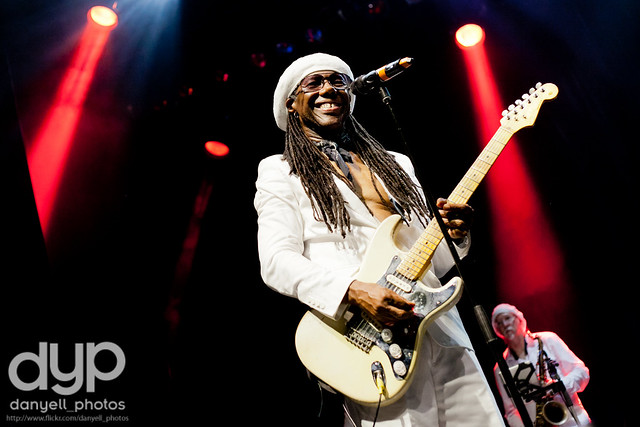 Chic feat Nile Rodgers @ Indigo2