

Grey card white balanced colours inaccurate, increasingly so at higher ISOs

GardenersHelper

In Memoriam
Messages
6,343
Name
Nick
Edit My Images
Yes
I am new to using raw. Processing my first set of raw test images proved to me that raw white balance manipulation is a powerful tool, and that Lightroom (as no doubt other raw editors too) makes it easy to change the white balance. However, it very quickly became obvious that although it was easy to change the white balance, getting it right was another matter altogether. So, I decided to do the sensible thing and use a grey card.

The procedure, as I read it, was straightforward. Include a grey card in a “calibration” image, using the same lighting as for the normal captures, and then in Lightroom, Photoshop or whatever take the colour values from the grey area of the calibration image to set up the white balance on the normal captures. And the colours would then be correct. Easy.

What I did not read, but after some confusion and head-scratching discovered, was that if you take multiple readings from the grey area of a single calibration image you will get different values of temperature and tint. This and what follows is for my G3, but I would be surprised if it was not true for other cameras.

The variations from one measurement to another (on the same image) are quite small at low ISOs, and at base ISO only make a subtle difference to the appearance of an image. However, as the ISO increases the differences get much larger and can have a huge impact.

As an experiment I captured four images, at (base) ISO 160, ISO 400, ISO 1600 and ISO 6400, of a grey card on a table with light coming through a roof light window just above the table. As there was 100% cloud cover the light almost certainly did not change during the few seconds while the four shots were taken.

The following graph shows the temperature and tint for 25 measurements taken from each of the four images. As you can see, the spread of temperature and tint values increases significantly as the ISO increases.
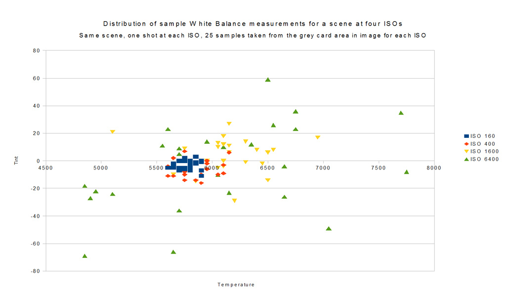

Spread of White Balance measurements for four ISOs by gardenersassistant, on Flickr

For those who prefer numbers, here are some statistics for the measurements.


White balance sample measurements by gardenersassistant, on Flickr

When I applied samples of the settings to several images it seemed to me that although the base ISO values did vary, the impact on the look of the image was probably less than would matter to most people. At the other end of the spectrum, using settings from the ISO 6400 calibration image, there were huge colour shifts. This composite image superimposes two of the white balance settings measured from the ISO 6400 calibration image.
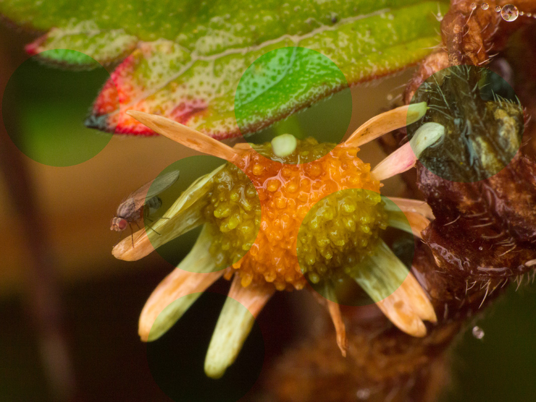

Image with two White Balance settings taken from the same calibration image by gardenersassistant, on Flickr

Here is what the grey card on the table looked like with the same two settings.
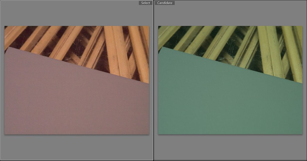

Grey card with two white balance adjustments by gardenersassistant, on Flickr


------------------------------------------


The other thing I discovered from this exercise was that even for base ISO, where there is not much variability about the measured white balance, using this white balance does not guarantee that the colours look like what you saw when capturing the image. For example, this pair of images is of the same flower. (Yes, the left hand one is underexposed, but I have deliberately only changed the white balance to avoid unwanted complications. As it happens though, correcting the exposure does not remove the redness, which is the issue of concern here.)
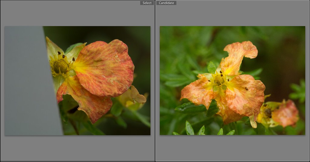

Same flower, different time of day, both grey card corrected by gardenersassistant, on Flickr

When I took both pictures the colour I saw was similar to the right hand version. I pass by that flower very often, and it always has an “orangy” aspect, and never red, in any light. However, both those images have been adjusted to the white balance taken from a calibration image taken at the time the image was captured.

Interestingly enough, using JPEG with my current camera, and with my two previous cameras, this flower tended to come out red like in the left hand image, so this is a familiar issue. It was not cured by the white-balance calibration of the left hand image. It was corrected for the right hand image. Very curiously, the more appropriately coloured version is ISO 3200, with its undependable white balance calibration, while the wrongly red one is base ISO, 160, with its much more consistent white balance calibration.

Another colour that is sometimes not brought into the realm of “reality as I saw it” by white balance correction is green, sometimes. With JPEG greens sometimes took on a totally unnatural bright emerald green character, and this is still happening with some white balance corrected raw images.

The good news is that it turns out that Lightroom has some very powerful, subtle and easy to use colour adjustment facilities. Much as I would have liked grey card white balance adjustment to handle it all, it looks like I am going to be grateful for those colour adjustment facilities.
 
Last edited:
Just after posting this, I came across sRGB vs. Adobe RGB 1998 at Cambridgeincolour.

I use sRGB because that is the standard for display on the Internet and that is what is needed by DSCL, where I get my printing done. The article talks about Adobe RGB providing richer cyan-green midtones, orange-magenta highlights and green shadows. Given the particular colours (described in the top post) that I have been having trouble with for some time, I can't help wondering if it is because they are outside the sRGB gamut (at some intensities).

Tricky. I'm reckoning on getting a "professional level" IPS monitor quite soon as I am sick and tired of the big change in gamma caused by the slightest head movement with my current TN monitor. I had assumed that a limited (sRGB) gamut screen was the natural choice. Perhaps a wide gamut screen would be better. But who else would be able to see any additional colours? And I wouldn't be able to print them. Both for those with sRGB screens and for the printing, I wonder how the mapping would work? Would it produce horrible colours?

Hmmmmm.......
 
At higher ISO, you are sampling more noise in the test area and the random coloured pixels skew the WB reading. Sample the largest area possible to even this out, and use a neutral white card rather than grey that will contain less noise. Grey is for exposure, and many grey cards are not in fact absolutely neutral, even if they claim to be. I have four and if you're being critical, they're all fractionally different

As a comment, there is no such thing as perfect white balance. The colour of an object is determined by the light falling on it, and that constantly changes. Your brain interprets this so it 'looks' right, usually approximately matching what it looks like under noonday sun. But not always - sunsets for example, or candle light.

I can get better colours with fine manual adjustment, after using a white balance reference target as a starting point. I often use the default background in Lightroom as a visual reference to work from, as that is equal red/green/blue neutral grey.
 
At higher ISO, you are sampling more noise in the test area and the random coloured pixels skew the WB reading.

Right. I'd assumed that was what was going on.

Sample the largest area possible to even this out,

I wanted to do that, but I couldn't see how to change the area that Lightroom uses to pick up the white balance. It seems to be fixed at 5 x 5.

I also tried defocussing to get an evening out effect during the capture, but I use autofocus and in order to get the camera to take an OOF capture I have to go into manual focus. On my G3 I found switching back and forth a lot between auto and manual focus too fiddly for comfort. I think it will be easier to change to base ISO and back.

and use a neutral white card rather than grey that will contain less noise.
Grey is for exposure,

Ah, that makes sense. Thanks.

and many grey cards are not in fact absolutely neutral, even if they claim to be. I have four and if you're being critical, they're all fractionally different

I'm not surprised. I started by using a lens cleaning cloth that claimed also to be 18% grey, but when I got such variable results (which I now realise was because I was using ISO 3200 for my first batch of test shots) I went out and bought a grey card. That is when I realised that it wasn't the target that was the major problem, but the ISO. I didn't check for variations between the targets, and given the residual variation from a single grey card capture even at base ISO I imagine that establishing the difference would be tricky without taking lots of observations. And then there would be issues about whether the lighting for both sets of shots was exactly the same. Hmmmm. Think I'll give that a miss. :)

As a comment, there is no such thing as perfect white balance. The colour of an object is determined by the light falling on it, and that constantly changes. Your brain interprets this so it 'looks' right, usually approximately matching what it looks like under noonday sun. But not always - sunsets for example, or candle light.

Interesting. That makes sense. Do you have a (readable) source discussing those issues in a bit more detail?

I also wondered about the concept of a single light balance relevant to a whole image. Especially with close-ups, which is what I work with almost all the time, there is loads of reflected light washing around from surfaces of different colours, and in some cases (e.g. an invertebrate on the underside of a back lit leaf) transmitted light too. So the colour-mix of the illumination can vary across the image, strongly so sometimes. Put a grey card in different areas of the image (conceptually at least - it would in practice be tricky to say the least for some of my shots) and you would get different readings presumably. So which would be the "proper" one. "No such thing" is the answer that comes to mind.

I can get better colours with fine manual adjustment, after using a white balance reference target as a starting point. I often use the default background in Lightroom as a visual reference to work from, as that is equal red/green/blue neutral grey.

Very interesting. That is the method I seem to have been drifting towards, especially having just started playing with the HLS/Color/B&W section in Lightroom, particularly the wonderful facility to work directly by pointing and dragging on the image.

Thanks again. It is really useful to get feedback from experienced practitioners.
 
Right. I'd assumed that was what was going on.... <snip>

Chasing critical colour accuracy will drive you mad. Basically, you'll struggle unless everything from the light source, to the light modifier, to the shooting environment and every stage thereafter is totally controlled and calibrated. That's what professionals have to do if they're shooting maybe a fashion catalogue, but even then you have no control over what the viewer sees whether that's on-screen with a variety of devices from a mobile phone to home PC to work PC etc etc, or a printed catalogue, magazine, whatever. Ask any on-line seller about these problems.

You can increase the WB sampling area in LR by not enlarging the image and adjusting the loupe scale to the right (bottom left of screen). TBH you will not get anything like the best from Lightroom without a book. I think you'd get on well with Martin Evening's writing style.

Edit: we are surprisingly tolerant of innaccurate white balance, for the reasons mentioned earlier. What is more important is the relationship between colours, so if you look at a print that is a bit blue all over, within reason your brain will filter out the blue and make it look right. What is much more important is colour consistency as we're are very sensitive to that. Eg, wedding shots of bride: a) get that dress as close to accurate as you can and sod the rest, b) make sure the dress is as close to the same colour as possible in every shot as it will stand out when images are compared side by side.

I find the best way is by eye, after using a WB reference to get close that will get the relationships between blue/yellow (colour temperature) and green/magenta (slider underneath in LR) pretty much in order. But bear in mind the influence of different light sources (daylight, flash, tungsten, reflected environment etc) makes exact colour match virtually impossible. Not to mention the horror of fluorescent lights that often don't emit a full colour spectrum, so you can't correct for colours that don't actually exist.

Realistically, all you can do is understand what's going on and control the various factors as far as possible, then go for the best compromise that keeps the main subject as accurate as you can get it, and looking the same shot to shot.
 
Last edited:
Richards given excellent advice re colour accuracy, so the only thing I'd like to add is; you should find a way of separating focus from your shutter button, is there a BBF option on your camera. Focussing with the shutter button for me was the most frustrating thing when I first used an AF camera.I need to get to press the shutter without having to struggle past the camera trying to refocus.
 
You can increase the WB sampling area in LR by not enlarging the image and adjusting the loupe scale to the right (bottom left of screen).

Ah! Thanks.

TBH you will not get anything like the best from Lightroom without a book. I think you'd get on well with Martin Evening's writing style.

I just had a peek at Amazon. I think you're right, thanks. I shall order a copy when I have decided whether to upgrade from Lightroom 3 (which came with my camera) to Lightroom 4. I see version 4 has Highlight and Shadow recovery, which I miss from Photoshop, but I understand they are achievable by other means in Lightroom 3 (I just read Martin Evening on highlight recovery with version 3). Apart from that, I don't see anything that looks compelling, unless there is something tasty hiding in White balance brush or Additional adjustment brush options, or the tweaks and bug fixes.

Edit: we are surprisingly tolerant of innaccurate white balance, for the reasons mentioned earlier. What is more important is the relationship between colours, so if you look at a print that is a bit blue all over, within reason your brain will filter out the blue and make it look right. What is much more important is colour consistency as we're are very sensitive to that. Eg, wedding shots of bride: a) get that dress as close to accurate as you can and sod the rest, b) make sure the dress is as close to the same colour as possible in every shot as it will stand out when images are compared side by side.

I'd come to a somewhat similar conclusion, about consistency, albeit in a rather different context of series of shots of invertebrates, for example as they make their way through foliage/undergrowth etc, and/or at different magnifications and angles, all of which can change the colour mix. Oddly enough though, it is consistency in some of the background colours that seems particularly important a lot of the time, particularly the greens. My wife is not a photographer, but is a plantswoman with extremely discriminating colour vision and she provides the best, totally merciless, QA I get of my images. We have had many discussions about greens in my images.

I find the best way is by eye, after using a WB reference to get close that will get the relationships between blue/yellow (colour temperature) and green/magenta (slider underneath in LR) pretty much in order. But bear in mind the influence of different light sources (daylight, flash, tungsten, reflected environment etc) makes exact colour match virtually impossible. Not to mention the horror of fluorescent lights that often don't emit a full colour spectrum, so you can't correct for colours that don't actually exist.

Luckily, fluorescent isn't an issue for me.

The approach of initial WB reference to get the relationships along the right lines and then some tweaks to nudge any non-credible colours (like some troublesome greens and reds) into a credible state seems comfortable to me. For some time now credibility has been my main criterion as far as colour goes - I don't have "perfect pitch" (is there a term for the visual equivalent of musical perfect pitch?) as far as colours go, and I have a very poor colour memory (well, a very poor memory, period), so the idea of "absolute colour accuracy" as between the scene and its rendition has never been a runner for me. Besides which, as you point out, it's probably not even achievable anyway, except, possibly, in the most controlled of conditions, which is at the other end of the spectrum from where I'm operating.

Realistically, all you can do is understand what's going on and control the various factors as far as possible, then go for the best compromise that keeps the main subject as accurate as you can get it, and looking the same shot to shot.

Terrific info and advice all through your response. Thanks again.
 
Richards given excellent advice re colour accuracy, so the only thing I'd like to add is; you should find a way of separating focus from your shutter button, is there a BBF option on your camera. Focussing with the shutter button for me was the most frustrating thing when I first used an AF camera.I need to get to press the shutter without having to struggle past the camera trying to refocus.

I don't have BBF, which may explain why you've lost me here Phil. :)

Is this a case of using manual focus but auto-focus kicks in when you press the shutter button? If so I can see that would be totally unworkable. But I use autofocus not manual focus, and I'm not aware of a problem with autofocus kicking in when I don't want it to (half press to gain and lock focus etc).

I must have missed the point. Again. :(
 
I'm unfamiliar with your camera, but many DSLRs have the ability to move focus control to a rear button. It has many uses but in the case of what you were trying to do, you could have used the back button to focus at infinity and then shot the grey card without the AF kicking in on the shutter half press. Without having to switch AF off - so really simple.

It's also great for focus recompose because you don't need to keep the shutter half depressed. I used to slightly release pressure on the shutter button which led to frustration. BBF makes life more like manual focussing because it allows the shutter finger to just fire the shutter. Although I use the half press for AE lock sometimes.
 
I'm unfamiliar with your camera, but many DSLRs have the ability to move focus control to a rear button. It has many uses but in the case of what you were trying to do, you could have used the back button to focus at infinity and then shot the grey card without the AF kicking in on the shutter half press. Without having to switch AF off - so really simple.

It's also great for focus recompose because you don't need to keep the shutter half depressed. I used to slightly release pressure on the shutter button which led to frustration. BBF makes life more like manual focussing because it allows the shutter finger to just fire the shutter. Although I use the half press for AE lock sometimes.

Ah, now I understand. Thanks.

I don't use focus and recompose much. My camera has CDAF rather than PDAF and I use single-area focusing with a moveable focus box to direct the camera to what I want it to focus on. Until recently I would make the focus box as small as possible and (apart from occasional use of focus and recompose) move it to what I wanted to focus on while keeping the composition as I wanted it. This worked well for me as I take multiple shots of a subject and I want to keep the subject in a particular position within the frame* even if the subject (as it often is) is moving around, either because what it is on is moving back and forth in the breeze, or it is wandering around. In either case while shooting a series I have to keep regaining focus, and unlike with focus and recompose I can do this without moving the camera back and forth to regain focus and then regain the desired framing.

* Loosely speaking. For a subject which is moving back and forth in the breeze I want to capture it as it is passing through a particular point in the frame. There is no time for focus and recompose in such circumstances.

I recently discovered and have since been using a facility on my camera called "pinpoint focus". This is similar to the focus box, but you have a little cross you can move instead of the box, and when you half press the shutter button the EVF/LCD zooms in on the area around the cross and as the focus engages you can see very precisely what the camera is focusing on. This is great for my purposes. It is even useful for "straight through" captures where I don't pause with a half shutter press; I find this necessary sometimes if the subject is moving a lot. In this case I still see the enlarged area around the focus point, this time very briefly, but enough to show me if the focus fell where I wanted it to, which in those circumstances it often doesn't. I find this helps me to decide when "enough is enough" for a difficult scene, either because I have several shots which seemed to be ok from the focus positioning point of view, or because nothing is working and I might as well give up.
 
I shall order a copy when I have decided whether to upgrade from Lightroom 3 (which came with my camera) to Lightroom 4. I see version 4 has Highlight and Shadow recovery, which I miss from Photoshop, but I understand they are achievable by other means in Lightroom 3 (I just read Martin Evening on highlight recovery with version 3). Apart from that, I don't see anything that looks compelling, unless there is something tasty hiding in White balance brush or Additional adjustment brush options, or the tweaks and bug fixes.

Version 4 upgrade ordered after a little more research. Noise reduction on the adjustment brush and soft proofing were enough to justify it for me. (Just watched an Adobe video on soft proofing - definite Wow factor for me with that. Perhaps I will get a wide gamut screen after all. :) )

Highlights and Shadows will be good to have too. On the face of it they don't appear to have the scope of the Photoshop versions, but that may just be a case of my not understanding how to combine techniques in Lightroom to achieve more subtle/complex effects. Reading more and watching Adobe videos and then where possible trying out what I have just seen is more and more impressing me with the combination of power and usability that Lightroom delivers. For example I've just been playing with the adjustment brush with automask turned on; goodness me that is powerful and a delight to use.

Martin Evening book ordered too. :)
 
Back
Top