#1 is better but could still do with a crop. This was my hasty attempt (please PM me if you want this taken down - you're an "Edit - yes"-er)
I cropped it square, desaturated the reds a little, almost completely desaturated the ketchup bottle (with a really bad mask - pls ignore her r shoulder), cleaned the glass up a bit with spot healing and pumped the cyan and yellow (mask for the specs only) and gave the bg a bit more blur. I'd probably look at sharpening but with a screen grab it wasn't worth it.
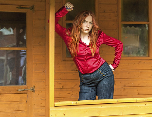
#2 I don't like. The rust(?) stain down the brickwork and the expression don't do it for me. But that's *just me*. I used to see Springsteen on TOTP and wonder whether he just needed to pop to the loo. It's put me off this type of expression for life. The left hand is indicating space that's not there. However I really like the crop, but I love "landscape" portraits.
Good advice this.
In short.
- Watch your backgrounds
- You're working with a zoom. Take time to experiment with different focal lengths and try different comps to see what you like best.


 Sarah by David Ore, on Flickr
")
 Sarah
Sarah Sarah
Sarah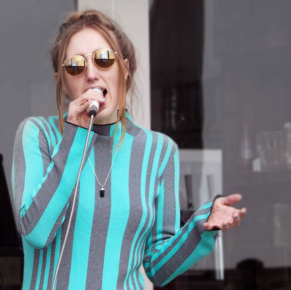
 Abi Flynn
 Abi
Abi Abi Flynn
 Abi
Abi Cool Singer
 The Singer
 Singing her Heart Out