Help; @ wits end; Is it me, is it the printer or are my expectations too high?

Messages
78
Edit My Images
No
Hopefully some people with more experience can help me out here.

Having moved to a larger home recently and having more wall space I have naturally wanted to get a lot of my images printed. I have jumped into the sink hole that is home printing as I was getting a little tired of paying £30-40 per image from a lab.

Not wanting to pay silly money for a printer and paper to dip my toes in, I did some research (web/youtube) as jumped on an entry level printer the Epson - XP 970 and paired it with some A3 Fotospeed NST 315 matt paper.

I have printed about 10-12 images and been completely under whelmed by the results except one image. I have watched hours of tutorials about editing for a print ( have a calibrated mac monitor) and my prints never come out like my edit. really Always a loss of sharpness and the color reproduction is not great. I have one exception to this rule which i will attach with some of the other examples.

Now is this a case of this is a cheapo £250 printer (compared to the proper professional machines) & I shouldn't be expecting more or a case of me not doing the process properly?

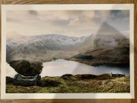
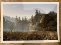
I will attach two Digital images (jpegs, ignore the stupid water mark on one) and some as good as I can do iPhone shots of the actual prints as an example. Note on the landscape shot across the lake that the sky has lost all its definition and warm colour across the image has gone compared to the digital, plus what you wont see is the loss in sharpness as the old stone buildings are so soft in the print. The autumn colour tree image is tack sharp on the print and actually looks like the edited image which is why I am so confused but this is defiantly the outlier of all my attempts thus far.

I print via Lightroom using the epson matte paper setting and profile for both examples. I did get a custom ICC profile for this printer/paper at a later date and it has made negliable difference if at all any.

I am about £35 down in paper and no ink left and have one image to show for it that I think is acceptable. The images/resolution/camera gear isn't my issue so I am a little at my wits end and feel like packing it all in and just biting the bullet and getting the labs to print.

Any suggestions will be helpful even if it's just to say stump up the money for a proper printer. The reason I have not yet is that that one image is exactly what I want from this printer/paper combo.

Thanks
 

Attachments

  • ADB0FC01-6314-4704-95EA-D1C652D093F7.jpeg
    ADB0FC01-6314-4704-95EA-D1C652D093F7.jpeg
    121.1 KB · Views: 46
  • 0093BBC0-6AD8-44D6-BCE8-E4E1F32A53F5.jpg
    0093BBC0-6AD8-44D6-BCE8-E4E1F32A53F5.jpg
    143.9 KB · Views: 46
  • 76623477-3346-4398-8BDD-A0A6A3D25C6F.jpg
    76623477-3346-4398-8BDD-A0A6A3D25C6F.jpg
    169.9 KB · Views: 45
  • BB141BBC-AEEE-4C75-8A91-0B44CD13F5AA.jpg
    BB141BBC-AEEE-4C75-8A91-0B44CD13F5AA.jpg
    182.6 KB · Views: 46
Last edited:
I share your pain, printing is itself a whole specialized subject. In terms of getting improved results from what I was seeing on my calibrated screen to print, I got the most benefit from using QImage https://www.ddisoftware.com/qimage-u/ for the final printing stage in the workflow.
 
Another QImage One user here and always get great results. qImage prints are better than LR but LR is still pretty good at printing but I do find sharpness and colours better with QImage.

looking at your images the colours are significantly different which could indicate a bad profile but I’d download a trial of QImage and see what you get from that.
 
The greens seem more vibrant and maybe there is more of a green tint overall in the prints. Were you able to see that the colours were all in gamut when you soft proofed them, and did you do a nozzle check to check that all the inks are flowing okay?

If you are using a Mac, it's not possible to double profile I think, which can be an issue with colours.

The paper can make a big difference and I find matt papers harder to deal with. @Harlequin565 is a font of knowledge on papers and printing.

Jose Rodriguez on YouTube suggests printing out one of his reference prints to check that you are getting the colours you want before you print anything that matters on a new printer.

I also use QimageOne - an old version, and I soft proof in Affinity Photo now that I've given up Lightroom. I use a Mac and the last time I looked you couldn't properly soft proof in the Mac version.
Thanks for that. Now you mention it the green is completely off and it’s so obvious now pointed out. Probably why the autumnal image works better and the landscape over the lake looks dull and green.

I will check out that YouTube channel and print the chart. Might also chat to fotospeed see if the profile is bugged and do it again.

Still abit mystified why the prints are not sharp overall. Will do a nozzle check again but I think they are fine.

Thanks all for the comments.
 
When you soft proof in LR you can turn on out of gamut colour warnings (like you would turn on highlight and shadow clipping when developing). See if the greens are out of gamut. If they are then the driver will shift the colours into the gamut of the printer. How that is achieved is down to the rendering intent.

A lot of print tutorials will tell you to always use Perceptual rendering intent and this couldn't be further from the truth. The truth is that is all depends on the image and you need to decide on the best intent to use. Personally I mostly use Relative because relative will only shift the colours that are out of gamut and not all of the neighbouring colours as well.
 
The paper can make a big difference and I find matt papers harder to deal with
I don't know whether this is true or not, but my experience with matt papers is that the ink can end up "splurging" a bit on it. If you imagine what ink does on blotting paper as an extreme example. I only use matt papers when I want a softer looking image which ties in with the OPs experience.

As to the OP, sharp rendition tends to come from "coated" papers - gloss, "silk", "lustre" and all the other words they use apart from "fine art".

Colour rendition varies widely depending on the paper, the profiles, age of ink, screen calibration... It can become a minefield.

Also check out Keith Cooper's channel & website. He has a calibration print you can download for free. And, get yourself some paper test packs. Ilford, Permajet, Hahnemuhle, Canson and Fotospeed all do them. Print out a single calibration print (without doing any other messing about) and compare the results. I have a box of the damn things !

IMG_0890.jpg

What you'll notice is that the colour rendition, sharpness, dmax (the depth of the blacks) are all very different depending on the paper. "Looking good" is very subjective, but if you use different papers you will start to get a feel for what works best for any given image. Paper isn't white sadly, and some papers can really mess with the colours.... I made a spreadsheet to remind myself (saddo alert)


Screenie by Ian, on Flickr

What I took away from all this testing is that some papers are pretty awful and some are great. There is no "wonder" paper that's cheap and gives excellent results. I've yet to meet anyone who has done this level of testing, so when people say a paper is awesome, I wonder what they are comparing it to, what their standards are, and what sort of photos they are printing. I also discovered that some papers print just great on default settings, whilst others need a ton of faffing with screen calibration and paper profiles and still look off. "What looks good" is subjective, but I would definitely recommend getting a couple of test packs (non-sponsored link) and trying lots of papers before giving up. Matt as well as gloss/semi-gloss.

When you're analysing the test prints, look to see how deep the blacks are and how quickly the highlights blow or the shadows go to black. This will give you an idea of how contrasty the paper is and will allow you to choose the right paper for the right image. Also, consider discarding anything that has poor colour reproduction (like greens that are way off) Once you've found a few papers to work with, that's the time to start mucking about with ICC profiles to get the colours bob on.

I'm also an advocate of calibrating your screen to match the prints (others really aren't so YMMMV). Once you've done that (and you could save it as a preset in lightroom for a particular paper) it makes getting accurate prints a one-click process and the whole experience of printing becomes far more enjoyable.

Good luck, but do persevere. You have some nice images that are well worthy of printing. Once you hit on a combination of image vs paper, you can start to produce some really great prints.
 
Last edited:
Ooh, also, re ink running out...

Larger printers have larger ink tanks, and the cost per ml is much less. If you enjoy it, consider getting something that has bigger tanks (50ml+) as these are generally aimed at the serious amateur market but also end up costing less in the long run. These printers with 5ml tanks make all their money on you buying millions of cartridges and they're not as well calibrated (in my experience) as their more expensive cousins. People get fed up and start using after market inks - which (in my experience!!) can cause nozzle blocking, and make colour issues worse.
 
One thing I can recommend is not printing a large picture if you're unsure how it's going to come out. Years ago I went through a lot of pain and hair tearing when I changed my PC and printer and just to keep the wastage down I printed small images first to check the colours. As I could fit multiple small pictures on one A4 and look at them through a magnifying glass this really cut down the wastage in both paper and ink whilst I got to the bottom of it all.

Good luck with it OP, I hope you get it sorted soon.
 
Last edited:
Thanks for all the help all. I have spoken to a guy at the framers I use who prints his own stuff and he has saved me from my woes based on his experience and having very similar issues with his much better printer the Canon Pro 1000.

This maybe helpful to other people if this happens, took him days to work out what had gone on and seems to fixed my issues.

So since printing the autumnal image (attached above) which I considered sharp and colour accurate, I have updated my macOS to the latest version 13. When I did that I installed the updated drivers & utility for the printer from the epson website. So I can be under current support for this macOS. Unbeknown to me that the printer utility registered 2 printers and gave them the exact same name as shown in this image, why it does this is beyond me. However when selecting one of the printers the "kind" section was showing the printer as airplay device & from doing some googling this seems to apply all kinds of colour managing etc. Lightroom just had this one in the dropdown as default so it's been using that because it said Epson XP-970 so I was none the wiser. Since manually renaming this printer to XP-970-air play and selecting the correct remaining XP970 the colour reproduction of a test I did this morning was 100x better. I will now send off another print for a custom ICC so hopefully this is now all resolved.

I hope this potentially may help someone else as I have wasted a full lot of ink and about 12 sheets of paper.

Screenshot 2023-02-17 at 10.21.19.png
 
Last edited:
This a before (top) and after (bottom) my "printer fix" explained above. The accuracy compared to the digi is night and day for a small test print. The sky & catbells on the left side of the image show a massive difference right away without going over with a tooth comb as well as the over saturated greens.

BA0C78ED-480F-45FF-AEBC-5922D6876E68.jpg
 
Last edited:
Glad you got to the bottom of it! It's amazing the feelings you go through when you get a crap print vs a good one.

Aaaaand relax :)
 
Thanks for all the help all. I have spoken to a guy at the framers I use who prints his own stuff and he has saved me from my woes based on his experience and having very similar issues with his much better printer the Canon Pro 1000.

This maybe helpful to other people if this happens, took him days to work out what had gone on and seems to fixed my issues.

So since printing the autumnal image (attached above) which I considered sharp and colour accurate, I have updated my macOS to the latest version 13. When I did that I installed the updated drivers & utility for the printer from the epson website. So I can be under current support for this macOS. Unbeknown to me that the printer utility registered 2 printers and gave them the exact same name as shown in this image, why it does this is beyond me. However when selecting one of the printers the "kind" section was showing the printer as airplay device & from doing some googling this seems to apply all kinds of colour managing etc. Lightroom just had this one in the dropdown as default so it's been using that because it said Epson XP-970 so I was none the wiser. Since manually renaming this printer to XP-970-air play and selecting the correct remaining XP970 the colour reproduction of a test I did this morning was 100x better. I will now send off another print for a custom ICC so hopefully this is now all resolved.

I hope this potentially may help someone else as I have wasted a full lot of ink and about 12 sheets of paper.

View attachment 381552

To be honest that's something I should have told you to check but completely slipped my mind. I've been caught out with that once or twice after an OS update.

As soon as I started reading your post, I knew immediately that you were going to talk about the dreaded "Air Print"

Just for future reference, after an OS update, always check that the printer drivers. It doesn't do it every time but I've had a couple of occasions where the updates has defaulted me back to Air Print for some reason.

Anyway, glad you got it sorted. I still highly recommend trying QImage One though.
 
Last edited:
What you'll notice is that the colour rendition, sharpness, dmax (the depth of the blacks) are all very different depending on the paper. "Looking good" is very subjective, but if you use different papers you will start to get a feel for what works best for any given image. Paper isn't white sadly, and some papers can really mess with the colours.... I made a spreadsheet to remind myself (saddo alert)


Screenie by Ian, on Flickr

What I took away from all this testing is that some papers are pretty awful and some are great. There is no "wonder" paper that's cheap and gives excellent results. I've yet to meet anyone who has done this level of testing, so when people say a paper is awesome, I wonder what they are comparing it to, what their standards are, and what sort of photos they are printing. I also discovered that some papers print just great on default settings, whilst others need a ton of faffing with screen calibration and paper profiles and still look off. "What looks good" is subjective, but I would definitely recommend getting a couple of test packs (non-sponsored link) and trying lots of papers before giving up. Matt as well as gloss/semi-gloss.

When you're analysing the test prints, look to see how deep the blacks are and how quickly the highlights blow or the shadows go to black. This will give you an idea of how contrasty the paper is and will allow you to choose the right paper for the right image. Also, consider discarding anything that has poor colour reproduction (like greens that are way off) Once you've found a few papers to work with, that's the time to start mucking about with ICC profiles to get the colours bob on.

I'm also an advocate of calibrating your screen to match the prints (others really aren't so YMMMV). Once you've done that (and you could save it as a preset in lightroom for a particular paper) it makes getting accurate prints a one-click process and the whole experience of printing becomes far more enjoyable.

Good luck, but do persevere. You have some nice images that are well worthy of printing. Once you hit on a combination of image vs paper, you can start to produce some really great prints.
This sort of information is priceless !!!
 
Back
Top