

- Messages
- 27
- Name
- Liam
- Edit My Images
- Yes
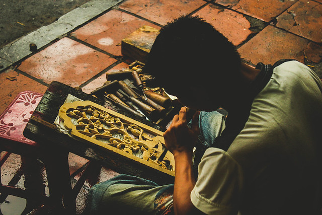
Here are a few shots from my favourite city in Vietnam, the beautiful Hoi An
 Hoi An by Liam Edwards, on Flickr
 Hoi An by Liam Edwards, on Flickr
 Hoi An by Liam Edwards, on Flickr
 Hoi An by Liam Edwards, on Flickr
 Hoi An by Liam Edwards, on Flickr
 Hoi An by Liam Edwards, on Flickr
 Hoi An by Liam Edwards, on Flickr
 Hoi An by Liam Edwards, on Flickr
Hoi An by Liam Edwards, on FlickrHoi An by Liam Edwards, on FlickrHoi An by Liam Edwards, on FlickrHoi An by Liam Edwards, on FlickrHoi An by Liam Edwards, on FlickrHoi An by Liam Edwards, on FlickrHoi An by Liam Edwards, on FlickrHoi An by Liam Edwards, on Flickr