How to edit for black and white

A problem with all methods of adjustment is that there can easily arise a discrepancy between aesthetic and meaning. An aesthetic on its own, whether achieved laboriously or just by pressing a few buttons, might easily escape the realm of genuine human meaning, and be crude and / or shallow. The best answer (and there's never just one) is in the synthesis of medium, tools and meaning.

I have a suspicion that you see images differently from most people, based on both this and previous comments.
 
As a separate observation, I looked at the results I presented on the previous page using a different screen from the one I edit on and this laptop - it looks completely hideous at 24" 1080P. Interesting how much difference resolution and possibly even screen tech makes.
 
I've never thought of or even heard of taking that approach. I might have to play with that and see what I can get.
This is the way a B&W adjustment layer works in PS... and if you apply that over a hue/saturation adjustment layer you get the same kind of tonal control.
 
I'd probably brighten it up a bit (there is a good article on that) and worked on the contrast. However, I agree with Box Brownie, the image looks kinda flat, so there is only so much you can do :confused:
 
Most of the edits will come down to personal choice.

Because of the similarity in tonal values between your hubby's face and the the background, I quite liked @swanseamale47's approach of blurring the background to at least make it feel different texturally.

IMVHO, that particular version went a bit far, but once the mask is generated, you should be able to play around with how much blur you add. It also depends how good your mask is, the worse it is, the less you can 'get away' with.

From my personal POV, I like B&W images to have areas of pure black and areas of pure white. So the technique I use on my own stuff is the 'J' technique in LightRoom.

Simply press J and it will show you which areas have lost detail. In blue for shadow and in red for highlights. Depending on the effect you want, you can have large areas in complete shadow with no detail at all, or only tiny bits.

I have to caveat that with two things however.

  1. I love really contrasty B&W images.
  2. My monitor must be really bright as I edit stuff on my home PC then upload it elsewhere and sometimes it seems overly dark,
Depending on the software you're using, they often have presets. While these shouldn't be your end goal (i.e. don't just push the button and leave it), they can be useful as a start point. Click on them all and scroll through to see if any of those does the heavy lifting for you. Some will look better than others.

Which brings me to my final point. A lot of what you see on this forum will (might) look very different to what the people editing it are seeing - unless everyone's monitor is calibrated to the same standards.

I remember one particular example of the TP52 from a few years ago, I made a comment on one of @Cobra's shots about "I'd have edited out that highlight" or something along those lines, and literally everyone else said "what highlight?" Even Chris struggled to see it in the editing software, so god knows how it was visible on my monitor.
 
Last edited:
I made a comment on one of @Cobra's shots about "I'd have edited out that highlight" or something along those lines, and literally everyone else said "what highlight?" Even Chris struggled to see it in the editing software, so god knows how it was visible on my monitor.
As already mentioned, regarding monitor set up,
perhaps our own inbuilt "monitors" vary too?

Rods work at very low levels of light. We use these for night vision because only a few bits of light (photons) can activate a rod. Rods don't help with color vision, which is why at night, we see everything in a gray scale. The human eye has over 100 million rod cells.

Cones require a lot more light and they are used to see color. We have three types of cones: blue, green, and red. The human eye only has about 6 million cones. Many of these are packed into the fovea, a small pit in the back of the eye that helps with the sharpness or detail of images.
 
If only you saw the highlights then your screen is too bright
IIRC, that was my reply too, I remember the "incident" happening, but not the details that followed
 
I've not seen it, I'm just reading the above text :)

As Kell said it was a 52 post, I've not entered for some years,
So you may not even have been "here"
 
Myself I think the OP is being to critical of her picture, looks fine to me! Beauty of the digital camera is you can see the photo right away. In that case if you really didn't care for it, shoot it again with a flash.
 
then your screen is too bright ;)

That’s literally what I said.

My monitor is a work-provided one. While it’s got lots of real estate, it’s not calibrated.

It gets decent reviews but not in a photographic sense and I’ve tried making it darker to compensate, but I don’t have any way of officially calibrating it.
 
Last edited:
but I don’t have any way of officially calibrating it.
I'm not sure if you've looked, but there are on line guides that help you get pretty close.
 
That’s literally what I said.

My monitor is a work-provided one. While it’s got lots of real estate, it’s not calibrated.

It gets decent reviews but not in a photographic sense and I’ve tried making it darker to compensate, but I don’t have any way of officially calibrating it.

Sorry, I may have mis-read your post, the last thing I read was... :)

so god knows how it was visible on my monitor.
 
Last edited:
My monitor is a work-provided one. While it’s got lots of real estate, it’s not calibrated.

It gets decent reviews but not in a photographic sense and I’ve tried making it darker to compensate, but I don’t have any way of officially calibrating it.
A couple tricks...
The white on your monitor should be about as bright as a white piece of paper in the same ambient light... a bit brighter if the room is dark.

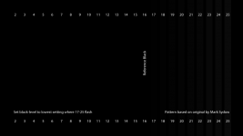
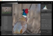
And if you use LR you can embed this test strip as the identity plate (keep it as a png, do not resize it). You should just be able to see the difference between the blacks in the upper row (maybe not w/o decent calibration), and the difference between all of the shades in the lower row. The test strip looks different against different BG's; just as your monitor looks different in different ambient levels... the black squares show best against a black BG.

TestStrip2.png


It stays visible in all of the separate modules (upper left corner).

Untitled-1.jpg
 
Last edited:
ETA - looking at the above post on my phone, it's not as easy to see the differences in the blacks on the top strip.
Yeah, it is harder to see the differences in the top row when against a light BG... the contrast is too high for your eyes.
If the differences in the top row are very obvious in LR then your monitor is probably too bright, or the gamma (midtone) is shifted towards darks.
 
Last edited:
Yeah, it is harder to see the differences in the top row when against a light BG... the contrast is too high for your eyes.
If the differences in the top row are very obvious in LR then your monitor is probably too bright, or the gamma (midtone) is shifted towards darks.

Appreciate your comment here. This laptop screen is calibrated but I couldn't see more than the faintest hint of variation at the top. Used my hands to mask out the background and suddenly there's a very obvious pattern there after all!
 
Yeah, it is harder to see the differences in the top row when against a light BG... the contrast is too high for your eyes.
If the differences in the top row are very obvious in LR then your monitor is probably too bright, or the gamma (midtone) is shifted towards darks.

Sorry to be a pain and you may not know the answer to this, but do you have to install it to every catalogue. I restarted LR with a new catalogue and it was no longer there.

I also don't seem to have that many options for my monitor.

I did download this image and managed to get it so that the 17th strip onwards were visible.

101_Brightness.png
 
It does seem that the identity plate has to be set up for each catalogue.
I don't have many options for my monitor either... that's why hardware calibration should be better.

And the 16 reference is for TV; I can see down to ~ 8 on my calibrated monitor (original, not embedded)... should technically be able to see #1 for full RGB gamut. On my monitor for white, red, and green 254 clips, and blue clips at 253 using these display clipping patterns.
 
Last edited:
And the 16 reference is for TV;

Oops. I didn't look into it that well (clearly).

Interestingly, on my work laptop and on my iPhone (which is supposed to have a great screen - I cannot see any of the black strips on that one above. I can just about make out 25 - but only because I know it's there.

Thanks for those other links though - I'll have a look at my home monitor later. I may also look at the spare that I use for Zwifting on to see if it's a better screen.
 
Last edited:
Back
Top