weekly ^Joe's Photo 52 2012 - 4 - :: Sweet :: added

Messages
2,808
Name
Joe
Edit My Images
Yes
Hello All,

I am Joe, I've had my 500D for about 5 months now, I attempted the 2011 52 but I did not finish it :(

I'm still a Photographic noob but have learnt a lot in the time I've had the camera, I hope to learn even more in the 2012 52 and never miss the theme by more than a week!!

Here we go...
 
Last edited:
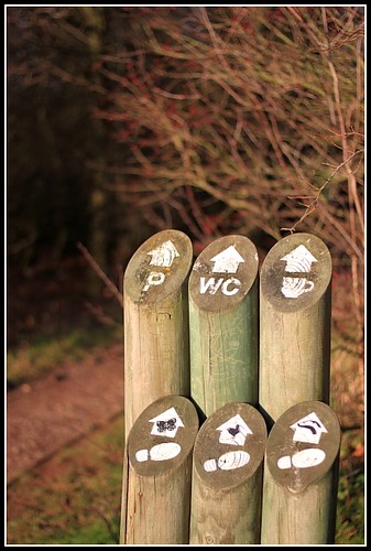
4....(y) but don't burn out :D

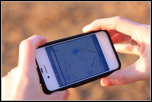
Of the 4, it's #3 for me. I saw it on Flickr and liked it. Simple but effective. Nice detail and exposure in the hand and right amount of detail in the BG.

Two minor points for me are your sleeve, better without I feel, and thumb, it looks a bit odd where it is.

Cheers and cracking start.
 
Great start Joe and brilliant interpretation of the theme, number 3 for me although I like them all in one way or another.
You can't be to far away from me where you are,
Best wishes
Cliff
 
I like #4 for the fact it's not just an arrow on a pristine piece of sand. All the over scuffs, etc. help add texture. Nicely done.
 
Last edited:
I love number 4; the slight hint of flare makes it very evocative :)
 
Great start to your project Joe.....4# for me..stands out nicely...great use of DOF...lose the sleeve though :clap:

Best of luck with your challenge :)
 
wow brave start 4 images for the first week ,i like no1 but think it might work well taken lower down and a tighter crop just my opinion though great start ,andy
 
Brave man... 4 for each week :D... one is hard enough. I think it has to be 3, with the points already made about the thumb and sleeve... Good luck.
 
I REALLY like sigh! Very original composition. Fantastic!
 
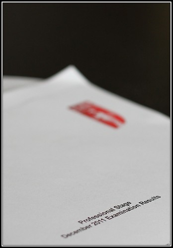
Hi, Joe, fear, like it, nice and minimal. I'd like to see a bit more depth...just enough to get more detail in the logo.

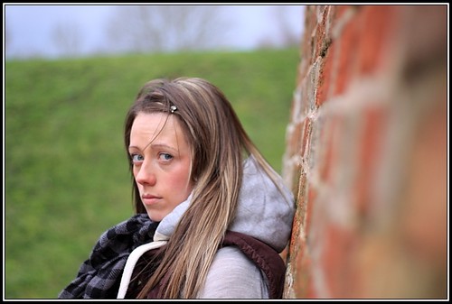
Sigh, nice focus, good lead in and I'm liking the colours. The only issue for me is I'm not seeing sigh...I'm seeing more, "What the blooming hell you looking at?!"

Cheers and now just Sweet to bring you up to date (y)
 
Fear: I like it... it fits the theme... Possibly a little more DOF...

Sigh : I like it, it's composed and focus nicely, but I'm afraid I have to agree with Andy... less sigh, and more "oh no not again!"...
 
Just caught up with you :D
I like #3 best in Direction, Fear fits the bill but it's not doing very much for me, whereas Sigh hits the spot and has good DOF
 
Hi Joe


Fear.....oh yes...I remember waiting for exam results(twas a long time ago though :LOL: ) so nice idea..you crit'd yourself with the DOF so nuff said except for well done...both on the shot & the pass (y)

Sigh.....great image , lovely & sharp , great angle ....can almost hear the sigh of....oh no , here we go again with the camera (y)
 
Hi Joe


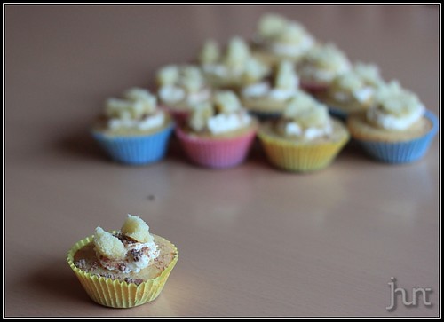
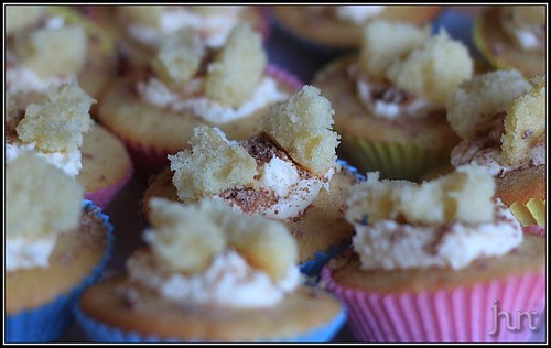
liking both your Sweet images...they look scrummy :)

#1....clone that darn spot :LOL: like they layout but think maybe a little more room to the RHS would help ?

#2.....great focus on the centre cake...you've caught the texture really well :clap:
 
Back
Top