
You are using an out of date browser. It may not display this or other websites correctly.
You should upgrade or use an alternative browser.
You should upgrade or use an alternative browser.
Just a couple
- Thread starter donald
- Start date
- Messages
- 5,001
- Edit My Images
- Yes
I think the second one has some possibilities - maybe not that particular shot, but certainly the location - just looking at it gives me a feeling of movement and a vague feeling of vertigo.
- Messages
- 638
- Edit My Images
- No
Composition is the key to any photo. I try to remember this at all times, telling myself, "this isn't a photo of a bridge, it's a photo of a curved line. How can I get that curved line to look its best?"
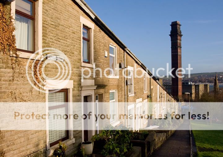
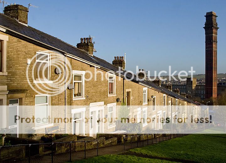
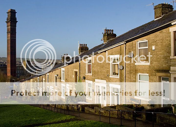
With that in mind, in photo 1 you have three main compositional elements to me: a receding diagonal line (the terraced houses), a vertical line (the tower) and a black space (the right side of the photo). The black space isn't doing anything useful so it should go. Put the tower at the far right of the photo with the terrace leading to it: that's your composition. I would take from a lower vantage point too, it seems you're quite high up, are you standing on a ladder? Try and get more foreground and more symmetry to the receding terrace so it leads the eye down to the tower.
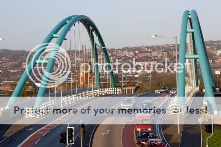
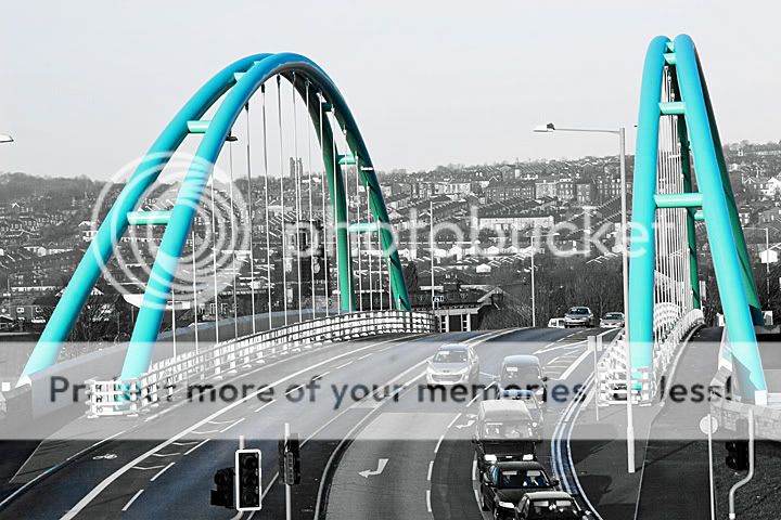
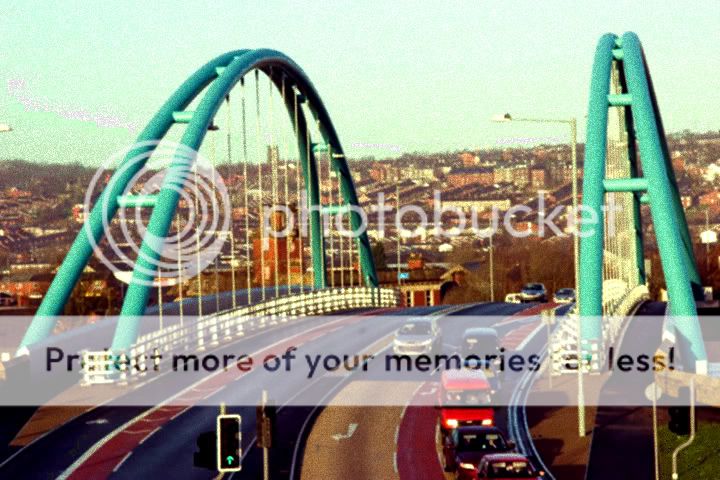
The second - seems like it's taken with a telephoto, giving a compressed feeling of space. There's really no compositional sense here, just an image - for instance, the traffic lights are floating around the bottom, the car is cut in half, and the perspective on the bridge isn't flattering. Needless to say the tonemapping makes no difference to the composition and therefore doesn't improve the photo. That sort of stuff is just a distraction if the underlying image needs improving. Decide what you're actually taking a photo of - is it the road, the cars, or the bridge? I would say there's a good image to be made of the bridge, but get down there with a wide angle and fill the frame!
See the results of the reshoot next week?
With that in mind, in photo 1 you have three main compositional elements to me: a receding diagonal line (the terraced houses), a vertical line (the tower) and a black space (the right side of the photo). The black space isn't doing anything useful so it should go. Put the tower at the far right of the photo with the terrace leading to it: that's your composition. I would take from a lower vantage point too, it seems you're quite high up, are you standing on a ladder?
Try and get more foreground and more symmetry to the receding terrace so it leads the eye down to the tower.The second - seems like it's taken with a telephoto, giving a compressed feeling of space. There's really no compositional sense here, just an image - for instance, the traffic lights are floating around the bottom, the car is cut in half, and the perspective on the bridge isn't flattering. Needless to say the tonemapping makes no difference to the composition and therefore doesn't improve the photo. That sort of stuff is just a distraction if the underlying image needs improving. Decide what you're actually taking a photo of - is it the road, the cars, or the bridge? I would say there's a good image to be made of the bridge, but get down there with a wide angle and fill the frame!
See the results of the reshoot next week?
OP
- Messages
- 1,315
- Name
- let me think....Donald
- Edit My Images
- Yes
Thanks everyone for the replies - all useful in their own way
Thanks for the comment - I guess this goes down under "or the bad" side of the coin
box now ticked - have fun
Plenty more angles of attack, this was taken from a "lazy" easy position from a convenient car park. Next dry day I will go down the canal path
Lovely reply with lots of food for thought
Thanks again
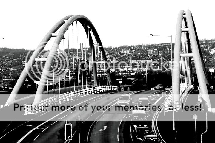
I seriously don't like the edit. I do agree on a more gritty B&W for that shot though.
Thanks for the comment - I guess this goes down under "or the bad" side of the coin
You don't have your "edit" box ticked but do you mind if I have a go just for fun?
box now ticked - have fun
I think the second one has some possibilities - maybe not that particular shot, but certainly the location
Plenty more angles of attack, this was taken from a "lazy" easy position from a convenient car park. Next dry day I will go down the canal path
Composition is the key to any photo. I try to remember this at all times, telling myself, "this isn't a photo of a bridge, it's a photo of a curved line. How can I get that curved line to look its best?
Lovely reply with lots of food for thought
Thanks again

OP
- Messages
- 1,315
- Name
- let me think....Donald
- Edit My Images
- Yes
Thanks Damien - I can see the B+W working. Next chance I will try a few more angles - I like the "photographing a curve" concept. Had a little play with the tower one on another original from a slightly different angle. Why is it I like it more when I flip it?
Donald
Donald
Last edited:
- Messages
- 6,914
- Name
- Damien
- Edit My Images
- Yes
Why is it I like it more when I flip it?
No idea but it works for me too!!
OP
- Messages
- 1,315
- Name
- let me think....Donald
- Edit My Images
- Yes
I really dont think the bridge shot workd...however its edited
I agree but I will have another go