Critique required Kell's 2023 TP52 - WEEK 52. Shots(s) of the year.

More of a photo montage than a photo per se.

Couple to choose from but I preferred the chocolate bar version. Mainly because the original version used really, really small letters and it was difficult to get the focus.

On the flip side, I preferred the different textures you get from a wider range of surfaces. Given more time, I'd prefer a version of the first one - just with bigger letters.

Had to do a fair bit of PS work to avoid overlapping the original letters too much as it was causing some legibility issues.

Bonus points for guessing any/all of the logos/brand names

Letters copy by Kell Lunam-Cowan, on Flickr

Choc Letters copy by Kell Lunam-Cowan, on Flickr
 
Last edited:
Great idea, I was going to ask if there's bonus points for the brands.
I'll have a go at the chocolate bars (a little insight into my world lol)
L - lion
E - I want to say aero?
T - topic - perhaps a special edition?
T - twirl
E - crunchie
R - yorkie
S - boost
 
Really colourful for the theme. Can only think of Double Decker for number 2 and kit kat for number 3
 
This is a fabulous compostion... the fact I got them all correct must point to a mis-spent childhood as I don't have a sweet tooth anymore!
 
This is a fabulous compostion... the fact I got them all correct must point to a mis-spent childhood as I don't have a sweet tooth anymore!

thanks Helen,

I must admit, I don't really have a sweet tooth. My daughter was very excited that I'd bought them all, but TBH they could well sit there uneaten for weeks if she wasn't in the house.
 
Well that's your diet out of the window
Well composed, must have been awkward. Very colourful.
 
What a wonderfully creative take on the theme Kell, I really like both of them.
 
Great idea and very colourful but can imagine a lot of work. Can’t get it out of my mind you in the shop thinking now I just need a T and an S. :)
 
Great idea and very colourful but can imagine a lot of work. Can’t get it out of my mind you in the shop thinking now I just need a T and an S. :)

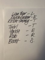
I made myself a list before I went.

Must have looked like a right greedy git.

(Couldn’t find Rolos in the shop I went to so ended up using the R from the Yorkie and buying a crunchie for the E.


DF8CF32F-53B4-4B30-9B25-6AFCA6228706.jpeg
 
Last edited:
  • Haha
Reactions: nog
Well I’d bet there isn’t many lists like that in prep for a photo shoot
 
Week 08 - Kitchen.

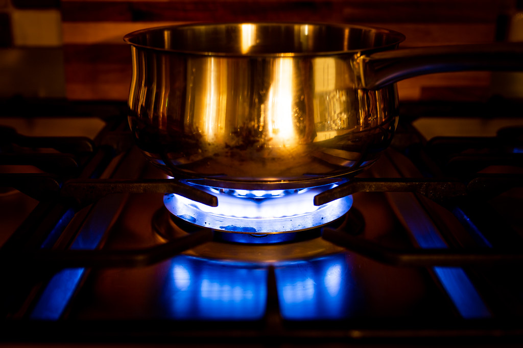
Pretty much knew what I wanted to try and capture immediately when I saw this,

Blue gas flame against yellow kitchen lights. Tried a few things (including some ICM) but settled on these, with the first being my favourite as it captured what I had in my mind the most. Though I have to say I quite liked how turning it B&W brought a whole new dimension to the flames.


TP522023 - WK08- Kitchen-3290 by Kell, on Flickr

TP522023 - WK08- Kitchen-3288 by Kell, on Flickr

TP522023 - WK08- Kitchen-3293 by Kell, on Flickr

TP522023 - WK08- Kitchen-3295 by Kell, on Flickr
 
Last edited:
Really nice Kell, and I agree with your shot choice. Almost looks like a still from a blade runner type film. (in my head anyway)
 
Yes, nice colour contrast on your chosen shot. As you say, turning it to B&W is very interesting.
 
Agree the shot with the full saucepan in works best. Nice reflections on the pan and below the burner.
Was the pan empty? A bit of water boiling to make some steam maybe would have added??
 
Four nice shots there!
 
Agree the shot with the full saucepan in works best. Nice reflections on the pan and below the burner.
Was the pan empty? A bit of water boiling to make some steam maybe would have added??
I did have some water in the pan. More to make sure I didn’t ruin it by sitting a dry pan on the heat.

It did start boiling towards the end but I didn’t really see the steam in any of the shots.
 
Last edited:
Agree with your choice, lovely colours and reflections. B&W picture could be used in a horror film.
 
I’m rather taken with the gas hob flames, looks difficult to capture so might become a personal technical challenge in a quiet moment.
 
Agree the shot with the full saucepan in works best. Nice reflections on the pan and below the burner.
Was the pan empty? A bit of water boiling to make some steam maybe would have added??
I tried a kettle with steam, disappointed with how little the steam showed in the shot.
 
What a great shot Kell. Love the colours in your chosen one but, you're right, the b&w shot is really cool.
 
I tried a kettle with steam, disappointed with how little the steam showed in the shot.

From actually having been on a professional shoot in early Jan, even they struggled to get the stem to show (mostly because it was on a very light background). The bulk of it was done in post.

From other things I've seen I think you have to light the steam separately. And have a much darker background to get it to show.
 
You've chosen the right shot Kell.
Great colours and reflections add interest.
 
Managing some comment catch-up!

Transparent - There was me thinking you timed it perfect, regardless of how you get it, they all count. A great set of images.

Snappers Choice - When I initially viewed the image the road was cut off. After seeing it full size I'm not convinced it needs it.

Knob - The sudden change in the DOF seems more jarring on the mono conversion.

Letters - I hope the chocolate lasted longer than the week the theme was active! Didn't manage to guess them all but an interesting spin on the theme.

Kitchen - The mono flames look like an angry monster!! The saucepan one is the most interesting.
 
Week 09 - Broken with B&W tech

Happened to luck into an invite to the Member's Room in the British Museum to work for a few hours.

On the way out, I realised I'd be going right through some areas where there were bound to be some 'broken statues' and the like.

I'd also been continuing an experiment where I've been using a 20 year old Point and Shoot camera, so the quality of the final images isn't amazing.

TP522023 - WK09- Broken-0133 by Kell, on Flickr

TP522023 - WK09- Broken-0136 by Kell, on Flickr

My first thought when walking home the other night, however was just how many broken paving slabs I was walking over. Some making quite graphic shapes. This one with an iPhone

TP522023 - WK09- Broken-3307 by Kell, on Flickr

This one from the little Pentax.

TP522023 - WK09- Broken-0147 by Kell, on Flickr

But my favourite was this one of the Rosetta stone. Not only is it broken itself, it was instrumental in breaking the age-old mystery of Hieroglyphics.

TP522023 - WK09- Broken-3313 by Kell, on Flickr
 
Last edited:
I like the Rosetta Stone one as much for the double meaning of "Broken" as for the actual image. Just need them to crack the Festos/Faistos/Phaistos/etc. Disc!
 
Really good double take on the theme with the Rosetta Stone - good work.
 
Some lovely images there and the quality is pretty good. I am leaning toward #1 with the heavy shadow which I rather like.
 
Week 10 - Full.

Just the one this week. Unusual for me.

But I know I'm not going to have much time this weekend.

Something I should do a lot more often when I'm picking up a camera before heading out. Check to see if the battery's FULL.

TP522023 - WK10 Full--2 by Kell, on Flickr
 
Broken - some lovely images there Kell, and the Rosetta Stone one is spot on.
Full - does the job nicely!
And a good reminder never to go out without a spare (full!) battery!
 
Nice Broken set Kell, some really interesting images and a great commentary.
Good take on the Full theme as well!
 
Like the light on the statue - the fact it was taken with a 20 yo camera really doesn;t show!

Rosetta Stone a great idea and nice composition, especially like the smooth OOF background. Has a feel of being 'over-sharpened' or something maybe, especially on the letters.

Full - has a simple, "taken-as-it-lay" feel to it. Nicely done.

Thanks.

On the Rosetta Stone, that shot was taken with an iPhone. I think everything I’ve got from this phone has that feeling to it.

Despite all the hype about this camera on this phone (14 pro), I don’t rate it any higher than my last phone which was 4 generations older (XR).
 
Nice take on the theme. I have been known not to check there is a battery in the camera, never mind a full one!
 
That is very cool Kell, the blue tones with just the pop of reddish colour from the streetlight works really well.
 
Back
Top