Lakes Monochrome

Messages
6,502
Name
Peter
Edit My Images
Yes
Sarah and I went on a workshop run by Melvin Nicholson and Chris Beard on Saturday. We started at Derwent Water in the morning and the afternoon was spent at Ullswater. It was a very relaxed and friendly event albeit the weather was pretty damp :(. It seemed whichever way we pointed the camera that was the direction the wind was blowing so we spent quite a bit of the time with cameras covered or wiping rain drops off the filters. We decided to make a weekend of it and took a few images on the Sunday which unfortunately had the same conditions as the day before. Unlike my usual style I've kept the editing to a minimum although I have experimented with some subtle toning.


#1
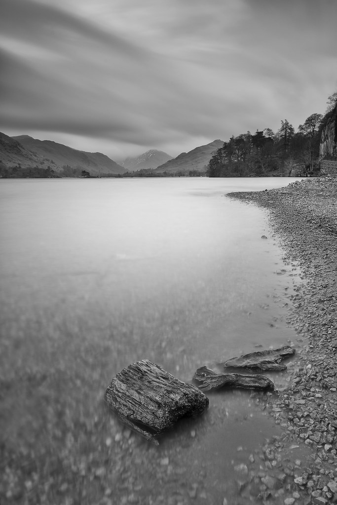
Catbells and Boathouse by Peter Bindon, on Flickr

#2
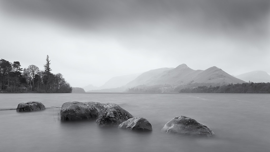
Derwent Water Rocks by Peter Bindon, on Flickr

#3
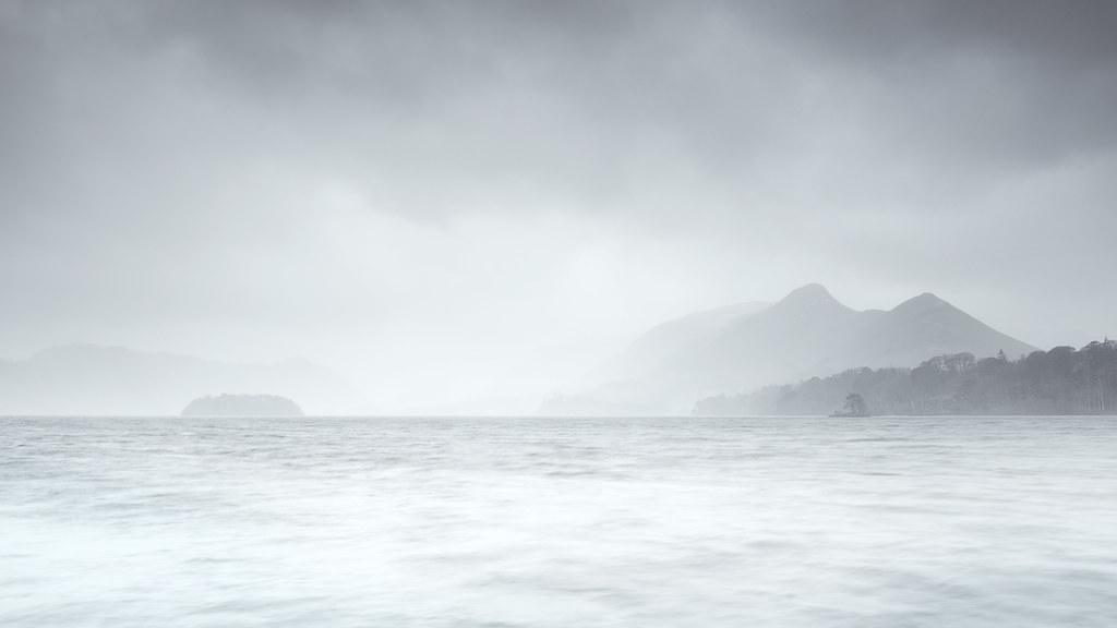
Misty Morning Derwent Water by Peter Bindon, on Flickr

#4
Toward Hartsop by Peter Bindon, on Flickr
 
A good set here Peter and to be honest i think the weather conditions coupled with the mono conversions make for some very atmospheric shots.

My favourite is #3......i love the minimalism of it and your tones are really nice.

Good job i say!
 
Nicely done set! I think 1 is my favourite but number 3 holds an appeal I can't put my finger on - I feel like I keep wanting to go back and look at it again, and again.
 
Fine result given the weather conditions, and a bit surprised to find myself preferring the second one of the set. I think it's possibly because it isn't clear whether these are rocks or boulders, but it's working anyway. (y)
 
Very nice, especially considering what you were working against.

The first 3 work best for me, with the gap between the rocks and background being just a little too large on number 4. It would also be nice if the toning of 3 and 4 could be tweaked into line with 1 and 2 to emphasise the unity of the set.
 
Three's great, I really like it but for me it could be better without the island (St Herberts?) which I find detracts from from the scene.
 

Very cool Peter!
#1 for me!
 
Hi Paul
I love No1 and No4, on balance I think No4 is my pick, although "maybe a lower point of view" :)D Only Joking mate). No I really love 4 and those clouds are really great, Like the leading shoreline with that little jink as it runs off to the right. Its a great perspective and I like the way it funnels you right down into the image to the mountain at the end. Very Nice.... as in my experience of the lakes this epitomises Lakeland weather (sorry the conditions weren't better for you both:().
I like the long exposure on No1 especially in the immediate foreground as this blends in well with the overall misty appearance of the frame overall and the toning is excellent. I also like the hard contrast the trees give on the LH side against the rest of the shot, for me the stones seem to step of toward the wooded bank and this seems to anchor and balance the shot nicely.
No 3 seems just a little too misty for me.
No 2 Also appealing apart from my incurable OCD that would tidy up those fiddly bits of weedy debris on the shoreline, like the low perspective:eek:;)
Nice set Paul.
 
A good set here Peter and to be honest i think the weather conditions coupled with the mono conversions make for some very atmospheric shots.

My favourite is #3......i love the minimalism of it and your tones are really nice.

Good job i say!
Thanks Stuart. I'm glad the sense of the atmosphere comes across

Nicely done set! I think 1 is my favourite but number 3 holds an appeal I can't put my finger on - I feel like I keep wanting to go back and look at it again, and again.
Many thanks

Fine result given the weather conditions, and a bit surprised to find myself preferring the second one of the set. I think it's possibly because it isn't clear whether these are rocks or boulders, but it's working anyway. (y)
Thanks Peter
 
Very nice, especially considering what you were working against.

The first 3 work best for me, with the gap between the rocks and background being just a little too large on number 4. It would also be nice if the toning of 3 and 4 could be tweaked into line with 1 and 2 to emphasise the unity of the set.
Thanks Toni. I have to say I'm not usually out in such conditions but I'm definitely glad I was. It's changed my view of using the weather as an excuse to sit at home. I agree about your comment of the toning. I edited them individually and chose the tone that I felt suited that particular image. Looking them as a set I definitely see the advantage of going for a unity of toning.

Three's great, I really like it but for me it could be better without the island (St Herberts?) which I find detracts from from the scene.
Thanks Nick. I appreciate the feedback. I can see what you mean about the inclusion of the island but for me I feel it keeps a bit of balance in the image. Fair comment though and good to hear a different opinion on the composition.


Very cool Peter!
#1 for me!
Thanks Kodiak
 
Last edited:
The first one for me. Love the way it fades into the distance. Spot on (y)
Thanks Paul

Brilliant set Peter, the misty mood really shows through,

Geoff
Thanks Geoff

Hi Paul
I love No1 and No4, on balance I think No4 is my pick, although "maybe a lower point of view" :)D Only Joking mate). No I really love 4 and those clouds are really great, Like the leading shoreline with that little jink as it runs off to the right. Its a great perspective and I like the way it funnels you right down into the image to the mountain at the end. Very Nice.... as in my experience of the lakes this epitomises Lakeland weather (sorry the conditions weren't better for you both:().
I like the long exposure on No1 especially in the immediate foreground as this blends in well with the overall misty appearance of the frame overall and the toning is excellent. I also like the hard contrast the trees give on the LH side against the rest of the shot, for me the stones seem to step of toward the wooded bank and this seems to anchor and balance the shot nicely.
No 3 seems just a little too misty for me.
No 2 Also appealing apart from my incurable OCD that would tidy up those fiddly bits of weedy debris on the shoreline, like the low perspective:eek:;)
Nice set Paul.
Many many thanks Steve for taking time to provide such detailed feedback. Much appreciated.

I liked your "maybe a lower point of view" comment. I'd previously been frustrated by my tripod due to the length of the centre column. I've come back and by chance found that someone on here was selling a Gitzo so I've snapped it up. No more excuses for being too high :)

I too was drawn to the curves of the shoreline in #4. I'm glad you liked it.

As for the weedy debris, when I was taking the shot it was a lovely colour of green which stood out. As a monochrome you're right - I should have tidied it up. Good excuse to return;)
 
I liked your "maybe a lower point of view" comment.
I think that went over your head :), it was word for word in your comments to my New Forest Thread (was only a Pun Honest Gov!)
Centre columns can be a pain and I have read that they can introduce vibration even if there right down out of use:eek: I have 2 tripods one I know I can remove the centre column cant think for the life of me if you can on the other... SWIMBO always says to me how can you get so low:eek:
Anyhow nice work Pete
Oh yeah I forgot that that one was yours. Whoops :)

I must admit to hardly ever moving the centre column above the bottom setting in case of vibrations especially for longer exposures. I used to use an old Manfrotto 055 for years and it had a two piece centre column so I could get a lot lower than my newer 055. This one has got a centre column than you can move to be horizontal but the movement on it can be horrific so again I haven’t used it.
 
Last edited:
I think I have the same, the older one you can unscrew the bottom of the centre column and it comes off leaving just the stub in the head piece (a good idea)
Don't think I have ever used centre columns so there a bit of a waste for Landscapers I guess.
Cheers
Steve
 
You have done a fantastic job Peter given the conditions atmosphere is immense enjoyed them all, also a big fan of not having a centre column. thanks you for sharing.
 
I'm liking these, Peter.

A little too much FG before the main stones in #2 for me.

I can't decide between #1 and #3. I like the composition and subtle tones of #1, but I think #3 edges it with the cool blues and misty look.

Cheers.
 
Last edited:
The stones at the lower edge of the frame in shots #2 and #2 look blurred / oof. Was the filter slightly bent in the holder? I have has this before with thinner resin filters.

Other than that, I like the first one
 
I'm liking these, Peter.

A little too much FG before the main stones in #2 for me.

I can't decide between #1 and #3. I like the composition and subtle tones of #1, but I think #3 edges it with the cool blues and misty look.

Cheers.
Many thanks Andy

My favourite is shot 3. I like the watercolour effect and the slightly blue tint.
Thanks Rory

The stones at the lower edge of the frame in shots #2 and #2 look blurred / oof. Was the filter slightly bent in the holder? I have has this before with thinner resin filters.

Other than that, I like the first one
Thanks Nick. I'll keep an eye out for the focussing

Post the tree one now, its better :)

Dave
Thanks Dave. I 'll start a new thread for that one :)

Very nice set Peter.
Many thanks Mark
 
A beautiful set. I'd probably crop out the shoreline under the stones in the second, but a really wonderful collection of subtle moody images. Three is probably my outright favourite - love the tones, framing and atmosphere. Conditions like that suit the Lake District far better than a bright sunny day!
 
Hi Peter that's a lovely set. It's really good to see some shots in less than ideal conditions and how you've captured and processed them to get the most out of them (for my eyes, anyway). We aren't always blessed with ideal shooting conditions and if we've made a trip somewhere, it's good to see how others handle the situation.

Thanks for sharing (I like 1 and 2 best) and fingers crossed the weather improves!
 
A beautiful set. I'd probably crop out the shoreline under the stones in the second, but a really wonderful collection of subtle moody images. Three is probably my outright favourite - love the tones, framing and atmosphere. Conditions like that suit the Lake District far better than a bright sunny day!
Many thanks

A very nice set thanks
Thanks Sandy

Agree with this.
Great set though, good mix of textures and plenty of atmosphere.
Thanks Matt

Hi Peter that's a lovely set. It's really good to see some shots in less than ideal conditions and how you've captured and processed them to get the most out of them (for my eyes, anyway). We aren't always blessed with ideal shooting conditions and if we've made a trip somewhere, it's good to see how others handle the situation.

Thanks for sharing (I like 1 and 2 best) and fingers crossed the weather improves!
Many thanks Paul. We're back there in a few weeks for the Photographers for the Cumbrian Floods event so we're hoping to get some more images from the Ullswater area

Really nice set Peter my personal favourites are 1 and 3

#1 has a lovely sense of scale and depth as it fades into the distance

#3 Is my pick simple(ish) and atmospheric :clap:
Thanks Graham
 
These are beautiful. It is tempting to say that you could have gone a bit bolder with some of the darker tones, but the silvery quality is very lovely, and I should imagine quite delicate.
Thanks Toby. I actually enjoyed the less is more approach to the PP I used one these.
 
A good set here Peter and to be honest i think the weather conditions coupled with the mono conversions make for some very atmospheric shots.

My favourite is #3......i love the minimalism of it and your tones are really nice.

Good job i say!
Totally agree, very atmospheric and the black & white makes them very special. A great set of photographs, well done!
 
Back
Top