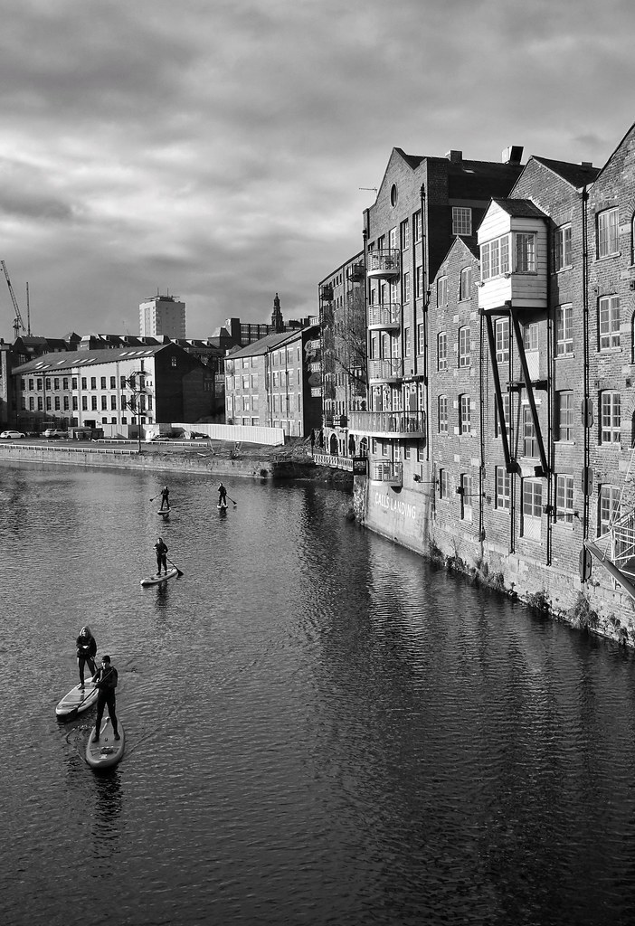
Went for a late afternoon walk around Leeds today hoping for some soft light to compliment the moody sky.
Photos were taken with Sony RX100 vii but I've been having some problems with processing on phone (Snapseed) lately so keen to know if these look ok when viewed on other people's devices, so any comments welcome.
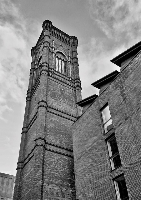 Leeds in Monochrome by NP UK, on Flickr
 Leeds in Monochrome by NP UK, on Flickr
 Leeds in Monochrome by NP UK, on Flickr
 Leeds in Monochrome by NP UK, on Flickr
 Leeds in Monochrome by NP UK, on Flickr
 Leeds in Monochrome by NP UK, on Flickr
 Leeds in Monochrome by NP UK, on Flickr
 Leeds in Monochrome by NP UK, on Flickr
Photos were taken with Sony RX100 vii but I've been having some problems with processing on phone (Snapseed) lately so keen to know if these look ok when viewed on other people's devices, so any comments welcome.
Leeds in Monochrome by NP UK, on FlickrLeeds in Monochrome by NP UK, on FlickrLeeds in Monochrome by NP UK, on FlickrLeeds in Monochrome by NP UK, on FlickrLeeds in Monochrome by NP UK, on FlickrLeeds in Monochrome by NP UK, on FlickrLeeds in Monochrome by NP UK, on FlickrLeeds in Monochrome by NP UK, on Flickr