You are using an out of date browser. It may not display this or other websites correctly.
You should upgrade or use an alternative browser.
You should upgrade or use an alternative browser.
Light Painting
- Thread starter SteveMc
- Start date
- Messages
- 861
- Name
- Tom
- Edit My Images
- Yes
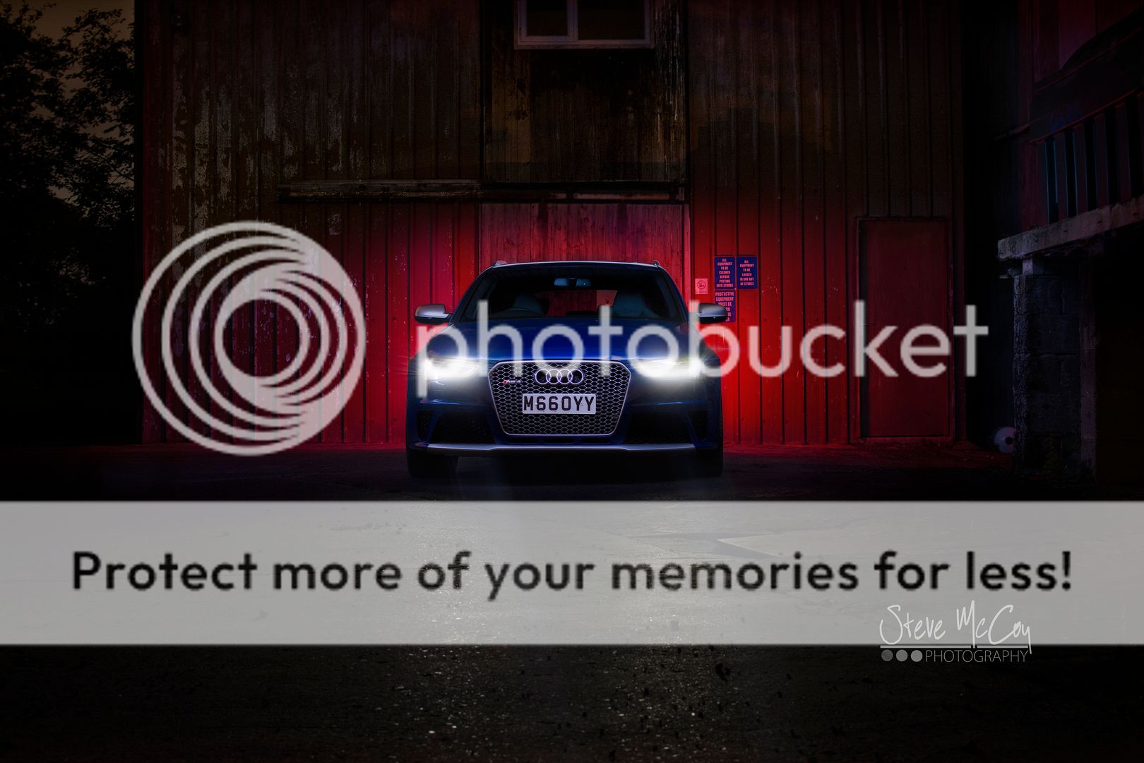
Really like the top one, but something about the bottom one doesn't match up. The colour on the wheel perhaps, or the simplicity of the background on the first isn't matched in the second with the backdrop just sort of stopping on the left. This helps the transition from dark to light in the top one, and is missing in the bottom.
- Messages
- 608
- Name
- Alex
- Edit My Images
- Yes
I like the first one. Nicely composed and the background contrasts nicely with the car. I've got to agree with Tom about the background in the second. The contrast between the building and the darkness off to the side draws my attention away from the main subject and, although it breaks the rule of thirds, I think the car would be better more centerally placed. Perhaps cropping out the left hand side would make all the difference?
- Messages
- 473
- Edit My Images
- No
I quite like them, they look pro, like the bottom one too as it seems to have a sense of movement (wheels locked round etc) even though all is still, think the roof top in the upper right of the lower distracts from the subject matter. I'd be happy with those.
- Messages
- 897
- Name
- Scott
- Edit My Images
- Yes
That's a very nice car indeed!
Like #1 the best, I've a few shots like that, are you white balancing the picture to the headlights or your light? Potentially try composite them together so you can sort the WB separately.
Also watch for things in the background that mess up the lines of the car, #1 the signs just to the right of the passenger mirror, I would have removed them in pp.
Only once brought my mrs on a shoot and she got fed up fairly quickly, I can understand your pain Nothing worse than missing an exposure!
Like #1 the best, I've a few shots like that, are you white balancing the picture to the headlights or your light? Potentially try composite them together so you can sort the WB separately.
Also watch for things in the background that mess up the lines of the car, #1 the signs just to the right of the passenger mirror, I would have removed them in pp.
Only once brought my mrs on a shoot and she got fed up fairly quickly, I can understand your pain
- Messages
- 388
- Name
- Martin
- Edit My Images
- Yes
I like them both, 1 would be better if the car was straight on and the clutter removed in post. Second one is great, it would be made better if there was a little more space between the car and the back ground.
Nice effort though I can't light up my shoots as well
Nice effort though I can't light up my shoots as well
- Messages
- 114
- Name
- Steve
- Edit My Images
- Yes
Thanks for the comments guys, always enjoy reading the feedback 
The second shot is really really missing another couple of exposures, One for the wheels and one for the right of the car to tie it all in. It does indeed look super imposed which isn't what i was going for.
The second shot is really really missing another couple of exposures, One for the wheels and one for the right of the car to tie it all in. It does indeed look super imposed which isn't what i was going for.


