

You are using an out of date browser. It may not display this or other websites correctly.
You should upgrade or use an alternative browser.
You should upgrade or use an alternative browser.
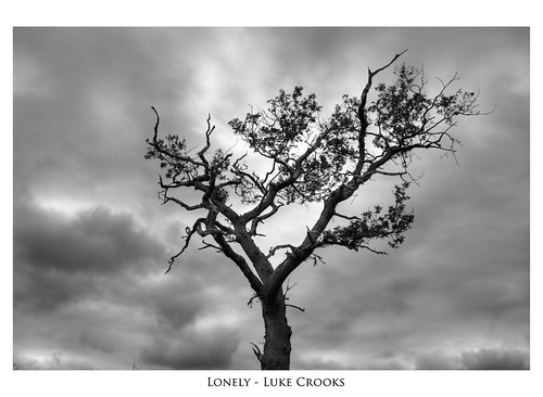
Lonely
- Thread starter Luke_
- Start date
- Messages
- 2,511
- Name
- Toby
- Edit My Images
- No
Is that because of the name? Or because of the picture?
No, no, the picture. I really feel it is cropped too short on the bottom.
I wonder if a dark border would solve this....?
Luke, can you not post at 800px longest side. Makes it so much easier to appreciate properly.
Last edited:
Yea, I cannot work out how to add a black border in PS though 
Still reading up on post processing.
Do you mean this sort of size?
http://farm3.static.flickr.com/2631/3969399454_e3ab97519e_b.jpg
Still reading up on post processing.
Do you mean this sort of size?
http://farm3.static.flickr.com/2631/3969399454_e3ab97519e_b.jpg
- Messages
- 2,511
- Name
- Toby
- Edit My Images
- No
Yup, thats it. I actually really like this image Luke, despite the reservations that I mentioned earlier.
Border:
Select - All
Edit - Stroke
Then in pop up box
Width - 60px (for example - you will have to experiment)
Colour - Black
Location - Inside
Blending -Normal
Opacity - 100%
I actually use The Gimp to create my borders, where the technique is different.
Border:
Select - All
Edit - Stroke
Then in pop up box
Width - 60px (for example - you will have to experiment)
Colour - Black
Location - Inside
Blending -Normal
Opacity - 100%
I actually use The Gimp to create my borders, where the technique is different.