

- Messages
- 298
- Edit My Images
- Yes
Hi guys, I'd like to start taking more portraits as my interest in this kind of photography is starting to grow. I took these shots of a local model a few weeks ago, I'm really happy with them but I would like some feedback on them from people who are more experienced in this kind of photography.
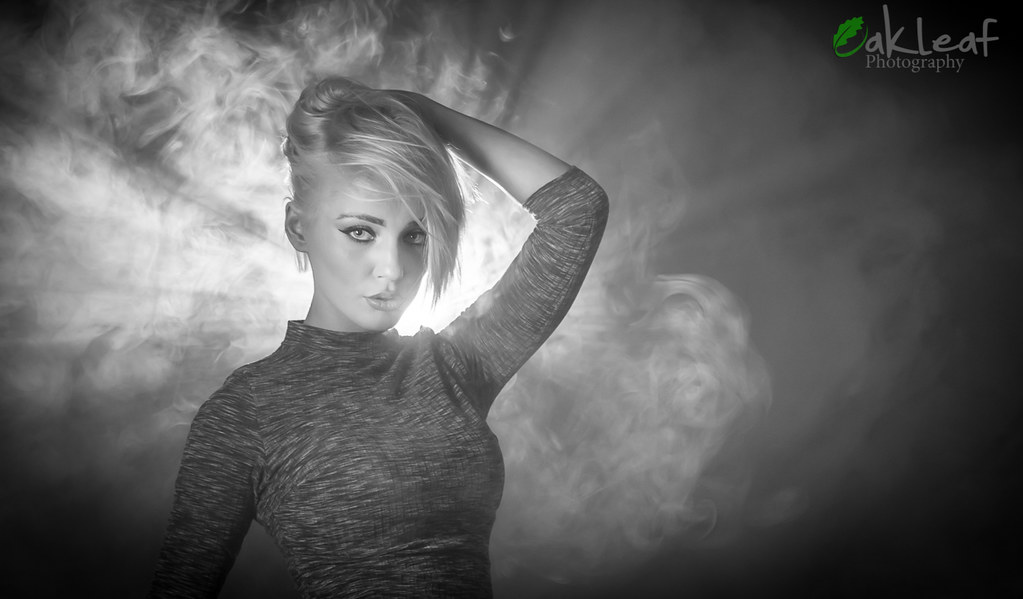 louise 2 by chris canavan, on Flickr
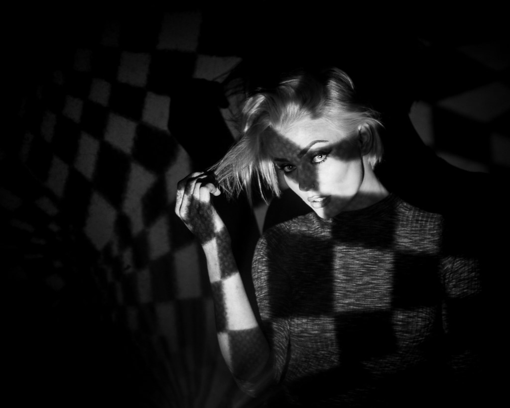 louise 1 by chris canavan, on Flickr
Cheers
louise 2 by chris canavan, on Flickrlouise 1 by chris canavan, on FlickrCheers
")

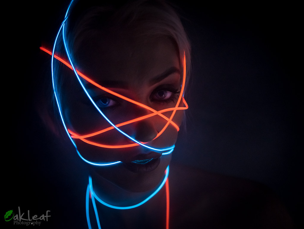 louise 3