Lower Heyford narrowboats - one shot, multiple images.

Messages
23,525
Name
Toni
Edit My Images
No
Sometimes I find that an image wants to be processed in several ways- or at least I like several different looks. I shot this last winter when I'd just got the D610 and a 28mm f3.5 AIS Nikkor and was learning to use the kit. My initail reaction was to reach immediately for mono, but I've since revisited it a couple of times, and like multiple versions.

Base image
LHNarrowboats-0422-2 by Toni Ertl, on Flickr

First mono edit
LHNarrowboats-0422 by Toni Ertl, on Flickr

Texturised edit
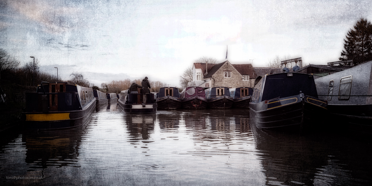
LHNarrowboats-0422-4 by Toni Ertl, on Flickr

'Facebook' edit
LHNarrowboats-0422-3 by Toni Ertl, on Flickr

Anyone else do this? What would you do differently?


I think, if the goal is illustration, the
fourth rendition does the better job.
 
I'm not sure about this shot. The 4th is the best rendition I think. I want to be constructive - it looks like you have really good subject matter, but the composition of this shot doesn't take advantage of it. I think it's the house on the top right which puts me off. The water is lovely, and super colours of the boats. Perhaps something with more angles and focus on a specific subject?
 
I'm not sure about this shot. The 4th is the best rendition I think. I want to be constructive - it looks like you have really good subject matter, but the composition of this shot doesn't take advantage of it. I think it's the house on the top right which puts me off. The water is lovely, and super colours of the boats. Perhaps something with more angles and focus on a specific subject?

Thanks for the comments Andy. The building is the admin centre for the boat yard, and there aren't any easy angles one can get to exclude it, though if I were enterprising with a clone-stamp tool it might disappear completely. I should probably go back again on a fine evening & see if there's better angles available as you suggest, though I've shot here several times in the past and an image that pleases me has been elusive outside of this one.
 
I'm not sure about this shot. The 4th is the best rendition I think. I want to be constructive - it looks like you have really good subject matter, but the composition of this shot doesn't take advantage of it. I think it's the house on the top right which puts me off. The water is lovely, and super colours of the boats. Perhaps something with more angles and focus on a specific subject?
I quite like the overall composition and I don't mind the building, but for me the most intrusive things are the two modern lamp posts on the left and the TV aerial on the building, all of which could esily be removed.
Another small detail - there is a bright object on the canal bank at the extreme left, which draws my attention, and could be cloned out or the crop tightend a bit.

PS, I prefer the appearance of number 4.
 
Last edited:
I hadn't noticed the lamp posts or arial, but the pale object on the canal bank bothered me immediately AFTER I'd posted the images. Thanks Brian, I can see the image isn't finished yet. :)
 
All the colour shots are fine but bland and forgettable, but the mono draws you in with its mood, and the water ripples are delightful. The tonal balance isn't there yet, but a little more work...
 
Thanks Peter - would you lift the shadows a little for more detail there?

You could do a little, but not at the expense of the overall mood, deep blacks are fine with me. Leaves more to the imagination. Especially if you crop the grey boat out of the right hand side, that would centre the eye even more effectively on the action between the two dark hulks I think.
 
Back
Top