Mother Rd

I think it's maybe the colour of the car that's a bit too bland, although you'd have thought that green was a striking enough colour.I'd like to see the saturation and contrast of the green tweaked up a bit, but I'm not sure if you've done this on an adjustment layer where you could make these changes? It might also be worth considering changing the car colour to a yellow or maybe blue, but I think red might be too strong. Your vision at the end of the day, and maybe it was exactly that shade of green that made you want to process the photo this way, so enjoy it for what it is. (y)
 
I think it's maybe the colour of the car that's a bit too bland, although you'd have thought that green was a striking enough colour.I'd like to see the saturation and contrast of the green tweaked up a bit, but I'm not sure if you've done this on an adjustment layer where you could make these changes? It might also be worth considering changing the car colour to a yellow or maybe blue, but I think red might be too strong. Your vision at the end of the day, and maybe it was exactly that shade of green that made you want to process the photo this way, so enjoy it for what it is. (y)

Thanks for taking the time to comment Peter.
That was the colour of the car, its what drew me to it in the first place.
 
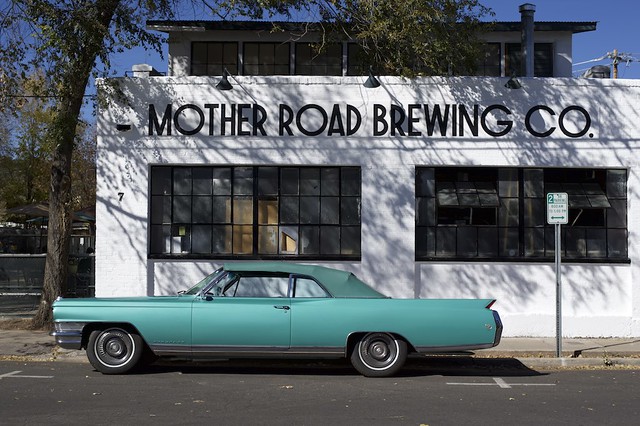
Can i be cheeky and ask for a colour version? I really like the scene but not sure that the selective colour has helped it any. Obviously understand if you say no as it is your picture and your vision. :)
 
it is a good photo - the selective colouring doesn't add anything. I think it would be an even better photo without the selective colouring
 
I am no expert but I do like it and it would look good as a big picture hanging on the wall. :)
 
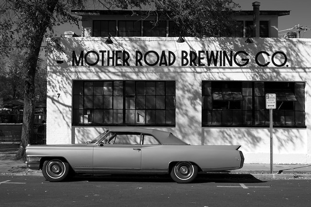
I like this a lot :) I don't tend to like selective colouring but this is a bit different so maybe that's why it works for me. Be good to see a completely mono version of it as well I think
 
Well, I like this a lot. I mean a lot. Selective colouring on this is perfect and enhances it to that extra level. It doesn't need a colour change either.

I think people don't like S-Colouring because, mostly, it's poorly executed. Don't be put off by the nay-sayers. It's a strikingly bold image. I'd be happy to have taken/achieved it.

Who decides something is passé anyway?
 
Last edited:
I rather like the late 1930's look of the building and typeface.
The flashy more modern streamlined convertible suits it well.
Even the partial colour is not inappropriate.

I would have liked the paint job on the car to look more shiny and contrasty to give a more airbrushed look, and wish the road sign had been more striking as say a larger lollipop type.
I would also have cropped the road a touch.

As soon as you go for the partial colour you become free to make any other alterations to the image for graphic effect.
 
Last edited:
As soon as you go for the partial colour you become free to make any other alterations to the image for graphic effect

Strangely enough my wife saw this and commented on how good it is (she's a keen photographer and a Master with Photoshop) - she's was quite shocked to notice it was a selectively coloured image. At first glance is does look like a late evening shot - which is how I saw it first up!
 
I like it in principle, I have no hang-ups about selective colour as long as it is carefully done and truly 'selective', my thoughts on this image specifically:-
  • It looks, to me, as if you have missed the colour (blue) on the road-sign to the right of the car ... the [2] and the <~>.
  • For me, the car extending beyond the building to the left and crossing the trunk of the tree creates a visual imbalance that I find uncomfortable to the eye.
  • The 'clutter' behind the tree detracts from the simplicity of the car and the building.
I appreciate that you probably didn't park the car and there was possibly no other way of capturing the image (even moving to the left?) but these are just my honest observations on a photo that is otherwise a good use of selective colouring :)
 
Strangely enough my wife saw this and commented on how good it is (she's a keen photographer and a Master with Photoshop) - she's was quite shocked to notice it was a selectively coloured image. At first glance is does look like a late evening shot - which is how I saw it first up!

I find it strange that you would say that, with such strong evidence of the shadows saying otherwise.
While it is a fairly unusual choice of selective colour, to me it is unmistakeably one.
 
I find it strange that you would say that, with such strong evidence of the shadows saying otherwise.
While it is a fairly unusual choice of selective colour, to me it is unmistakeably one.

I did say at first glance ;)
 
Can i be cheeky and ask for a colour version? I really like the scene but not sure that the selective colour has helped it any. Obviously understand if you say no as it is your picture and your vision. :)

Ill post the original.

it is a good photo - the selective colouring doesn't add anything. I think it would be an even better photo without the selective colouring

Thank you Phil. As above ill post the original in a bit.

I am no expert but I do like it and it would look good as a big picture hanging on the wall. :)

Thanks Kev, its exactly what I've done.

I like this a lot :) I don't tend to like selective colouring but this is a bit different so maybe that's why it works for me. Be good to see a completely mono version of it as well I think

Cheers Carl, ill post a mono version too.

Well, I like this a lot. I mean a lot. Selective colouring on this is perfect and enhances it to that extra level. It doesn't need a colour change either.

I think people don't like S-Colouring because, mostly, it's poorly executed. Don't be put off by the nay-sayers. It's a strikingly bold image. I'd be happy to have taken/achieved it.

Who decides something is passé anyway?

Thanks Barry, I'm glad you like it.

I rather like the late 1930's look of the building and typeface.
The flashy more modern streamlined convertible suits it well.
Even the partial colour is not inappropriate.

I would have liked the paint job on the car to look more shiny and contrasty to give a more airbrushed look, and wish the road sign had been more striking as say a larger lollipop type.
I would also have cropped the road a touch.

As soon as you go for the partial colour you become free to make any other alterations to the image for graphic effect.

Not sure the car is that modern Terry. I may have lost a little shine in the car by doing the edit.

Strangely enough my wife saw this and commented on how good it is (she's a keen photographer and a Master with Photoshop) - she's was quite shocked to notice it was a selectively coloured image. At first glance is does look like a late evening shot - which is how I saw it first up!

Glad your wife also likes it. Its very much a selective colour shot, the colour version will prove this.

I like it in principle, I have no hang-ups about selective colour as long as it is carefully done and truly 'selective', my thoughts on this image specifically:-
  • It looks, to me, as if you have missed the colour (blue) on the road-sign to the right of the car ... the [2] and the <~>.
  • For me, the car extending beyond the building to the left and crossing the trunk of the tree creates a visual imbalance that I find uncomfortable to the eye.
  • The 'clutter' behind the tree detracts from the simplicity of the car and the building.
I appreciate that you probably didn't park the car and there was possibly no other way of capturing the image (even moving to the left?) but these are just my honest observations on a photo that is otherwise a good use of selective colouring :)
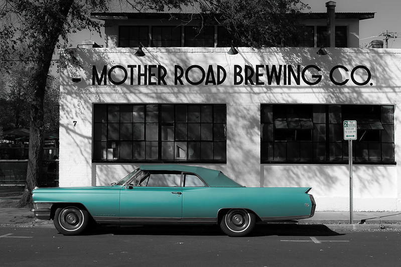
Gramps, the blue was completely taken out of the image. The sign wasn't intended to have any colour in it but i missed it and after i realised it didn't really bother me having a hint of colour there.
Like you said, there wasn't much i could do about the position of the car, nor the clutter.
 
Back
Top