My First 'Portrait' Shot

Messages
2,553
Name
Chris
Edit My Images
Yes
Your thoughts and whatnot appreciated!

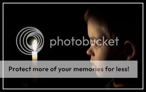
Eddentially, I thought I'd have a crack at a moody low-light shot with one of the kids, and this is the result.
Discovery.jpg


Shot with a D70 and 50mm f1.8 lens with an ISO setting of 1600. I altered the colour temp and reduced the saturation in RawShooter.

Any thoughts/opinions?
 
That's really nice! :thumb: You can get some nice soft effects with candles. I'd be inclined to crop it a little on the left.
 
excellent shot that works very well, nice!
 
CT said:
That's really nice! :thumb: You can get some nice soft effects with candles. I'd be inclined to crop it a little on the left.

Agreed, Just the slightest of crops from the left would make this a stunning shot. Well done.. :thumb:
 
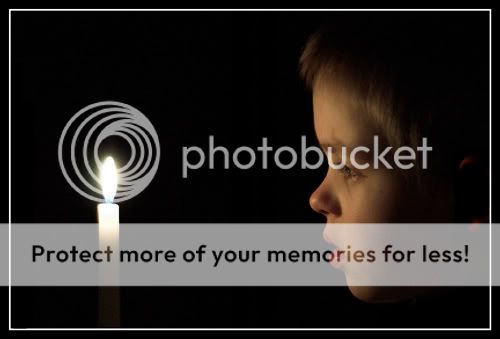
Thanks for the comments, everyone. Been playing a little - is this better?

Discovery2.jpg
 
I still think there's a bit too much space on the left which leaves it looking a bit unbalanced?

Here's a quick alternative...

candle.jpg


I removed the detail below the lad's chin to keep it even simpler, and gave it a sharpen. Another option would be to lose the ear altogether, but then you'd need to re-balance the pic, but they're just ideas for you, and it's a lovely shot anyway - definitely worth hanging on the wall.
 
Thanks CT - good ideas, and thanks very much for the input!

Best burn the big version to CD and get it printed!
 
Damned right! :thumb:

If you decide to lose the ear then you'd have a bit too much space on the right but rather than crop it again, I'd just cut out the head and move it to the right a little. In fact with such a plain background it's dead easy to move the head or the candle anywhere you like.
 
portrait.jpg


very easy to move stuff around I knocked this up in 3 mins trying to make one of those hidden image pictures see the lamp/vase shape formed by the two faces? :coat:
 
I like this shot, it is very well balanced light wise, with the exposure showing the soft tones. Its definately one worth printing.
 
Lovely shot but can I make one constructive suggestion - I think the ear is distracting - it grabs my attention away from what I should be looking at - it might be worth reducing the lightness in photoshop 'hue and saturation' settings right down so that you can't actually see it.

Sorry if this seems a little cheeky - me being a newbee and all that.

Matt.
 
Cool suggestion, Matt - thanks! I did do an edit where I did exactly that... :thumb:
 
I like the original pic (how did I not see this thread before????)
 
Catdaddy said:
Cool suggestion, Matt - thanks! I did do an edit where I did exactly that... :thumb:

Any chance of posting the 'earless' version so that people can compare it with the original?

Matt.
 
Certainly, sah!

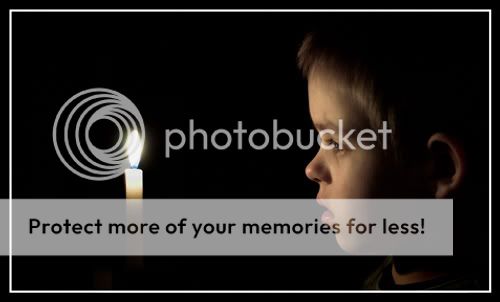
I also cropped it somewhat... the ear hasn't gone altogether, but not far off...

Candle_Edit.jpg
 
Would have been a cracking shot for the Illumination bi weekly !
 
Back
Top