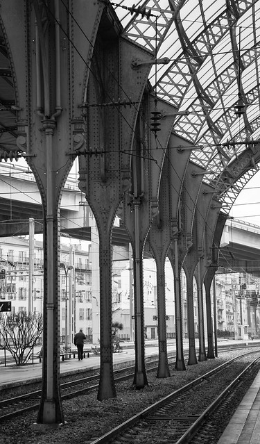
It's a shame that you've not received a single comment on this. I keep coming back to look at this image and, possibly because it's small, it took me a long time to realise that the subject/target for the eye is the person walking away from the camera bottom left.
There's a couple of things I'd like to suggest that might help. I've been distracted by the distortion of vertical lines in the image, so that the pillars *look* like they are curved instead of vertical, and the top of the image seems to lean over to the left even though the bottom of the image seems to be horizontal. The repeating pattern also drew my eye away, and had me hunting for a subject at the top right of the image. While it's interesting, it isn't exactly negative space that makes the bottom of the image stronger and actually weakens the effect of the pillars and man. Try cropping about 35% off the top and 25% off the right and the image becomes much more powerful - almost classic.
Hope that's useful.


 France Nice Train Station by PIPetrov, on Flickr
")
