

- Messages
- 1,652
- Name
- Chris
- Edit My Images
- Yes
I went up to Mam Tor this morning to see if there would be a nice sunrise, and I was rewarded with a wintry scene which I really enjoyed being out in. There was some nice light over the Edale Valley on the way back to the car.
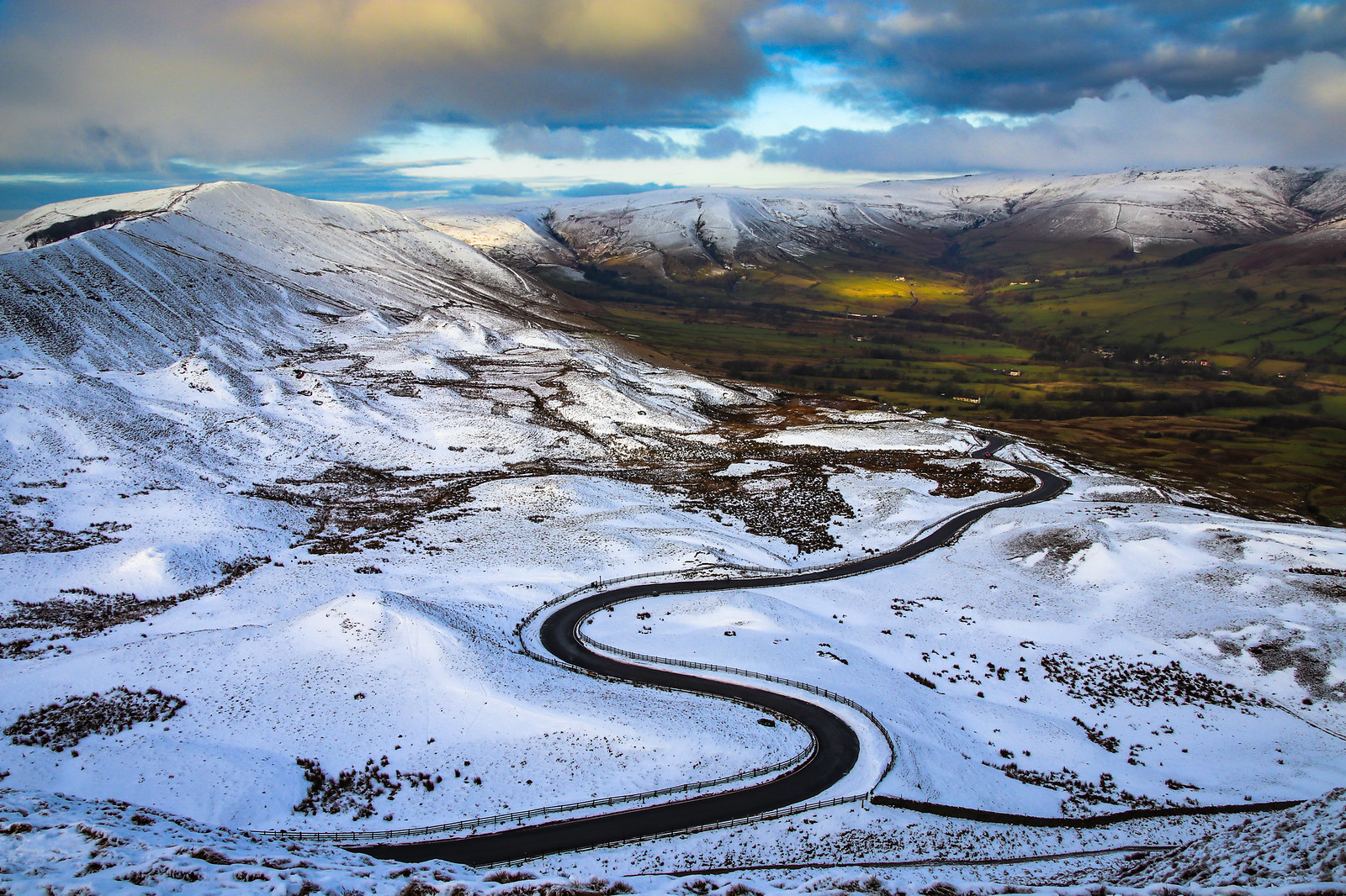 Windy Road To Edale-1-3 by Chris Shaw - chriscross, on Flickr
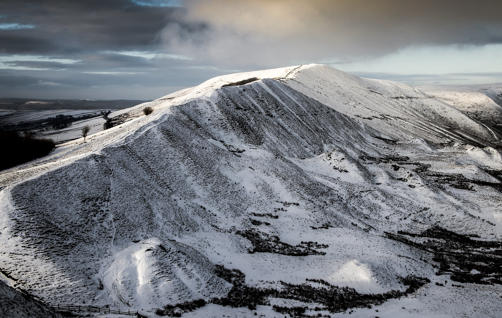
 Mam Tor -1 by Chris Shaw - chriscross, on Flickr
Cheers
Windy Road To Edale-1-3 by Chris Shaw - chriscross, on FlickrMam Tor -1 by Chris Shaw - chriscross, on FlickrCheers
")
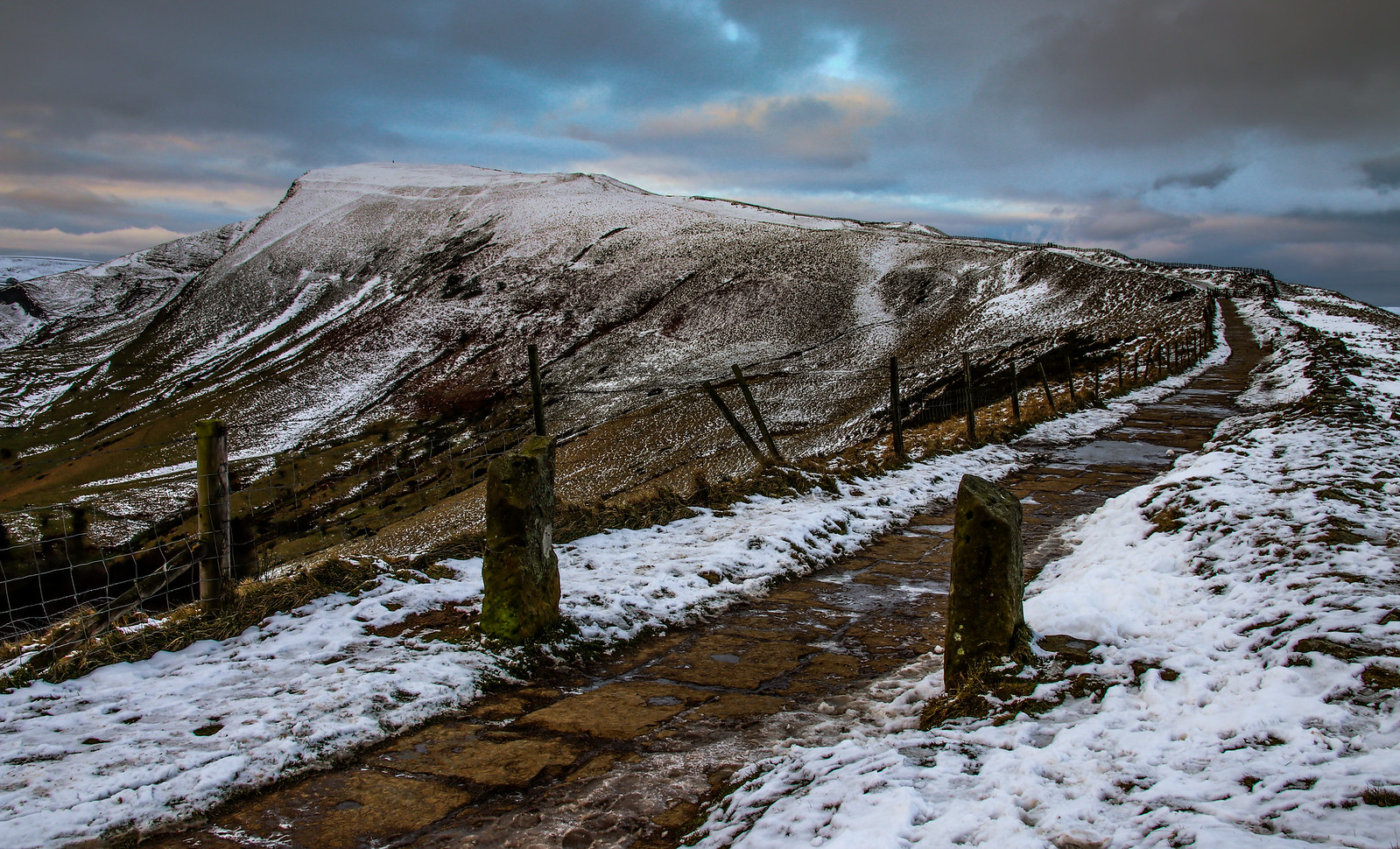
 Rushup Edge-1