
- Messages
- 437
- Name
- Shaun
- Edit My Images
- Yes
Evening TP!
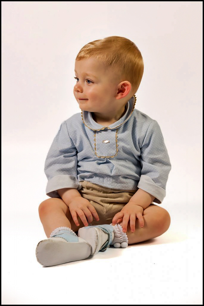
Sorry for another post but just wanting some feedback please. I didn't know how to word the title, but what I'm wondering, is what is more appealing as a background on the next two photo's. I can't decide whether the very white is too white.
Thanks


Sorry for another post but just wanting some feedback please. I didn't know how to word the title, but what I'm wondering, is what is more appealing as a background on the next two photo's. I can't decide whether the very white is too white.
Thanks
")
")

 for a few reasons