Beginner Portrait Feedback

Messages
437
Name
Shaun
Edit My Images
Yes
Hello

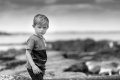
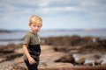
Amatuer photographer here, I was out with my son the other day, and just snapping away with my 6D and 70-200

I really like this shot, more so as it wasn't posed he just kind of looked my way as I was going about it, however just looking for advice on how you would have imroved on it? Obviusly one is just the B&W version of the same photo, and the last is the orginal raw, converted to jpeg and resized to fit for upload

Thanks :)
 

Attachments

  • AskAdvice (1 of 2).jpg
    AskAdvice (1 of 2).jpg
    62.2 KB · Views: 132
  • AskAdvice (2 of 2).jpg
    AskAdvice (2 of 2).jpg
    83.3 KB · Views: 135
  • AskAdvice2 (1 of 1).jpg
    AskAdvice2 (1 of 1).jpg
    72.7 KB · Views: 126
Personal taste - but neither of those processing styles are an improvement on the very nice image you captured.
 
Thank


What direction would you take in processing it? The last one is literally just how it came out of the camera
Yup - and there’s nothing I’d do.

Sorry but there’s a fashion to believe processing style is really important. A good shot is a good shot, very rarely genuinely helped by adding a ‘style’ in post.
 
Yup - and there’s nothing I’d do.

Sorry but there’s a fashion to believe processing style is really important. A good shot is a good shot, very rarely genuinely helped by adding a ‘style’ in post.

I think that's what I get caught up on sometimes, probably from spending too much time on Instagram. Valuable feedback thank you it's appreciated
 
Great snap. In my opinion also the original one is great. In my opinion the important things about portraits it that it looks natural - nothing beats original in this case
 
Yup - and there’s nothing I’d do.

Sorry but there’s a fashion to believe processing style is really important. A good shot is a good shot, very rarely genuinely helped by adding a ‘style’ in post.

Phil is absolutely right, I think I'd be tempted to tweak the blacks slider and white balance a little in lightroom to get the image a bit closer to what you saw in camera maybe.

As for improving it:
  • I guess a narrower aperture would give more detail from the background to the image at the cost of separation, I think I would have shot it wide open too because that separation is gorgeous
  • The colours and tones are spot on so you throughly nailed your exposure (see edit comment above if you want to tweak it)
  • The crop could maybe be improved as theres a lot of headspace wasted, I like the space he's looking into. So if I were to recrop it (or have a time machine) I think maybe I'd lose some top and some left, just a tad not loads. Often thats the choice of focus point in camera to drop onto the eye, I think the 6D has 9 so that does get forced on you sometimes.

That's fantastic feedback thankyou!
 
I think both work very well. The original lacks saturation, which you've addressed in the colour edit. The B&W might be my favourite... it's hard not to be influenced by 'trends' in editing, especially if you're on IG etc. B&W it fairly timeless in that respect.

Not necessarily needed, but ideas to play with: when doing the B&W conversion, depending on your software you should be able to adjust luminosity based on hue (of the original image), e.g. you could darken the sky by pulling down the blues slider. This could increase sub-sep. This might also affect his eyes, which you could mask out. You could do similar on the colour edit by decreasing luminosity or saturation in the blues. Like I say, not necessarily needed here as you have two great edits but fun to play with.

Awesome thank you, good suggestions and something I can keep in mind when I'm editing :)
 
I'm not experienced the PS Elements et al but original one for me............... (y)

''if it aint broke etc

but I'm distracted by the white blob on the RHS --- I would have removed it
 
Back
Top