You are using an out of date browser. It may not display this or other websites correctly.
You should upgrade or use an alternative browser.
You should upgrade or use an alternative browser.
B&W Portrait
- Thread starter dan00001
- Start date
- Messages
- 8,322
- Name
- Ian
- Edit My Images
- No
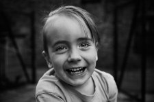
I'd lift the reds a little, especially the lip shade as it's a bit too dark for me. Don't know what colour the T-shirt is but you could drop that down a bit if you wanted some contrast. Also, I'd crop it to a 4/3 style photo by losing the LH edge chopping out that white blob in the top left corner (which you can't now unsee, sorry!). You've got a bit of room to crop off the bottom if you prefer a more 3:2 look or want to balance it better.
I really like it. A natural expression, and the wide angle adds drama. The only issue I have with the processing is that the lips look a little too dark for my taste. A red lift might make it less of an issue. Possibly one might argue it's over sharp, but that might be my taste as I'm not a fan of the ultra-sharp digital look.
Just my opinion as always. It's still a keeper, and one for the album. Nice work!
Last edited:
- Messages
- 288
- Name
- daniel
- Edit My Images
- Yes
Thank you, I had a feeling I'd over sharpened, and I totally agree. it's something I do almost unconsciously, and I don't know why. Maybe because I used to do a lot of landscape photography. I also tried a really tight crop and really liked it.I'd lift the reds a little, especially the lip shade as it's a bit too dark for me. Don't know what colour the T-shirt is but you could drop that down a bit if you wanted some contrast. Also, I'd crop it to a 4/3 style photo by losing the LH edge chopping out that white blob in the top left corner (which you can't now unsee, sorry!). You've got a bit of room to crop off the bottom if you prefer a more 3:2 look or want to balance it better.
I really like it. A natural expression, and the wide angle adds drama. The only issue I have with the processing is that the lips look a little too dark for my taste. A red lift might make it less of an issue. Possibly one might argue it's over sharp, but that might be my taste as I'm not a fan of the ultra-sharp digital look.
Just my opinion as always. It's still a keeper, and one for the album. Nice work!
I'm re-learning Gimp software and had a quick play with the mono mixer and it wasn't working the way you would expect it to, so I need to watch some tutorials.
I also agree with that white blob, I hadn't noticed it before but now it stands out.
Thank you, again.
- Messages
- 288
- Name
- daniel
- Edit My Images
- Yes
Thank you, No I don't mind the edit.
I'm just trying to work out the mono mixer in Gimp. I can also use the mixer in RawTherapee which works how you would expect, but in Gimp, the mono mixer affects the entire image, not just the individual colors.
The t-shirt is yellow, by the way.
I'm just trying to work out the mono mixer in Gimp. I can also use the mixer in RawTherapee which works how you would expect, but in Gimp, the mono mixer affects the entire image, not just the individual colors.
The t-shirt is yellow, by the way.
- Messages
- 8,322
- Name
- Ian
- Edit My Images
- No
I'd personally pull the yellows down a bit to differentiate them from skin but not so much it blends into the background. Problem is that doing that could pull some of the skin tone down too and leave nasty patches. Green/Blue T shirts in future! Needs a bit of care and possibly some masking, but I have no clue how easy that is in GIMP.Thank you, No I don't mind the edit.
I'm just trying to work out the mono mixer in Gimp. I can also use the mixer in RawTherapee which works how you would expect, but in Gimp, the mono mixer affects the entire image, not just the individual colors.
The t-shirt is yellow, by the way.
What do you think to losing the blob? Looks much better to me, but it's your photo! Pedant alert - you've introduced a white bit down the RH bottom corner now too. Don't hate me
Kudos to you using GIMP. I wouldn't have the patience for it.
Sorry for going on about it. I think I just want a copy of the colour version to see what I can do with it. But seriously, my comments are all a bit nit-picky. It's a great photo.
- Messages
- 288
- Name
- daniel
- Edit My Images
- Yes
No, your critique is welcome. You are helping me spot thing I wouldn't have otherwise thought of. I did burn the t-shirt a little, after the last edit and yes it does look a lot nice, it makes the face pop a little more. And yes, I agree the crop looks better.
Here is basically the raw image converted to jpeg. The only enhancement being a little bit of contrast. Please excuse the blue teeth!

Here is basically the raw image converted to jpeg. The only enhancement being a little bit of contrast. Please excuse the blue teeth!

- Messages
- 8,322
- Name
- Ian
- Edit My Images
- No
This is my take. Ignore the cropping (I've taken too much off the bottom) and sharpening (uploads are generally quite soft compared to Flickr links) as I took the image from a screen cap. I think I'd prefer a brighter look for this sort of image. It's probably a bit too bright in this instance but not far off where I'd want to be. Obviously if your monitor is brighter than mine, then it's going to look like I've gone too far. So please stick with what you best like the look of! For me, the eyes and mouth are less dark, similar to what Gav did above.
Couldn't do much with the yellows due to the size of the image, but it was the nittyest of picks anyway.

Let me know if you want me to take this down once you've had a look.
Couldn't do much with the yellows due to the size of the image, but it was the nittyest of picks anyway.

Let me know if you want me to take this down once you've had a look.
- Messages
- 145
- Edit My Images
- No
Personally I prefer Dan0001's version, but perhaps the eyes need a little lightening as in Gav's version. Harlequin565 has gone too far with the lightening; skin tones are lost and it just looks overexposed. The 'original' B+W image does look overprocessed.
Lovely natural pic though.
Lovely natural pic though.
- Messages
- 4,907
- Name
- Simon
- Edit My Images
- No
That explains beautifully why you're having trouble with the processing.No, your critique is welcome. You are helping me spot thing I wouldn't have otherwise thought of. I did burn the t-shirt a little, after the last edit and yes it does look a lot nice, it makes the face pop a little more. And yes, I agree the crop looks better.
Here is basically the raw image converted to jpeg. The only enhancement being a little bit of contrast. Please excuse the blue teeth!

The light & contrast isn't there in the image in the first place. Trying to add it in post will always look odd.
Cute pic though, I'd correct the wb & exposure & do a less contrasty conversion.
- Messages
- 288
- Name
- daniel
- Edit My Images
- Yes
It was shot in RawThat explains beautifully why you're having trouble with the processing.
The light & contrast isn't there in the image in the first place. Trying to add it in post will always look odd.
Cute pic though, I'd correct the wb & exposure & do a less contrasty conversion.
- Messages
- 288
- Name
- daniel
- Edit My Images
- Yes
Thank you, It does look a little too bright on my screen. But that is one thing I am concerned with when editing photos, my screen. I am using a mid range HP laptop so probably not the best screen for editing images. After Christmas, I may look at getting a desktop monitor suitable for editing photos.This is my take. Ignore the cropping (I've taken too much off the bottom) and sharpening (uploads are generally quite soft compared to Flickr links) as I took the image from a screen cap. I think I'd prefer a brighter look for this sort of image. It's probably a bit too bright in this instance but not far off where I'd want to be. Obviously if your monitor is brighter than mine, then it's going to look like I've gone too far. So please stick with what you best like the look of! For me, the eyes and mouth are less dark, similar to what Gav did above.
Couldn't do much with the yellows due to the size of the image, but it was the nittyest of picks anyway.
View attachment 402688
Let me know if you want me to take this down once you've had a look.
Thank you for all of your, and everyone else's advice, though. It is much appreciated.
- Messages
- 4,907
- Name
- Simon
- Edit My Images
- No
You still need to set the wb before doing a b&w conversion.It was shot in Raw
- Messages
- 4,907
- Name
- Simon
- Edit My Images
- No
It does to me. Others may differ!Does the white balance look off? It's set to auto white balance, which I think the D700 does a decent job of, most of the time.
The skin is rather magenta, the whites of the eyes somewhat blue.
- Messages
- 145
- Edit My Images
- No
I don't think so. It has a slightly 'cool' look, which overcast daylight will give. It might be a teeny bit 'off', but easily adjustable in post. Bear in mind wer'e looking at screens, which will all have different colour biases, according to how they've all been calibrated. So it probably looks different on your screen to mine, or someone else's. The skin tones look consistent with what a pink child's skin would look in such light; the yellow and the blue in the teeth seem accurate enough. Doesn't look particularly one way or the other, to me at least.Does the white balance look off? It's set to auto white balance, which I think the D700 does a decent job of, most of the time.
- Messages
- 2,680
- Name
- Peter
- Edit My Images
- No
I like it, it does have a 1940s/50s feel about it.


