Printing woes....

Messages
472
Name
Andy
Edit My Images
Yes
OK, so I'm having a bit of a play with my new Canon IP4600 and the results are a little random.

I always use LR2 to process my images, so I decided I'd use the print module as well. Selected paper settings, etc in print settings and then selected use printer colour management - printed one off.

It didn't quite represent what I had on the screen, lol!! In general it looked underexposed, and also the white balance looked a way of, with whites looking a little brown, and greens coming out kahki.

I decided to try using the Canon print software, and although a little better as far as exposure, it still looks a touch underexposed, and again the white balance looks different.

I'm using Canon paper so the printer knows what it's printing on.

I can't believe my monitor would be that far out, although I've never calibrated it. Are there any basic free calibrations to see how far out it is?

What else should I try, letting Lightroom handle the colour management rather than the Canon?

I'll upload the image I'm playing with so maybe others could comment on the original sources exposure, colour, etc?

EDIT: here's the image:
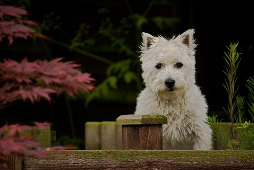
3160246636_6ab6608a98.jpg


On my screen the dog looks well exposed, nice & white, the bush/foliage in the background is nice & green, the leaves on the left a little pink and the fence brown with a green mossy line along the top.

The images I'm getting off the printer leave the fence looking a muddy brown, the leaves a reddy pink, the bush & foliage a kahki colour, more browny/green, and the dog a little under exposed, and a little off white.

Any thoughts?
 
I just got an IP4600 and I had this same problem. Skin tones seem to be orange/too warm, do you have that problem?

I am just going to live with it as the majority of photos I print are not of people, and everything else seems unaffected.

I asked for help with this here:
http://www.talkphotography.co.uk/forums/showthread.php?t=102486

and I think the general concensus was that it is down to the monitor.

However, I will keep looking back at this thread to see if there is anything that will help me :popcorn:

Cheers,
Matt
 
Ok thanks, I'll take a look.

But based on the image I've posted, how does it look on your monitors?
 
Doesn't look to bad on my calibrated monitor, maybe just a touch dark.
I would say that printing from within LR you are probably best setting up a proper colour managed work flow, it does make a difference
 
It looks a bit murky but there's no exif data so I've no way of know if or how much of that is down the colour space the image is in. Does the image look the same in your web browser as it does in LR2? If so you really need to get your monitor calibrated and the first port of call would be to dive into the monitor's menu screen and check what colour temp it's running at, it should be 6500k but I'm guessing you're running at the cool or 9300k setting.
 
The image is a touch dark, but much more exposure and I was loosing detail in the fur.

I must admit I have looked at my images on other monitors before and not noticed too much difference.

I'll check my settings for colour temp. I'll be quite annoyed if my monitor is a long way out as I have processed quite a few images on this laptop!!

The images in LR2 (print screen) or my browser looks the same colour/exposure wise, but interestingly enough it looks sharper in my browser than in LR2, although it is smaller.
 
Ah, laptop is the magic word. The colour temp will be very cool which explains why the print looks so warm. It's very rare to find a laptop that allows the colour temp of the screen to be changed and getting them calibrated is a bit of a nightmare. You can get the white/black point and gamma pretty close but the colour is a bit of a lottery and combined with poor viewing angles laptops are far from ideal for editing work :(

No exif is probably because you've got minimize embedded data ticked in the LR export window.

edit to add: There's a lot of room for increasing the exposure before you lose detail in the fur which shows, sadly, how far out your monitor is.
 
Oh dear - that's rather annoying!!

I have had a quick look at the monitor settings, etc and it seems that I can only adjust Gamma, Brightness & Contrast for either all, or for red, green, blue individually.

The fact that the exposure is a bit dark may explain why I feel an image looks to be clipping before the highlight warning comes on. Oh, and you were right about the embedded data bit :)

I realise it's not ideal, and I do intend to get a separate monitor once my office is sorted, until then I have no space.

Is there any basic calibrating software that I could try to improve things?

I do have a calibration disc for LCD TV's, would this be worth using?
 
In fact, someone who know's they have a pretty good monitor, would you mind having a bit of a play with the image to set it to what looks correct on your monitor, to give me an idea again of how far out mine is?

As an example, here are a couple more...

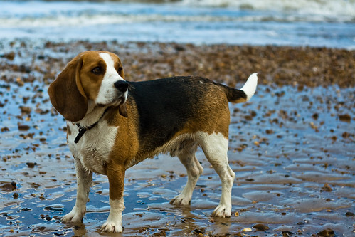
on this image, on my laptop his blaze and tail look to be just on the verge of clipping, exposure wise:

2693882508_05a99b3ca2.jpg


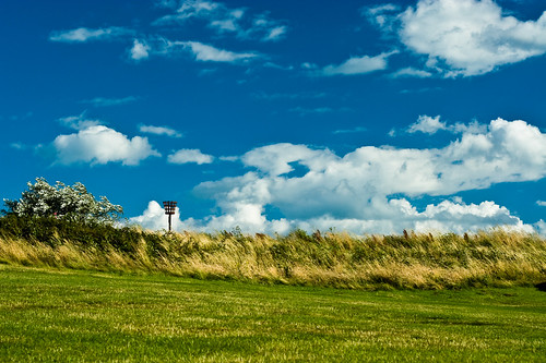
and this one is pretty vivid, for colour:

2693085681_c982ca198e.jpg


I appreciate all your help :)
 
Is there any basic calibrating software that I could try to improve things?

jack_russ.jpg


All I did here was run levels in Photoshop.

Have a look at this page:

http://epaperpress.com/monitorcal/index.html

and follow the instructions. The brightness/contrast/gamma you found are for your gfx card not the monitor. Laptop monitors normally only have a backlight control so you'll be limited on what you can change but the gamma control should allow you to get the 3rd part with the inner/outer greys looking better.

The tail of the dog on the beach isn't far off but there's still some room but at that size it's pretty hard to tell if there's any detail to lose in the first place.
 
Pxl8, that does look pretty good on this monitor, a little bright, but not as bad as to loose detail. I reckon in hindsight that my processing wasn't great. Thanks for helping me out :)

Don't get me wrong, it's not a great photo anyway, just one of my mother-in-law's dog and she asked me if I could print it for her.

When I ran an auto tone in LR it looked awful, so I adjusted as best I thought without over-exposing the dog - I can see now that it's not very good.

I'd still say the image on my screen, to what gets printed out is very different though. I'll print your image to compare.

Also, sorry for the small images, but as we all are, I'm limited by the forum rules so just use the medium size on Flickr.

The grayscale looked OK, but I'll try the gamma adjustment for the light/dark square.
 
jack_russ.jpg


All I did here was run levels in Photoshop.

Have a look at this page:

http://epaperpress.com/monitorcal/index.html

and follow the instructions. The brightness/contrast/gamma you found are for your gfx card not the monitor. Laptop monitors normally only have a backlight control so you'll be limited on what you can change but the gamma control should allow you to get the 3rd part with the inner/outer greys looking better.

The tail of the dog on the beach isn't far off but there's still some room but at that size it's pretty hard to tell if there's any detail to lose in the first place.

This looks pretty good on my calibrated monitor, the first image did look off !! However the other 2 images come through looking pretty much spot on and match your descriptions !!

Hope this helps

Dean
 
Hmm, well now I feel like a bit of a plumb as I've got up this morning and looked at them in daylight, and they don't look too bad!!!

A touch darker, so my monitor is obviously a touch bright, but either the ink has changed over night, or it was just the poor light I was in yesterday making them look so murky!!

Interestingly though, there is still a difference between the LR print, and the Canon print.

Both were set to use the printer for colour management, yet the LR print is a little darker with the red/brown tones about right, and the green a little muted - whereas straight from the Canon software, it's a little brighter with better greens, but the red/brown looks a little too red.

I can see I'm going to have to keep playing!!
 
Or you could just take the image into your local lab. Talk to the people who do printing for a living, you will get real photos too, not inkjet........
 
Yeah, that's fine for when I want prints done - as I've said, this was just a little 'can you just....' from the mother-in-law.

Besides, if my monitor is wrong, taking them to a print shop will yield the same results.
 
Well, I just ran the QuickGamma program for a basic calibration, the brightness was a bit out and the indivdual RGB gamma were quite a way out, just looked at another gamma test chart (one where the squares merge at a distance) and it looks OK, as long as you are square on to the monitor.

I'm definately going to invest in a separate, fixed monitor though :)
 
Just a note, if you're using QuickGamma then you should associate the sRGB profile with your monitor. Although generally this is a bad idea as it basically disables colour management in this situation it's the right thing to do as any other profile won't take into account the changes that QuickGamma has made so you do need to stop colour managed apps from using any profiles to adjust display colours.

It's not ideal but it's better than nothing :thumbs:
 
Thanks pxl8, I did read something about that.

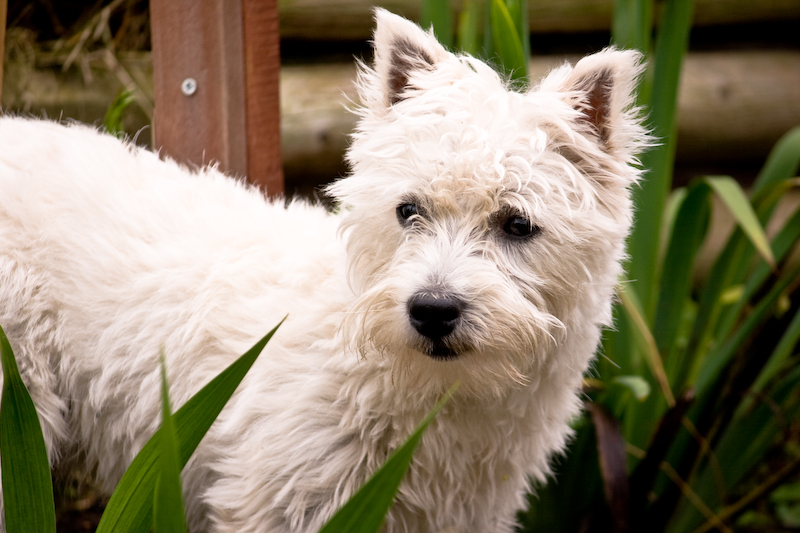
I've gone back to a couple of images of the same little Westie. Do these look any better to you guys?

3162617549_d8bc6daa16_o.jpg


3163448408_2661ffc8ee_o.jpg
 
if you want to calibrate without the hardware why dont you just change the screen settings to make them look like the print? then you will get consistent results, but it may not look good to others
 
I would however recommend a proper calibration hardware solution as it really helps, my spyder 2 wasnt that much really
 
I had considered that, but the settings on this monitor are pretty limited.

I'll just get a half decent separate monitor, then calibrate that properly :)
 
Just to update this it seemed that a lot of it was down to the printers own profiling.

You can ask it to show you a preview before printing, so I selected it.

In Lightroom 2, leaving the colour management to the printer and selecting the correct profile in the printer settings gave an image preview that was very different to the image on Lightroom (you can view them side by side).

So I turned the colour managent off in the printer driver, and just set the paper type & quality, then selected the printer profile in LR2, and set it to Perceptual. This time the preview was a lot closer, a little too vivid on the green and magenta, but generally OK.

The colour cast can be adjusted in the manual colour settings on the driver (still leaving colour management off), but the trouble I have there is that if I reduce the Magenta level to get the purple looking, this sends the green over the edge!! Seems a bit of playing with the three colour sliders is needed but it's definately a lot closer to my lightroom image than it was :)
 
Back
Top