"Nice Bokeh" is an entirely subjective thing; I would actually say that of the two example pics, I prefer the back-ground of the first to the second, and that to my mind, that is the one actually displaying this nebulous Japanese art-fashion thing they call 'Bokeh'.. we used to just call oof-highlights!
Second shot, has much more even texture back ground, without sky-light cutting through foliage; renders a much smoother oof texture, but doesn't actually show any typical bokeh 'high-light' circles.. top shot where it does show bokeh circles, they are quite pronounced five sided pentagons, rather than smoother circles.... hmmm... takes us into the debate over 'nice' bokeh as to whether the circles look better as popper fuzzy circles and whether lenses with six or seven or eight blade aperture iris, or even curved blade iris, or getting really prosaic on the matter, old fashioned penny-washer apertures, or even novelty shaped shaped bokeh filter's that make oof highlights penguin shaped or something, make the 'bokeh'.. nicer... if any-one can actually agree or pin down what 'bokeh' really is or should be.
Fashionable bit of jargon, though.. best avoided IMO. But to return to your question, how pleasantly a lens renders out-of-focus background, primarily depends ON that background. How out of focus it may be is a function of DoF and the camera to subject to background distances and the aperture setting.. but MOST on the actual background itself, and how much detail and texture is in it, and how fine it is.
A said, to my mind, the first shot, with high-lights through the foliage of the tree, is actually making some 'feature' of the highlight detail, within the the oof back-ground; Second is merely rendering the denser, more evenly toned back-ground oof, offering a pleasant subject/background dissociation with no distraction or added 'interest'.. and which is 'nicer' is utterly subjective.
I actually find the first shot 'more' interesting; the bird is is flight, it shows the bird in some sort of more natural setting, and context, and the high-lighted background is adding some impact to the shot.. second is rather more static; the bird is posed on a post, the back-ground incidental, its providing little or no context or extra interest to the shot, or concentrate viewers attention solely on the bird.
Which is to tackle the base 'definition' of Bokeh, or lack of; in that the frat shot, with obvious highlight rings, has what more, would, and probably more correctly describe as 'bokeh', where the second, simply rendering oof texture into a more milky soft tone, probably isn't; its simply a well disassociated oof back-ground,
t ignoring the curious semantics; What was your intent in either case? What were you trying to achieve? Did you actually want a more bokerish 'interesting' oof back-ground effect, or did you simply want to achieve back-ground disassociation?
I don't have much interest in things with feathers; but the first shot, is the one I find far more 'interest' in looking at; the bird is in flight, doing 'something', its pleasantly composed, the bird flying 'in' to the frame, space ahead of it giving a balance to the composition, the back-ground, is natural, but disassociated from the subject, so it does draw my attention onto the bird, whilst adding some 'interest' in those obvious high-light circle, that don't distract, and do add to the composition as a whole, which I find more pleasing. Second shot? Bird is looking to the left, cramped up at the left hand side of the frame; it doesn't have 'space' to look into, nor 'frame' or 'expression' that makes sense of that cramped-ness, its just 'cramped;, loads of space to the right, with a lot of very uninteresting disassociated ooof back-ground with no detail or interest in it.. why is it there? Why didn't you shoot 'portrait' and frame tighter on the bird and put the post its sat on under it to add some context to the shot? Bokeh or not, there's more I don't like about the fundamental composition of that shot, before conidering how 'nicely' you have tackled the oof background, and whether it may or may not be bokeh or how to get more or less of what might be bokeh out of it.....
And I have to say! my biggest gripe with both shots is the large, prominent, and utterly cliche'd "I must have one to go with my Flikr account", 'waiter-mark'! Sorry.. horrible things, and on second shot? Could you not have at last shifted the thing into that dead zone to the right rather than leaving it slap center over the bird? In both cases, it adds little or nothing to the picture; It might be 'better' were it a little less distracting; added at a more discreet transparency level; made smaller, or shifted to a less prominent part of the frame.. IF it has to be there at all! To my mind these are like "Kev & Shaz" sun-strips on old MKIII Ford Escort! rather ugly poser tramp-stamps for photo's! As said, I have little interest i things with feathers outside of a Las-Vegas cabaret show; What sort of I guess it's an owl is that? If you have to title a photo, then something that adds or explains it, like Say, "Lesser Spotted Hoot Owl, at Little Itchington Country show, June '17" you 'might' add the "(c) I.B, Likepro" go-faster stripe to, may be a little more useful, and inoffensive; b-u-t.. what's it's purpose? IF you web-publish folk can 'steal' the image, and they wont give a hoot whether you have water-marked or not, ad can as easily crop or clone it out anyway if they are determined enough; so why do you need it? Why do you wat it? And does it 'add' anything to the picture you present? Which is all a departure from queries of Bokeh, what it may or may not be, or how to achieve it, whether more or less pleasantly... but, as far as what to look for and what you might do to make better photo's, aught come far higher on the list, to my mind! Though both are, in there own way pleasant enough pictures, but first one, does have a bit 'more' going for it.
As far as Bokeh is concerned... answer remains that it's an oft debated facet of out-of-focus back-grounds, most of which is dependent on the actual back-ground itself; and lenses, lens apertures and bokeh effect filters are all of even more questionable merit to the effect you wish to achieve, that's down to controlling DoF around your subject, IF the back-ground itself is amenable to achieving the 'effect' you desire.
Eg: if your back-ground is a plain brick wall, you can render it fantastically OoF, but without much detail or contrast in it, the 'mixing up' of OoF detail, will still leave it pretty 'flat' and texture less. If you have a Christmas tree hung with fairy lights, that has much more inherent texture and contrast, you will get a much more distinct OoF effect and more discernible fringing around highlights, adding potentially more interest, or distraction to the back-ground, but displaying more of the fringing between high-lights and low-lights, that are more obviously what many call 'bokeh'... and may or may not be what you want to achieve or what viewer likes in the shot. Ie; the back-ground is all important, the hardware, not so much, and if t can give a shallow focus DoF effect to help, you still need that backgroud to play ball.


 Barn Owl 2 by LionOfJudah13, on Flickr
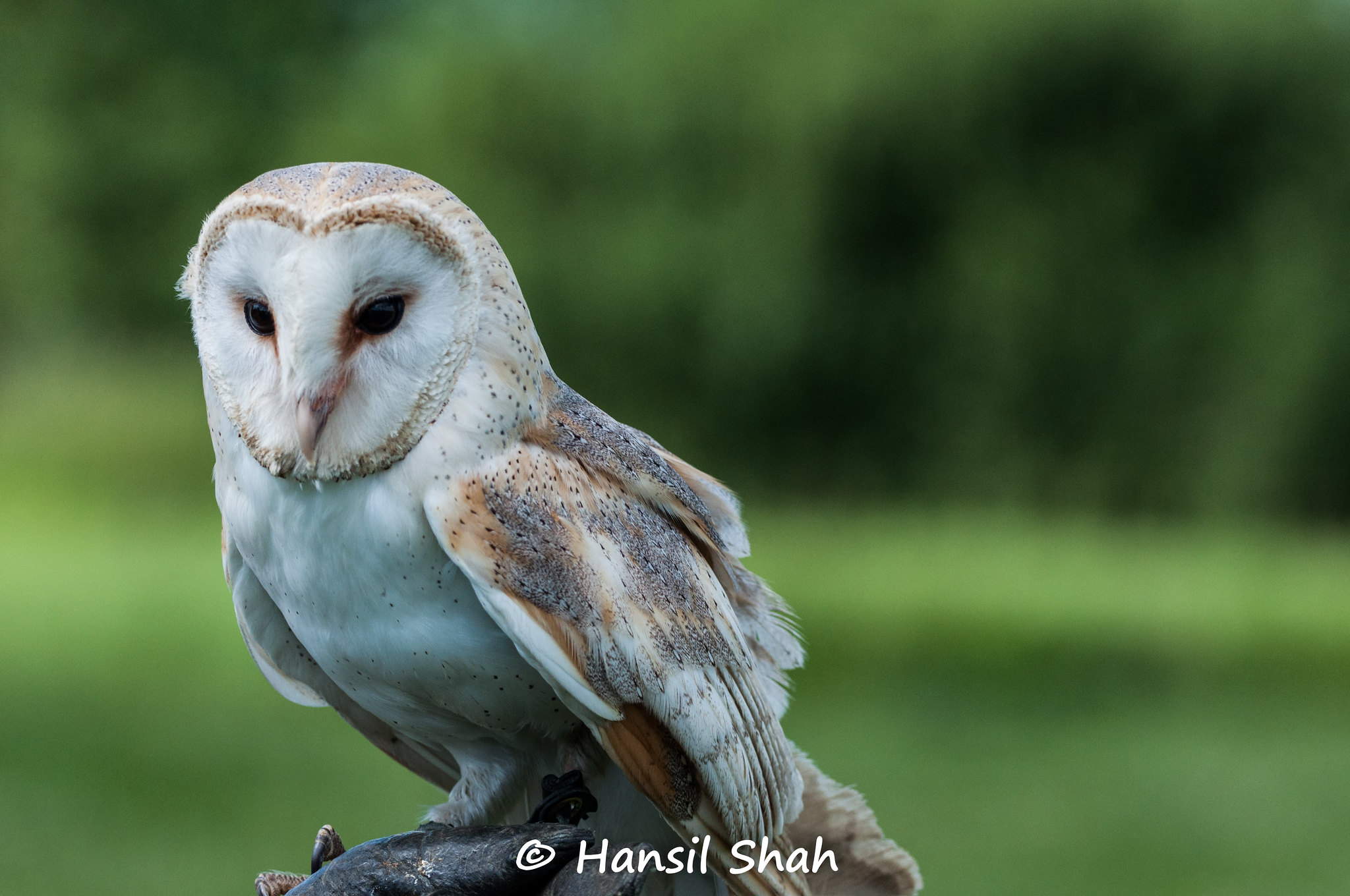 Barn Owl 1 by LionOfJudah13, on Flickr