weekly Rico's 52. Weeks 7: Root (uninspired)

Messages
678
Name
Richard
Edit My Images
Yes
I was inspired to take up the 52 after reading the positive experiences of those that took part last year. Being new to digital photography, I thought of it a sa great way to learn.

I was not short of ideas for the first topic, Directions.
What I was short of was cooperative weather, good health (damn you stomach bug! :puke:) and experience.

So, this afternoon I ventured out in a last ditch effort to find an interesting sign post, as there is not as many in the 52's as I thought there would be!

What I've ended up with is this:
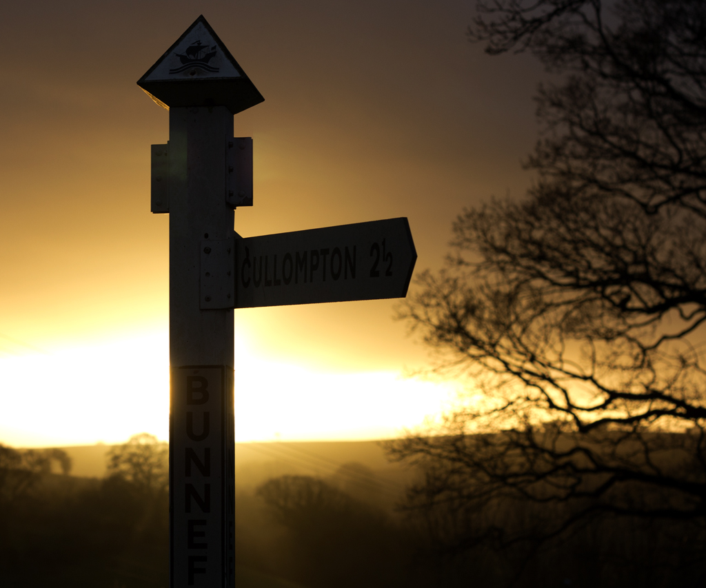

Direction by ricrico, on Flickr

This is my first attempt at PP. I basically tweaked the levels and cropped. No sharpening added as I don't know how much, if any it needs!
If anyone has any tips for basic PP please let me know! I have had a browse through the PP section but can not find much of help.

So, on to week 2...
 
Last edited:
Week 1: Direction // Direction edit (less of a crop)
Week 2: [URL="http://www.talkphotography.co.uk/forums/showpost.php?p=4323472&postcount=11]Fear[/URL]
Week 3: [URL="http://www.talkphotography.co.uk/forums/showpost.php?p=4341691&postcount=27]Sigh[/URL]
Week 4: [URL="http://www.talkphotography.co.uk/forums/showpost.php?p=4363227&postcount=47]Sweet[/URL]
Week 5: [URL="http://www.talkphotography.co.uk/forums/showpost.php?p=4406821&postcount=68]Secure[/URL]
Week 6: [URL="http://www.talkphotography.co.uk/forums/showpost.php?p=4406873&postcount=69]Industry[/URL]
Week 7: [URL="http://www.talkphotography.co.uk/forums/showpost.php?p=4427794&postcount=82]Root[/URL]
 
Last edited:
A very good start to your 52 Richard, there's a lot of people setting a high standard right of the bat and your one of them.

Keep up the good work :)
 
Hi Richard, it's quite a flat photograph and I actually like it that way.

My main concern is the blown out sky behind the sign.

Cheers and good luck
 
Many thanks for the comments folks, looking forward to this week trying to capture fear.
 
Richard, a very good start to the 52! Only minor point for me is, I would have liked a bit more space at the top. I look forward to seeing what you come up with next.
 
Richard, a very good start to the 52! Only minor point for me is, I would have liked a bit more space at the top. I look forward to seeing what you come up with next.
Thank you! :)
 
Fear. This one had me thinking for a while and then I came to think about why we subject ourselves to fear by reading scary books or watching scary films.

With that in mind, I've produced 2 images. I've learnt a lot along the way, which is always good!


fear by richcoo, on Flickr

I like the idea of the image but I've not managed to pull off what I pictured in my head. I couldn't manage to get a satisfyingly spooky figure in the background. :shrug:


fear2 by richcoo, on Flickr

A shot of some of the scary DVD's on the shelf. Again, I couldn't quite pull off what I had in my head but it's my favorite of the 2.

Still a few days left though! :bonk:
 
I like the Direction shot but it might have been better at a slight angle as you end up thinking there's a sign pointing towards you but can't make it out.

The Fear shots I'm not a fan of I'm afraid.

The first, I see what you tried to do with the ghost but by facing away it seems like it can't be arsed looking at the woman let alone scaring her! Also it's too strong/defined a ghostly image which is too close to the reader in a very close crop. The book comes across as a heavy handed attempt to hammer the Fear link home.

The second, I just don't see it as being scary tbh. A pile of old occult books, bit of shadow, cobwebs etc maybe but not dvds.

I know these sound very negative but I think it's because I can see what you wanted to do and I believe you could easily make a much better version of the first with just a bit of a re-think.
 
Last edited:
Thanks for the comments chaps.

The second shot was not in itself meant to be scary, more a take on why we try and scare ourselves!:thinking:
 
Hi Richard....'pologies for taking sooo long to pop in on your thread :crying:

Direction....nice start to your project :)....slightly blown sky but hey , it happens sometimes , like the thought behind the shot & right on theme , possibly a little too tight top of frame /? Like it though so (y) from me


Fear....again...great thinking behind the image & a great start on the pp ( I'm hopeless at it )...hits the theme ( why do we insist on scaring ourselves by reading these books :LOL: ) possibly having the ghost looking towards the girl may have worked better but still a million times better than I could have achieved :clap:

Best of luck with your project,look foward to seeing more (y)
 
Hi Richard, i really like the direction shot. Think it may have needed a little more sky in between the sign and the tree to balance it out a but more. Just looks a bit bunched up in my eyes :shrug:

Fear - your first shot is a really cool idea and I think pretty well pulled off. I agree that maybe the book is a little in your face but I do like the ghost and the way he is facing. Good job mate.
 
Great pictures for your 52.

My thoughts are,
Direction: The top looks a bit too cropped for me, It could have a bit more sky to really set it off.
Fear: I like No1, again as said above, the figure facing the person sitting reading would have been a better shot, possibly with a blanked out face with just visible outlines.

Looking forward to this weeks now.

Chris
 
direction - lovely shot

fear - now that's what I was trying to do, but a bogey man under the bed lol, well done. I must learn how to make ghosts!
 
Direction, lovely shot yes the suns blown,, but i don't think it detracts from a nice image as others have said its a bit of a tight crop i'd have liked to have seen it in portrait, with more below and above.

Fear not sure on either of them, i think the man is not ghosty enough in one, and 2 just looks grainy on my monitor which i can't get past, maybe this monitor
 
Hi Richard....'pologies for taking sooo long to pop in on your thread :crying:

Direction....nice start to your project :)....slightly blown sky but hey , it happens sometimes , like the thought behind the shot & right on theme , possibly a little too tight top of frame /? Like it though so (y) from me

Fear....again...great thinking behind the image & a great start on the pp ( I'm hopeless at it )...hits the theme ( why do we insist on scaring ourselves by reading these books :LOL: ) possibly having the ghost looking towards the girl may have worked better but still a million times better than I could have achieved :clap:

Best of luck with your project,look foward to seeing more (y)

I missed the ghost at first. I'd like to see the ghost looming over the reader. I do like the processing on both these.

Cheers.

Thanks! :)

Hi Richard, i really like the direction shot. Think it may have needed a little more sky in between the sign and the tree to balance it out a but more. Just looks a bit bunched up in my eyes :shrug:

Fear - your first shot is a really cool idea and I think pretty well pulled off. I agree that maybe the book is a little in your face but I do like the ghost and the way he is facing. Good job mate.
Thank you. :)

You've obviously put a lot of efforts into this - I like the shadowy figure! Mandy

Thanks alot. :)

Great pictures for your 52.

My thoughts are,
Direction: The top looks a bit too cropped for me, It could have a bit more sky to really set it off.
Fear: I like No1, again as said above, the figure facing the person sitting reading would have been a better shot, possibly with a blanked out face with just visible outlines.

Looking forward to this weeks now.

Chris

Thanks Chris.

direction - lovely shot

fear - now that's what I was trying to do, but a bogey man under the bed lol, well done. I must learn how to make ghosts!

Direction, lovely shot yes the suns blown,, but i don't think it detracts from a nice image as others have said its a bit of a tight crop i'd have liked to have seen it in portrait, with more below and above.

Fear not sure on either of them, i think the man is not ghosty enough in one, and 2 just looks grainy on my monitor which i can't get past, maybe this monitor

Thanks Lizzy.

The general consensus seems to be that Direction was a bit of a tight crop. I completely agree, I really wish I had taken a bit more time and got it in portrait. I really wasn't expecting to get anything useful as it was my first attempt at shooting into the sun and I had no idea how to do it lol.

I've gone back to the RAW and uncropped it (is that even a word? :nuts:).
Hope you all like. :cool:

Direction_edit by ricrico, on Flickr

Now, back to pondering about *sigh*...
 
well, I can help you with this one, you need to grab some mates and find a suitable shop and recreate the album cover that mancs man did :p

mumford and sons?

go on, I dare ya!
 
sturisoma said:
well, I can help you with this one, you need to grab some mates and find a suitable shop and recreate the album cover that mancs man did :p

mumford and sons?

go on, I dare ya!

Ooh now there's an idea!
 
Richard
Think the direction works well, a few comments about the sun already made, to be honest i've not tried taking shots into the sun myself so not qualified to comment what should have been done.
The fear one i like, the ghost works, but would have been better stooped over the reader or if you could have made it look more like he was walking through the door/windows more. Again not a PP expert. Great start and look forward to seeing more
 
Thanks riu. I had a lightbulb moment earlier for *sigh* and I'm just working on it now!
 
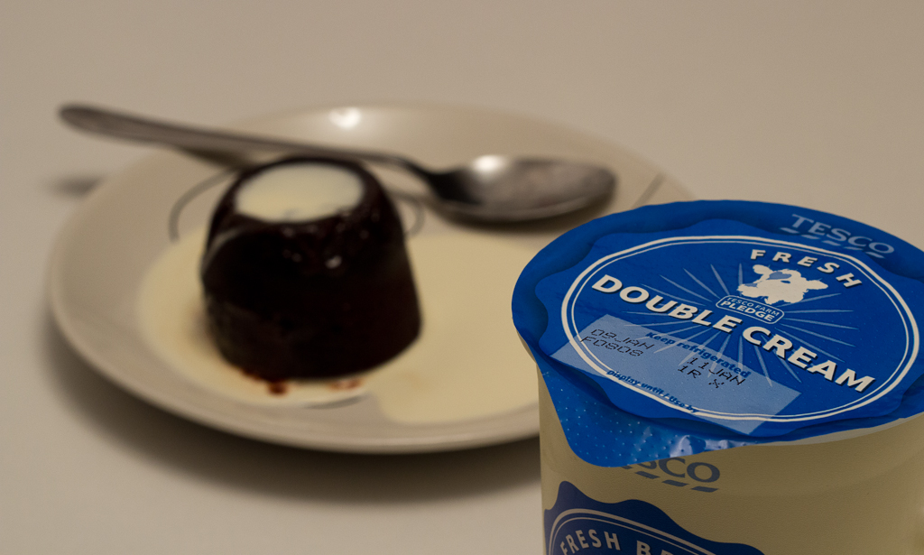
I'm sure I, like many TPers, let out a sigh when they saw this weeks theme!

I've been scratching my head for a good few days. I've taken some inspiration from others but I couldn't think of anything that I was happy with.

Then, tonight I was putting cream on my pudding when I noticed something and let out a sigh.


sigh by ricrico, on Flickr

So, what did I do after taking the photo? I scraped the cream off and ate it anyway! :puke:
 
Last edited:
Haha. Unlucky! Out of date cream. I hope it didnt spoil the pudding!
 
Hi Richard,

Good start to your 52, for direction I like your uncropped version alot, the light is just lovely. Fear, great idea, I imagine she is biting her nails behind that book, not so keen on the ghostly figure. Sigh, brilliant didn't see it at first...then the penny dropped!


All the best for the next challenge.

Carol
 
That would have been a 4 letter word begining with "S" but it would'nt have been sigh....

Cheers


Steve
 
Direction : Love the colours and warmth, and the direction is clear, so bang on theme... Whilst understandable, the sign seems a little dark, and I wonder if a splash of fill light would help ??

Fear : I see what you were attempting, and the ghost image is intriguing, but I'm afraid neither of them quite work for me. Perhaps having a dark figure outside the window, pressed against the glass looking in would have worked better.

Sigh : We all have those moments... and also Sigh about it.. works for me.
 
Did the cream taste bad? If not I'd have eaten it anyway!!!

Great shot, and nice subtle take on the theme. I'm glad you didn't go the obvious route and include something with today's date on it to emphasise that the cream is out of date; I like subtle a lot!!!
 
Last edited:
Great idea, I completly agree this week really was a challenge!
 
Good set there mate but direction original does it great take on theme and very well shot :clap:
 
Back
Top