Same lens different images

Messages
2,247
Name
Gary
Edit My Images
Yes
Mods feel free to move this if you think appropriate.It's not a critique post but a post about lens perspective and imo equipment related.

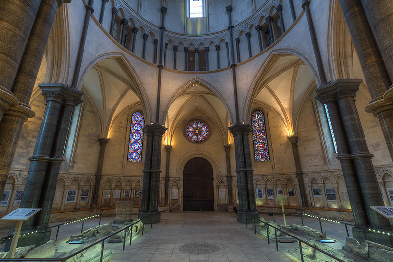
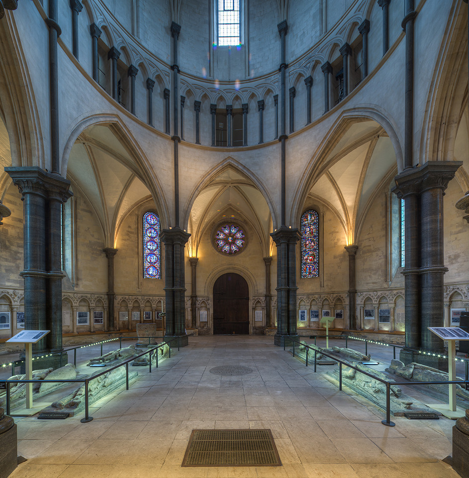
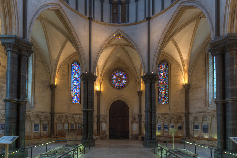
Below are 2 shots taken with the Canon 17 MM TS&E lens.One image is just an image shot at 17mm and the other is part of a stitched pano with things corrected using the shift function.I've then cropped this image to show approx the same area as the standard image.

I'm not looking for critique on the processing,content etc.It's a question of which image do people find the most appealing perspective wise.I've showed this image to 5 non photographer friends and they all prefer the standard image over the shift corrected version.To be honest,I think I do too and it's the one thing that's stopping me replacing my recently deceased 17MM TS&E.

Do photographers look at images differently to non photographers?

Which do you prefer?

17mm TSE and then cropped to show approx the same image.
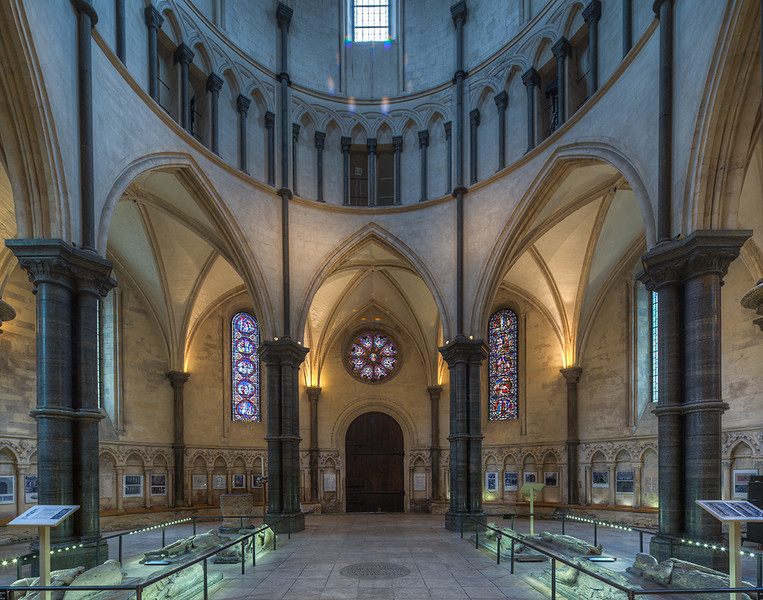
i-t48pQFF-L.jpg


Standard 17mm image with the TS&E
i-nrP57DC-L.jpg


Gary
 
Naturally as you look up at a scene in which objects become further away your perception is that the furthest things away from you should get smaller....I think that's why the top image looks 'wrong' as the parallel lines look to the brain to be somehow unnatural...IMO
 
I prefer the first one.
It looks like the scene has been photographed from half way up the scene rather than at floor level with the camera pointed upwards.
 
Normally I dont like T/S, as kennysarmy says you normally see perspective in real life.

This one is not quite a obvious as normal but I think it starts to look like it's bowing outwards towards the top of the image and it makes it a little unnatural looking.
Maybe a couple of degrees of perspective to balance it out a little??
 
Hi Pete

You tend to see that when you shoot things that go high when they are close up.Totally agree with you that it starts to look "funny" to the eye.Do you prefer no1 or no2?-maybe something inbetween?That would have to be done in post though.You need to keep everything level in camera to allow for the proper stitching of the 3 images.

Gary
 
I prefer the first. The bottom part of the frame, where there is more detail, shows the verticals how my eye would see them. It's only when looking up to the top things seem a bit more off, but there is less interest up there anyway so I'd rather see it look right at the bottom.
 
Hi

I prefer the top one. The wife also prefers the top one and she knows absolutely nothing about photography.

Graham.
 
The uncorrected image looks better and more natural IMHO because the corrected one has gone too far and looks top-heavy.

I'm very picky about verticals being vertical (do it in software) but there comes a point, and that shot is quite a long way past it, when just letting the verticals converge as they do naturally is the better option.
 
I prefer the top one as well, my wife preference is for the bottom one (not a togger but has a good eye). Just out of curiosity, can you post the bottom one with lens correction applied (Lightroom?) as I am curious what the difference would be?
 
Prefer the bottom half of the first, to me it looks like the verticals are diverging rather than being straight, very unnatural.
 
the second one.

I find the composition far more pleasing as the curve of the balcony in the first one leads my eye out of the image, and the columns enhance the balcony.
 
1st one for me. Although it could maybe do with a tad (+3 ?) on vertical perspective.
 
The corrected one looks much better with the top window cropped out, better still with a bit off the sides where those curves seem to make things worse.

Interesting flare patterns and ghosting going on above the door.
 
I most definitely prefer the top one. The bottom one is a raw potato as far as I am concerned.

If I am going to be thoroughly anal with it - I will have note that it is very slightly overcorrected - maybe by 1 degree (i.e. the outer columns - the left one at least - go wider higher up).
This is where the human perception can stir the water even further. The brain does correct the perspective up to some extent, but not entirely. Even ancient greek civilisations realised this when building Acropolis and other big temples.
A simple way to keep things 'real' is to very slightly under-correct - by 1-2 degrees. The end result somehow looks more pleasing.

Looks like most people are preferring the first one so far.That's interesting.

For people who are interested in the lens itself here's the original 3 shot shifted stitched pano.
i-7WbK87H-X2.jpg


gary

OK, this is where things start to get pear shaped if we trust Photoshop (or others) default output.
We have already established about the correction of angle - the lines get just a bit too wide higher up.
Another one is dimensions. This is where the brain can play even stranger tricks, and rightly so. The ceiling and cupola are now fairly distant compared to pillons, and thus will appear smaller than are pictured. They look really stretched out, and so you may want to distort to compress them slightly in PS.
Give it a go if you have time to kill


Re - 17 TSE. I think this is the very wrong reason not to consider one. High price tag and lack of filter threads are a lot more credible excuses.
You can obviously take a relatively soft and distorted 17-40mm, and correct images in Photoshop. This is not a tragedy, I do this regularly, but then end result is obviously quite a lot softer, and equivalent to quite a bit more than 17mm FOV. It's your choice.
 
It's interesting how some people prefer one shot to another.I wonder if the people who like the 2nd image also like fisheye shots and the people who like the first image don't.

The image was shot on a tripod with a 5D3 and I always spend time making sure everything is totally level before taking a 3 shot stitch.The top of the picture is how it came out of camera.Maybe the spirit level in the camera isn't accurate enough to get things 100%.I've seen lots of pics taken with a TS lens that show the same effect.

Gary
 
Re - 17 TSE. I think this is the very wrong reason not to consider one. High price tag and lack of filter threads are a lot more credible excuses.
You can obviously take a relatively soft and distorted 17-40mm, and correct images in Photoshop. This is not a tragedy, I do this regularly, but then end result is obviously quite a lot softer, and equivalent to quite a bit more than 17mm FOV. It's your choice.

I've owned the 17mm for about 18 months and it's a great lens.The lack of filter threads doesn't bother me in the slightest.I tend to always use it on a tripod so it's just a simple job to take multiple images and join in post.I already have the focal length covered with the 16-35 Mk2 so it's more a question of do I prefer the corrected image or the normal image.I used to think I liked the corrected images but now I'm not so sure.
The ability to create easily stitched images is probably enough to make me get another one.I was just surprised to find so many friends who preferred the not shifted image over the shifted image when most things photography related tend to say converging verticals is bad.

Gary
 
I prefer the top one as well, my wife preference is for the bottom one (not a togger but has a good eye). Just out of curiosity, can you post the bottom one with lens correction applied (Lightroom?) as I am curious what the difference would be?

Bottom image after Lightroom correction of -67.

i-mDpJVt7-L.jpg


And the original again for comparison.
i-nrP57DC-L.jpg


Cheers
Gary
 
Last edited:
I previously said I preferred the 1st, and still do. Showed the photos to my wife (not a photographer) and she prefers the 2nd.
 
Thanks for putting up the Lightroom corrected version, I have to say I prefer that one over the others, LH column not quite vertical so gives perspective without making my eyes bleed!
 
The first one - the second one does not look right to my eye. Surely when we look at something the human eyeball/brain makes the corrections for us so we don't see converging verticals. I might be wrong but the second one does not look natural.
 
Back
Top