

- Messages
- 1,729
- Name
- paul
- Edit My Images
- Yes
A disastrous few days as I lost all my data on a memory card but hey that's life.
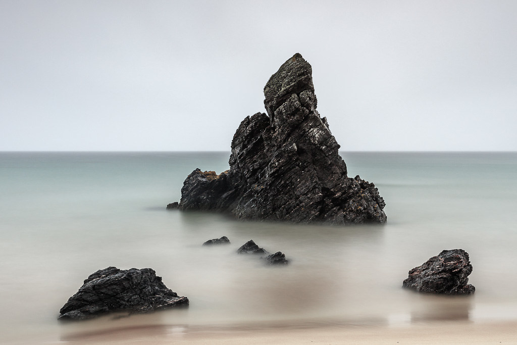
I turned up at Sango Bay and it was a horrid day, sky was meh and the tide was going out and it was hammering down with rain. Stood under the umbrella and decided on a couple of long exposure images after a walk about.
Decided on a square crop as it fitted quite nicely and the marmite border
Shapes 1.
 Shapes 1. Sango Bay by Paul Cronin 1, on Flickr
Shapes 2.
 Shapes 2. Sango Bay by Paul Cronin 1, on Flickr
Shaps 3.
And then an over exposed image to bring the detail out of those lovely rocks.
 Shapes 3. Sango Bay by Paul Cronin 1, on Flickr
I turned up at Sango Bay and it was a horrid day, sky was meh and the tide was going out and it was hammering down with rain. Stood under the umbrella and decided on a couple of long exposure images after a walk about.
Decided on a square crop as it fitted quite nicely and the marmite border
Shapes 1.
Shapes 1. Sango Bay by Paul Cronin 1, on FlickrShapes 2.
Shapes 2. Sango Bay by Paul Cronin 1, on FlickrShaps 3.
And then an over exposed image to bring the detail out of those lovely rocks.
Shapes 3. Sango Bay by Paul Cronin 1, on Flickr
 shapes 1.
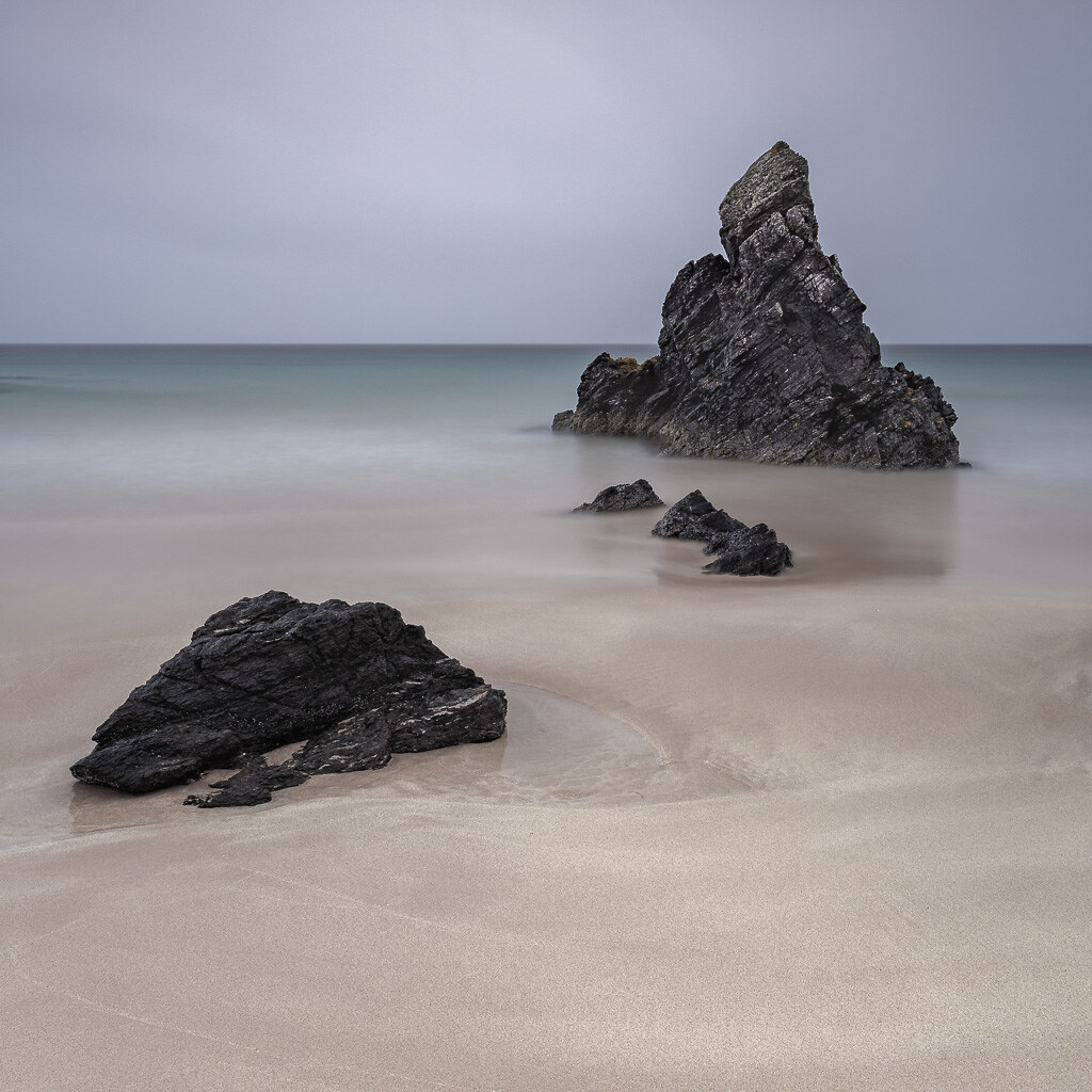 Shapes 2.