- Messages
- 1,456
- Edit My Images
- No

 Easter-Maxi-128.jpg by Jon Richy, on Flickr
nearly in focus M8

Maybe he was using eye auto focus!nearly in focus M8
I edited it to be more warmer. cant remember what setting i had in camera.I notice from your other shots on Flickr that the A9 is doing the same warmer tone white balance that generally occurs with the A7i, even more so considering a flash was fired? Did you deliberately shoot with a warmer tone?
 London Photo walk Spring pt 2--385.jpg by Jon Richy, on Flickr
 London Photo walk Spring pt 1--514.jpg by Jon Richy, on Flickr
I edited it to be more warmer. cant remember what setting i had in camera.
This is with the A9 as well
Yea true.Outdoor shots have never been an issue for the mk1 A7 but indoor, under different lighting, causes colour correction differences.
https://www.flickr.com/photos/josh1408/43168335021/
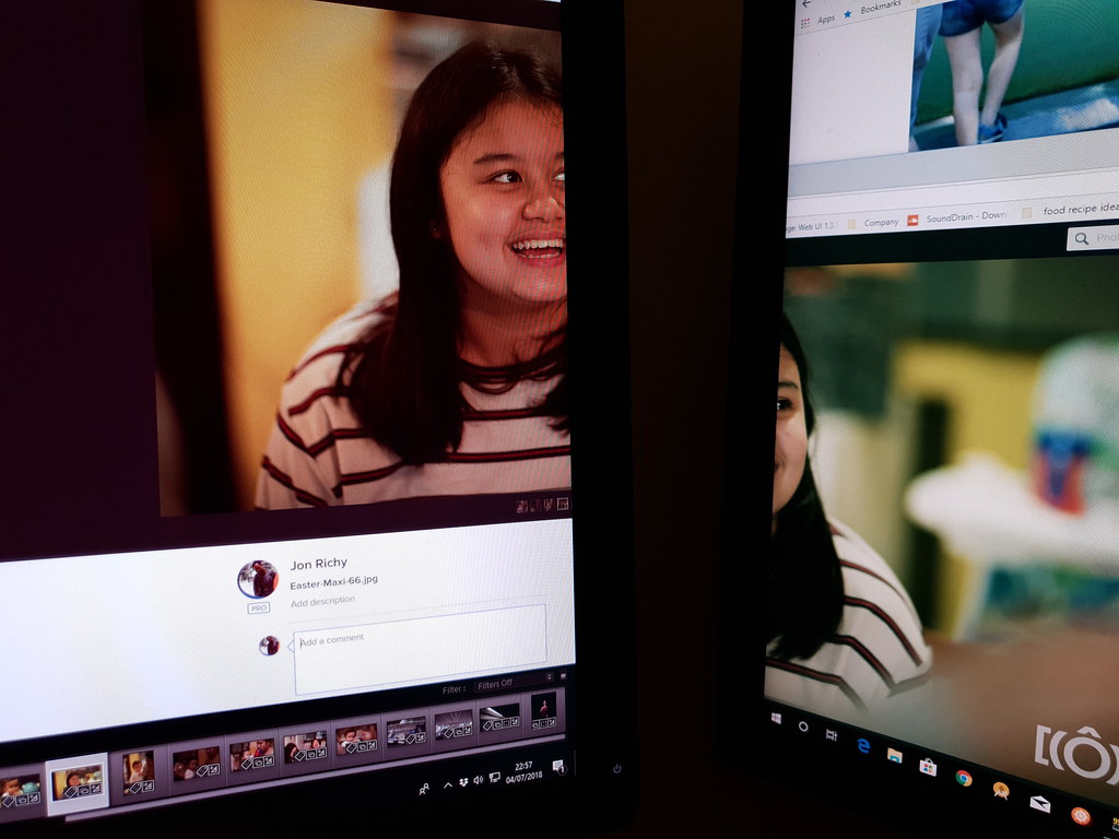 2018-07-04_10-57-27 by Jon Richy, on Flickr
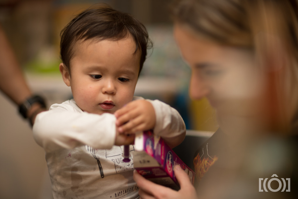 Easter-Maxi-151.jpg by Jon Richy, on Flickr
Yea true.
Looking at that shot and it is indeed warmer and diddnt even edit it
I need to sort out my monitor on the right. its calibrated wrong and that same pic is cooler!
Luckily i do my edits on the monitor u see on the left.
If i remember correctly i tweaked the AWB for use with my flash
top one ,hair looks a bit greenI edited it to be more warmer. cant remember what setting i had in camera.
This is with the A9 as well
At first sight this looks like a winter sunrise with mist risingSmouldering end to forest fires near home tonight...
Sony A73 with Samyang 35mm f2.8
Lough Fea Forest Fire by CFC Photo, on Flickr
Is it just me or does A7RII seem better of the lot?Talking about colour.... The yellow is easy to see in A7 mk1 and mk2.
View attachment 129836
View attachment 129837
Is it just me or does A7RII seem better of the lot?
Talking about colour.... The yellow is easy to see in A7 mk1 and mk2.
View attachment 129836
View attachment 129837
How do DPR take all these comparison images with multiple cameras and have the models faces exactly the same in each? Even down to the creases/laughter lines on their face.
It's a studio scene not real life people
So it's a photograph of a photograph. Cheers, I'm having a crazy day so missed the obvious!
Busy building cams?
Quality
Quality
So this is all over the issue on how I see the files?
I actually pondered the choice of the word, I could have chosen many adjectives which would be worse, in the end I chose unacceptable, and added “for my work” to qualify it, giving it a perspective and a level that you can see where I am coming from, not from a snobbery point of view but from an objectivity point of view. Clearly some people took this the COMPLETE wrong way. I was hoping you would understand that is exactly what I mean by that, I think it adds a level of objectivity in a debate of the colours of those files as presented. I fully am aware that you or anyone else may find it acceptable or amazing and thought you would know that I am aware of that too. This word suggests there is a line in the sand, a cleaner cut, as opposed to an arbitrary “meh”? I would have thought you read that and thought at most “that’s your opinion but I like it.” and that’ll be that and given others have already mentioned this and have given constructive criticism in the past, including me, you would know that I wasn’t meant to offend.


You can say the same thing to me, and I wouldn’t get offended, or may be I should because he said there are "more weird colours than he produces in a lifetime", is that something okay to say compare to what I have said? It’s just an opinion at the end of the day. So, sorry Alan if you are offended. It’s just an opinion, may be it was too blunt but I am not going to lie, I would give you all the tips how I think the files would look better (IMO) but if that isn’t the look of what you are going for, it would be pointless (which btw, I have said that before too to Alan), but for me, for my work, those files, as presented, are unacceptable. I am not sure whether I should lie and be fake and say “that looks fab, I would put my name on that!” that is as much as an insult because you know it’s not true.
You can be insulted by the choice of a single word, I can’t help it if you feel that way, I can’t take it back now but the truth is the truth. You can go on and say “oh, that wasn’t what you said previously blah blah blah.” and want to argue more, but take this post as my last word on the matter and I consider it closed.
I do know the characteristics of my old and new lenses pretty well now, for example I'm sure you'd hate the out of camera colours from my Nikon 50mm f2 but if I want to change them less than a minute in CS5 gets them how I want them YMMV.You're ignoring that this started out because Alan said Fuji wasn't very good, yet others said they'd prefer Fuji over the Sony A7.
Manual glass may be a factor in how his images look, but we all know that old manual glass can still provide class images. So I don't think that approach is being knocked. Alan has certainly produced images with improved/different colour profiles, that was done quite recently in fact.
Raymond has stated why he wouldn't go with an A7 quite clearly I thought. Someone can not like the output they see from certain gear, that's fine. Raymond doesn't like the A7 output, Alan doesn't like the Fuji output. That's about the sum of it, quite how it descended into the depths it has I don't know but then this is the internet
 especially since I downloaded Nik Filters
 Raymond... Get over this.
- I'm not obsessed and neither am I unduly offended. How can I be obsessed when looking at what pictures I take and when for every manual lens picture I take I maybe take one, two or three pictures with AF lenses on my MFT and 1" cameras. Yes, I like using old and new manual lenses on my A7 but I have a life beyond this
- How can I be offended when you're just a few lines of txt on line? I'm not one who lives and dies by on line comment so fill your boots but I would ask that you don't let this clog up the thread as no one else will give a flying.
- I sometimes process for a neutral look and sometimes for a more... artistic look... be it an old picture look or just something I think will suit the picture and my mood. If you think my pictures are off colour fine but don't judge the A7 or any other bit of kit by what I (or any one else do) take a balanced view and look at anything you might like from others, there's plenty of examples on line.
It's my 1st wedding anniversary at the weekend and if I take any pictures with my A7 I might just post some so sharpen your typing finger
Haha. Cheers. Yeah, it took a while, but I'm making up for lost time now.Seems like you're finally enjoying your new camera mate?
Are you able to make me one of these.....Cheers. I was asked by a guy who's bought one of the first 10 Chromas if I had any flyers I wanted him to give out at large format workshops he runs. Of course, I never seem to take the simple option (print them) so decided to make them from the same 2mm acrylic I'm using in part of the camera assembly. Not like I haven't got enough work to do already!
Do you want it engraved and infilled or have the Dolby branding cut from silver/chrome vinyl and stuck to gloss black acrylic?
 Dahlia, 04/07/18.
 Flower


 Exotic Flower