

cannockwolf
<span class="poty">POTY (Joint) 2016</span>
- Messages
- 2,858
- Name
- Dave
- Edit My Images
- No
Need some input on this whether it works or not
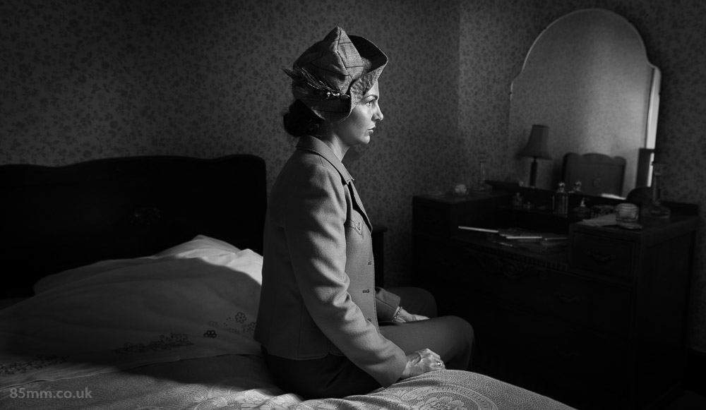 The Big Decision by David Byrne, on Flickr
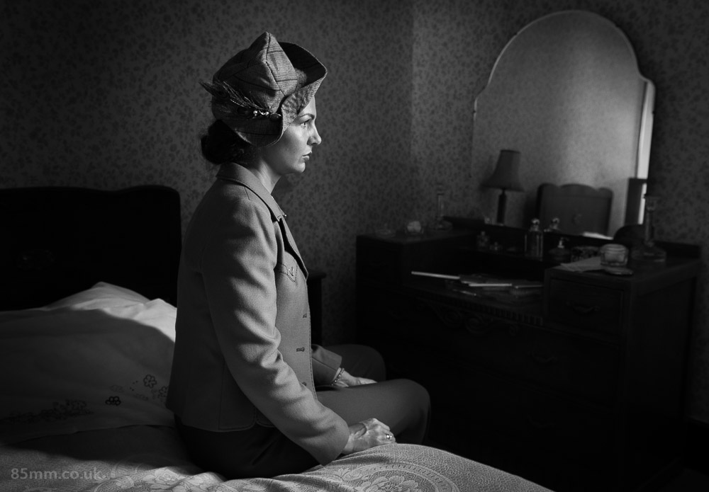 The Big Decision-2 by David Byrne, on Flickr
The Big Decision by David Byrne, on FlickrThe Big Decision-2 by David Byrne, on Flickr
Last edited:
") I still think a slightly less central placement would have been marginally more satisfying, though.
I still think a slightly less central placement would have been marginally more satisfying, though.