

You are using an out of date browser. It may not display this or other websites correctly.
You should upgrade or use an alternative browser.
You should upgrade or use an alternative browser.
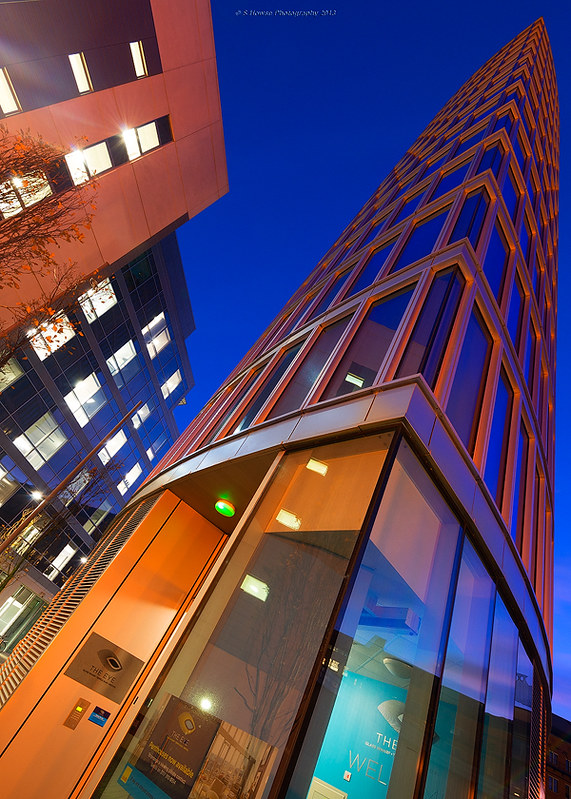
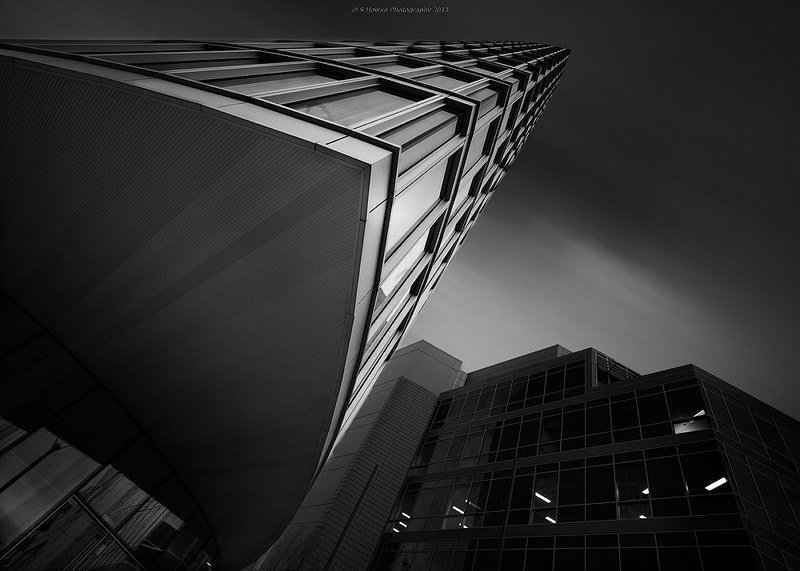
The Eye, Bristol
- Thread starter Digifrog
- Start date
OP
- Messages
- 1,069
- Name
- Scott
- Edit My Images
- No
Thanks everyone for the feedback
 I think you're right about the trees, they are a pain with architecture images. I'm not a big fan of cropping so a revisit to recompose would be best.
Moon you say") Now you've given me an idea, I can put a moon in there somewhere
Now you've given me an idea, I can put a moon in there somewhere
I plan to get my hands on Joel Tjintjelaar's B/W Masterclass videos, I think they'd be helpful.
I like them both, but the first is a bit cluttered around the building and the tree doesn't help. A tighter crop may be in order.
I think you're right about the trees, they are a pain with architecture images. I'm not a big fan of cropping so a revisit to recompose would be best.I like that first one too, nice leading lines. Gives a ton of depth to the images with the perspective. A shame there was not a moon or a plane at the top of the image for the lines to lead to, but hey, we can only shoot what is there
Moon you say
Now you've given me an idea, I can put a moon in there somewhere I plan to get my hands on Joel Tjintjelaar's B/W Masterclass videos, I think they'd be helpful.
- Messages
- 20,926
- Name
- Steve
- Edit My Images
- Yes
These are very striking, but my nod goes to the B&W
OP
- Messages
- 1,069
- Name
- Scott
- Edit My Images
- No
Cheers guys
Yes, the key difference between these two shots is that the colour is pretty much SOOC (with a little saturation & contrast adjustment and some selective sharpening) whereas the BW has been extensively edited. The original is pretty flat (contrast wise) and fairly monochromatic with a cool blue cast. I have always liked the Super Black treatment in my BW and although this isn't quite super black a lot of selective contrast work was done. As mentioned above, Joel Tjintjelaars BW Masterclass will give me more ideas on achieving that tonal depth/range and tonal separation required for strong BW images.
Tony DeSantis bought JT's Masterclass and he has got the look I love nailed to a tee.
http://www.flickr.com/photos/tony_d/
I like the black and white one as I feel its a better perspective but I would like to see the colour version of this shot.
Yes, the key difference between these two shots is that the colour is pretty much SOOC (with a little saturation & contrast adjustment and some selective sharpening) whereas the BW has been extensively edited. The original is pretty flat (contrast wise) and fairly monochromatic with a cool blue cast. I have always liked the Super Black treatment in my BW and although this isn't quite super black a lot of selective contrast work was done. As mentioned above, Joel Tjintjelaars BW Masterclass will give me more ideas on achieving that tonal depth/range and tonal separation required for strong BW images.
Tony DeSantis bought JT's Masterclass and he has got the look I love nailed to a tee.
http://www.flickr.com/photos/tony_d/
- Messages
- 910
- Name
- Andy
- Edit My Images
- Yes
shot 2 is excellent scott, really great work, thanks for sharing
cheers andy
cheers andy