

- Messages
- 8,261
- Name
- Carl
- Edit My Images
- Yes
Ive had the black perspex a while and when I last shot using it, I used my very cheap neweer lighting and softbox, though it wasnt a very large, maybe 40/50cm or so, but last month I upgraded my lights to godox with bowens fitments (yaaay) and a couple of octo-boxes which are feckin massive and just about fit through the doorway. The softbox is gridded.
I know what I need to do:
Make sure the perspex is spotlessly clean as I picked up some minor scratches/hairs/marks in the photos I have taken.
Add a kick light to the rear to highlight the rim of the objects to give some depth.
Any other tips would be gratefully received")
1.. In this test, I had some sea-salt shower gel and thought I would put some sea salt next to the product, I think if it was the bottle on its own, the image would not work as well - even though the shower gel is more like head-and-shoulder shampoo (silky smooth), sea salt is definitely not like that unless its fine of course.
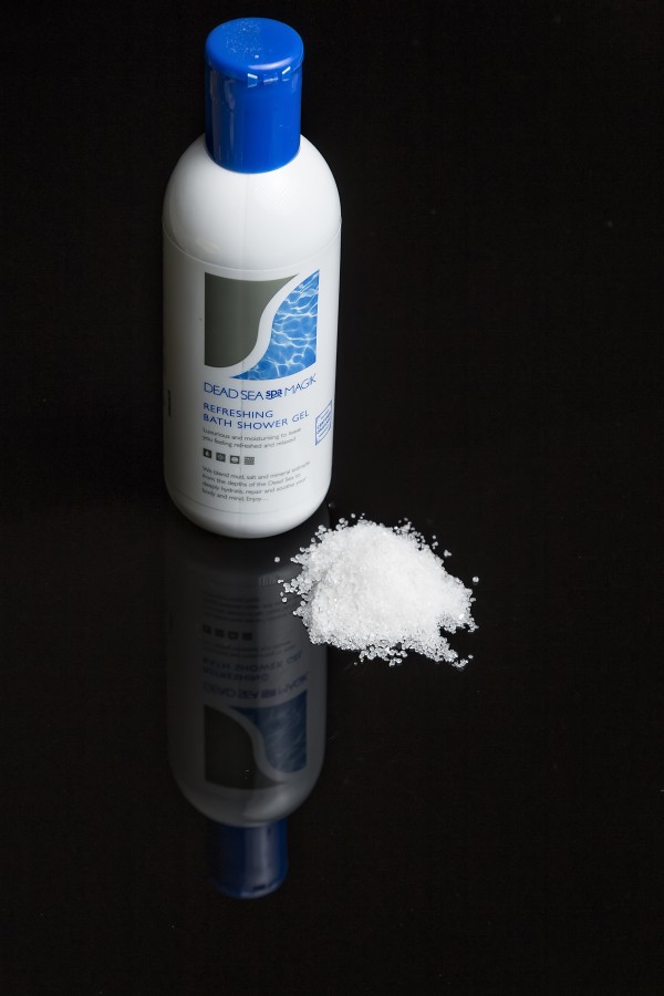 New lighting test#7 by Carl Harrison, on Flickr
2.. This is the dog's play ball. Got a few hairs on it - I wanted to use this as example because of its shape. Its non-reflective (pretty much), a bit furry and has lines in there so wanted to see how that would come out
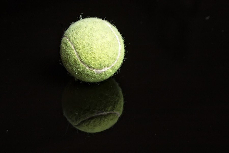 New lighting test#1 by Carl Harrison, on Flickr
3.. 3 Red Apples, personally one of my favourites because its like the above, round, but has some colour, texture and some reflective capability so I was able to see how soft the light actually was
 New lighting test#3 by Carl Harrison, on Flickr
4.. Minions favourite munchies - Bananas
 New lighting test#4 by Carl Harrison, on Flickr
5.. Bananas and an apple, just to get a mix of the above two images to see how that goes
 New lighting test#5 by Carl Harrison, on Flickr
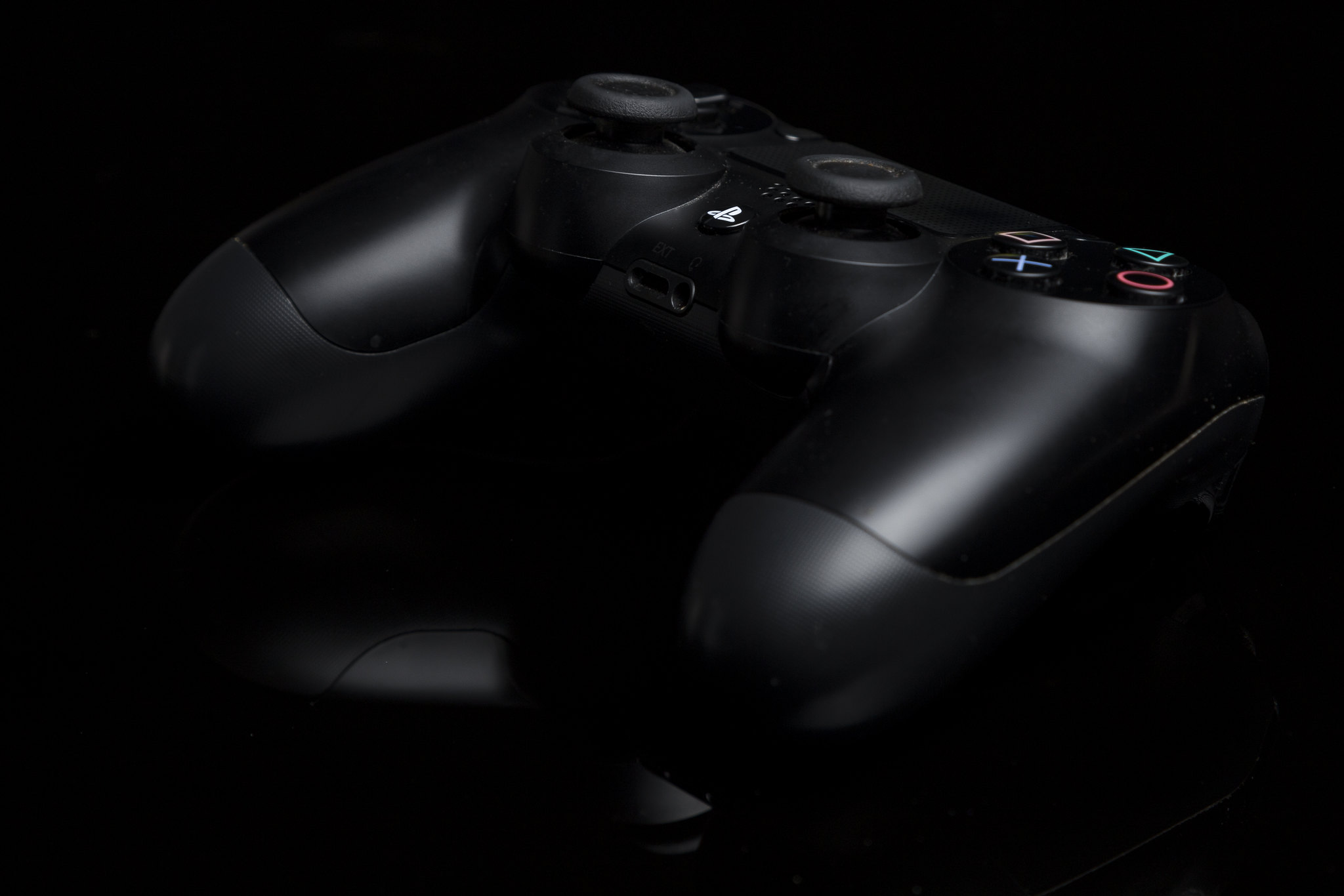
6.. Playstation 4 controller, a couple of different angles.
 New lighting test#6 by Carl Harrison, on Flickr
and
 New lighting test#6 by Carl Harrison, on Flickr
What I am happy about the images:
Hardly any processing, just camera raw, bit of contrast, set white balance to flash, set my sharpening level, cropped and saved. Should have removed the "bits" surrounding the objects - but this was a test for me so the next tests will be cleaner.
Although I a kicker light might not be so important on the fruit objects, I think it would add a lot more to the PS4 controller.
Thanks for popping in
I know what I need to do:
Make sure the perspex is spotlessly clean as I picked up some minor scratches/hairs/marks in the photos I have taken.
Add a kick light to the rear to highlight the rim of the objects to give some depth.
Any other tips would be gratefully received
1.. In this test, I had some sea-salt shower gel and thought I would put some sea salt next to the product, I think if it was the bottle on its own, the image would not work as well - even though the shower gel is more like head-and-shoulder shampoo (silky smooth), sea salt is definitely not like that unless its fine of course.
New lighting test#7 by Carl Harrison, on Flickr2.. This is the dog's play ball. Got a few hairs on it - I wanted to use this as example because of its shape. Its non-reflective (pretty much), a bit furry and has lines in there so wanted to see how that would come out
New lighting test#1 by Carl Harrison, on Flickr3.. 3 Red Apples, personally one of my favourites because its like the above, round, but has some colour, texture and some reflective capability so I was able to see how soft the light actually was
New lighting test#3 by Carl Harrison, on Flickr4.. Minions favourite munchies - Bananas
New lighting test#4 by Carl Harrison, on Flickr5.. Bananas and an apple, just to get a mix of the above two images to see how that goes
New lighting test#5 by Carl Harrison, on Flickr6.. Playstation 4 controller, a couple of different angles.
New lighting test#6 by Carl Harrison, on Flickrand
New lighting test#6 by Carl Harrison, on FlickrWhat I am happy about the images:
Hardly any processing, just camera raw, bit of contrast, set white balance to flash, set my sharpening level, cropped and saved. Should have removed the "bits" surrounding the objects - but this was a test for me so the next tests will be cleaner.
Although I a kicker light might not be so important on the fruit objects, I think it would add a lot more to the PS4 controller.
Thanks for popping in

 _MG_3331