- Messages
- 349
- Name
- Rowan
- Edit My Images
- No
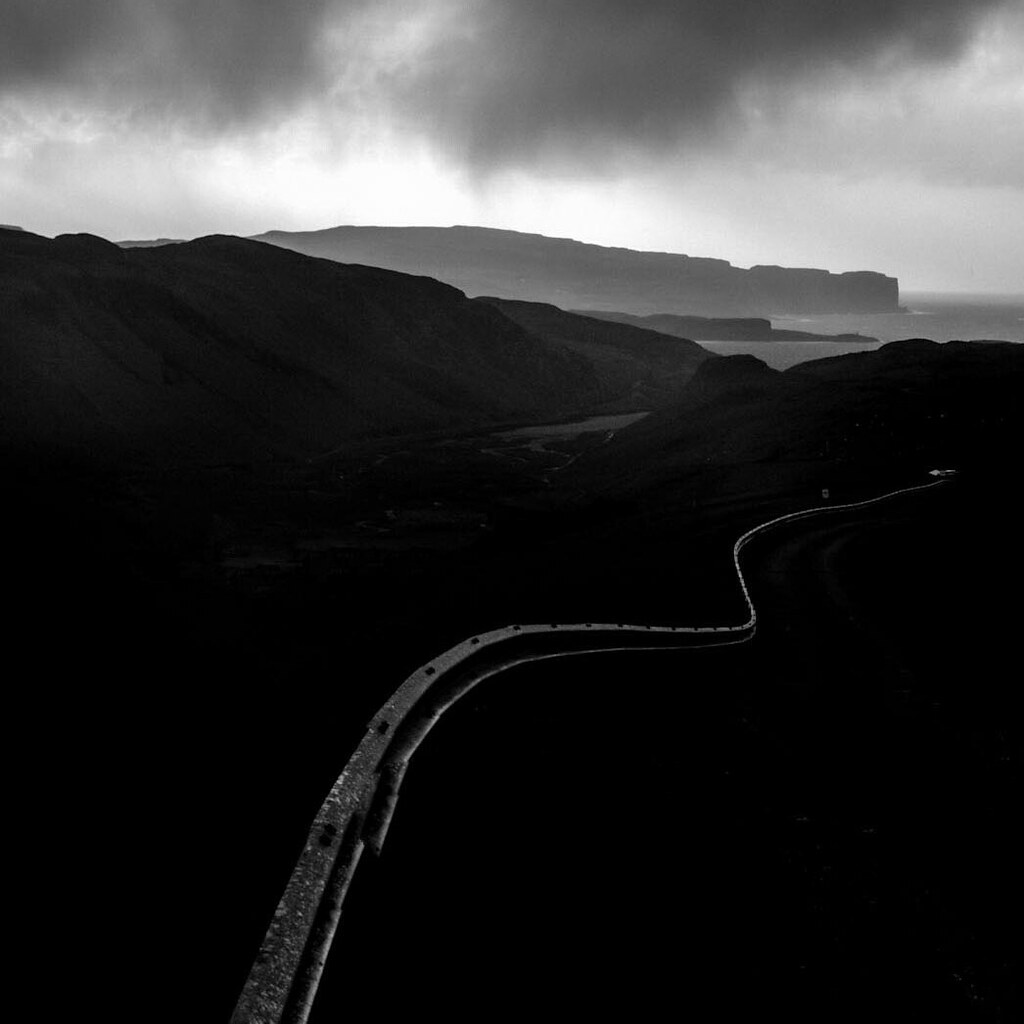
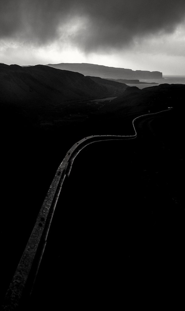
Hi everyone,
Although I don't normally shoot landscapes, it would be sacrilege not to in a place like Skye! Here's one of my favourites; as usual it would be great to hear your thoughts and critique.
Thanks!
Although I don't normally shoot landscapes, it would be sacrilege not to in a place like Skye! Here's one of my favourites; as usual it would be great to hear your thoughts and critique.
Thanks!
Last edited:
")