Which composition works best for you?

Messages
2,514
Name
Keith
Edit My Images
Yes
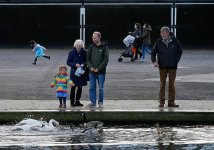
My aim here was to try and get some framing by using the white frames on the beckground shed and the line of the river bank, and I also like that the girls are closer to the centre because of their colours and for me they are the main focal point of the scene - which has the working title "Happy Days"
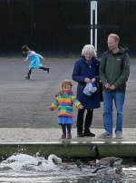
Alternatively all the people are more aligned to the centre in the second image but you dont have the framing of the posts.
Interested to know which people think is the best composition of the two.

Happy days composition.jpg

Happy days composition 2.jpg
 
IMO

The second image is better balanced:-

The child in blue is running into unobstructed negative space (in #1 the white post on the left acts like a barrier)

Furthermore, the man on the left is 'on a third' which is visually more pleasing and there is a touch of leadin line from the swans > child > couple> women with buggy.

Lastly, the subject matters (yes plural) are more like two images in one and that creates a jarring 'view' I might describe it as "neither fish nor fowl".


HTH ?
 
Last edited:
I agree with Box Brownie. Having your main interest in the centre does not usually work well and the chap on the right needs either to be a part of the picture or not there at all.
 
I’m not keen on either because the brightness of the white frames in the background dominates the foreground to my eyes. Due to that I prefer the first image because the background frames are better placed. Honestly I hardly notice what is happening in the foreground.
 
Two for me, but theres not a lot in it,
if I'm honest the white lines devide and distract a bit too much for me, I might have been tempted to try it with the top white line cut off. Just my 2p worth.
 
For me, no real main point, if it was my "family photo" I would crop a lot out and make it portrait, but I don't like what I tried at all, was just my first reaction.

e1.jpg
 
Number two. The posts are part of the resp. group structures left and right. allowing the girl on the left to be seen as an isolated figure set apart. I too wonder about cropping the horizontal line as suggested by Wayne.

Interesting discussion.

Anthony
 
You've seen the potential for a good photo by noticing the verticals and horizontals which could act as 'sub frames'. As such the three verticals works better than the two. The placing of the people is better balanced in the second. A combination of the two would be much better than either.

I reckon when trying to decide if one or another of two similar pictures I've taken is best then they both miss the mark as a good picture would stand out. :(
 
No.1 has dead space on the LHS and the guy on the RHS is a bit far to the RHS but then again it has a sort of symmetry with the equally spaced vertical white things in the background.

I can see the thinking in cropping some of the LHS out in No.2 but I think I'd still stick with No.1, for the symmetry on the background with I think is quite nice.

It's just MVHO though.

Well seen and taken Keith. Which do you prefer?
 
Last edited:
No.1 has dead space on the LHS and the guy on the RHS is a bit far to the RHS but then again it has a sort of symmetry with the equally spaced vertical white things in the background.

I can see the thinking in cropping some of the LHS out in No.2 but I think I'd still stick with No.1, for the symmetry on the background with I think is quite nice.

It's just MVHO though.

Well seen and taken Keith. Which do you prefer?
Both for different reasons but probably 2 for the better position of the people, either way it's a scene I love and I may mess around with it further.
 
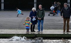
Another stab, I find the Golden Mean often works well.......there must be a reason it's stuck around for so long!
mean.jpg
 
I reckon when trying to decide if one or another of two similar pictures I've taken is best then they both miss the mark as a good picture would stand out. :(
This is what I do, too. If I can't decide then neither is good enough.

My aim here was to try and get some framing by using the white frames on the beckground shed and the line of the river bank, and I also like that the girls are closer to the centre because of their

I think you might be overthinking the composition at the expense of the subject.
IMO there are 3 or 4 different pictures in this image; attempts to shoot a whole scene often fall short.

In your position I would have tried to get lower and framed much tighter on the central group of 3 - but tried to find an angle where the white posts didn't interfere.
 
In your position I would have tried to get lower and framed much tighter on the central group of 3 - but tried to find an angle where the white posts didn't interfere.
I too would have done the same. The white posts are sticking out of the head of one o the subjects and detract from this composition.
 
I think a lot of people are in agreement that trying to get too much into the image can fall short, it's a nice image but it would have worked brilliantly if two things were different.
Firstly the woman pushing the pram - Her leg would ideally not intersect with the man's arm.
Secondly, pulling further out and having a third background subject in the empty space to the right of the couple pushing the pram. This would have given a reason for pulling wider, and shown a coincidence and a balance that would really draw attention. The three subjects framed by the surrounding white beams, plus the two subjects in line with the middle two white beams.

The wider you shoot, the more things that have to perfectly fall into place to make a great image. It hardly ever happens but when it does it's magic. Unless there's a compelling compositional reason to go wide, you're better off coming in close and doing your best with a smaller frame.

But it's no use worrying about elements that were never there that could have made it better - Working with what you have here in front of you, I would perhaps take several steps to the left to frame the main subjects between those white beams and crouch down lower to create a horizon line from the grey asphalt so that at least the head + shoulders of the man and the woman would rise above the horizon line and into that dark frame.
Then it's just a matter of timing for when you click the shutter (other people have passed out of the way / the birds are doing something compelling etc.). Given their positioning, you could end up with a nice diagonal from upper right to lower left, going from the man, to the woman, down to the child, and if you wait a while and the birds move slightly left and the gazes of all three are directed at the birds, you would have a slam dunk diagonal composition.
 
Back
Top