

- Messages
- 741
- Name
- Tom
- Edit My Images
- Yes
So i've begun a series of portrait images featuring friends and family, that also features whisky. Deliberately looking at a square format and have done the first couple of images over the last week so sharing for critique and thoughts.
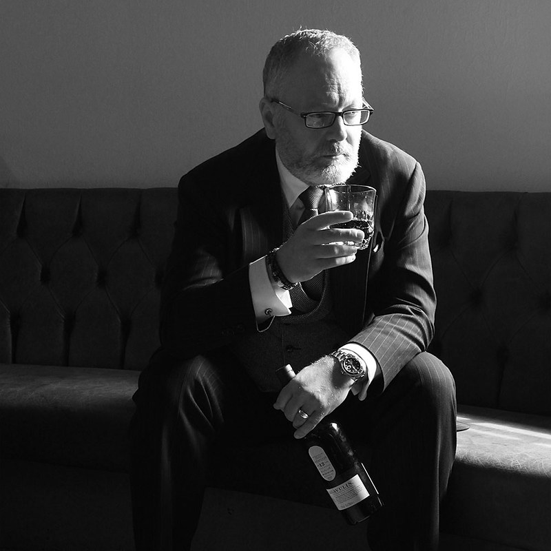
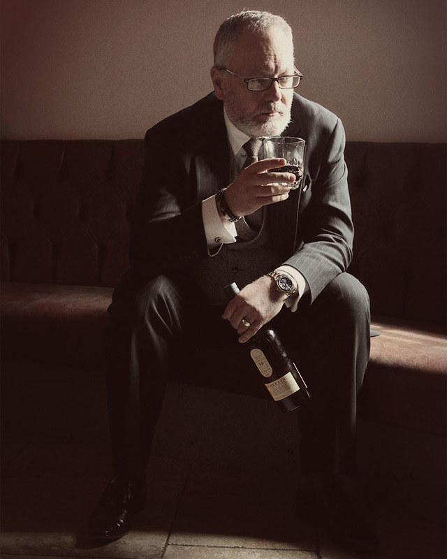
Image 1 - Richard
 richard by Tom Thomson Photographer, on Flickr
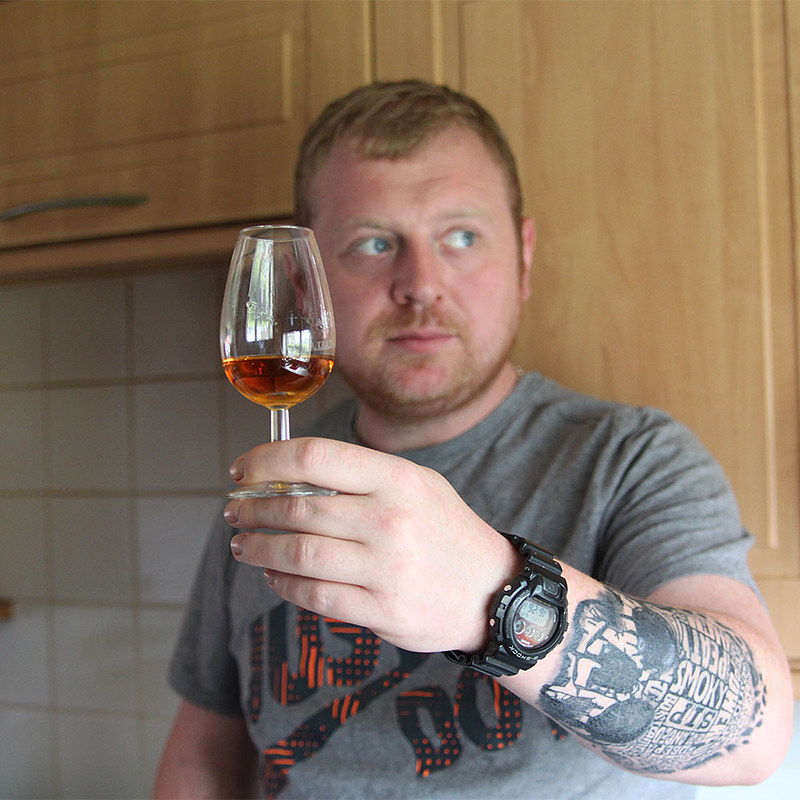
Image 2 - Scott
 Scott by Tom Thomson Photographer, on Flickr
Image 1 - Richard
richard by Tom Thomson Photographer, on FlickrImage 2 - Scott
Scott by Tom Thomson Photographer, on Flickr")
 Scott Colour Edit