
and the site receives a small commission

You are using an out of date browser. It may not display this or other websites correctly.
You should upgrade or use an alternative browser.
You should upgrade or use an alternative browser.
Why would you render in B&W verses Colour.........whats the consensus ???
- Thread starter ndwgolf
- Start date


- Messages
- 11,278
- Name
- Jak
- Edit My Images
- No
- Messages
- 2,168
- Name
- Steve, Coventry, England
- Edit My Images
- Yes
I don't even know if Consensus is the right word but it sounds posh so I'll stick with it.
Why would you render in B&W verses Colour.........
View attachment 394831View attachment 394832
In this photo, I like the B&W better, the model stands out from the background better, but if it had been in different surroundings????? Don't know, until I see
")
I normally prefer architecture/motor-sport/machinery and similar for B&W and avoid parks/gardens full of green, people depends more on surroundings.
- Messages
- 23,537
- Name
- Toni
- Edit My Images
- No
Mono seems to favour your model's skin more.
In general, I like it because it simplifies the scene, bringing it down to key elements.
In general, I like it because it simplifies the scene, bringing it down to key elements.
OP
- Messages
- 4,375
- Name
- Neil Williams
- Edit My Images
- No
Gav what makes an artist choose between a B&W or colour image……. That’s the questionAre you refering to your images above or as an open question??
If the images above, I'd think it's down to your personal taste and what you enjoy
- Messages
- 9,910
- Name
- Graham
- Edit My Images
- Yes
If there are multiple sources of different types of light, B&W can be handy.
A great example I had was a wedding in France where there was natural light coming through the windows, interior lighting and also wall mounted heaters. They were all producing different colour temperatures causing a bit of a nightmare in some shots. B&W sorted it.
I also find it good if high contrast is desired or a very artistic or dated look.
I don't particularly like B&W with baby and child photography. Their skin tones don't warrant it in my opinion.
Gav.
Challenge Owner
- Messages
- 7,731
- Name
- Gav
- Edit My Images
- Yes
I'd choose colour, unless the light or colour distracted from the image or I was looking to shoot B&W from the start ie LowkeyGav what makes an artist choose between a B&W or colour image……. That’s the question
- Messages
- 9,790
- Name
- wayne clarke
- Edit My Images
- Yes
I think for me it about "seeing" in BW. I shot BW for many years and still can visualize what a shot would look like before I take it. So when I see a shot I think works in BW I shoot with the conversion in mind. Sometimes I'll even shoot it in BW in camera (raw and jpeg so I have the option later of colour or a better conversion) mostly to see if I like the result. I set a custom option on the mode dial for a BW with orange filter raw/jpeg and up the contrast a click or two, that way I just turn off from AV to C1 and instant BW the way I like it.
At the end of the day it's what works for the individual.
At the end of the day it's what works for the individual.
Last edited:
- Messages
- 25,327
- Name
- Phil
- Edit My Images
- No
I prefer B&W as a general rule (though can't remember my last B&W conversion). That obviously falls down whenever colour is a major component in the composition.
In your shot above - I'm on the fence as to the blue bikini being a striking enough contrast to say that the colour is better.
In your shot above - I'm on the fence as to the blue bikini being a striking enough contrast to say that the colour is better.
OP
- Messages
- 4,375
- Name
- Neil Williams
- Edit My Images
- No
Phil the Bikini is actually Black with white lettersIn your shot above - I'm on the fence as to the blue bikini being a striking enough contrast to say that the colour is better.
- Messages
- 25,327
- Name
- Phil
- Edit My Images
- No
it looks royal blue on my screenPhil the Bikini is actually Black with white letters
time to calibrate maybeThough I'm rusty in PS, the below shows some blue, even if I can't find the RGB values as easy as I ought to be able to - this is sampled from the bikini top
Last edited:

- Messages
- 2,872
- Name
- Chris
- Edit My Images
- Yes
IMO this works converted not all do , its horses for courses

From this

From this
OP
- Messages
- 4,375
- Name
- Neil Williams
- Edit My Images
- No
My bad. It’s dark blue
- Messages
- 1,563
- Name
- Jamie
- Edit My Images
- Yes
If the colour adds nothing to the image, it's probably better off in B+W.
In the image you posted, there's not much going on colour-wise. Her skin is practically the same colour as the sand and there's nothing else to add any colour-contrast. If there were some vivid aqua or blue, or any bright colour in the scene it would help to grab attention - Her outfit, a beachball, ocean in the background would all work.
For me in general, I look for light - The direction, softness, falloff, shape... Colour is literally the last thing I look for so I almost "see" in mono anyway. I guess I default to mono, and add colour when it's needed, whereas most people see colour as the default, and convert to mono if colour isn't working.
- Messages
- 9,910
- Name
- Graham
- Edit My Images
- Yes
IMO this works converted not all do , its horses for courses
From this
I really like your colour processing in the colour version as well, you've got the greens and blues complimenting each other perfectly.
- Messages
- 7,089
- Name
- Lewis
- Edit My Images
- Yes
It is difficult, for example, the first images I prefer the B&W version, I think because the subject stands out more. However, on the castle images I prefer the colour, as it gives the castle more separation from the hill it is built on.
I tend to default to colour, but am going to make an effort to take some black and white images. As I am shooting mirrorless, I can set the EVF to B&W, which may help.
I tend to default to colour, but am going to make an effort to take some black and white images. As I am shooting mirrorless, I can set the EVF to B&W, which may help.
OP
- Messages
- 4,375
- Name
- Neil Williams
- Edit My Images
- No
My bad. It’s dark blue
- Messages
- 490
- Edit My Images
- Yes
Beautiful!
- Messages
- 490
- Edit My Images
- Yes
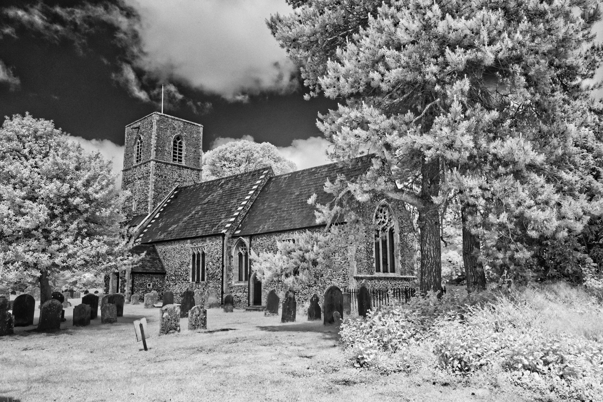
I think old building's should always be in B&W. Old discarded farm equipment also. Hazy memory of the past!


Last edited:
- Messages
- 3,270
- Name
- Graham
- Edit My Images
- No
I will have a go at this, at least in terms of my personal views. In general, I prefer looking at, and making, black and white images over colour, but certainly not to the exclusion of colour. I am also (ignoring my interests in wildlife), mainly interested in landscape.Gav what makes an artist choose between a B&W or colour image……. That’s the question
Beyond the subject itself, I am primarily attracted to the shapes, form, textures, tonality and colours in and around the subject. And it's an attempt to "balance" these aspects that can make an interesting subject into an interesting photograph, or indeed, a rather ordinary subject into an extraordinary photograph.
I find it easy for colour to dominate a photograph, and overpower the subject. So the use of colour needs to be a conscious decision for when it's considered important for the photograph. I also think that colour works best when the photographer has consciously "colour graded" the image to enhance the "feel" they want to convey with the photograph. By colour grading I mean careful and subtle manipulation of colour, contrast and saturation, in a manner that is sympathetic t he subject and reflects the photographers feelings towards the subject.: not "enhancing" reality to make eye grabbing photographs that "pop".
I find "Realistic" colours rather disappointing, compared to reality as they seem either unrealistic or over saturated and over-sharpened. No one likes scientifically realistic colours, so we are always fighting against the fact that none of of us see colours as they really are, and we all see colours slightly differently to each other.
I try to make the colour or B/W decision at the time of making the exposure whether a picture is "all about the colours" and the subject itself isn’t that important, or whether colour is essential to convey some important aspect of the subject. I usually try and "see" the image in front of me as a final print., which I also find useful for tweaking composition.
Other than that, I tend to be more interested in the shapes, forms, textures and tonality of an image where the subject and surroundings are more graphical than colourful. But finding images that work in black white, is at least as difficult, if not ,more difficult than finding those that work in colour. It certainly seems much easier to produce "OK" colour images than "OK" black and white images. Very rarely, will an image taken with colour in mind work as a black and white, but if I like the subject enough, making a colour image will often save an image I had originally visualised as being black and white.
Because I can often rescue a failed black and white image (but rarely the other way round), I am primarily seeing the world in black and white, except for when its screams "this needs to be in colour". I find it difficult to actively think/visualise in colour and black and white at the same time, so although I occasionally have days, when I find myself concentrating on colour images, I don't often switch during the day, unless, as explained above, something demands colour.
So, overall, and with the exceptions mentioned. it's the subject that chooses whether I photograph it with black and white or colour in mind and, most of the time, this also decides whether the final image is in colour or back and white.
In practise, I'm not as organised and structured as this suggest, but the overall principles still underpin how I choose between colour or black and white.
RedRobin
Dances With Dogs
- Messages
- 9,314
- Name
- Robin
- Edit My Images
- Yes
Personally, my default is to shoot in colour. However, some images lend themselves well to a B&W interpretation and current RAW editors offer very extensive options for conversion to B&W including even the type of darkroom film paper represented.
Occasionally, not often, a colour image is too much of a nightmare to get the colours right and I use B&W to come to the rescue as it completely sidesteps the colour issues.
Many decades ago when I shot architecture on a Nikon 35mm film camera I only shot B&W and only thought in B&W. I loved the yellow / orange / red filters!
RedRobin
Dances With Dogs
- Messages
- 9,314
- Name
- Robin
- Edit My Images
- Yes
.... For me, this sexy baby looks much more appealing in your B&W photo.I don't even know if Consensus is the right word but it sounds posh so I'll stick with it.
Why would you render in B&W verses Colour.........
View attachment 394831View attachment 394832
RedRobin
Dances With Dogs
- Messages
- 9,314
- Name
- Robin
- Edit My Images
- Yes
An example of the same RAW image being post-processed in both colour and then B&W. Digital photography is such an advantage!
Your preference is simply a matter of personal taste. I like each for different reasons, hence why I have published them both.
 BLACK FIVE IN COLOUR by Robin Procter, on Flickr
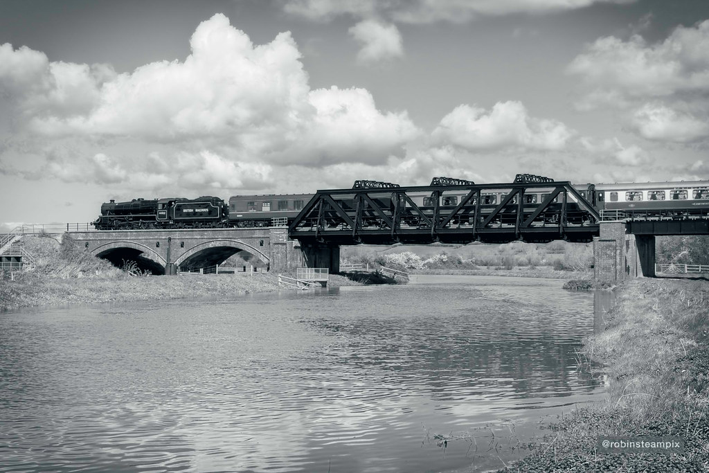 BLACK & WHITE PICTURE OF A BLACK FIVE LOCO by Robin Procter, on Flickr
Your preference is simply a matter of personal taste. I like each for different reasons, hence why I have published them both.
BLACK FIVE IN COLOUR by Robin Procter, on FlickrBLACK & WHITE PICTURE OF A BLACK FIVE LOCO by Robin Procter, on Flickr