
You are using an out of date browser. It may not display this or other websites correctly.
You should upgrade or use an alternative browser.
You should upgrade or use an alternative browser.
weekly Joshwain's Photo52 of 2012. - Week 7 added! (Root)
- Thread starter Joshwain
- Start date
OP
- Messages
- 1,379
- Edit My Images
- Yes
Nice subject Josh and fits rather nicely, if i'm being hyper critical i'd have liked to see the tenner flat on the surface, the crease on the left hand side i find distracting
Well, the shot has made you "sigh"
")

jgs001
Brian Cox
- Messages
- 12,646
- Name
- John
- Edit My Images
- Yes
A good three to be getting along with Josh... As for the Joker in week 2... you were kinda busy ...
Direction : A good interpretation
Fear : A good use of DOF... the only thing I'd say would be to try and adjust things to prevent the blurred pole coming out of the dog.
Sigh : Makes sense...
... Direction : A good interpretation
Fear : A good use of DOF... the only thing I'd say would be to try and adjust things to prevent the blurred pole coming out of the dog.
Sigh : Makes sense
...- Messages
- 8,398
- Name
- Lynne
- Edit My Images
- Yes
Hi Josh
Joker it maybe but that is one lovely shot of a cutie pooch...
Sigh....yup , that looks like my current bank balance Right on theme....uncurl the tenner & add a bill & it's spot on
Good luck with your exam results mister
Joker it maybe but that is one lovely shot of a cutie pooch...
Sigh....yup , that looks like my current bank balance
Right on theme....uncurl the tenner & add a bill & it's spot on Good luck with your exam results mister
OP
- Messages
- 1,379
- Edit My Images
- Yes
Here I am in my fourth week of my Photo52 challenge. As promised, I'm becoming more committed to the challenge and I have no exams until the summer now so it's full steam ahead with photography! 

Photo52 (4) - Sweet by Joshwain, on Flickr
ISO 800
f/5.6
1/50 sec
This is more or less a self explanatory interpretation of the topic. It isn't exactly ambitious but I think it is quite a good result to say it was taken with my 18-55mm kit lens. I would have loved to get a nice shot of some falling sugar but I don't have enough, or should I say any good lighting equipment to do that. Maybe in the future though
- Messages
- 1,513
- Name
- Alex
- Edit My Images
- Yes
I like it but I think the sugar needs some more light.
Yay for no exams!
Yay for no exams!
OP
- Messages
- 1,379
- Edit My Images
- Yes
I like it but I think the sugar needs some more light.
Yay for no exams!
It wasn't exactly the best place to shoot for light
The far end of a kitchen that only has a tiny window on a dull day.But yay for no exams indeed, going to spend tomorrow with my camera rather than with a pile of mind maps and text books
- Messages
- 6,633
- Name
- Paul
- Edit My Images
- No
Here I am in my fourth week of my Photo52 challenge. As promised, I'm becoming more committed to the challenge and I have no exams until the summer now so it's full steam ahead with photography!
Photo52 (4) - Sweet by Joshwain, on Flickr
ISO 800
f/5.6
1/50 sec
This is more or less a self explanatory interpretation of the topic. It isn't exactly ambitious but I think it is quite a good result to say it was taken with my 18-55mm kit lens. I would have loved to get a nice shot of some falling sugar but I don't have enough, or should I say any good lighting equipment to do that. Maybe in the future though
Nice and simple again, but the sugar definitely needs a little more light in it.
OP
- Messages
- 1,379
- Edit My Images
- Yes
I was pretty stumped when I saw this week's topic but after a bit of thought I came up with this.
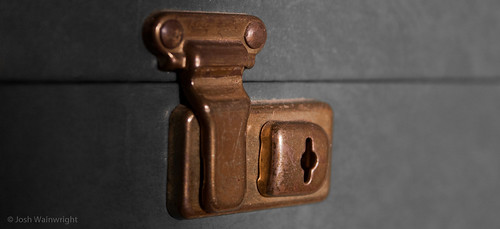
Photo52 (5) - Secure by Joshwain, on Flickr
ISO 800
f/5.6
1/200 sec
Similar to week 1, this has a little story behind the interpretation. This is my mum's jewellery box and I can remember her going in it when I was younger and seeing all her jewellery, so obviously I'd try to get in it after she left the room. I could never get in though for some reason, and she never seemed to lock it. Anyway, years later I found out that to open it you just have to push the key hole to the left rather than pulling the flap up or whatever I used to try
So there you have it, secure
OP
- Messages
- 1,379
- Edit My Images
- Yes
I like that as it's got a real used / distressed look. I would have cropped a bit off the left though as I think it's a little central
Hmmm, I kind of liked the shadow to the left though
OP
- Messages
- 1,379
- Edit My Images
- Yes
I like the shadow, I think there's either just a little too much or it's just too black right at the edge I think
Yeahh, I kind of agree now I've looked at it again. I'll leave it as it is though, I've put it up now so I'll have to bear things like that in mind for other weeks. I can look back and think "That one could have been loads better"
- Messages
- 522
- Edit My Images
- Yes
Direction - crisp and clear and a nice take on the theme. Agree that it would be better without the curled page but tbh it's not the end of the world!
Sigh - Nice black background and the curls etc add character to the cash. I don't think it'd work as well with new notes.
Sweet - as per the other comments really, more light needed and a less straightforward angle.
Secure - Simple but effective.
Sigh - Nice black background and the curls etc add character to the cash. I don't think it'd work as well with new notes.
Sweet - as per the other comments really, more light needed and a less straightforward angle.
Secure - Simple but effective.
- Messages
- 6,502
- Name
- Peter
- Edit My Images
- Yes
Sigh – Don’t worry you’ll be equally broke when you’re earning and having to pay the bills
Sweet – As said above a bit more light would help this
Secure – I quite like the drop off of light on this one
Sweet – As said above a bit more light would help this
Secure – I quite like the drop off of light on this one
OP
- Messages
- 1,379
- Edit My Images
- Yes
Direction - crisp and clear and a nice take on the theme. Agree that it would be better without the curled page but tbh it's not the end of the world!
Sigh - Nice black background and the curls etc add character to the cash. I don't think it'd work as well with new notes.
Sweet - as per the other comments really, more light needed and a less straightforward angle.
Secure - Simple but effective.
Sigh Dont worry youll be equally broke when youre earning and having to pay the bills
Sweet As said above a bit more light would help this
Secure I quite like the drop off of light on this one
Thanks guys
I agree that Sweet could have been loads better and I'll learn from my mistakes, that's what this challenge is for
- Messages
- 1,101
- Name
- Stephen
- Edit My Images
- No
hi Josh, sorry for not stopping by sooner.
Nice idea with the direction - again curly page issues and some slight damage on the top edge, but you know about that.
The sigh is good. Nice idea and I'll take cash crumpled or not, but I think it looks better with a nice crumple.
Sweet; what a great idea. Again, more light on the sugar but a nice concept.
The secure shot is nicely in focus and I don't think I'd take too much of the shadow away; maybe a half of it. Like everything though, its subjective. Well done.
OP
- Messages
- 1,379
- Edit My Images
- Yes
hi Josh, sorry for not stopping by sooner.
Nice idea with the direction - again curly page issues and some slight damage on the top edge, but you know about that.
The sigh is good. Nice idea and I'll take cash crumpled or not, but I think it looks better with a nice crumple.
Sweet; what a great idea. Again, more light on the sugar but a nice concept.
The secure shot is nicely in focus and I don't think I'd take too much of the shadow away; maybe a half of it. Like everything though, its subjective. Well done.
Thanks mate
I'm going to try get out this week for 'Industry', I think the indoor shots are getting a bit boring to see
- Messages
- 1,195
- Name
- Simon
- Edit My Images
- Yes
Hi Josh, still playing catch up with threads...
Direction - nice shot, well lit and great dof, only niggle for me is the small curl at the top of the page.
Fear - lovely shot, hehehe i'm a sucker for cute dogs though.
Sigh - great interpretation on the theme, just maybe a tad more light on it.
Sweet - another good shot with great dof.
Secure - simple but effective, bang on theme too.
Good work so far fella, looking forward to seeing more
OP
- Messages
- 1,379
- Edit My Images
- Yes
Hi Josh, still playing catch up with threads...
Direction - nice shot, well lit and great dof, only niggle for me is the small curl at the top of the page.
Fear - lovely shot, hehehe i'm a sucker for cute dogs though.
Sigh - great interpretation on the theme, just maybe a tad more light on it.
Sweet - another good shot with great dof.
Secure - simple but effective, bang on theme too.
Good work so far fella, looking forward to seeing more
Thanks
Industry is going to be a difficult one but I have something in mind if I can get close enough with my 18-55mm kit lens
- Messages
- 13,760
- Edit My Images
- Yes
Catch up time
Sweet - great idea Josh.. it's amazing ow they get the sweetness in the little tab - anyway back to the pic, I like the composition, with a tiny bit more light (even a led torch) at it would sparkle
Secure - Again, a great Idea, I too feel a small crop would help, but I must say I really like the lighting
Sweet - great idea Josh.. it's amazing ow they get the sweetness in the little tab
- anyway back to the pic, I like the composition, with a tiny bit more light (even a led torch) at it would sparkleSecure - Again, a great Idea, I too feel a small crop would help, but I must say I really like the lighting
OP
- Messages
- 1,379
- Edit My Images
- Yes
Catch up time
Sweet - great idea Josh.. it's amazing ow they get the sweetness in the little tab
Secure - Again, a great Idea, I too feel a small crop would help, but I must say I really like the lighting
Improvements that I will bear in mind for the weeks to come, thanks for the post
Hi,
Great 52 thread, I like the fact you tell a story with the pictures.
Matt
Cheers mate, I kind of want a story to look back on and an explanation behind my interpretation. Something different I suppose
- Messages
- 8,398
- Name
- Lynne
- Edit My Images
- Yes
Hi Josh
little catch up from me...missed a couple of weeks as spreadsheet not updated
Sweet.....on theme...simple but it does work , slightly lighter as said but like
Secure....right on theme & loved your story to go with it....great DOF ,sharp on the lock , nice angle & 2 simple colors
little catch up from me...missed a couple of weeks as spreadsheet not updated
Sweet.....on theme...simple but it does work , slightly lighter as said but like
Secure....right on theme & loved your story to go with it....great DOF ,sharp on the lock , nice angle & 2 simple colors
OP
- Messages
- 1,379
- Edit My Images
- Yes
Hi Josh
little catch up from me...missed a couple of weeks as spreadsheet not updated
Sweet.....on theme...simple but it does work , slightly lighter as said but like
Secure....right on theme & loved your story to go with it....great DOF ,sharp on the lock , nice angle & 2 simple colors
Thanks Lynne
Just bought a 55-250mm lens online so I should have that ready for next week's topic. I'm off out to get Industry tomorrow though
OP
- Messages
- 1,379
- Edit My Images
- Yes
I promised myself I would go out and get a good shot this week but a lack of motivation seemed to get on top of me so here's what I came up with
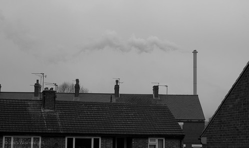
Photo52 (6) - Industry by Joshwain, on Flickr
ISO 200
f/8.0
1/400 sec
It's a poor shot and a simple interpretation once again but I promise next week's will be better as I have the week off college and a new 55-250mm lens coming. Anyway, this is a shot from my bedroom window of what I wake up to every morning. Pretty sight, I know It's one of the chimneys of a nearby coking plant that seems to be pumping out some every second of every day. I thought about going to the plant and taking a shot from there but I thought it would be better to show how it fits into my life
Photo52 (6) - Industry by Joshwain, on Flickr
ISO 200
f/8.0
1/400 sec
It's a poor shot and a simple interpretation once again but I promise next week's will be better as I have the week off college and a new 55-250mm lens coming. Anyway, this is a shot from my bedroom window of what I wake up to every morning. Pretty sight, I know
It's one of the chimneys of a nearby coking plant that seems to be pumping out some every second of every day. I thought about going to the plant and taking a shot from there but I thought it would be better to show how it fits into my life
OP
- Messages
- 1,379
- Edit My Images
- Yes
Week 7 and some motivation finally seems to be kicking in!

Photo52 (7) - Root by Joshwain, on Flickr
ISO 200
f/5.0
1/200 sec
This is probably the first week I am fully pleased with my shot. I took it today out at the Yorkshire Sculpture Park. It looks like I have edited it quite a bit but I really haven't, the stump was actually strangely full of colour. I don't think I need to explain my interpretation
Bring on tomorrow's theme!
- Messages
- 13,760
- Edit My Images
- Yes
Industry - Nice to see how you see this in your every day life, B&W sure suits it, good to still get the shot when not motivated
Root - now that is one hell of a stump, when viewed 'large' there is some cracking colours/textures in that there wood - nice shot
I'd be tempted to put a larger shot in your post
Root - now that is one hell of a stump, when viewed 'large' there is some cracking colours/textures in that there wood - nice shot
I'd be tempted to put a larger shot in your post
- Messages
- 999
- Name
- Roly
- Edit My Images
- Yes
That must of been one hell of a huge tree, bet that kept a few people warm this winter.
Agree with DK, when viewed larger you can really see the colour and textures come out, reminds me of ayers rock.
Good work
Agree with DK, when viewed larger you can really see the colour and textures come out, reminds me of ayers rock.
Good work
- Messages
- 6,502
- Name
- Peter
- Edit My Images
- Yes
Industry - Good use of B&W but I'd have liked to have seen the factory rather than the houses in the foreground.
Root - As said the textures are great on this one.
Root - As said the textures are great on this one.