weekly foggy4evers 52 2013 Below added

First one is fantastic for gravity. Nothing to crit there at all. The ice cube does look a bit like a severed finger, though. :D

Nice clean image for wild. I think the swan may be a little too close to the centre though, maybe a crop with it a bit more to the left?
 
Last edited:
Agree about a crop on the swan bit off the LHS and bottom, nice colour on the water works for me
 
I like the crop as it is, the swan is placed nicely in the frame, like the DOF also, good shot.
 
Hi ya


Wild....SUPERB...nuff said :clap:

Gravit...#1 for me....love everything about it , the color , the BG , the little drops (y) If I'm being mega mega mega picky.....there's a few little white spot type things on the stem of the glass?
 
I could look at that for ages... I keep thinking 'tighter crop' but then again the space around it kind of adds to the wild element, as well as adding emphasis to the DOF. It's a very pleasing image to look at for me.
 
(y) Very sharp, and I like the colours and the light, they look natural to me. The others on Flickr are good too.
 
A lovely shot of the swan, with great light. Agree, a slight crop would benefit. Well done!
 
Beautiful! Only thing i would say is maybe a closer crop?

This sort of thing was the first thing in my mind too. Well done for being so quick!

Cheers...... +1 for a crop

Nice photo for Wild. Lighting works well keeping the water blue and the swan white. But I agree with the above comment about a closer crop possibly.

Thanks.....+2 for a crop :D

Well done mate, nice capture and nothing like hitting the ground running on day one.

Personally, I like the space around it. (y)

Cheers.....+1 no crop

Like it. Despite the light,mother colours and contrast a nice. The detail is as well.

I did a slight crop, and it felt better to me.

I'll keep an eye out for any more you post.

Cheers.

Cheers Andy......+3 for a crop

First one is fantastic for gravity. Nothing to crit there at all. The ice cube does look a bit like a severed finger, though. :D

Nice clean image for wild. I think the swan may be a little too close to the centre though, maybe a crop with it a bit more to the left?

All I can see now is a severed finger :bonk:

+4 for a crop

(y)

Agree about a crop on the swan bit off the LHS and bottom, nice colour on the water works for me

Cheers.....+5 for a crop

I like the crop as it is, the swan is placed nicely in the frame, like the DOF also, good shot.

Thanks....+2 for no crop

Hi ya


Wild....SUPERB...nuff said :clap:

Gravit...#1 for me....love everything about it , the color , the BG , the little drops (y) If I'm being mega mega mega picky.....there's a few little white spot type things on the stem of the glass?

Cheers Lynne, the white spots are a few splashes from previous attempts.

I could look at that for ages... I keep thinking 'tighter crop' but then again the space around it kind of adds to the wild element, as well as adding emphasis to the DOF. It's a very pleasing image to look at for me.

Cheers, Ill put you down for no crop +3

(y) Very sharp, and I like the colours and the light, they look natural to me. The others on Flickr are good too.

Cheers, it's a place I've been to a few times and I love to shoot the Swans as they are so graceful

wonderful light and tones, like the ripples on the water.. certainly says wild..

Cheers (y)

A lovely shot of the swan, with great light. Agree, a slight crop would benefit. Well done!

Thanks and I think that makes you +6 for the crop


Well the census says crop but I like it as is so :razz:

:D
 
Hi, I do like Space #1. Of the three, I feel #3 could stand on its own. Love the rich red and the black compliments it.

Cheers and I like the build sequence.

Cheers.
 
Really like the set of 3. The focus in 1 and 3 works really well. The middle shot strikes me as a bit busy in the company it's in, but i really like the movement blur. A really nice take on the theme too.
 
ALso think space works well - #3, #1, and #2 in order of preference for me individually, but work well laid out as they are.

Middle one is a bit busy, I think the tape measure at the front is possibly unnecessary, as is your chin. The blur is great - some speedy sawing going on there :LOL:

But love the DOF used on the first two - and agree the pool shot would stand up on its own quite happily.
 
Hi, I do like Space #1. Of the three, I feel #3 could stand on its own. Love the rich red and the black compliments it.

Cheers and I like the build sequence.

Cheers.

Thanks Andy

Really like the set of 3. The focus in 1 and 3 works really well. The middle shot strikes me as a bit busy in the company it's in, but i really like the movement blur. A really nice take on the theme too.

Cheers, the centre one isn't staged as I was doing some DIY so it's the corner of the man cave that gets messy/busy. I also placed it in the middle as It's the odd one out of the three and thought it might be a little unbalanced at one side.

ALso think space works well - #3, #1, and #2 in order of preference for me individually, but work well laid out as they are.

Middle one is a bit busy, I think the tape measure at the front is possibly unnecessary, as is your chin. The blur is great - some speedy sawing going on there :LOL:

But love the DOF used on the first two - and agree the pool shot would stand up on its own quite happily.

Thanks, as above it was DIY time and the tape measure is the only bit that was placed and could have been left lying flat. I did think about cropping my chin out but at least you don't get the full ugly mug :D

Also a speedy saw....not, just the right shutter speed to make me look busy :cool:
 
Hi Colt...nearly missed you as well as couldn't see a link to your thread in the photo's only thread :crying:

That looks like a great space...I could do with one of those ! Great set of shots , the dart one stands out for great DOF , the saw one for the fab motion & the pool(?) one for vibrant colors , POV and again great DOF :clap:

Work....love it...simple , very effective , good strong colors , lovely black BG & sharper than a sharp thing (y)

Doh! forgot to post in photo thread :bonk:

Cheers (y)

All I can say is I would love to have a man cave like yours. I just gave mine in the house up.... My wife needs it more than I do.

Jealous!

Cheers, It's been a long time coming and still lots to do.
 
Gluttony AKA The Manwich.

Served on a Tiger roll

Layer 1 Daves Gourmet Hurtin' Habanero & Honey Mustard and many many Jalopenos
Layer 2 Burger topped with chilli cheese NO HORSE
Layer 3 2 rashes of Bacon
Layer 4 Burger topped with chilli cheese NO HORSE
Layer 5 Hash Browns
Layer 6 2 pieces of Southern Fried Chicken
Layer 7 Several Battered Onion rings
Layer 8 Chilli cheese

Garnished with a bed of fries


Manwich by foggy4ever, on Flickr
 
Last edited:
Great job on work (y)
I like the vibrant colours, the sharpness of the detail and your use of negative space in composition. Perfect (y)

Gluttony, wow thats quite a burger, and by the ingredients sounds like it is, in the words of Peter Kay, "A taste sensation" :D

Lovely warm colour tones in there, composition spot on too, this could easily be a product shot, it should feature on their menu at least. iain
 
Hi, Work, 4:49 what's that then :thinking: :D

Like it, nice and minimal. BG is bang on as is the blue. Nice and sharp and well composed. No crit on this one.

Gluttony, crit, well you won't send me one :D

Nice detail and dof really isolates the food. Crit, maybe a slight vibrance boost and the chips at the front are blown.

Yeah, fancy one of them now :rules:

Cheers
 
Hi Colt :)

Miles behind... so quick catch-up

Space - What a cracking space you have there, love the 3 individual images, the pool shot is a cracker (y)

Work - Simple but very effective, good dark background and a lovely bright display, liking the composition too :)

Gluttony - Mmmmmmm looks very nice indeed, agree that should be a pic on the menu, very well taken (y)
 
2 great last images there....

Love the alarm, got the time that we can empaphise with. Great background and nice placement with the empty space around, which comes across as a very dark bedroom.

And what a burger - love the bed of chips, (couple of bright patches - but as its only a thin layer they don;t detract too much), and got the oooziness of the cheese spot on. Even liking the hint of something going on in the background, but not enough to distract.
 
Great job on work
I like the vibrant colours, the sharpness of the detail and your use of negative space in composition. Perfect (y)

Gluttony, wow thats quite a burger, and by the ingredients sounds like it is, in the words of Peter Kay, "A taste sensation"

Lovely warm colour tones in there, composition spot on too, this could easily be a product shot, it should feature on their menu at least. iain

Cheers, all credit should go to the cook aka the boss aka the wife :D

Hi, Work, 4:49 what's that then :thinking:

Like it, nice and minimal. BG is bang on as is the blue. Nice and sharp and well composed. No crit on this one.

Gluttony, crit, well you won't send me one

Nice detail and dof really isolates the food. Crit, maybe a slight vibrance boost and the chips at the front are blown.

Yeah, fancy one of them now :rules:

Cheers

I've given you the full instructions now so get cooking :D

ps. you need to change/update your thread title :LOL:

:D

Hi Colt :)

Miles behind... so quick catch-up

Space - What a cracking space you have there, love the 3 individual images, the pool shot is a cracker

Work - Simple but very effective, good dark background and a lovely bright display, liking the composition too

Gluttony - Mmmmmmm looks very nice indeed, agree that should be a pic on the menu, very well taken (y)

Cheers DK

2 great last images there....

Love the alarm, got the time that we can empaphise with. Great background and nice placement with the empty space around, which comes across as a very dark bedroom.

And what a burger - love the bed of chips, (couple of bright patches - but as its only a thin layer they don;t detract too much), and got the oooziness of the cheese spot on. Even liking the hint of something going on in the background, but not enough to distract.

Cheers, I only noticed the bright patches as the sun popped out after I'd eaten the Manwich :bang:

Great work for gluttony, I'm simultaneously attracted and disgusted. :)

:LOL: but you know you want one.


We use a national wholesalers for most of the Manwich

JJ Food Services

Layer 1 many many Jalopenos
Layer 2 Burger
Layer 3 2 rashes of Bacon
Layer 4 Burger
Layer 5 Hash Browns
Layer 6 2 pieces of Southern Fried Chicken

Served on a bed of fries
 
To be honest it made me feel bit sick all that food. Definitely ughhhhh... Definitely gluttony..:)
 
That's a great shot. Bang on theme and the colours just make me hungry!(y)
 
nice pic of what looks a disgusting burger to me anyway definitely gluttonous
 
Well executed, great colours and explanation. Good detail and full of calories lol.
Nicely done!
 
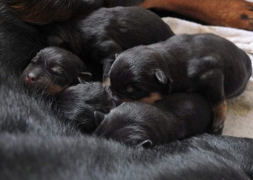
I agree on the shoe-horn... but lovely little puppies... might take a bit off the right side and top?? Love the cute little eyes-closed look they have.
 
:love::love::love::love::love::love: awwwwwwwwww

You can send them little babies to me :D Love rotties, even if the current one is a flaming loon :nuts:

All i can say is awww again :LOL:
 
Back
Top