

You are using an out of date browser. It may not display this or other websites correctly.
You should upgrade or use an alternative browser.
You should upgrade or use an alternative browser.
weekly DK's 52 in 2013 - Wk 47, 50, 51 & 52 added - FINISHED !!!
- Thread starter Dark Knight
- Start date
- Messages
- 4,088
- Name
- Graham
- Edit My Images
- Yes
yay for the little caterpillar - I think only twice have I shot more than 300 shots in a day... let alone a session!! (One when in a bird hide at CenbtreParcs, and t'other at Brands Hatch), bet the delete key's been earning its keep sifting out the good from the bad! amazing from the merely average.. :nuts:
super sharp, lovely colours and the background works well, they are wriggly little things too!
super sharp, lovely colours and the background works well, they are wriggly little things too!
OP
- Messages
- 13,760
- Edit My Images
- Yes
Blimey... thanks BrianWhimsical...
I nearly fell off my chair when I saw this fantastic image. I just kept on looking and pointing and laughing, in the end I had made so much noise that I had the whole family round the computer and we ALL thought it was amazing. 10/10 brilliant
")
Hahaaaa yeah that bit kept making my wife go queezyBeginning: Sounds like this took even more effort than whimsical, I think I like it but that thing sticking out of the top of it has me feeling uneasy. <gulp> Nice focus and fraiming.
 -
- Thanks again
Hey LynneHi ya Dean
and another BLIMEY, Thanks LynneWhimiscal......absolute belter of a shot ( reminds me a similar one I did in last years 52 ) but your is streets ahead...great lighting , love the words spelt out , good detail in the hand with good skin tones as well....brilliant
ThanksBeginning......chuckled all the way through your words on taking this shot.....
I prefer that but but just wish the whole body went off into the distance - or just slowly faeded out, little bugger wouldn't play ball
OP
- Messages
- 13,760
- Edit My Images
- Yes
Thanks TonyGenius on the Whimsical - simply genius. Witty too, with the missing letters.
I think I hate you.

Yes I am, I was layin flat on my stomach in the end and had to keep shuffling around to try and get the angle required... I must of looked like it's elder brother !!!Nice macro shots for beginning. Are you shooting your macros handheld? I am as well and having a devil of a time with my DoF.
You were right the first timeyay for the little caterpillar - I think only twice have I shot more than 300 shots in a day... let alone a session!! (One when in a bird hide at CenbtreParcs, and t'other at Brands Hatch), bet the delete key's been earning its keep sifting out thegood from the bad!amazing from the merely average.. :nuts:
I'm trying to be very strict nowadays, getting tougher on my self all the time as my storage is filling up rapidly !!!
That they aresuper sharp, lovely colours and the background works well, they are wriggly little things too!
Cheers Graham
AND thanks to everybody else, isn't it odd that some times the ones you don't expect get great comments, and boy does it sound/feel good after a crap week
- Messages
- 2,166
- Name
- Nick
- Edit My Images
- Yes
Lovely colours and textures in Whimsical. DOF is pretty much spot on as I see it. Good job!
Beginning #2 for me. A bit more 'head on' would be nice, but you don't really get to pick your shots with these kind of thing. Cracking detail, and the shallow DOF really suits.
Beginning #2 for me. A bit more 'head on' would be nice, but you don't really get to pick your shots with these kind of thing. Cracking detail, and the shallow DOF really suits.
OP
- Messages
- 13,760
- Edit My Images
- Yes
Cheers NickLovely colours and textures in Whimsical. DOF is pretty much spot on as I see it. Good job!
Beginning #2 for me. A bit more 'head on' would be nice, but you don't really get to pick your shots with these kind of thing. Cracking detail, and the shallow DOF really suits.
I did get a few 'Head On' but the focus wasn't 'quite' there
OP
- Messages
- 13,760
- Edit My Images
- Yes
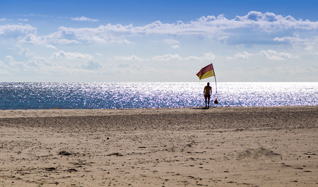
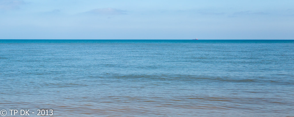
Wk 36 - 'Curve'
3 to choose from, First up is a simple shot from A walk down Great Yarmouth sea-front Yesterday, the second and third are both from a walk on Gorleston Beach this morning (A few more on my Flickr)
What have I learnt from this week, I MUST keep checking my settings and play about with DoF a bit more, some of the 'Other' shots I got would have been good shots had the DoF been deeper... they are instead binned!!!
Here you go... Thanks for popping in
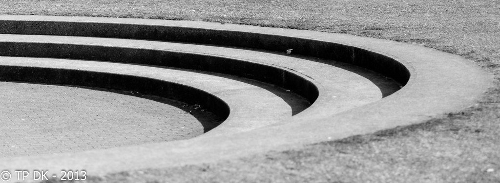
Finding a Curve 10 by TP DK, on Flickr
A subtle curve on the pole... and the horizon
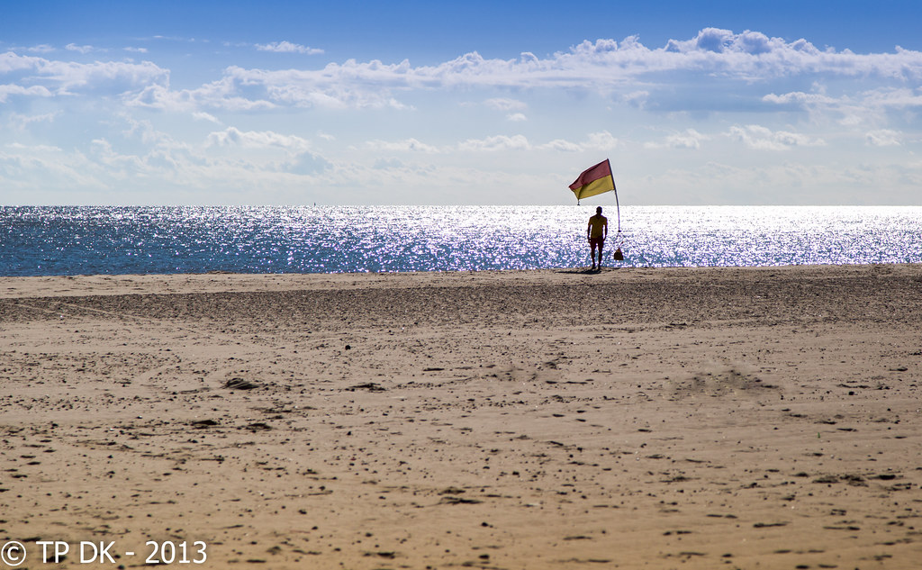
Finding a Curve by TP DK, on Flickr
And the curve of the roof, I liked the flare on this one, and the inclusion of one of the lifeguards, but people may prefer the others on Flickr that are 'cleaner'
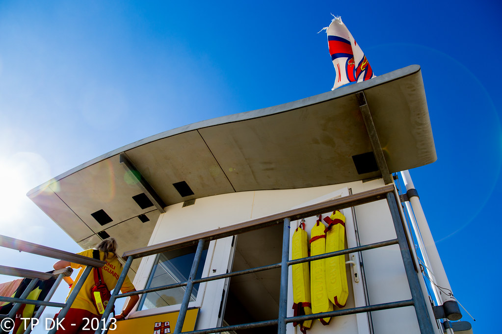
Finding a Curve 2 by TP DK, on Flickr
THANKS
3 to choose from, First up is a simple shot from A walk down Great Yarmouth sea-front Yesterday, the second and third are both from a walk on Gorleston Beach this morning (A few more on my Flickr)
What have I learnt from this week, I MUST keep checking my settings and play about with DoF a bit more, some of the 'Other' shots I got would have been good shots had the DoF been deeper... they are instead binned!!!
Here you go... Thanks for popping in
Finding a Curve 10 by TP DK, on Flickr
A subtle curve on the pole... and the horizon
Finding a Curve by TP DK, on Flickr
And the curve of the roof, I liked the flare on this one, and the inclusion of one of the lifeguards, but people may prefer the others on Flickr that are 'cleaner'
Finding a Curve 2 by TP DK, on Flickr
THANKS
- Messages
- 11,087
- Name
- Allan
- Edit My Images
- No
Hello
Really like the definition of the shadows on the first one, there is something very pleasing about it, though because of the crop it seems a little squashed
the second I like the emptiness but not sure about the placement of the flag/figure
the third has a lovely blue sky which goes really well with the yellow floats? and the t-shirt of the lifeguard, nice flag too
A really good set
- Messages
- 4,088
- Name
- Graham
- Edit My Images
- Yes
Can't believe you can fill a set on flickr with your possibles.... of which any would fit the bill....
I reckon the lifeguard shot is the pick for me, the one you chose with the lifeguard going about her business. Without her the shot looses all its appeal tbh.
The blue sky is fantastic against the yellow and the curve of the roof. And I think the lens flare adds to the shot here too.
Agree with allan on the curve of the steps, and like the second but it certainly doesn;t have the same appeal as the lifeguard hut
OP
- Messages
- 13,760
- Edit My Images
- Yes
Hello
Really like the definition of the shadows on the first one, there is something very pleasing about it, though because of the crop it seems a little squashed
the second I like the emptiness but not sure about the placement of the flag/figure
the third has a lovely blue sky which goes really well with the yellow floats? and the t-shirt of the lifeguard, nice flag too
A really good set
Cheers Alan
I guess it does look a bit squished, just a loo wish angle though to be honest, and cropping all the crap out
OP
- Messages
- 13,760
- Edit My Images
- Yes
Can't believe you can fill a set on flickr with your possibles.... of which any would fit the bill....
I reckon the lifeguard shot is the pick for me, the one you chose with the lifeguard going about her business. Without her the shot looses all its appeal tbh.
The blue sky is fantastic against the yellow and the curve of the roof. And I think the lens flare adds to the shot here too.
Agree with allan on the curve of the steps, and like the second but it certainly doesn;t have the same appeal as the lifeguard hut
Cheers Graham
That's my fav too...
Do you think the 2nd one needs a closer crop?? The sky was rather boring higher up so hence the excessive sand
blakester
Shine On Harvest Moon
- Messages
- 6,679
- Name
- Iain
- Edit My Images
- No
Wow! Some great work there Dean from the Catchup King
They all fit the bill so difficult to choose.
Number one, I like the minimalist feel to it, it fills the frame with no other distractions around it, the only thing I'd mention on this is the litter. I feel it spoils the look a little and could be cloned out.
Number two, really like this, the colours, composition everything comes together well. I would maybe crop a little of the sand, make it about the same size relatively as the sky. I know that may bring the horizon closer to the centre but I do think it would be effective.
Number three, is probably my favourite of the three Dean, for everything that others have mentioned above. The pov, lens flare, colours, they all work so well together.
Great work rate matey
- Messages
- 8,398
- Name
- Lynne
- Edit My Images
- Yes
Hi Dean
Good catch up there mister ...
Curve 1 for me...simple , mono works well....clone out the rubbish & it's 100% for me
Curve......little too much sand for me...using the "scroll up n down method" I'd might be tempted to lose the majority of the sand creating a more letterbox crop ?
Curve 3....strangley not taken with this one , like the POV & the blue sky against the silver curved structure but not as appealing as the other 2...sorry
- Messages
- 4,831
- Name
- Alan
- Edit My Images
- Yes
hi Dk
Catch up time
Connection - alt 2 for me as I like the detail and the fact that without any reference, it is intriguing having to decide whether it is a screw or a giant auger. well done
Connection - good shots. Those tortoiseshells are b...ggers cos of that fuzzy back. #2 for me as I feel that it fits the theme best cos of the connection thro the proboscis
Whimsical - excellent .. like the fact that it looks a bit ordinary at first but then working thro the letters makes I very interesting and humorous
beginning - #1 is a bit confusing - not sure of focal point or which end etc. #2 has excellent b/g and good colour throughout.
Curve - good set. Like #2 as a shot but not as strong a connection to the theme as the other 2. #3 is top shot. beautiful colours and lots of interest.
Catch up time
Connection - alt 2 for me as I like the detail and the fact that without any reference, it is intriguing having to decide whether it is a screw or a giant auger. well done
Connection - good shots. Those tortoiseshells are b...ggers cos of that fuzzy back. #2 for me as I feel that it fits the theme best cos of the connection thro the proboscis
Whimsical - excellent ..
like the fact that it looks a bit ordinary at first but then working thro the letters makes I very interesting and humorous beginning - #1 is a bit confusing - not sure of focal point or which end etc. #2 has excellent b/g and good colour throughout.
Curve - good set. Like #2 as a shot but not as strong a connection to the theme as the other 2. #3 is top shot. beautiful colours and lots of interest.
OP
- Messages
- 13,760
- Edit My Images
- Yes
OMG... I didn't even think of the litter :bang: cheers IainWow! Some great work there Dean from the Catchup King
They all fit the bill so difficult to choose.
Number one, I like the minimalist feel to it, it fills the frame with no other distractions around it, the only thing I'd mention on this is the litter. I feel it spoils the look a little and could be cloned out.
Thanks... now in the process of doing thatNumber two, really like this, the colours, composition everything comes together well. I would maybe crop a little of the sand, make it about the same size relatively as the sky. I know that may bring the horizon closer to the centre but I do think it would be effective.
Cheers IainNumber three, is probably my favourite of the three Dean, for everything that others have mentioned above. The pov, lens flare, colours, they all work so well together.
Great work rate matey
`
Thanks LynneHi Dean
Good catch up there mister ...
Another that spotted itCurve 1 for me...simple , mono works well....clone out the rubbish & it's 100% for me
Yup... now doing that, with thanks for all your suggestionsCurve......little too much sand for me...using the "scroll up n down method" I'd might be tempted to lose the majority of the sand creating a more letterbox crop ?
No Problem... my wifey doesn't like it either... must be a girl thingCurve 3....strangley not taken with this one , like the POV & the blue sky against the silver curved structure but not as appealing as the other 2...sorry
OP
- Messages
- 13,760
- Edit My Images
- Yes
Thanks Alan... not many went for that so glad you liked ithi Dk
Catch up time
Connection - alt 2 for me as I like the detail and the fact that without any reference, it is intriguing having to decide whether it is a screw or a giant auger. well done
Thanks... and double thanks for telling me what one it isConnection - good shots. Those tortoiseshells are b...ggers cos of that fuzzy back. #2 for me as I feel that it fits the theme best cos of the connection thro the proboscis
Cheers buddyWhimsical - excellent ..
Yeah I think this is another re-shoot for surebeginning - #1 is a bit confusing - not sure of focal point or which end etc. #2 has excellent b/g and good colour throughout.
Thanks Alan as alwaysCurve - good set. Like #2 as a shot but not as strong a connection to the theme as the other 2. #3 is top shot. beautiful colours and lots of interest.
OP
- Messages
- 13,760
- Edit My Images
- Yes
Grrrrr, looks like I forgot to press the 'send' button.
I'll comment....again....tonight.
Cheers.
OP
- Messages
- 13,760
- Edit My Images
- Yes
OP
- Messages
- 13,760
- Edit My Images
- Yes
Cool... Thanks for the suggestionyep, works for me.
- Messages
- 8,398
- Name
- Lynne
- Edit My Images
- Yes
HI ya
I was thinking slightly more severe crop though your edited crop does work better.......

only working with netbook so not sure about it as only got a minute screen....will remove if you say the word
I was thinking slightly more severe crop though your edited crop does work better.......
only working with netbook so not sure about it as only got a minute screen....will remove if you say the word
Last edited:
OP
- Messages
- 13,760
- Edit My Images
- Yes
HI ya
I was thinking slightly more severe crop though your edited crop does work better.......
only working with netbook so not sure about it as only got a minute screen....will remove if you say the word
Ooooo no I like that
Brian_of_Bozeat
Jeff
- Messages
- 3,235
- Name
- Brian (not Jeff)
- Edit My Images
- No
Wow! - what a difference a crop makes, that looks amazing! well done - both of you
OP
- Messages
- 13,760
- Edit My Images
- Yes
Cool... I'll accept that praiseI agree with the others - thats the best of the shots and its the best crop too - nice positioning
Thanks... it was nothingWow! - what a difference a crop makes, that looks amazing! well done - both of you
Hmmmm B&W... maybe tomorrow's editLynne's drop is bang on....she's learning you know
Not keen on the harsh light. Wonder what b&w would look like?
Cheers...and I suspect the flag isn't there at sunset or sunrise
Afraid they are not there early or late no, that was the lifeguard, he had just set that flag out
OP
- Messages
- 13,760
- Edit My Images
- Yes
BUGGER !!!!
Keep forgetting to post my 'Still' image, it's been on Flickr for ages :bonk:
Wk 34 - they were moving rather fast at the time, but they look 'Still' now
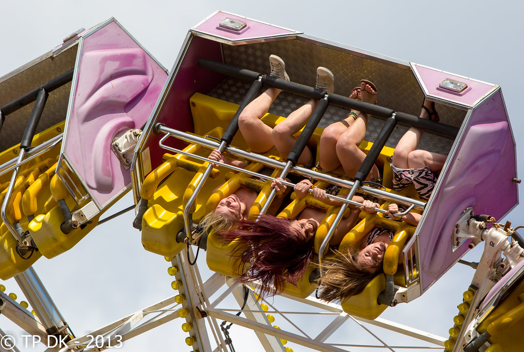
Wk 34 - 'Still' by TP DK, on Flickr
Keep forgetting to post my 'Still' image, it's been on Flickr for ages :bonk:
Wk 34 - they were moving rather fast at the time, but they look 'Still' now
Wk 34 - 'Still' by TP DK, on Flickr
Last edited:
Brian_of_Bozeat
Jeff
- Messages
- 3,235
- Name
- Brian (not Jeff)
- Edit My Images
- No
Another cracker DK. Loads of emotion, loads of implied movement & rather unnerving at the same time.
- Messages
- 8,398
- Name
- Lynne
- Edit My Images
- Yes
Hi ya Dean
Still......beautifully frozen moment & amazingly sharp...really pops out of the screen
Still......beautifully frozen moment & amazingly sharp...really pops out of the screen
OP
- Messages
- 13,760
- Edit My Images
- Yes
Cheers AllanHi DK
great pic would never have thought of that at that angle but it works really well,
Me too mateI think I prefer your crop on the beach shot.
Hmmmm sounds like a request I can certainly doLove the still one but for some reason part of me wants to see it in Mono. I can't express why.
Thank You LynneHi ya Dean
Still......beautifully frozen moment & amazingly sharp...really pops out of the screen
OP
- Messages
- 13,760
- Edit My Images
- Yes
Annnnnd onto the next
Thought I would go for a walk with Mrs DK on sunday to get my shot seems the weather was so nice... I was at first going for my beach shot, but Allan has beat me to it
Soooooo I'm afraid it's a choice of 3 again...
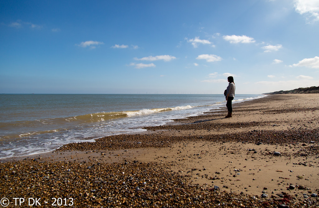
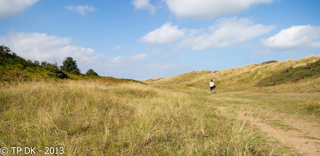
Wk 38 - 'Solitude'
Even though this is a much tighter crop to the other 2 I have on Flickr, I think Mrs DK's posture is more in keeping with 'Solitude' ??
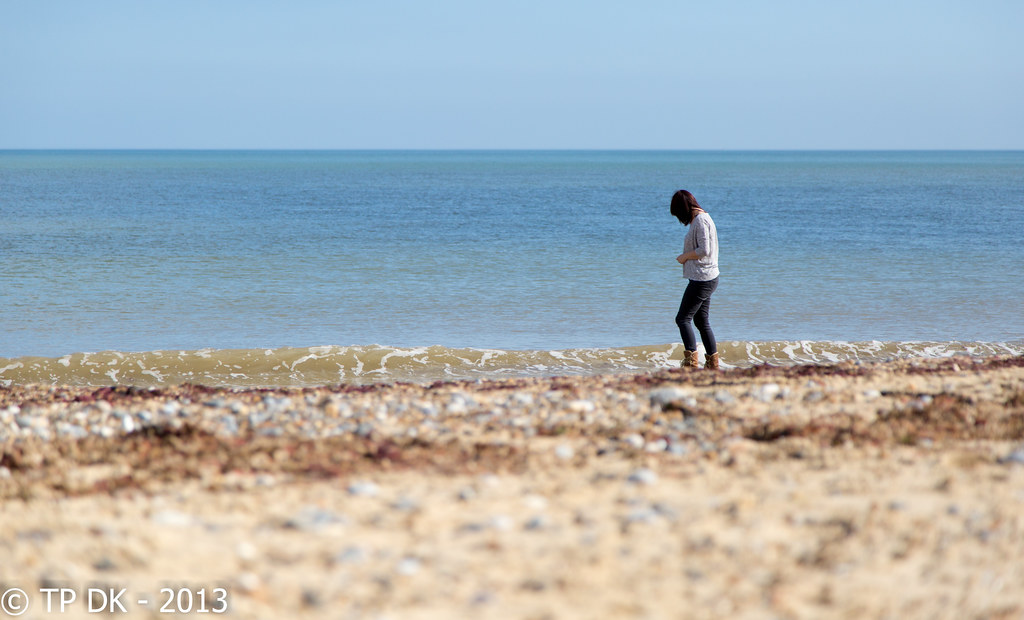
Wk 38 - 'Solitude' 4 by TP DK, on Flickr
Wk 38 - 'Solitude' 2 by TP DK, on Flickr
With this one I don't think Mrs DK walking is very 'Solitudey'
Wk 38 - 'Solitude' 1 by TP DK, on Flickr
I think I now prefer this one... MUST be viewed on Flickr
Wk 38 - 'Solitude' 3 by TP DK, on Flickr
Please let me know what you think
Thought I would go for a walk with Mrs DK on sunday to get my shot seems the weather was so nice... I was at first going for my beach shot, but Allan has beat me to it
Soooooo I'm afraid it's a choice of 3 again...
Wk 38 - 'Solitude'
Even though this is a much tighter crop to the other 2 I have on Flickr, I think Mrs DK's posture is more in keeping with 'Solitude' ??
Wk 38 - 'Solitude' 4 by TP DK, on Flickr
Wk 38 - 'Solitude' 2 by TP DK, on Flickr
With this one I don't think Mrs DK walking is very 'Solitudey'
Wk 38 - 'Solitude' 1 by TP DK, on Flickr
I think I now prefer this one... MUST be viewed on Flickr
Wk 38 - 'Solitude' 3 by TP DK, on Flickr
Please let me know what you think
Last edited:
blakester
Shine On Harvest Moon
- Messages
- 6,679
- Name
- Iain
- Edit My Images
- No
Hi Dean, another good work rate display
Choices, choices
I think #2 gets my vote though. I feel this one says solitude the most to me.
Mrs DK stood looking out towards the water certainly works.
I do think it needs a little bit more photography-wise to elevate it beyond a record shot. Not sure what that little bit more would be, perhaps a B&W conversion or your good lady being in silhouette, dunno
Up to date though, good work on that score.
You and Marsha have excelled yourselves this week
OP
- Messages
- 13,760
- Edit My Images
- Yes
cheers Iain... I actually feel relieved to be caught up with the photo side of stuff, I now hope I can catch up a bit more on comments, but been traveling all afternoon so have to catch up with Work emails firstHi Dean, another good work rate display
I may go for the silhouette idea of yours to be honest, I did shoot trying to get the sun streaming in from the top right corner but it didn't work as well as it looked in the view finder
- Messages
- 8,398
- Name
- Lynne
- Edit My Images
- Yes
Hi Dean
Thanks for your never ending hard work keeping the spreadsheet ...top work mister
Solitude.......hmmmmm, choices choices....think Andy's comment about silhouetting your other half has merit but they still work as shot....excepting the crop....I'd be tempted to crop quite a chunk off the bottom of all & a sliver of the rhs baring the seascape one ( which strangely enough I did as well but as not as well as yours !)