Webby Photo52 - Week 52 - Glass added

Adie... The photo of the dictionary... mmm its not abstract to me... Yes you have a technically fab photo as always but I think this is the sort of photo that should be resisted when doing a 52! Just taking the word out the dictionary... I get it but I hate it! Sorry to sound so negative... I think you could pull something out the bag with this one thats a piece of your own art straight out the camera... I know you can!
 
No probs Mark, but this isn't a word from the dictionary. It is a scientific paper Abstract, which is in all academic peer reviewed papers. The whole section is the abstract, not just the word. There is nothing that says the word has to mean ART, and as i don't believe there is such a thing as abstract art, I thought I would look at other meanings of the word.

Sorry you only see the art connection, but thanks for commenting on the technical aspects too :)

Kind rgds

Adie
 
Adie... i love both shots for abstract. BUT the first hits the nail. why, probably because the DOF and the subtle attraction to the word itself. Yes i see glasses, but the arm frames the word... its like my MIX ... people saw MIXture of sweets???? but in the centre laid the true meaning i wanted to capture.

...and by the looks of it, you've been touched by the sarcastic tongue of Mr E...:shrug:
 
Have to say I agree with Mark, looking at back at your previous photos you were the last person I would have thought would have done quite a "safe" interpretation....

Did nt your imagination want to run wild?


Haha, I'm not sure what is safe about it. For me this is about photography, not art. I want to deliver competent technically good photos on theme. This photo involved off camera flash, mixed with ambient light, reflective and refractive glasses, shallow DoF and a key area which needed to be in focus without looking like it is the main focus of the photo. For me safe would be a random OOF blobs of colour, and no photographic merit, and a bold claim it is abstract art! ;)
 
Adie... i love both shots for abstract. BUT the first hits the nail. why, probably because the DOF and the subtle attraction to the word itself. Yes i see glasses, but the arm frames the word... its like my MIX ... people saw MIXture of sweets???? but in the centre laid the true meaning i wanted to capture.

...and by the looks of it, you've been touched by the sarcastic tongue of Mr E...:shrug:

^ Kev... beginning to think I just shouldn't bother saying anything!
 
Haha, I'm not sure what is safe about it. For me this is about photography, not art. I want to deliver competent technically good photos on theme. This photo involved off camera flash, mixed with ambient light, reflective and refractive glasses, shallow DoF and a key area which needed to be in focus without looking like it is the main focus of the photo. For me safe would be a random OOF blobs of colour, and no photographic merit, and a bold claim it is abstract art! ;)

^ Fair comment and I actually agree with you completely on this!
 
You miss the point...

Looking back at your previous sumissions we can all see you have an "artistic" eye along with the technical skills to pull of some fantastic shots....

I just thought with this weeks word you could have been more "creative" ;)

:)
 
I see what you mean Jeff. I just don't have it in me to make a science paper more creative :)

Still, I have a nice creative idea for pair, so hopfully I can get back on track.

Cheers all.


Adie :)
 
Photographing a word on a paper :thinking:
It's not something that's bothering me, but I guess I expected something different from you.
That said, I appreciate the skill in how you've taken the shot.

I cannot make my mind up on which I prefer.

In the first, I would have preferred a switch for the open arm, ie the arm of the glass coming in from bottom left. May be I've been reading too many rules!

I like the shadow off the glasses in the second, but the shadow going over the 'a' in abstract is spoiling it for me. I would have loved it if the shadow could have framed the word abstract.

Both nice shots though non the less.
 
Adie i like your Abstract photo and am happy to see a different take on abstract.

As above the 2nd image is the more pleasing to the eye (y)

Thanks, this theme has caused a bit of discussion, but we all move on :D
 
Photographing a word on a paper :thinking:
It's not something that's bothering me, but I guess I expected something different from you.
That said, I appreciate the skill in how you've taken the shot.

I cannot make my mind up on which I prefer.

In the first, I would have preferred a switch for the open arm, ie the arm of the glass coming in from bottom left. May be I've been reading too many rules!

I like the shadow off the glasses in the second, but the shadow going over the 'a' in abstract is spoiling it for me. I would have loved it if the shadow could have framed the word abstract.

Both nice shots though non the less.

Thanks Neil,
But the abstract is more than just a word, it is the entire lead in to a scientific paper.

Still, as I said in another post, I don't think the word has added much to the photography on this forum, other than a few unhappy teddies! :)

Onwards and upwards!
 
Well, almost near the end, and a subject that hopefully will not cause the grief last weeks did!

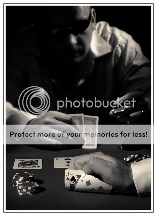
Here is my week 44 Pair.

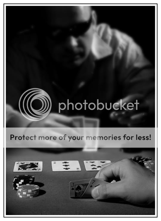
And in keeping with the theme, here is a PAIR of photos (mainly because I broke my own rule about cropping on a joint!) and added a different PP B&W.

A bit more complicated to shoot than last weeks.
3 strobes, timer shot with a mad dash to get in shot in time!

Now, time to think of how to tackle SAFE :thinking:

Week44-Pair2web.jpg

Week44-Pair1web.jpg
 
Brilliant! Prefer the first one I think... I had a feeling you would go for something like that!

The lighting in the first is better and I think there is just a tad more atmosphere in the clarity of the other player!

Great work.

I hoped to have a catch up today... done the pics but I've left my card reader at work doup! And tried to get my camera to talk to my apple... but I need the driver and cant find the driver disk... so just gonna wait till I get the reader tomorrow!

Mark
 
Many thanks Mark, it is much appreciated. :clap:


Brilliant! Prefer the first one I think... I had a feeling you would go for something like that!

The lighting in the first is better and I think there is just a tad more atmosphere in the clarity of the other player!

Great work.

I hoped to have a catch up today... done the pics but I've left my card reader at work doup! And tried to get my camera to talk to my apple... but I need the driver and cant find the driver disk... so just gonna wait till I get the reader tomorrow!

Mark
 
Great take on the theme (y) I also prefer the 2nd shot with the deeper dof. The subject really lends itself to the black and white!

Thanks Tina, yes the colour version lacked the atmosphere of the B&W.
 
Hi

I prefer the second shot.

Something bothers my eye about the lighting though...I will try and explain...

The man in the backgrounds face is partly in shadow - leading my brain to believe thre is little light coming from his RHS, but then my eyes look lower in to the scene and see his right hand which is lit well from his RHS - my brain finds this very confusing.

Maybe a better balance of light on the main character? the foreground lighting does nt seem to have as much confusion.

It's a well set up and thought out composition though :) and very well suited to the post processing...
 
As usual great lighting.

Theme's bang on for me and b&w works very well.

I can almost see you with your head down slightly to look at you cards, then raising your eyes slightly to get a read.

The lighting 'issues' mentioned don't bother me...I guess poetic licence has a place in every discipline...(y)#

Any reason for choosing the cards you used...just curious :thinking:

Cheers.
 
Hi

I prefer the second shot.

Something bothers my eye about the lighting though...I will try and explain...

The man in the backgrounds face is partly in shadow - leading my brain to believe thre is little light coming from his RHS, but then my eyes look lower in to the scene and see his right hand which is lit well from his RHS - my brain finds this very confusing.

Maybe a better balance of light on the main character? the foreground lighting does nt seem to have as much confusion.

It's a well set up and thought out composition though :) and very well suited to the post processing...

No probs Jeff, you have a good eye for deconstructing lighting setups ;)
Like most shots, I light to try and create a story, not recreate what was seen. This was aiming to be a card table in a seedy room somewhere, centraly lit from above, and then a few extra lights to add drama. I toyed with having all the light come from camera left (which was needed to light the near cards) but the whole photo was a bit unbalanced, with the right side being too dark at the back.
When I moved the rear light to light the other side of the rear gambler, it balanced out better (IMHO).
I nned to be carefull where I place my lights, as this was shot arounf the dining room table, and near the walls and windows in my house, something I didn't want to show, hence not lighting them :)

Cheers mate, and keep it up :)

Adie
 
Hi Adie, a very good picture, very well set up and executed. Number 2 is my preferred version, as the lighting is better.

Thanks mate :)

As usual great lighting.

Theme's bang on for me and b&w works very well.

I can almost see you with your head down slightly to look at you cards, then raising your eyes slightly to get a read.

The lighting 'issues' mentioned don't bother me...I guess poetic licence has a place in every discipline...(y)#

Any reason for choosing the cards you used...just curious :thinking:

Cheers.

Thanks, and just like my HIDDEN shot, you sometimes need to light something that wouldn't normally be lit ;)

As for my choice of cards, well, I wanted it to feel more "real" than turning up 2 Aces, so I picked a pair of pairs utilising the flop, but made sure they represented a fairly strong hand.
But then again, i'm pretty rubbish at cards, so what do I know LOL

Adie
 
An interesting take on the theme, why didn't I think of that!!

The lighting has given it a nice moody feel.
The different angles for the light don't bother me.
Backroom poker dens could be like this, I wouldn't know!

Both work for me.
The detail in the second player I think pips the post though.
 
Week 45 - Safe

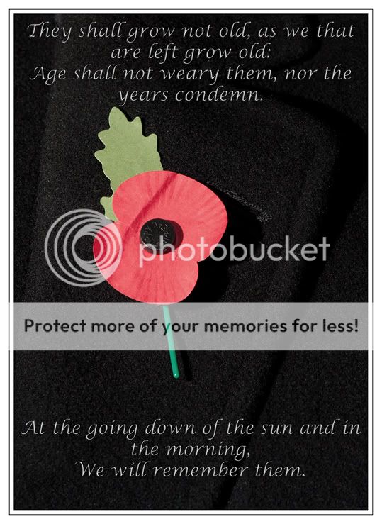
This one is self indulgent, and very personal to me. I scratched around for a few ideas, then it dawned on me the date this week.:)

This for me is on theme. I have avoided fancy photography and lighting for simple crisp lines and bold colours. I didn't want to distract from the symbolism at the heart of the shot.


They kept us safe from oppression and tyranny. They gave their tomorrows for our today's.

And to the men and women doing their bit in the sand pit, have a safe tour!


At 11.11.11, I will remember them.

Week45SAFEweb.jpg


(Back to normal photography next week (y))
 
plain, simple lines, bold colours. sometimes an image doesn't need to make a viewer study it to see the big picture. great work as ever adie (y)
 
Hiya Adie,

Pair:

I have been back and forth to you pair shots since you posted them and couldn't make up my mind which I preferred, that is until today. I like both shots, but have to say the second shot works best for me, mainly because one can see the three cards in the centre and the DOF gives a certain quirkiness to the ambiance of the setup.

Well done on the lighting, composition and jumping into the frame for the shot :clap:

Safe:

Wow what a poignant photo and right on theme. The poem is emotional and the text font suits well.

A great photo to commemorate the Day of Remembrance and all those who lost their lives and all those who still strive to keep us safe.

Well done

Cheers

Dawn :)
 
Been very busy at work, and also building a new pc, so these are both a little late and a little rushed.

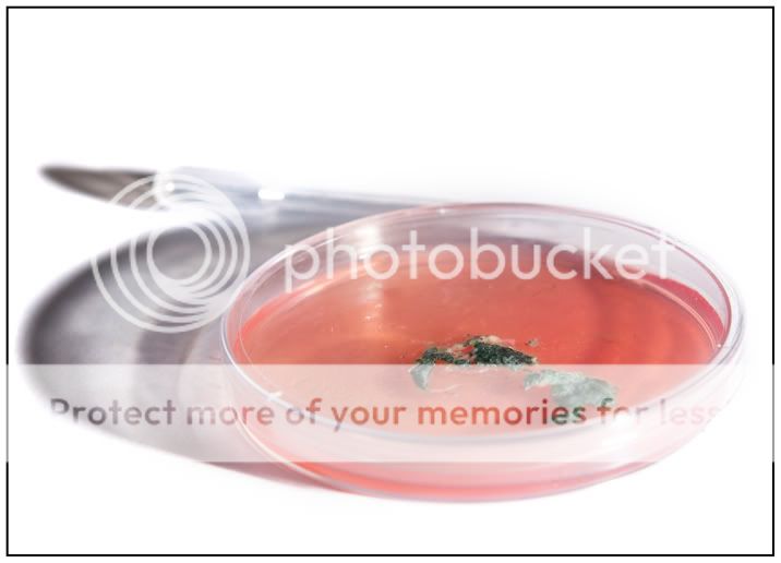
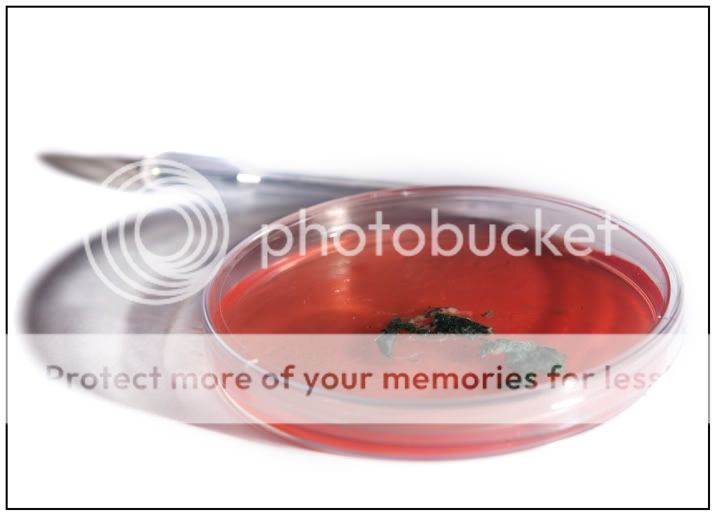
The theme of living had me stumped, and slightly underwhelmed, but then I hit upon the idea of the most basic form of life (no not X factor contestants!)..

Because the subject is simple bacteria, i wanted the shot simple, uncluttered and sterile.

Hope I pulled it off.

46-livingweb.jpg


Rgds


Adie
 
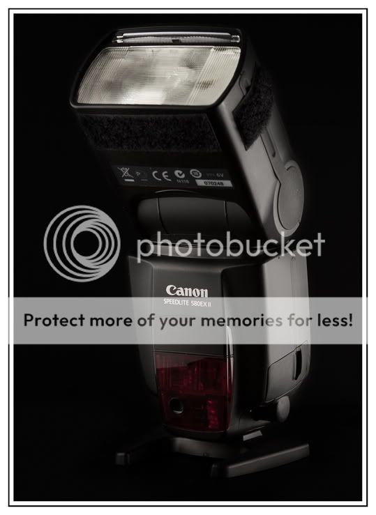
With the Lighting theme, I realised almost all my shots are linked to this theme, as almost all my shots use controlled flash off camera lighting. But in order to be more "on theme", I tried to show lighting in two ways:
1 the subject of the shot is a flash gun
2 the lighting of a black object with a reflective glass component on a black background.

The shot looks simple, but was a bugger to light!

3 flash guns in all, 1 to shoot, 2 to light!

47-lightingweb.jpg


Rgds

Adie
 
Can I be the first to say that your light is beautifully lit. Elegantly posed to. Nice uplift on the head to elongate the neck. And a turn showing depth. Well done. ...my model for light was a pain in the rear...
 
Sorry adie I leap flogged over living. To which I'm not sure. The shadow lhs does irk me.. Maybe a birds eye shot would have failed better. Or the flash not so low I'm guessing. But for theme.. Very apt subject matter...
 
Adie, I love the idea of the bacteria for your subject but isn't that mould? Are they bacteria? Anyhow, I think the focus is on the lid of the petri dish and not the contents...it also looks a little too...bright :shrug:

Your light is beautifully lit and sharp as a tack to my eye (y)
 
Can I be the first to say that your light is beautifully lit. Elegantly posed to. Nice uplift on the head to elongate the neck. And a turn showing depth. Well done. ...my model for light was a pain in the rear...

Many thanks (love the new Avatar BTW!)

Sorry adie I leap flogged over living. To which I'm not sure. The shadow lhs does irk me.. Maybe a birds eye shot would have failed better. Or the flash not so low I'm guessing. But for theme.. Very apt subject matter...

No probs, I opted for shadows otherwise the Petri dish looked like it was displaced! I quite liked the way the light went through the dish, but I see that it might look a little strong. I will look at softening them, and see what it looks like.

Adie, I love the idea of the bacteria for your subject but isn't that mould? Are they bacteria? Anyhow, I think the focus is on the lid of the petri dish and not the contents...it also looks a little too...bright :shrug:

Your light is beautifully lit and sharp as a tack to my eye (y)

Tina, you are of course correct, it is mold (please allow me a little artistic licence however, I didn't want to shoot the really colourful bacteria in case I wiped us all out! LOL)
I wanted bright for the clinical feel, but I do understand it might be a bit too bright for some.

Thanks for looking though! :)
 
Here is a slightly less bright version of the Petri dish....

46-living2web.jpg
 
Back
Top