- Messages
- 13,760
- Edit My Images
- Yes
Hi John ")
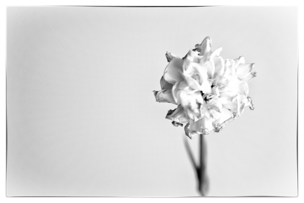
Work - A very clever shot, thanks for sharing your set up, that works very well
Work - A very clever shot, thanks for sharing your set up, that works very well


 Iain from me

Do you mind expanding on that a little, is it the shadow, post processing? It's just the original is pretty sharp so I don't know what you mean
Sorry yes, juxtaposition please, I agree on time, I loved it at the time (which is odd for me as I usually want everything as sharp as possible)
