ccsnet's 52 for 2010 - Week 34,25,36,37,38,39,40,41,42,43 & 44

Messages
597
Name
Terran
Edit My Images
Yes
Been new here I've been lurking for a bit but I fancy having a ago at a project like this to motivate me.... so - 52 Photos to come - no idea how good they will be or what but trying will help me improve.

I'm a bit limited using the Panny TZ5 but thats not going to stop me and I am sure CS2 will help any thing along too.

In the mean time feel free to visit my web site to have a look at other stuff I have done so far.

Terran

STILL TODO:

Week 22... Skipped - nothing happened


None ( for a change )

I really need more time in a day lol
 
Last edited:
4343674012_befdb4a6c1.jpg


Full Version

Heres my first....

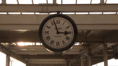
Week one and this week its themed on the new year..... which lead to a new start which lead to 'Time' and the clock featured in the film 'Brief Encounter'. You can find more information out about it and the location at http://www.carnforthstation.co.uk/

Photo is a HDR merged using CS2 and then a 90% sepia finish added

Terran
 
Last edited:
Hi Terran,

Just had a read about the station on the link you posted. It sounds like an interesting place with lots of history . . . read lot of good stuff to shoot :)

Really nice idea with the clock and I like the sepia tint to it - the warm reflections on the bottom of the clock are a nice touch too.

I'm not sure that the bottom of the image is adding much though. Looks a little bit odd with the pillars cropped off and the white sky isn't helping. Might be worth having a play around with the crop. Try taking some off the bottom, or maybe even cropping into a portrait orientation.
Thanks... I may have a play..... despite the clock its self its hard to pick it out been such a busy view ( see attached ).... even in this one I had to clone out the digital sign.

P1020198.JPG


alt view

P1020201.JPG


Thanks for the tips though.... the idea is to improve over the year.

Terran
 
Last edited:
Considering how cluttered the view is in the second two shots, I think you've done a pretty good job on isolating the clock and making it the main focal point. (y). The lighting makes getting an exposure spot on a bit of a nightmare too!

Also I just tried to PM you about something I just saw you posted on another thread (nothing bad mind, just didn't want to clutter up someone else's thread!) but it came up with an error saying that I couldn't do it! Do you know it does that?!

Chris
Thanks, fixed and it should be working now ;)

Now that I've seen the whole scene, I think I agree :LOL:
Thank you very much.... it was hard to do.... tbh I really wanted the Virgin train ( the west coast line is ft away ) in the photo but apart from that been hard to I kept missing it lol.

Terran
 
Before you read this remember I've not looked at what others have done as I didn't want to get influenced been so personal....

4342938067_5110f8bc8e.jpg


Full Image

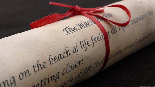
This weeks image is very personal to me mainly because I came up with the idea, dyed the paper, created the poem and then put it all together.

Starting with the paper its self I used well soaked tea bags and reasonably think card. At each stage I also had three versions of this going so I could choose the best and when it went wrong have a back up. Using the tea bags not only allowed some texture to occur but also dye it the olde' world style parchment colour.

The biggest delay was writing the poem my self. Those that know me know that this is not my thing but rather than pick one up from the net I really wanted to make it my own work.

The photo was took on a black background which un-fortunate due to the limitations of my camera came out darker in some areas and lighter in others so along with the text I did a little re-work. I also stuck a warming filter on at a very low level to bring the colour back to the paper and slightly changed the colours to make the red ribbon stand out again.

Over all I'm happy with it having taken a number of different angles etc before getting to this view how ever I do believe due to my limitations with Adobe Photoshop and my camera this could have been a better shot.

I hope you like it and any tips on getting rid of the purple tinge on the red ribbon in CS2 would be appreciated.... colour replace makes a mess.... problem is now I've told you you will see it :(

Terran
 
Last edited:
Terran,

Glad to see you taken up this challenge.

This week's shot really highlights that you don't need £1000's worth of kit to get a great image. The effort you've put into this image has really paid off, the position of the scroll in the frame is just right, the choice of colour for the ribbon is right as is the died paper. (y)
 
I really like this picture, the died paper, dark background and bright ribbon all work well and I think it's very effective and well worth the effort you put into it (y)
 
really works well this photo, the angle of the photo, the look of the paper, all look's perfect..

it makes it even better with all the effort you've put into making the paper, and writting your own poem for it, well done
 
This weeks image is very personal to me mainly because I came up with the idea, dyed the paper, created the poem and then put it all together.

Well, top marks! Nice image, and the fact that you created everything from scratch is a real bonus. I'm very impressed! :)
 
Last edited:
bl**dy hell some work gone into that one love the image and effort that you have put into that (y) well done :clap:
 
:clap: Just brilliant Terran!
I'm so impressed with the effort that's gone into this and it's really paid off. It's a great feeling when you put that much into a project and the end result is worth it - you must be very proud of this image.
I hope that this is one that you'll be keeping.

The ageing of the paper has come out perfectly and just the right choice of ribbon to go with it - I actually can't see any purple tint on my screen. :shrug:
Nice positioning of the scroll across the frame and the DOF on the text has worked well.
 
Very good indeed - you have gone to a lot of effort and it has really paid off.
:clap::clap:

I can just see the purple tint though might not have noticed it if you hadn't mentioned it. I would deal with it like this:
1. enlarge the picture to 2-300%
2. create a hue/saturation adjustment layer.
3. instead of "master" select magenta from the drop-down list of colours
4. use the eyedropper to select one of the offending purple pixels
5. desaturate it and darken it (as you have a black background)
6. click ok
7. invert the mask to black (Ctrl +I) to get the original colours back
8. with a fine brush paint white on the mask over the purple line to allow the desaturated version to show.
HTH
Cheers - will give that a go....

Terran
 
Have not looked at the poetry posts until after I have taken my shots, so as not to be influenced. Just starting to see what others have done and this is very nice. I like the way the depth of field drops off just at the ends (or the blur if added in post processing).

The effort and personal commitment that has gone into this makes me rather ashamed of my measly half hour spent on it.
 
[S4]Top marks for effort![/S4]

A great idea and well executed :clap:

I wouldn't worry too much about the inconsistency in the background.

Perhaps as a minor critique if you'd played with the levels slider in photoshop to get the background a little bit darker and maybe a vignette to add mood.

The colour fringing has already been solved by Tracer so no need to repeat what has already been said.

Very impressed T (y)
 
Full marks for effort, and I love the image too. To the point, on theme, well executed. I quite like the background as is, it adds a bit to the image with that colour. I suspect a black background would work too, but I don't think this detracts.
 
@Tracer - Tried that sort of made a mess I think I know why which leads me to....

@Ian & Stoo - Believe it or not it started out as a black back ground.... I couldnt get out to buy some cloth so borrowed my lads coat.... :whistle: .... and thats where my problems started I think. Because its not true black its been leaving an edge and when CS2 processes it sort of leaves it. I'll try some other methods as its plainly annoying as I can see it even if others dont....

BTW - Re DOF - My camera does not have a manual focus... it was a pain... had to shoot else where first... grrrr

@Digitall - Many thanks - any comment is good comment as far as I am concerned

Terran
 
Thats great work Terran. You,ve gone to a lot of effort on this one and its paid off big time. Its made me feel a little guilty but on the other hand inspired me to try and think more about how I tackle the project(y)
 
I like the time shot, it's good and the clock is an interesting centre piece with symmetry around it... Apart from the sun...

Poem, excellent work, and a lot of work to set it up too, but well worth it.
 
Ok for this week - 2.... the first one I like but after getting C&C from MC Stoo he seems to think that its the 2nd which is the better shot....

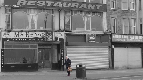
Chopped - This week I wanted to stay away from the expected photo so thought laterally. Part 1 and 2 are not the photo I actually wanted although I wont say what that is as I intend to go back for that when I'm able to. So what is this about ? Basically a view of todays events specifically chopped.... no longer needed.... redundant. The above photo has used selective colouring although I must admit I wanted to try some thing new how ever this just fit right. Why ? Using this technique I'm able to draw the viewer to the important part of the picture.... in this case the lady walking past allowing the contrast to the currently disused premises, in this case which is redundant or no longer needed.... the buildings or the person ?

4343675954_32901a2c14.jpg


Full Image

...and in this case the now disused shop and flats above next to the still very active pub - a centre of life with in one area of the town giving a real contrast.

PS The buildings are not straight so gave me grief trying to make this look right....

4343676996_088b891b99.jpg


Full Image

Terran
 
Last edited:
How the FLIP do you change the title on this ? I know its double click but every time it do I goes edit mode and then straight in to the page.... use IE and it does nothing ahhhhhh.

Terran

EDIT Given up after 10 mins Gah !

EDIT Got it - advanced edit....
 
Last edited:
I see what you were aiming for, and I think the first one works best. I find the differences between the buildings to harsh. Well done for getting something different.
 
which is redundant or no longer needed.... the buildings or the person ?

Very nice idea. I prefer to see a bit more contrast in B&W shots. I'd add a touch more contrast, but that's IMveryHO.

Also very much like your week 2 entry. great DoF on it.

Keep up the good work. Some great shots in this thread.

Ian.
 
Very nice idea. I prefer to see a bit more contrast in B&W shots. I'd add a touch more contrast, but that's IMveryHO.

Also very much like your week 2 entry. great DoF on it.

Keep up the good work. Some great shots in this thread.

Ian.
Thanks

Terran

EDIT PS Good point re the contrast.... noted for next time
 
Fantastic idea Terran and I think you’ve pulled it off very well.
Most definitely thinking outside the box and a very clever take on the theme.

I didn’t even notice the selective colouring in No.1 until you mentioned it – which is a good thing. One of those effects where subtle is best IMO.
Love the way that you’ve used processing to split the 2 buildings in no.2 and just to be controversial, personally I prefer this shot to the other one.
It’s the little details like the missing brickwork from the front of the disused building that make it for me – and the way that the crossing lamp sits between the two. Would have been great if you could have got that right in the middle of the two buildings.
 
I quite like the first one as a picture but it doesn't convey the theme to me particularly, maybe because there is a lot going on which is fun to look at but also distracting.

I prefer the second one much more - a much cleaner composition, more direct, and I like your processing.
(y)
 
Thanks both....

@Sarah - re the lamp.... tbh I did it on purpose because I thought it would strange and an undefinable object so just moved slightly.

@Tracer - Yeh - theres a lot in that picture.... in fact its cropped down for that reason... Another reason for leaving the 'restaurant' bit in us because its very close to a famous one 'Modleys'.

So - Marmite pictures this week.... no bad thing in that.

Terran
 
Back
Top