

You are using an out of date browser. It may not display this or other websites correctly.
You should upgrade or use an alternative browser.
You should upgrade or use an alternative browser.
Maddi - swamp woman
- Thread starter ryanyboy
- Start date
- Messages
- 2,179
- Name
- Nick
- Edit My Images
- Yes
Lovely set Ryan - number 4 is my pick from them. Obviously the lighting is perfect given that I was holding various parts of it 
Was good fun and thanks for letting me come along")
Nick
Was good fun and thanks for letting me come along
Nick
- Messages
- 776
- Name
- Dave
- Edit My Images
- Yes
Really like these ryan, not you usual style but you should branch out more !
The lighting is spot on as ever , and the model deserves a medal!
The lighting is spot on as ever , and the model deserves a medal!
- Messages
- 13,760
- Edit My Images
- Yes
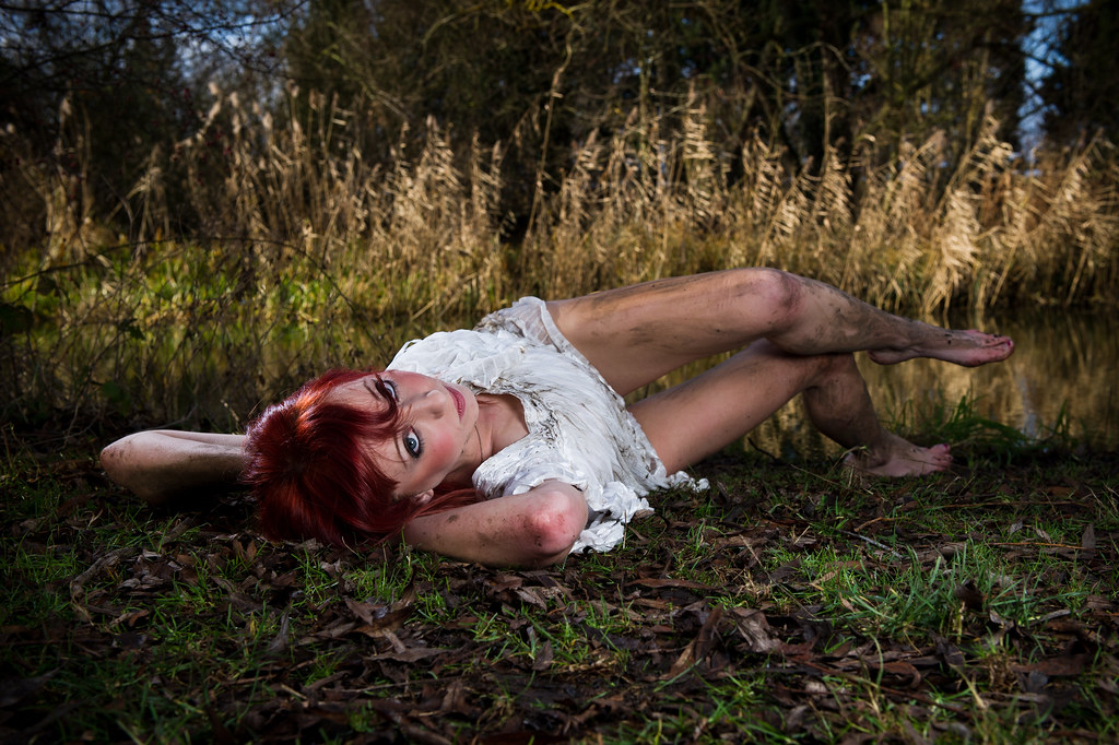
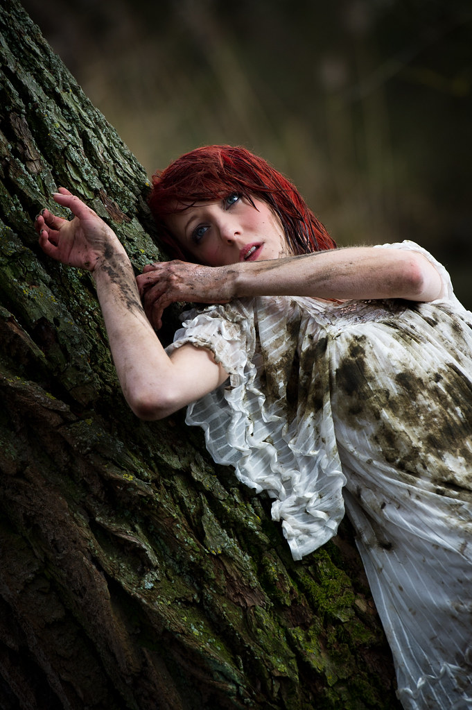
A great set Ryan... Love the colours, her hair and Eyes grab you in each shot - no:1 is my fav of them - all cracking pics
OP
- Messages
- 5,275
- Name
- Ryan
- Edit My Images
- Yes
Really like these ryan, not you usual style but you should branch out more !
The lighting is spot on as ever , and the model deserves a medal!
Many thanks Dave. I actually think these types of images are my usual style - in terms of lighting composition etc. It's just the subject is arguably a tad more provocative possibly perhaps..?
Lovely work, Ryan.....some great colours and lighting going on there!!
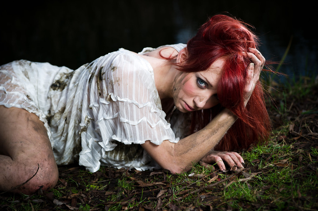
Cheers mate - and thanks for coming along to help with the lights etc. Number 5 seems to divide opinion - I've had someone rave about it and others not so keen.
I am absolutely loving these.
Great lighting and colours. Great poses and the model is amazing.
For me #1 and #5 and at a push it will have to be #5. The pose is great...eye contact would have ruined it for me
Cheers.
Thanks Andy. There you go Damien - someone who loves number 5
A great set Ryan... Love the colours, her hair and Eyes grab you in each shot - no:1 is my fav of them - all cracking pics
Many thanks mate. I really appreciate it.
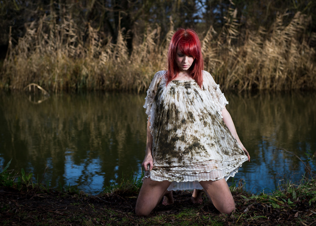
I like #2 a lot. The branch on the left at the water's edge is a bit distracting but that's being really picky.
The pose in #5 just doesn't do anything for me I'm afraid.
I know what you mean about the distracting bit of reed in number 2. If I ever enter the image in a competition I'll be sure to clone it out as best I can. Funnily enough I didn't like the bright part of her left foot in that picture either and I've already gone back & sorted it out on my edit of the picture.
all work for me bud , and they look better on here than facespace.......... why is that?
Many thanks skipper. Images on Facebook always look atrocious imo. I never truly critique images on there because FB certainly does murder them. These are hosted on Flickr and while Flickr isn't perfect it's the better way to look at images on the net I think.
- Messages
- 6,408
- Edit My Images
- No
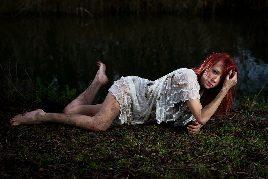
Really nice set Ryan. Good tones and poses. I think #3 is the powerful composition.
Nick
Nick
- Messages
- 776
- Name
- Dave
- Edit My Images
- Yes
Many thanks Dave. I actually think these types of images are my usual style - in terms of lighting composition etc. It's just the subject is arguably a tad more provocative possibly perhaps..?
Yes thats fair, it has your usual flair with balancing the light, I should have said not your usual subject matter !!
OP
- Messages
- 5,275
- Name
- Ryan
- Edit My Images
- Yes
Really nice set Ryan. Good tones and poses. I think #3 is the powerful composition.
Nick
Many thanks Nick. Much appreciated mate
- Messages
- 53
- Name
- Phill
- Edit My Images
- No
Hi Ryan, I really love the way the model is wonderfully lit with a dull background. Im new to all this artificial light stuff could you give me some pointers how to get the "popping out" look without lighting everything else? Cheers!