- Messages
- 6,293
- Name
- John
- Edit My Images
- Yes
Well I tried the 366 last year and work commitments killed it for me as I missed a day 
Lets see how the 52 project pans out - I have to say though looking at the 52's they're not just snapshots like so many of my 366's were so although more time theres a much higher standard!
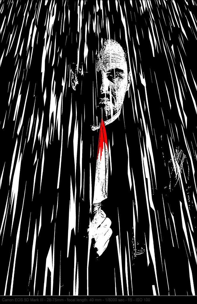
Week 1 : Sin
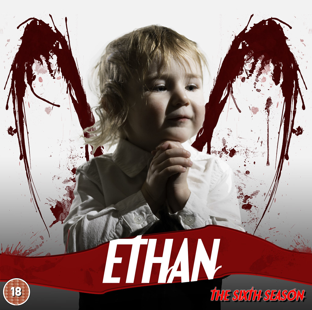
Week 2 : Season
Week 3 : Gravity
Week 4 : Wild
Week 5 : Space
Week 6 : Work
Week 7 : Gluttony
Week 8 : Time
Week 9 : Juxtaposition
Week 10 : Letter
Week 11 : Electric
Week 12 : Direction
Week 13 : Tacky
Week 14 : Value
Week 15 : Greed
Week 16 : Angle
Week 17 : Rustic
Week 18 : Kind
Week 19 : Vertical (or reshoot)
Week 20 : Pattern
Week 21 : Movement
Week 22 : Below
Week 23 : Size
Week 24 : Process
Week 25 : Rock
Week 26 : Pair
Week 27 : Reshoot and Shape
Week 28 : Plenty
Week 29 : Speed
Week 30 : Step(s)
Week 31 : Mono
Week 32 : Connection
Week 33 : Beginning
Week 34 : Still
Week 35 : Whimsical
Week 36 : Curve
Week 37 : Power
Week 38 : Solitude
Week 39 : Sweet
Week 40 : Reshoot and Cut
Week 41 : Live
Week 42 : Reflection
Week 43 : Melt
Week 44 :
Week 45 :
Week 46 :
Week 47 :
Week 48 :
Week 49 :
Week 50 :
Week 51 :
Week 52 :
Lets see how the 52 project pans out - I have to say though looking at the 52's they're not just snapshots like so many of my 366's were so although more time theres a much higher standard!
Week 1 : Sin
Week 2 : Season
Week 3 : Gravity
Week 4 : Wild
Week 5 : Space
Week 6 : Work
Week 7 : Gluttony
Week 8 : Time
Week 9 : Juxtaposition
Week 10 : Letter
Week 11 : Electric
Week 12 : Direction
Week 13 : Tacky
Week 14 : Value
Week 15 : Greed
Week 16 : Angle
Week 17 : Rustic
Week 18 : Kind
Week 19 : Vertical (or reshoot)
Week 20 : Pattern
Week 21 : Movement
Week 22 : Below
Week 23 : Size
Week 24 : Process
Week 25 : Rock
Week 26 : Pair
Week 27 : Reshoot and Shape
Week 28 : Plenty
Week 29 : Speed
Week 30 : Step(s)
Week 31 : Mono
Week 32 : Connection
Week 33 : Beginning
Week 34 : Still
Week 35 : Whimsical
Week 36 : Curve
Week 37 : Power
Week 38 : Solitude
Week 39 : Sweet
Week 40 : Reshoot and Cut
Week 41 : Live
Week 42 : Reflection
Week 43 : Melt
Week 44 :
Week 45 :
Week 46 :
Week 47 :
Week 48 :
Week 49 :
Week 50 :
Week 51 :
Week 52 :
Last edited: