
You are using an out of date browser. It may not display this or other websites correctly.
You should upgrade or use an alternative browser.
You should upgrade or use an alternative browser.
weekly Blondie606's 52 2013 Wk 52 Water-The End :-(
- Thread starter blondie606
- Start date
OP
- Messages
- 8,398
- Name
- Lynne
- Edit My Images
- Yes
I really like that shot, the colours and lighting are great. It also helps that your subject matter looks so yummy!
We must have crossed posts?
First time: I like what you have done, looks interesting.
Second time: This is the one of the two that i prefer, love the movement on the second hand and the b&w. Beautifully sharp too.
Thanks Lisa , I really do need to learn more pse stuff & this theme prompted me to try something....wanna play more with it now on other still life shots . The second hand doesn't stand out as much as I hoped but quite please that I got the shot I envisaged in my mind
I like the watch.
That is what I was trying to get with mine but I couldn't get the second hand right.
You are right about shiny things though")
Thanks mister...I tried to reduce the glare by using a black brolly above & to one side....I vaguely recall it's bad luck to put a brolly up in the house...I'm hoping a conservatory doesn't count

- Messages
- 987
- Name
- Alex
- Edit My Images
- Yes
Hi All
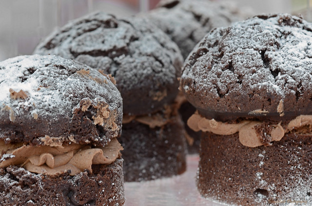
Gluttony....think I know who came up with this theme :razz: Stumped for ideas so went the obvious route...'cept I dont think it's that obvious in my shot ! Got the D7000 back from Nikon , sensor all nice n clean & auto focus repaired....
I tried a couple of these cakes before I took the photo's , on a cake stall at Hodsock Priory today...& OMG.....I could have eaten loads of them , totally scrummy. The lady running the stall asked what I was going to do with the shots so i told her they were for the theme of Gluttony....thats spot on she said...have another
Gluttony b by llj666, on Flickr
Not a good week theme for me...onwards & upwards to next saturday

Delicious work in your 52! Subscribing!
Hello Lynne, I like your gluttony shot, and they would have fit the first theme (sin) as well I think - they look very 'corrupting' for lack of a better word.
I like both of your time shots as well, though the second would be my favourite. I like how you've got the seconds hand showing at each individual 'tick' rather than a blur, if that makes sense. Were they very difficult to capture that way?
It's a shame about the scratches, and perhaps in retrospect capturing the seconds hand more to the top of the watch may have distracted the eye from them?
- Messages
- 4,088
- Name
- Graham
- Edit My Images
- Yes
good pair of time shots - both very different but each appealing in their own way.
Love the distortion, and how its twisted the hands on the first, and the detail is great on the second. The scratches could be seen to detract, but I find them a nice extra detail, plenty to look at in that shot, and well composed.
Love the distortion, and how its twisted the hands on the first, and the detail is great on the second. The scratches could be seen to detract, but I find them a nice extra detail, plenty to look at in that shot, and well composed.
- Messages
- 4,836
- Name
- Alan
- Edit My Images
- Yes
Hi Lynne
Time #1 - that is nice. Like the colour palette and the shape that you have achieved. Looks like a piece of high quality moulded glass ash tray- Caithness kind of style. Super lighting.
#2 - good comp and excellent crop. No idea how you did it but very good capture of the second hand. Don't mind the shiny surface or the scratches - just a matter of preference and the quality of the image overcomes those minor points. I have had my watch about 46 years so it would probably have as many dints and scratches.
The goblin
<span class="poty">POTY Winner 2015</span></br>
- Messages
- 4,407
- Name
- Marsha
- Edit My Images
- Yes
Hi Lynne, I like what you've done with the liquefy tool on number one. The bit of shadow on the right does add a little depth. I prefer the second one though, the movement is very clever If it wasn't for all the scratches this could be a product shot. However, I think the scratches add character and show a much loved watch
If it wasn't for all the scratches this could be a product shot. However, I think the scratches add character and show a much loved watch - Messages
- 532
- Name
- Ray
- Edit My Images
- Yes
First one shows good use of PP skills, second one is just a really great photo, with lovely tones.
blakester
Shine On Harvest Moon
- Messages
- 6,679
- Name
- Iain
- Edit My Images
- No
Another vote for #2 from me Lynne, but it was a close call
Its the level of detail you've captured, the second hand movement and the lighting which all come together to make it a quality image IMHO.
#1 as I said it was a close call, I really like the colours and lighting too.
Good work Missus
Its the level of detail you've captured, the second hand movement and the lighting which all come together to make it a quality image IMHO.
#1 as I said it was a close call, I really like the colours and lighting too.
Good work Missus
OP
- Messages
- 8,398
- Name
- Lynne
- Edit My Images
- Yes
Thanks for your comments...tis appreciated . The 2nd hand on my watch ticks as opposed to sweeps so it was fairly easy to capture the movement like I did...which was a bit of a bugger cos I actually wanted a sweep...too tight to buy another watch thoughHello Lynne, I like your gluttony shot, and they would have fit the first theme (sin) as well I think - they look very 'corrupting' for lack of a better word.
I like both of your time shots as well, though the second would be my favourite. I like how you've got the seconds hand showing at each individual 'tick' rather than a blur, if that makes sense. Were they very difficult to capture that way?
It's a shame about the scratches, and perhaps in retrospect capturing the seconds hand more to the top of the watch may have distracted the eye from them?
I like those - the second in particular is exactly what I had in mind for mine, but better executed than I could hope for - really nice and just the right count of seconds and at just the right time to make the image.
Cheers john...I'll check your thread soon in my mega comment catch up but I'm sure your shot will be as good if not better
For me I prefer the second time, especially the movement in it. It's a shame you didn't notice the scratches before as I think if shot/processed differently they could has added and interesting worn and aged look.
Thanks PK...tis amazing how much detail a macro lens picks up...you've got me thinking bout different pp now though...
Hi,
Loved the gluttony shot, very sharp and nicely composed.
Time (second one) i like a lot, nice idea with the movement.
Thanks Martin
- Messages
- 5,787
- Name
- Storm Trooper
- Edit My Images
- Yes
Gluttony.....I can almost taste those!!!!! I think I would have liked a few more in the shot to show real gluttony. A close up showing a whole one would be an alternative but wouldn't exactly show the theme.
Time......I like the second one the most, nice and sharp, looks great as a B&W and just the right amount of watch face showing.
Time......I like the second one the most, nice and sharp, looks great as a B&W and just the right amount of watch face showing.
OP
- Messages
- 8,398
- Name
- Lynne
- Edit My Images
- Yes
good pair of time shots - both very different but each appealing in their own way.
Love the distortion, and how its twisted the hands on the first, and the detail is great on the second. The scratches could be seen to detract, but I find them a nice extra detail, plenty to look at in that shot, and well composed.
Thanks mister , appreciate your comments
Hi Lynne
Time #1 - that is nice. Like the colour palette and the shape that you have achieved. Looks like a piece of high quality moulded glass ash tray- Caithness kind of style. Super lighting.
#2 - good comp and excellent crop. No idea how you did it but very good capture of the second hand. Don't mind the shiny surface or the scratches - just a matter of preference and the quality of the image overcomes those minor points. I have had my watch about 46 years so it would probably have as many dints and scratches.
Hi Allan....glad you like time #1...it's growing on me, not a bad result for 10 mins faffing in pse ! Time #2....surprised myself at capturing the movement I wanted in the 2nd hand...after 2 years of 52's it looks like I may have learnt some thing
Lynne, I really like the time warp shot, it's wonderful. To me the watch is just a watch, the moving second hand is pretty much invisible. Love the first, though.
Cheers Chris...yup , went for the obvious shot as very little Time to spend getting the shot it...but hey , I learnt something doing the Time Warp image & managed to create an image I had in my head with time #2 so quite a good weekend for me
Anything that reminds me of Dali gets a thumbs up from me, but it's #2 for me. Nice and clean with cracking movement. Liking the high key lighting. Wonder what a subtle border would look like.
Cheers.
Cheers matey....you feeling alright ?? no comment on the crop
 No borders for me..too much of a pain when putting the 52 photobook togther
 I like both time shots, I think the first one is my favourite as it's very unusual.
Thanks , glad someone else likes the Time Warp...wanna find more objects to warp now
OP
- Messages
- 8,398
- Name
- Lynne
- Edit My Images
- Yes
I love the watch pic with the sweeping hand, great work indeed
Cheers for your comments..appreciated
Hi Lynne, I like what you've done with the liquefy tool on number one. The bit of shadow on the right does add a little depth. I prefer the second one though, the movement is very clever
Thanks Marsha....everynow n then I see something in a magazine that I fancy trying & the Time theme fitted the bill for using the liquify tool . & chers for your kind comments on #2...rather pleased with how it turned out...almost exactly what I had in my minds eye for change
OP
- Messages
- 8,398
- Name
- Lynne
- Edit My Images
- Yes
First one shows good use of PP skills, second one is just a really great photo, with lovely tones.
Many thanks
Number 2 for me.
The composition is great and it's lovely and sharp. The scarring on the watch gives a real sense of the effects of the passage of time. Love it!
Aww..thanks Nick
Another vote for #2 from me Lynne, but it was a close call
Its the level of detail you've captured, the second hand movement and the lighting which all come together to make it a quality image IMHO.
#1 as I said it was a close call, I really like the colours and lighting too.
Good work Missus
Cheers matey
really like what you have done in pic 1 unusual and really caught my eye
Liquify tool in pse..thought I'd give it a try , glad you like it
Gluttony.....I can almost taste those!!!!! I think I would have liked a few more in the shot to show real gluttony. A close up showing a whole one would be an alternative but wouldn't exactly show the theme.
Time......I like the second one the most, nice and sharp, looks great as a B&W and just the right amount of watch face showing.
Chhers mister....I can asure you they were very tasty
OP
- Messages
- 8,398
- Name
- Lynne
- Edit My Images
- Yes
Week 9....had to google for ideas & meaning ....quite a scary theme at 1st glance but good'ol google showed me the way ..at least I thought it did ! Spent an hour driving round sheffield & rotherham looking for an image that I had in my mind...couldn't find it (the image not my mind ) Just about to give up & resort to plan b when I spotted something very close to what I wanted...unfortunately I couldn't get the high view point I wanted so settled for this :

Juxtaposition by llj666, on Flickr
Still not sure it shows juxtathingy but ran out of time & patience to do anything else...the weather was half decent & I needed to get out on the bike for a blast ..not sure it's done my cold a lot of good but I feel mentally better for it
Feel free to rip it to shreds people....I would like some feedback on the focus......having had the camera's autofocus fixed I'm now thinking the lens has a problem ?
cheers all
) Just about to give up & resort to plan b when I spotted something very close to what I wanted...unfortunately I couldn't get the high view point I wanted so settled for this :Juxtaposition by llj666, on Flickr
Still not sure it shows juxtathingy but ran out of time & patience to do anything else...the weather was half decent & I needed to get out on the bike for a blast ..not sure it's done my cold a lot of good but I feel mentally better for it
Feel free to rip it to shreds people....I would like some feedback on the focus......having had the camera's autofocus fixed I'm now thinking the lens has a problem ?
cheers all
I'm pulling my hair out trying to think of something for this theme, and I don't have all that much to spare!
As I understand it, juxtaposition is the act of placing two items side by side for comparison in order to highlight their contrasting differences. I think.
I like the composition, the 'zig zag' of windows leads my eye along the picture to the tall building, and the combination of the new and the old, and the bright and the drab suits the theme nicely IMO.
As an afterthought, I might have cropped the picture so those windows peeking out at the very bottom l/h of the picture didn't show, or would it have clipped the windows on the near r/h side?
Very good idea and pic.
Now to put my thinking cap on.. :bang:
- Messages
- 19,461
- Name
- Andy
- Edit My Images
- Yes
Hi, Lynne, Juxtaposition is bang in theme. Old and new juxtaposed. I'm on iPad so can't comment on focus but looks fine to me. Well composed. The slightly ajar window on the right really works for me.
Crit, well I might have cloned out the bushes growing from the chimney on the RHS.
Good show, now you can put your feet up
Cheers.
Crit, well I might have cloned out the bushes growing from the chimney on the RHS.
Good show, now you can put your feet up
Cheers.
OP
- Messages
- 8,398
- Name
- Lynne
- Edit My Images
- Yes
I'm pulling my hair out trying to think of something for this theme, and I don't have all that much to spare!
As I understand it, juxtaposition is the act of placing two items side by side for comparison in order to highlight their contrasting differences. I think.
I like the composition, the 'zig zag' of windows leads my eye along the picture to the tall building, and the combination of the new and the old, and the bright and the drab suits the theme nicely IMO.
As an afterthought, I might have cropped the picture so those windows peeking out at the very bottom l/h of the picture didn't show, or would it have clipped the windows on the near r/h side?
Very good idea and pic.
Now to put my thinking cap on.. :bang:
Thanks Steven , I too have lost a few strands of hair & more has turned grey with this theme
I tried various crops but kept losing bits of the image as left as was...just cropped a sliver from the lhs due to a slight distortiion correction Hi, Lynne, Juxtaposition is bang in theme. Old and new juxtaposed. I'm on iPad so can't comment on focus but looks fine to me. Well composed. The slightly ajar window on the right really works for me.
Crit, well I might have cloned out the bushes growing from the chimney on the RHS.
Good show, now you can put your feet up
Cheers.
Cheers matey...did wonder about the bush growing out of the chimmey pot but thought that it added to the whole juxtaposed thingy ?
- Messages
- 532
- Name
- Ray
- Edit My Images
- Yes
I like it, great take on the theme - old build, new build.
Composition is great with the horizontal and vertical lines, and with the repeating pattern of the houses I had to go full size to make sure you hadn't copy/pasted them all! (although that did lead me to notice the couple of greyed chimneys!)
Nothing looks wrong with the focus though, any softness will presumably be due to taking it at f16.
Composition is great with the horizontal and vertical lines, and with the repeating pattern of the houses I had to go full size to make sure you hadn't copy/pasted them all!
(although that did lead me to notice the couple of greyed chimneys!)Nothing looks wrong with the focus though, any softness will presumably be due to taking it at f16.
- Messages
- 4,088
- Name
- Graham
- Edit My Images
- Yes
Cracking shot Lynne - the missed chimney pot is the only thing that lets it down for me. love the use of colour on the houses against the B&W of the tower block.
And on a pretty hard week theme-wise, you're bang on theme.
I wonder how easy cloning out the lampost would be too?
And on a pretty hard week theme-wise, you're bang on theme.
I wonder how easy cloning out the lampost would be too?
- Messages
- 4,836
- Name
- Alan
- Edit My Images
- Yes
Hi Lynne -
Juxtaposition - spot on . Good comp, good contrast with old and new, colour and b&w, height. Some very minor points mentioned by others but don't detract from a super sffort.
Could say........ ......
But just for you :.....

Juxtaposition - spot on
. Good comp, good contrast with old and new, colour and b&w, height. Some very minor points mentioned by others but don't detract from a super sffort.Could say........
......But just for you :.....
Last edited:
- Messages
- 1,221
- Name
- Carl
- Edit My Images
- Yes
Hi Lynn. glad I was not the only one who had to google the def of juxtaposition ... I am also thinking old new / modern traditional.
Well you cracked it and I think many others will follow suit. I like the idea of juxtaposition of colours so will look for yellow / blue as opposites of colour wheel ( thanks to my smart kid daughter for that one)
Good work as ever.
Carl
Well you cracked it and I think many others will follow suit. I like the idea of juxtaposition of colours so will look for yellow / blue as opposites of colour wheel ( thanks to my smart kid daughter for that one)
Good work as ever.
Carl
- Messages
- 213
- Name
- Everton
- Edit My Images
- Yes
Took a week off, and now struggling to catch up with FB.
Still trying to get my head round this one and looking at yours and others understanding the theme better
Very good example of the theme, old with new, small with large, looks in focus to me
Still trying to get my head round this one and looking at yours and others understanding the theme better
Very good example of the theme, old with new, small with large, looks in focus to me