
You are using an out of date browser. It may not display this or other websites correctly.
You should upgrade or use an alternative browser.
You should upgrade or use an alternative browser.
Ian Wilson's 52 - Wk 19 INGREDIENTS & QUAD added
- Thread starter Ian_Wilson
- Start date
OP
- Messages
- 200
- Edit My Images
- Yes
Not very happy with any of these images and all I can do at this late stage is to crop them differently. I have always stuck rigidly to my 3:2 aspect ratio, so in the interest of trying something new and improving the end result I have allowed myself the luxury of cropping to whatever ratio suits the pic.
I think these work better, but that may just be desperate hope and subjectivity rather than reality so would REALLY appreciate any objective views:


I think these work better, but that may just be desperate hope and subjectivity rather than reality so would REALLY appreciate any objective views:
- Messages
- 8,336
- Name
- Ian
- Edit My Images
- No
Not very happy with any of these images and all I can do at this late stage is to crop them differently. I have always stuck rigidly to my 3:2 aspect ratio, so in the interest of trying something new and improving the end result I have allowed myself the luxury of cropping to whatever ratio suits the pic.
When I saw the bus shot up above, I thought exactly the same as you and Arthur (above)
Much improved.
As to the empty street shot. It almost works for me. The overlapping railings spoil it a little, but a lower PoV would spoil your shadows. Not sure how I'd approach a shot like this, but I see what you're getting at, and think it had potential to be the better of the two. Maybe a higher PoV if it was possible?
Either way, the bus shot is the winner for me.
Ian.
- Messages
- 246
- Name
- Steve
- Edit My Images
- Yes
Was going to suggest a tighter crop on the bus shot but you've already done it. As Arthur said, for some reason the empty seat in front of them seems to add something but I can't put my finger on it. Maybe it's because the central passenger looks a little lost\lonely. As if he is missing something\someone.
 ...
...SarahLee
TPer Emerita
- Messages
- 13,060
- Name
- Sarah
- Edit My Images
- No
No more sprouts in puddles this week? 
It'll be the cropped bus shot for me then.
The crop is a big improvement, although perhaps I would have kept a touch more of the black along the bottom edge.
There's just something about the way that the orangey flare washes over the empty seats at the front. It's something that in principle really shouldn't work, but it just does . . . brilliantly.
It'll be the cropped bus shot for me then
. The crop is a big improvement, although perhaps I would have kept a touch more of the black along the bottom edge.
There's just something about the way that the orangey flare washes over the empty seats at the front. It's something that in principle really shouldn't work, but it just does . . . brilliantly.
- Messages
- 1,780
- Name
- Darren
- Edit My Images
- Yes
I think I actually prefer the original bus image (I'm not a fan of odd proportions on crops). Some eye contact from one of them would have been great.
The kid walking along is a good shot and whilst maybe not having a great deal going on makes you think about him the more you look at his face and expression.
Afraid the railings shot isn't working for me. Maybe needed a sprout to help it out a bit
The kid walking along is a good shot and whilst maybe not having a great deal going on makes you think about him the more you look at his face and expression.
Afraid the railings shot isn't working for me. Maybe needed a sprout to help it out a bit
OP
- Messages
- 200
- Edit My Images
- Yes
I think I actually prefer the original bus image (I'm not a fan of odd proportions on crops). Some eye contact from one of them would have been great.
The kid walking along is a good shot and whilst maybe not having a great deal going on makes you think about him the more you look at his face and expression.
Afraid the railings shot isn't working for me. Maybe needed a sprout to help it out a bit
Ha! The sprouts are still haunting me!
I can see my photography career is already heading down the route of sprout specialist
A good selection of street shots.
I really like the cropped version of the first one, which takes out all the distractions and leaves the arresting patterns of light and shadow - well spotted.
I like the rim lighting of the second but find the way the railing cuts him in half too disturbing.
I prefer the original crop of the bus - it is more identifiable and there is a lovely balance of colours between the blue and the orange.
Well done.
OP
- Messages
- 200
- Edit My Images
- Yes
Thought his would be easier than it was! Not helped because I had to scrap my original idea due to non-cooperative teenager mood swings (my sons, not mine!).
2 ideas worked on were
a) Panning
b) Shooting from moving vehicle
both things involving speed and I had never tried either before so the end result is less important than the learning experience.
Once again found that the shot I chose was not the one I was aiming for. I love the painterly effect of this shot and it is more or less straight out of the camera apart from a little straightening, crop and level adjustment. The effect is provided by a hedge in the foreground close to the side window of the car I was shooting out of (I wasn't driving at the time, honest!)

The best of the panning shots was this:

and the other shots I considered were:

and this

As always any comments welcome, good or bad.
PS: For the sprout fans out there, I'm sorry I couldn't find any fast moving sprouts or think of any way to work them into the theme
2 ideas worked on were
a) Panning
b) Shooting from moving vehicle
both things involving speed and I had never tried either before so the end result is less important than the learning experience.
Once again found that the shot I chose was not the one I was aiming for. I love the painterly effect of this shot and it is more or less straight out of the camera apart from a little straightening, crop and level adjustment. The effect is provided by a hedge in the foreground close to the side window of the car I was shooting out of (I wasn't driving at the time, honest!)
The best of the panning shots was this:
and the other shots I considered were:
and this
As always any comments welcome, good or bad.
PS: For the sprout fans out there, I'm sorry I couldn't find any fast moving sprouts or think of any way to work them into the theme
- Messages
- 193
- Edit My Images
- No
Hehe...teenage mood swings! Never productive for the creative juices.
Number 1 works best for me Ian. Simple and effective.
Cheers, Rob
Never productive for the creative juices.Number 1 works best for me Ian. Simple and effective.
Cheers, Rob
OP
- Messages
- 200
- Edit My Images
- Yes
Hehe...teenage mood swings!
Number 1 works best for me Ian. Simple and effective.
Cheers, Rob
Sorry I 've got a bit behind with your thread, but I'd definitely vote for Speed shot #1 if you had another poll. I love it!
I hope you're not too disappointed if your Study of Sprout reclining in Puddle doesn't win a Worst Photo Award.
Jean
Thanks for taking the time Rob, Jean.
Must admit I am once again a bit embarrassed when I compare my simple shots to many of the very excellent submissions on this theme, but as long as I am trying new things and learning it is worthwhile.
Anyone know what the new theme is this week?
After several tricky weeks and not terribly exciting results I am determined to produce something of a higher standard , and I think I need to plan more and to start sooner rather than rushing it on a Sunday afternoon again.
Where can I find the announcement of the theme?:shrug:
SarahLee
TPer Emerita
- Messages
- 13,060
- Name
- Sarah
- Edit My Images
- No
Hi Ian,
Next week's theme is "present". It's posted in "competitions, challenges and inspiration" here.
Well done on having a try with panning this week. Not something I've ever tried and I imagine it's damn hard to get right. That van is so very nearly there, I reckon with a bit more practice you'll have it nailed.
I agree with your choice for the week though. Shot 1 is my favourite too - It really has got that painted feel to it, definitely says speed but you've managed to keep enough definition in the trees so that we can see what they are.
Not too keen on the final shot, but number 3 is very interesting and comes close to being my favourite - mainly because I can't quite work it out and have to keep looking back at it.
It's like a picture within a picture and those splashes of pink on the figures draw your eye right into it.
I have no idea how you did it and it's a very odd looking image - but odd in a good way :shrug:
p.s. As far as I can see there's absolutely nothing to be embarrassed about with any of your shots, so stop putting yourself down
Last edited:
- Messages
- 1,515
- Name
- Kay
- Edit My Images
- Yes
I reeally like the first Speed shot, it has a nice 'Impressionist' feel to it
Panning is a tricky thing to get the hang of, I shoot a fair bit of motorsport and I'l keep maybe a few out of every hundred pictures I take! Lots of practice and you'l get there
Panning is a tricky thing to get the hang of, I shoot a fair bit of motorsport and I'l keep maybe a few out of every hundred pictures I take! Lots of practice and you'l get there
- Messages
- 8,336
- Name
- Ian
- Edit My Images
- No
I like the third shot to be honest. The first does look painterly and I can see why you chose it, however I find something quite mournful in the third shot with the mother & children.
I really can't think of anything more constructive than the fact that I just prefer it.
Of course you're teasing us about the sprouts. Going to give us all a present at the end of the week perhaps?
Ian.
I really can't think of anything more constructive than the fact that I just prefer it.
Of course you're teasing us about the sprouts. Going to give us all a present at the end of the week perhaps?
Ian.
OP
- Messages
- 200
- Edit My Images
- Yes
I like the third shot to be honest. The first does look painterly and I can see why you chose it, however I find something quite mournful in the third shot with the mother & children.
I really can't think of anything more constructive than the fact that I just prefer it.
Of course you're teasing us about the sprouts. Going to give us all a present at the end of the week perhaps?
Ian.
Ha Ha, you have just given me an idea, have been struggling desperately for inspiration and I have just had the germ of an idea. Basically someone receiving a beautifully wrapped present that is actually a bag sprouts.
I am not going to be able to find a model so will have to do it for real...my wife's reaction will be worth a photo when she opens her Valentines day present! Will have to get the shot in one take and be ready to run away fast.
I do quite like the way that the mother and children are seen reasonably clearly and yet the foreground is blurred and you are clearly rushing past, but I thought that was just me.
It's funny how one weeks experience leads into the next, as it is kind of a snatched street shot, that i probably wouldn't have kept it if we hadn't have done Street last week.
- Messages
- 8,336
- Name
- Ian
- Edit My Images
- No
.my wife's reaction will be worth a photo when she opens her Valentines day present!
You sir, are a brave brave man.
Ian.
- Messages
- 8,336
- Name
- Ian
- Edit My Images
- No
I know Lee has been going round a lot of old threads poking people with a stick, but I agree with him on this.
Have you given up Ian?
Ian.
Have you given up Ian?
Ian.
OP
- Messages
- 200
- Edit My Images
- Yes
I know Lee has been going round a lot of old threads poking people with a stick, but I agree with him on this.
Have you given up Ian?
Ian.
Not intentionally.
Too much going on at home and work for a spell and never did anything for "Present" and then kind of lost track of what was needed.
Now I have to go and find out what all the missing weeks are....
which will depress me even more.
Maybe best thing is to start with this weeks theme and try to add missing weeks out of order...goes to search for theme.
Ian
OP
- Messages
- 200
- Edit My Images
- Yes
Anyone care to tell me what the themes are that you have all been working on since "Present"? Or is there somewhere with a list of weekly themes?
Got it -
Present
People
Mechanical
Play
Chemistry
Candid
Hmmm....
Sounds like a lot of thinking involved in these and thinking always slows me down so best tactic is perhaps to cheat a bit and reach for a big shoe horn at least until I get caught up.
Got it -
Present
People
Mechanical
Play
Chemistry
Candid
Hmmm....
Sounds like a lot of thinking involved in these and thinking always slows me down so best tactic is perhaps to cheat a bit and reach for a big shoe horn at least until I get caught up.
Last edited:
OP
- Messages
- 200
- Edit My Images
- Yes
PEOPLE
I did a fashion style location shoot with a brilliant young model called Becca from Purestorm. Never had a shoot where I got so many good pics and that has to be down to the model as I didn't do anything different.
These are the ones I feel are best though;
1. Leaning towards this as it is the most dramatic

but I also like these
2.

3.

4.

5.

Like I say, too many to choose from so any opinions welcome on preferences or where the photography could be better.
I did a fashion style location shoot with a brilliant young model called Becca from Purestorm. Never had a shoot where I got so many good pics and that has to be down to the model as I didn't do anything different.
These are the ones I feel are best though;
1. Leaning towards this as it is the most dramatic
but I also like these
2.
3.
4.
5.
Like I say, too many to choose from so any opinions welcome on preferences or where the photography could be better.
OP
- Messages
- 200
- Edit My Images
- Yes
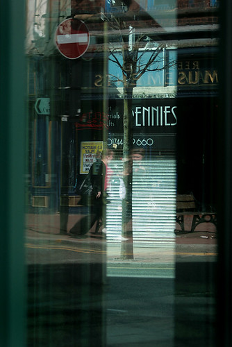
OK, in the effort to catch up on a few weeks, some shameful stretching of the the themes will be necessary...so here we have "Play with reflections" from a half hour walkabout round St Helens Town Centre while my 14 yo son was warming up for his heavy metal gig.
Only 2 alternative shots this time, and I am submitting the 1st one as it is more interesting for me than the other. Plan was to work on 2 themes per week, but 2 shots will have to suffice for now.
1.
2.

Only 2 alternative shots this time, and I am submitting the 1st one as it is more interesting for me than the other. Plan was to work on 2 themes per week, but 2 shots will have to suffice for now.
1.
2.
OP
- Messages
- 200
- Edit My Images
- Yes
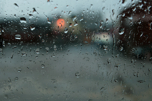
OK, more desperate theme-stretching gives us the "Chemistry of light reacting with glass and water""
....sorry but desperate times require desperate measures and if I don't get caught up now I never will.
Another half hour waiting around for kids - this time during my daughters flute lesson I was sat in the car and started looking at the raindrops on the car window and came up with some I am quite pleased with as themeless shots, but a little embarrassed to submit under the Chemistry heading.
1. Submission & my favourite
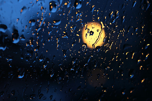
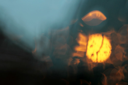
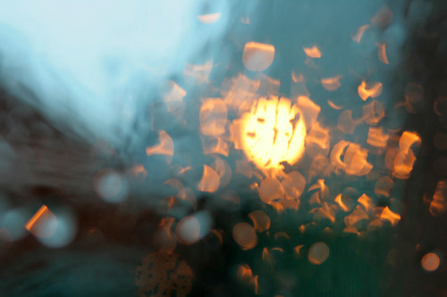
2. These were the other candidates
....sorry but desperate times require desperate measures and if I don't get caught up now I never will.
Another half hour waiting around for kids - this time during my daughters flute lesson I was sat in the car and started looking at the raindrops on the car window and came up with some I am quite pleased with as themeless shots, but a little embarrassed to submit under the Chemistry heading.
1. Submission & my favourite
2. These were the other candidates
- Messages
- 5,450
- Name
- April 2008
- Edit My Images
- No
Well, not sure about Chemistry, but those people shots look really great to me. Top marks for catching up! My fave of your latest upload has to be the last 'people' shot... looks very pro to me from all point - exposure, lighting, pose, location, etc.
- Messages
- 8,336
- Name
- Ian
- Edit My Images
- No
Those people shots are excellent Ian #2 for me as the winner.
If I were you, I'd skip the missing weeks rather than panic, and just join up with Week 12 (Produce). I fell behind for a couple of weeks and just gave up on Chemistry.
Glad you're back!
Ian.
If I were you, I'd skip the missing weeks rather than panic, and just join up with Week 12 (Produce). I fell behind for a couple of weeks and just gave up on Chemistry.
Glad you're back!
Ian.
jgs001
Brian Cox
- Messages
- 12,646
- Name
- John
- Edit My Images
- Yes
Welcome back Ian, well done for working on catching up, no rush though, fill em in as you go... Chemistry the first sort of works, but it's real crowbar material... People, they are all good shots, but I only see 1 person (being picky) ... may fave is the last one of People.
... may fave is the last one of People.SarahLee
TPer Emerita
- Messages
- 13,060
- Name
- Sarah
- Edit My Images
- No
Good to see you back Ian.And in reverse order . . .
Chemistry : Yep. I like the one you chose. It's got an "arty" feel and it's just quite pleasing on the eye. I don't know what it's got to do with chemistry, but :shrug: it helped get you up to date.
Playing with reflections : I wasn't sure about this when I first saw it, but the more I look the more interested I get.
Is it a reflection of a reflection or some clever PP? I can't quite work out how part of the reflection has the writing the right way round, but the other part is clearly a mirror image.
Whatever you've done, once I started looking I really got drawn into this one.
People : They've all come out really well!
My favourite is No.3 out of that set. I like the reflections in her glasses and the fact that her eyes are still sharp behind them.
OP
- Messages
- 200
- Edit My Images
- Yes
Those people shots are excellent Ian #2 for me as the winner.
If I were you, I'd skip the missing weeks rather than panic, and just join up with Week 12 (Produce). I fell behind for a couple of weeks and just gave up on Chemistry.
Glad you're back!
Ian.
It is good to be back, I hate letting things drop. While I am sure you are right about skipping the missing weeks I am not sure I can let myself off the hook that easily - it will bug me until I get properly up to date
Welcome back Ian, well done for working on catching up, no rush though, fill em in as you go... Chemistry the first sort of works, but it's real crowbar material... People, they are all good shots, but I only see 1 person (being picky)
I confess to a very significant crowbar usage! Can I ask for multiple offences to be taken into account?
Well, not sure about Chemistry, but those people shots look really great to me. Top marks for catching up! My fave of your latest upload has to be the last 'people' shot... looks very pro to me from all point - exposure, lighting, pose, location, etc.
I have done more portraiture and model shoots than anything type of photography so that is sort of home ground for me, and the idea of this was really to try new things so it's a bit of a cheat really.
And in reverse order . . .
Chemistry : Yep. I like the one you chose. It's got an "arty" feel and it's just quite pleasing on the eye. I don't know what it's got to do with chemistry, but :shrug: it helped get you up to date.
Playing with reflections : I wasn't sure about this when I first saw it, but the more I look the more interested I get.
Is it a reflection of a reflection or some clever PP? I can't quite work out how part of the reflection has the writing the right way round, but the other part is clearly a mirror image.
Whatever you've done, once I started looking I really got drawn into this one.
People : They've all come out really well!
My favourite is No.3 out of that set. I like the reflections in her glasses and the fact that her eyes are still sharp behind them.
Thanks Sarah, the chemistry was meant to be the reaction between water, glass and light but I admit it is a bit tenuous to say the least.
The reflections play is as shot (apart from crop and lightness/contrast) adjustments. I am not able to do clever PP I'm afraid.
Basically I shot through 2 empty shop windows that were at right angles to each other and I don't know what was reflecting from where but it was pretty weird. I think because there were 2 semi reflective windows there are 2 different sets of reflections mixed together over the view through the window. A lot of the stuff in there comes from further up the main road I was shooting onto.
Thanks to all who have kindly commented. I will get round to reciporicating but am a bit wary of seeing too many ideas on themes I have yet to do so will try to catch up first.
OP
- Messages
- 200
- Edit My Images
- Yes
Had the opportunity to grab some pics today at a farm where my youngest was doing her horse stuff, and came across an old tractor in one of the sheds, so spent a bit of time on this and realised it would perhaps qualify as "Mechanical" theme, which would get me caught up to week 10.
This is my favourite;

and I don't think any of the other candidates come close;
1.
2.
3.
I am not going to put myself under pressure to catch up.
I will just try and stay with the new themes (again) and if the opportunity to fill in any of the missed weeks presents itself I will.
This is my favourite;
and I don't think any of the other candidates come close;
1.
2.
3.
I am not going to put myself under pressure to catch up.
I will just try and stay with the new themes (again) and if the opportunity to fill in any of the missed weeks presents itself I will.
Last edited:
OP
- Messages
- 200
- Edit My Images
- Yes
I am a bit confused about what is happening this week with CLOSE and INDULGENCE - anyone care to tell me why there are two themes?
Anyway, I have something for close so am going with that!
1. Preferred choice

2. Alternative

[These are water droplet CLOSE up]
Anyway, I have something for close so am going with that!
1. Preferred choice
2. Alternative
[These are water droplet CLOSE up]
Last edited:
- Messages
- 8,336
- Name
- Ian
- Edit My Images
- No
Welcome back (again) Ian!
Really like the water droplet shots. I'm rubbish at them and find them really difficult, so well done. Can't really comment beyond that as I don't know what I'm talking about.
I also like the B&W tractor. Good range of tones and an almost abstract composition. Works well for me.
Ian.
Really like the water droplet shots. I'm rubbish at them and find them really difficult, so well done. Can't really comment beyond that as I don't know what I'm talking about.
I also like the B&W tractor. Good range of tones and an almost abstract composition. Works well for me.
Ian.
karmagarda
Good between the sheets
- Messages
- 2,821
- Name
- Conor
- Edit My Images
- Yes
Haha! This is one wicked 52 that you have! Loving that "Sprout in a puddle shot", absolutely one of the worst shots, yet at the same time the most genius shot, I've ever seen 
To pick out a few favourites, Chemistry, even though it doesn't really relate to the theme for me, is very very good. Love the abstractness of it. The contenders aren't even close to how good the first one is for me though. For people, number 3 is awesome. Easily my favourite. The lighting and crop make it a very interesting photo. All the rest are also really good shots. I can't really offer any crit, only stay away from sprout fields any more you nutter!
To pick out a few favourites, Chemistry, even though it doesn't really relate to the theme for me, is very very good. Love the abstractness of it. The contenders aren't even close to how good the first one is for me though. For people, number 3 is awesome. Easily my favourite. The lighting and crop make it a very interesting photo. All the rest are also really good shots. I can't really offer any crit, only stay away from sprout fields any more you nutter!
OP
- Messages
- 200
- Edit My Images
- Yes
Welcome back (again) Ian!
Really like the water droplet shots. I'm rubbish at them and find them really difficult, so well done. Can't really comment beyond that as I don't know what I'm talking about.
I also like the B&W tractor. Good range of tones and an almost abstract composition. Works well for me.
Ian.
Thank you!
The water droplet shots were actually fairly easy from a photographic point of view as I followed a YouTube video that went through it step by step. The most diffficult thing was to set up the water drips.
Used low power on the speedlight so that the flash duration was very short and 'froze' the water, and sett the white balance to tungsten to get the deep blue colour.
Will try and stay with it ffrom here on in.
- Messages
- 1,560
- Name
- Chris
- Edit My Images
- Yes
welcome back mate, sprout in puddle? best place for them if you ask me!!!
too many to comment individually but your People shots are excellent, chemistry stands out for me too and i like what you have done with some of the reflections shots. Keep hanging in there you have some interesting stuff (except the sprouting spawn of the devil)
too many to comment individually but your People shots are excellent, chemistry stands out for me too and i like what you have done with some of the reflections shots. Keep hanging in there you have some interesting stuff (except the sprouting spawn of the devil)
SarahLee
TPer Emerita
- Messages
- 13,060
- Name
- Sarah
- Edit My Images
- No

Welcome back again !!!!
I absolutely agree with your chosen shots for mechanical and close. Both are head and shoulders above the outtakes.
The angle, colours and shadows in the tractor shot are spot on for me.
The light coming through the window(?) with horizontal stripes is a nice touch too.
And the water drop
I've had a few half-hearted attempts at this, but never devoted enough time to it to get a really good one.
Well done for persevering and getting it.
p.s the 2 themes are because Simon was a bit late posting this week (Busy indulging himself apparently
), so Nicki stepped in and chose a theme for people who wanted to get out shooting early on the bank holiday.