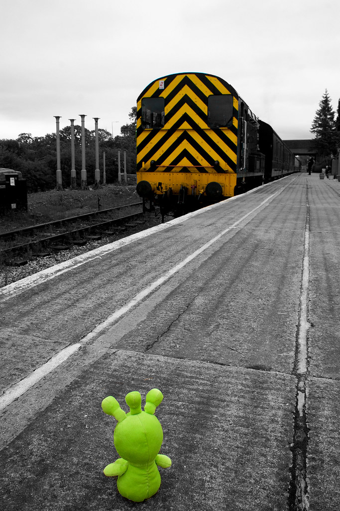
weekly Michael23's 2012 52 COMPLETED! WooHoo! Slide show added

I knew there was something I forgot to post! The details....

Number 1:

This is a handful of drinking straws, stuffed inside a tissue roll tube, took 6 pictures altering the camera position very slightly on some pics.

Lens was sigma 70-300 apo + a close up lens, giving quite high magnification

I then stacked these in a programme called Starstax . The stacked image was opened in elements 10, where I increased the contrast and saturation and a sharpen.

Number 2:

This was 9 pictures of rain water on my patio table, which has black glass making the patterns stand out quite well, again I stacked these images to give the different patterns, upped the contrast again and did a black and white conversion using the infra red preset in elements 10 which made things stand out quite well, I then used the adjust colour option and decreased the red channel and got this colour, plus a sharpen Lens was 18-55 with close up lens

Number 3:

This is the brass handle on my patio door, raw file opened and blacks pushed to around the 60 mark I think, pushed the fill light a little as well, then opened in elements 10 and saturation pushed a little and a sharpen too. 18-55 with close up lens

Number 4:

This is the pole for my clothes line! I was looking at rain drops and saw this one and manged a couple of shots before it dripped away! Pushed blacks a little on the raw file, converted to b+w in elements 10 and I used adjust colour and added blue, which I am really liking at the moment.

Hope have explained that clearly enough, if not let me know (y)

Really pleased with this set of pictures and I feel a much stronger interpretation of the theme than in last years project

Pleased you all like it (y)
 
no.4 reminds me of a microscopic pic of bacteria :-O
 
You've been having some fun there Michael... love the first one.. they all fit the theme perfectly though.
 
Hi, bud....NICE.

I'm on my phone so won't comment in detail....but these are bang in theme. interestingly enough I was looking at abstract impression paintings yesterday and your first 2 are of that genre.

However, it might based #3 for me.

Clap....clap ...clap chap!!
 
Definitely #3 for me, something about the colour and clarity with the water drops that gives it the edge :clap:
 
Hi, Michael, they look even better on my laptop.

Of the 4, it's #4 then #1. #1 is bang on theme. Great, vivid, colours and it feels like it has great depth.

#4 is the best for me. Really like the processing and it has a religious feel to it, for me, crown of thorns. Although it doesn't detract too much for me, possibly the lower centre section in focus?

:clap:

Cheers.
 
What can I say Michael, they're all stunners! A VERY good week for you it seams!

If I had to pick, it'd be number 3 I think. Or one. Or two or four!

Perfection!
 
#3 and 4 for me, #3 was well spotted and I like that one the most even though I'm not quite sure what it is. The tone really works for #4. ;)
 
Thanks everyone (y) The comments are very much appreciated, and when I read them my reaction was WOW! For these pics to be so well received, I am over the moon! I'm not sure which too pop in the flickr group, it's down to 3, the patio door handle and 4, the clothes line post. Andy, I see your point on the focus that you mentioned, I hadn't noticed it, dof was very minimal so doubt I could improve it.

(y)
 
Andy, I see your point on the focus that you mentioned, I hadn't noticed it, dof was very minimal so doubt I could improve it.

(y)

Hi, Michael, I'm hear to learn, so I'll ask, what would F16 (as opposed to F11) @ 1/100 (as opposed to 1/200) have resulted in?

Cheers and I'd forgotten about the Flickr group. Also, my 2012 TP 52 Abstract is much better that my TP 2011 TP 52 as well....which is good for both of us...:D
 
Hi Andy, I am not 100% sure how much difference f16 would have made, perhaps if I moved the focus point lower and used f16, I may have got more of the pole in focus whilst still managing to keep all the top area included too, but focus would have more critical, and this being a hand held shot could well have been more difficult, also didn't want to miss the droplet, I was that close up my breathing almost killed the droplet.
 
Abstract - You have really excelled yourself this week, they are all strong contenders but I like the colour and detail on number 3. Really nice work. Nick (y)
 
hi Michael, what a great set you have for this theme!! I'm tied between 3 and 4 but am leaning towards 3 as I really like the colours and sharpness of it (not that your others arent sharp this one just jumps out more:)).
Some of these themes certainly make you see things differently!:)
 
Hi Michael, I'm slowly getting there with my catch up

Authority - loving both and excellent use of selective colouring, but the doggy suit is more on theme for me

Leave - interesting take on the theme and for me the processing fits it really well.

Random - great idea and very creative

Temperature - good pose, bang on theme

Abstract - wow wow and wow!!! Amazing set love em all (y)
 
can't say anymore than everyone else nice set of pics (y) I do like 3 and 4 :clap:
 
Hi Ya

brilliant set of images for Abstract, all strongly on theme....nu #1 & 3# for me , #1 just love the colors & softeness of the image , #3....just a fab image , sharp , strong colors , great water droplets & would never have guessed it's a handle .....excellent work Michael :clap:
 
Right, week 24, can't believe how quick these weeks are flying by!

Had some time at Midland Railway Centre in Butterly today, and I seem to have had symmetry on my mind, no idea why :LOL:

Hopefully hese will fit the bill, and I look forward to seeing your thoughts


Week 24, symmetry by scilly puffin, on Flickr

One of my favourite Diesel Engines, A class 20 upfront


Week 24, symmetry #2 by scilly puffin, on Flickr


Week 24, symmetry #3 by scilly puffin, on Flickr


Week 23, symmetry #4 by scilly puffin, on Flickr
 
#1 would have been great for the theme if it had been straight on, as it is #3 is the best photo IMO.
 
Hi, Michael, quick off the mark...(y)

All four have symmetry, but for me, it's an absolute word and you've missed the perfection of symmetry in a few.

#1, interesting colours but needed to be more square on.
#2, better and I do like the bold, white circle at the bottom. Symmetry is a tad off.
#3, that looks like an interesting object and I like the textures and muted colours.
#4, symmetrically, this is the best IMO. Nice strong lines. Looks like the shadows and sky were an issue and you made the best choice of a silhouette.

Cheers.
 
my preference is 2 or 4 although I'd be tempted to crop 2 down to just the round things :clap: I do like using ordinary stuff for extraordinary pics :banana:
 
No 2 for me with a tighter crop I don't think it matters that the images themselves are symmetrical as long as the featured item has symmetry, its just a mirrored image otherwise. (y)
 
I wasnt meant to be posting on this weeks yet but here I am.

I like #4, its symmetry without being totally obvious.

The others do definitely meet the theme. I think #1 would be good straight on.
 
Micheal, the first isn't quite straight enough on for me to show symmetry... it's interesting though, as is the second, and the crop works better. However, the third is my fave of these and works best for the theme
 
oh no you're gonna be mad! I think the crop is too tight now :p :p

maybe I will just stick with the bridge before I cause you too much work :LOL:
 
I wasnt meant to be posting on this weeks yet but here I am.

I like #4, its symmetry without being totally obvious.

The others do definitely meet the theme. I think #1 would be good straight on.

Hi Alex, I wish I could have got straight on with number 1, but had to settle for this position,

Micheal, the first isn't quite straight enough on for me to show symmetry... it's interesting though, as is the second, and the crop works better. However, the third is my fave of these and works best for the theme
Thanks very much John, can't decide between 3 and 4 myself now.


oh no you're gonna be mad! I think the crop is too tight now :p :p

maybe I will just stick with the bridge before I cause you too much work :LOL:

:LOL::LOL: I don't mind going back to them, but I did try numerous crops of the class 20 loco, but settled on this crop, the others didn't really work that well. As said, it's between 3 and 4 now and I can't make my mind up :thinking:
 
Back
Top