

You are using an out of date browser. It may not display this or other websites correctly.
You should upgrade or use an alternative browser.
You should upgrade or use an alternative browser.
THE PP GAME!
- Thread starter Phil Young
- Start date
 .
.- Messages
- 1,756
- Name
- Jim
- Edit My Images
- Yes
Here's the last minute rush of entries galloping over the horizon into the box canyon to save the day................ er no, it's only me I'm afraid.
Here's the screen grab for ARC,
View attachment 16461
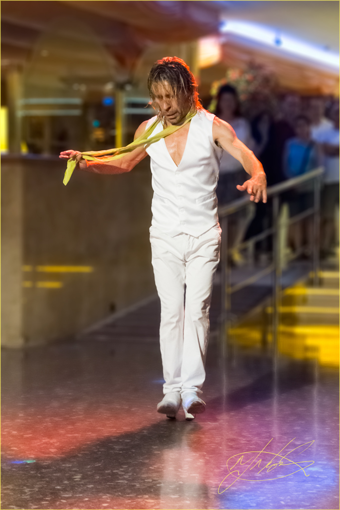
Then I selected the dancer [Who I'm reliably informed is in fact Rhodese himself!] I made a layer by copy and desaturated the back-ground and also gave it 12% radial blur in the zoom mode which worked OK but was a shame because it blurred out Homer and Lisa Simpson.
Then I sharpened up the dancer [Rhodese] a bit and tried to get rid of the noise but didn't have much luck.
Flattened and reduced image size for upload.
Please don't make me the winner
View attachment 16462
Here's the screen grab for ARC,
View attachment 16461
Then I selected the dancer [Who I'm reliably informed is in fact Rhodese himself!] I made a layer by copy and desaturated the back-ground and also gave it 12% radial blur in the zoom mode which worked OK but was a shame because it blurred out Homer and Lisa Simpson.
Then I sharpened up the dancer [Rhodese] a bit and tried to get rid of the noise but didn't have much luck.
Flattened and reduced image size for upload.
Please don't make me the winner
View attachment 16462
- Messages
- 3,194
- Name
- Paul
- Edit My Images
- No
I'm making my excuses early ...
I didn't have a lot of time, and my monitor is shot (waiting on a nice new one from Dell) ...
Good. Got them out of the way ...
Import into LR with my usual default of applying any lens corrections (CA only I think in this one)
Used the eye dropper on the mans suit (is it really Rhodese??) to set wb
Cropped in tighter, mainly from the right
Global:
adjustment brush on the people top right exposure -1.15, sharpness -100
convert to B&W
added strong contrast tone curve
export as sRGB, qual 75%
 not_mine-1154 by PabloRosso, on Flickr
I didn't have a lot of time, and my monitor is shot (waiting on a nice new one from Dell) ...
Good. Got them out of the way ...
Import into LR with my usual default of applying any lens corrections (CA only I think in this one)
Used the eye dropper on the mans suit (is it really Rhodese??) to set wb
Cropped in tighter, mainly from the right
Global:
exposure +0.65
contrast +8
whites+9
blacks -6
clarity +10
cloned out light reflected in the wallcontrast +8
whites+9
blacks -6
clarity +10
adjustment brush on the people top right exposure -1.15, sharpness -100
convert to B&W
added strong contrast tone curve
export as sRGB, qual 75%
not_mine-1154 by PabloRosso, on Flickr- Messages
- 1,154
- Edit My Images
- Yes
Earwiggo.
Jim said,
"Here's the last minute rush of entries galloping over the horizon into the box canyon to save the day................"
Who do you think you are Jim Carrey as Andy Kaufman.") .
.
"Then I selected the dancer [Who I'm reliably informed is in fact Rhodese himself!]"
I dance because it's better than my singing..
As if,
Jim I luv the banter..
The shot was taken sitting down, I can't stand too well.
It's from my resent holiday on the Costa Brava.
Jim.
Your edit is much the same as mine and I like it a lot.
Though the aurora around the dancer spoils it a little.
Jim I avoided this by saving the selection and re-using it on the blur layer.
AHILL.
The first edit is the one I'll judge, both are good but I prefer the first one.
A rundown on the noise removal would have been nice as I'm pretty useless at it.
A very competent entry.
Paul.
(is it really Rhodese??) "Ay, Fifty years ago." .
.
I tried B&W it didn't look half as good as this.
I would have liked to have seen the forward shadow burned in more.
Maybe a fast film grain overlay, to hide the noise would be in order.
The winner is................. DA-RA............Paul, just because you were bold enough to go mono.
They were all good considering the starting point, well done all.
Over to you Paul.
Over and out.
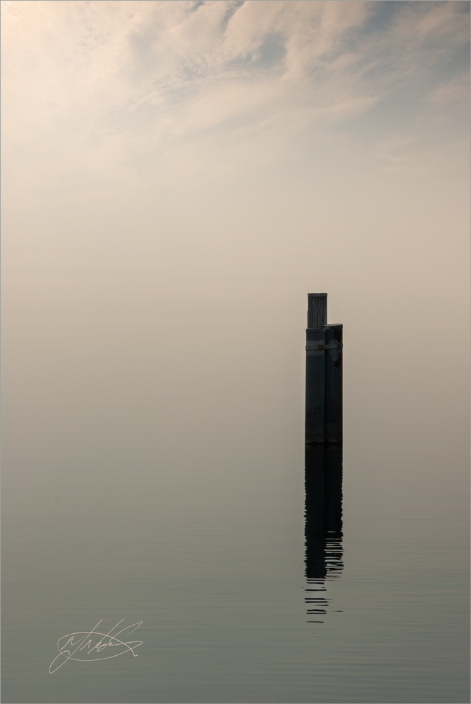
My edit,
I wish I had documented the steps when I did it, looking back its much the same as what I did with David's (Pookeyhead.) chickens.
Post #4533 on page 114.
Click for big.
Rhodese.
Jim said,
"Here's the last minute rush of entries galloping over the horizon into the box canyon to save the day................"
Who do you think you are Jim Carrey as Andy Kaufman.
."Then I selected the dancer [Who I'm reliably informed is in fact Rhodese himself!]"
I dance because it's better than my singing.
.As if,
Jim I luv the banter.
.The shot was taken sitting down, I can't stand too well.
It's from my resent holiday on the Costa Brava.
Jim.
Your edit is much the same as mine and I like it a lot.
Though the aurora around the dancer spoils it a little.
Jim I avoided this by saving the selection and re-using it on the blur layer.
AHILL.
The first edit is the one I'll judge, both are good but I prefer the first one.
A rundown on the noise removal would have been nice as I'm pretty useless at it.
A very competent entry.
Paul.
(is it really Rhodese??) "Ay, Fifty years ago."
.I tried B&W it didn't look half as good as this.
I would have liked to have seen the forward shadow burned in more.
Maybe a fast film grain overlay, to hide the noise would be in order.
The winner is................. DA-RA............Paul, just because you were bold enough to go mono.
They were all good considering the starting point, well done all.
Over to you Paul.
Over and out.
My edit,
I wish I had documented the steps when I did it, looking back its much the same as what I did with David's (Pookeyhead.) chickens.
Post #4533 on page 114.

Click for big.
Rhodese.
- Messages
- 3,194
- Name
- Paul
- Edit My Images
- No
Thanks Rhodese (I think ... )
On my way back from Austin Texas they had live music in the airport. Here's a snap of Bob Cheevers http://www.bobcheevers.com/ he was very good if you like country.
 austin_texas_airport_D600-6378 by PabloRosso, on Flickr
The raw file is here https://www.dropbox.com/s/raqvnju0gg68k07/austin_texas_airport_D600-6378.nef
I'll call it Friday evening if that's ok.
)On my way back from Austin Texas they had live music in the airport. Here's a snap of Bob Cheevers http://www.bobcheevers.com/ he was very good if you like country.
austin_texas_airport_D600-6378 by PabloRosso, on FlickrThe raw file is here https://www.dropbox.com/s/raqvnju0gg68k07/austin_texas_airport_D600-6378.nef
I'll call it Friday evening if that's ok.
- Messages
- 1,154
- Edit My Images
- Yes
Open in ACR, auto, open in PS.
Crop 3X2 including extra on the RHS,
Copy layer.
Select the blank space and fill with content aware.
Tidy up.
Select the cupboards and remove with fill - content aware.
Remove the cable with clone and the healing brush.
SAVE.
Create the guitar stock? Using bits from all over using the clone tool plus cut and paste.
SAVE.
New layer fill with 50% grey. Then using a soft low capacity brush, dodge and burn the face. White to dodge, black to burn. (Eyes, teeth, highlights on RH side cheek and nose.)
SAVE.
Flatten.
Add adjustment layers for exposure masking the subject, saturation and warm up masking the background.
Flatten.
Add a border with the stroke command.
SAVE.
Save for web.
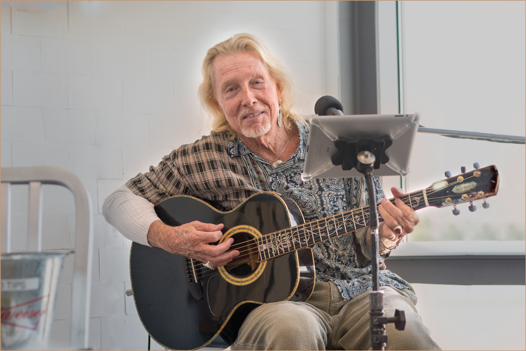
CLICK IMAG FOR TEXAS SIZE PICTURE AND ZOOM.
Rhodese.
Last edited:
- Messages
- 3,194
- Name
- Paul
- Edit My Images
- No
beginning to look like a one horse race
- Messages
- 3,194
- Name
- Paul
- Edit My Images
- No
OK, here we go ... well I have carefully considered all of the entries. Let me tell you now this was a difficult decision, after all with so many great entries to choose from ...
Alright, I'll cut the sarcasm.
By default @Rhodese gets this, thanks for having a go
fwiw here is my quick edit
 austin_texas_airport_D600-6378 by PabloRosso, on Flickr
Alright, I'll cut the sarcasm.
By default @Rhodese gets this, thanks for having a go
fwiw here is my quick edit
austin_texas_airport_D600-6378 by PabloRosso, on Flickr- Messages
- 1,756
- Name
- Jim
- Edit My Images
- Yes
Sorry guys n gals, missed the cut been out walking and sweating [plus re-hydrating with beer!]
I did this before I went but didn't get time to finish it off. Does the b&w and removal of wires etc. work?
View attachment 16851
I did this before I went but didn't get time to finish it off. Does the b&w and removal of wires etc. work?
View attachment 16851
- Messages
- 3,194
- Name
- Paul
- Edit My Images
- No
Hi Jim, like the idea of re-hydrating with beer
And yes, it works for me
And yes, it works for me
- Messages
- 1,154
- Edit My Images
- Yes
Moornin all.
I see this thread has been a hive of activity in my absence, so let’s give it a kick and see if it is dead, if it doesn’t groan by Friday morning I will pass the carcass over to the subject of my challenge and wait for a phoenix moment.
This is another old one, but could be fun.
Friday morning then, good luck.
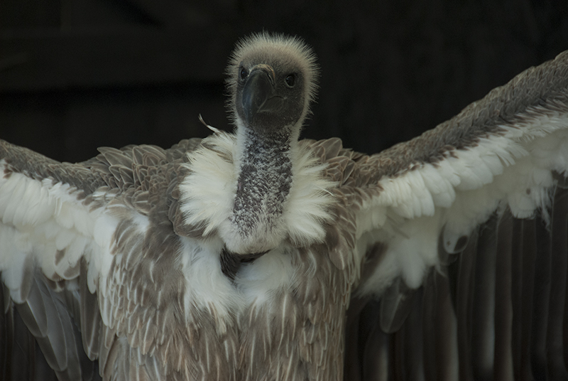
LINK TO RAW FILE.
https://www.dropbox.com/s/blzve6cm4p0fs35/VULTURE.NEF
Rhodese.
I see this thread has been a hive of activity in my absence, so let’s give it a kick and see if it is dead, if it doesn’t groan by Friday morning I will pass the carcass over to the subject of my challenge and wait for a phoenix moment.
This is another old one, but could be fun.
Friday morning then, good luck.
LINK TO RAW FILE.
https://www.dropbox.com/s/blzve6cm4p0fs35/VULTURE.NEF
Rhodese.
- Messages
- 1,756
- Name
- Jim
- Edit My Images
- Yes
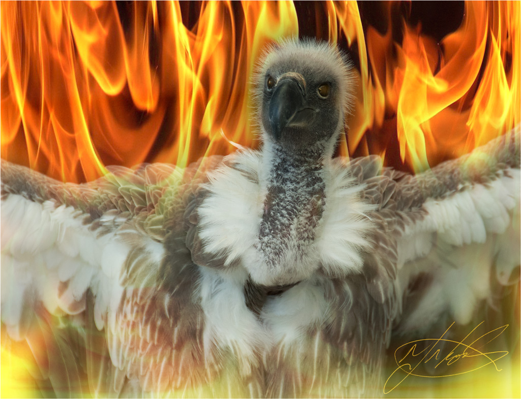
It's done!
Started with ACR, here's the screen grab..............
View attachment 18375
As you can see, exposure,whites and clarity were upped a bit.
Then I reduced the image size as my PC is getting lpng in the tooth and I'm running slow so PS handles small files quicker.
Used Shadows/highlights to give a bit more contrast.
Then converted to b&w using a green filter because that brought out the bird's head better.
Reduced noise a bit.
Inserted a Norwegian mountain as a back-drop.
Saved for Flickrrrr.
Bing,bang, bong...here it is.
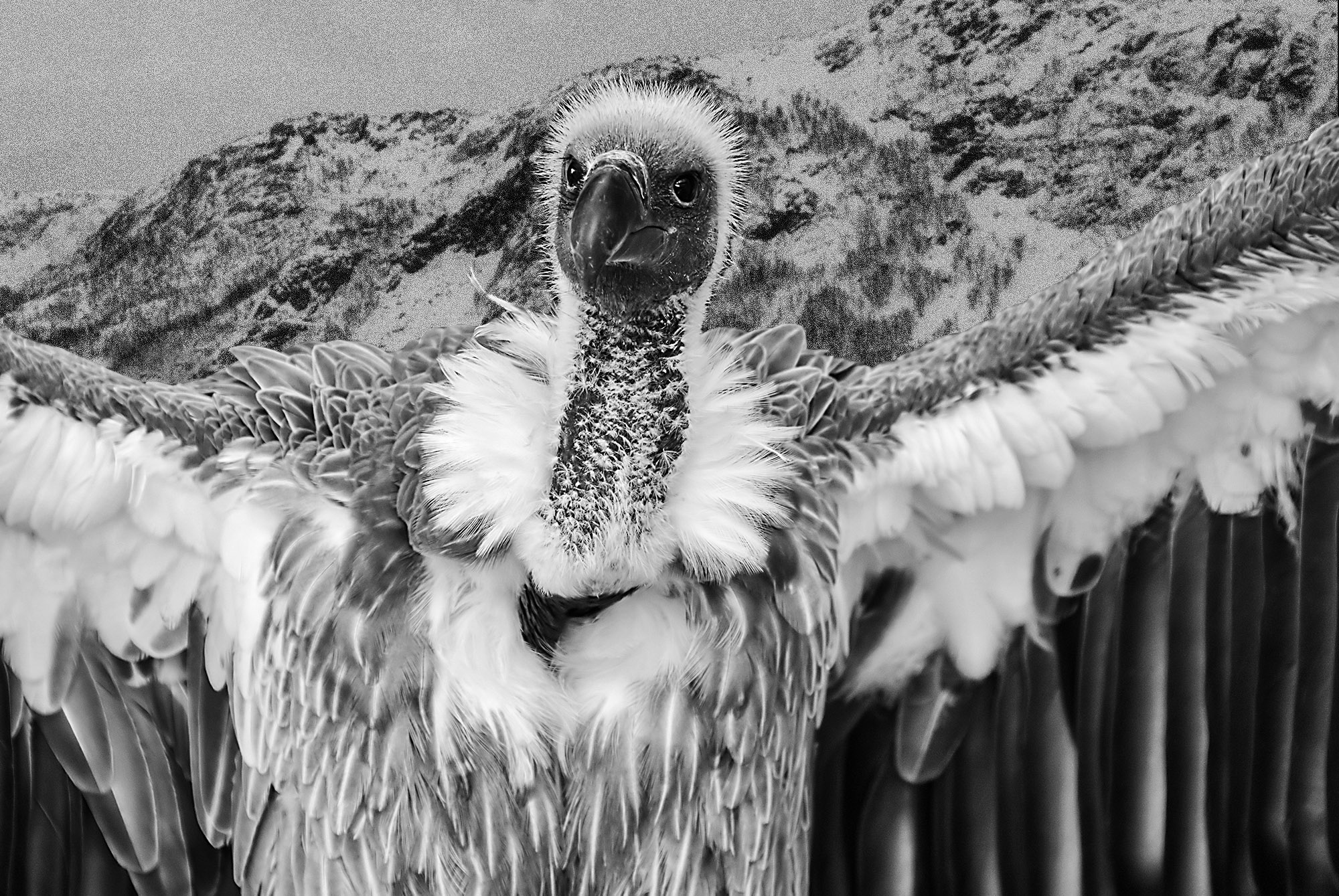 VULTURE by Farmejim, on Flickr
Started with ACR, here's the screen grab..............
View attachment 18375
As you can see, exposure,whites and clarity were upped a bit.
Then I reduced the image size as my PC is getting lpng in the tooth and I'm running slow so PS handles small files quicker.
Used Shadows/highlights to give a bit more contrast.
Then converted to b&w using a green filter because that brought out the bird's head better.
Reduced noise a bit.
Inserted a Norwegian mountain as a back-drop.
Saved for Flickrrrr.
Bing,bang, bong...here it is.
VULTURE by Farmejim, on Flickr- Messages
- 1,154
- Edit My Images
- Yes
Hi sorry for the delay it seems half of Wolves Virgins (and there aint many of them ) had a total blackout yesterday.
Well done Jim a stalwart effort. .
.
The triumph is yours, over to you if you think its worth carrying on.
My edit, it seems that the Phoenix seed fell on stony ground.
Rhodese.
) had a total blackout yesterday.Well done Jim a stalwart effort.
.The triumph is yours, over to you if you think its worth carrying on.
My edit, it seems that the Phoenix seed fell on stony ground.
Rhodese.
- Messages
- 1,157
- Edit My Images
- No
Resurrecting this out of a bit of boredom!
LR Basics, Curves, Brushes and Split toning. Cropped and sharpened plus grain.
View attachment 21348
LR Basics, Curves, Brushes and Split toning. Cropped and sharpened plus grain.
View attachment 21348

- Messages
- 1,154
- Edit My Images
- Yes
Oh, “ffs” lets not let this thread die.
Even now, reading through past challenges there’s so much advice, experience and technique being freely given.
Have a go at this; it’s the simple things that can be so difficult.
I’ll give it ten days.
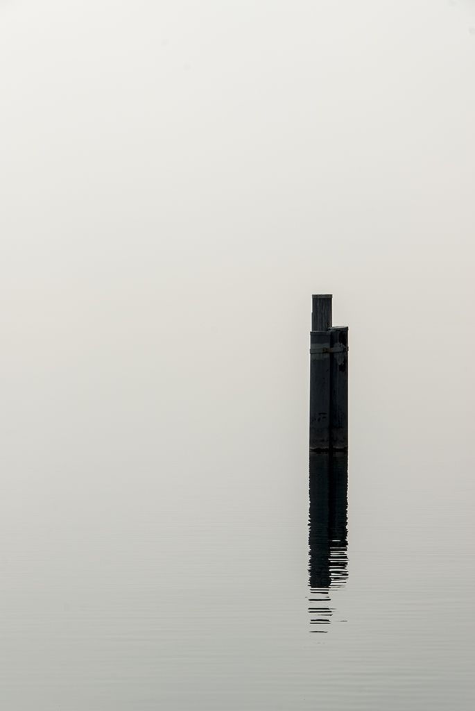
LINK TO RAW...https://www.dropbox.com/s/5qr4b24oovslery/POST IN WATER..NEF?dl=0
Rhodese.
Even now, reading through past challenges there’s so much advice, experience and technique being freely given.
Have a go at this; it’s the simple things that can be so difficult.
I’ll give it ten days.
LINK TO RAW...https://www.dropbox.com/s/5qr4b24oovslery/POST IN WATER..NEF?dl=0
Rhodese.
- Messages
- 1,756
- Name
- Jim
- Edit My Images
- Yes
Oh, “ffs” lets not let this thread die.
Even now, reading through past challenges there’s so much advice, experience and technique being freely given.
Have a go at this; it’s the simple things that can be so difficult.
I’ll give it ten days.
LINK TO RAW...https://www.dropbox.com/s/5qr4b24oovslery/POST IN WATER..NEF?dl=0
Rhodese.
Nice shot Rhodese
Seems a shame to ruin it! I'll do my best... [not to ruin it
]- Messages
- 1,756
- Name
- Jim
- Edit My Images
- Yes
Like I said, I like the original and don't think there's much to do without messing it up so I added a horizon [is it an horizon?] and a seagull 'cos we all love seagulls!
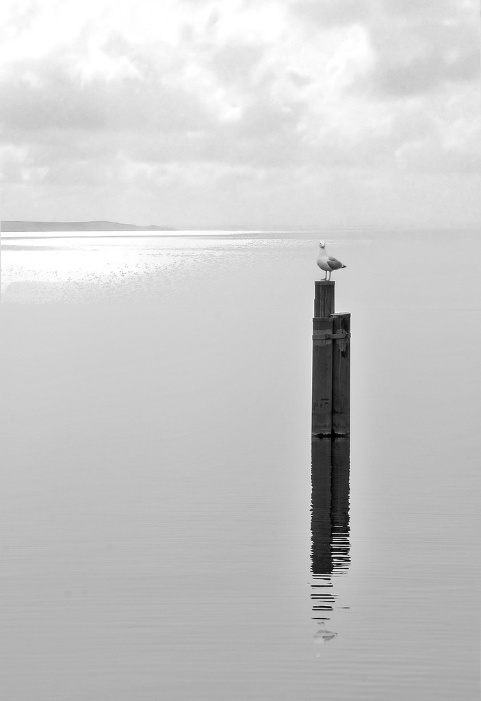 POST IN WATER. not my original! by Farmejim, on Flickr
- Opened with ACR
- Increased exposure, decreased contrast and upped clarity View attachment 22637
- Reduced image size to stop my PC grunting too much [shot on memory like me]
- Extra layer to work on.
- Added horizon from my trip to The Scillies.
- Added a seagull from Penzance harbour.
- Converted to monochrome.
- Realised there's no seagull reflection so remedied that.
- Save for Flickrrrr
- Swore at spell checker, I'm not a King Yank so don't try n tell me how to spell harbour, realise and if you don't understand where the Scillies is or Penzance for that matter get a bloody atlas, GRRRR!!!
POST IN WATER. not my original! by Farmejim, on Flickr- Messages
- 3,194
- Name
- Paul
- Edit My Images
- No
OK, here's my attempt, not much really to do to this imo ...
import into LR
cropped to a 5:4 ratio
warmed image up wb 5150
whites + 71
blacks -5
applied a linear tone curve -69, -29, -71, +44
applied a small amount pf post crop vignette -10 feather 80
export as jpeg, qual 75% and sRGB
click for bigger.
 not_mine_post_in_water by PabloRosso, on Flickr
import into LR
cropped to a 5:4 ratio
warmed image up wb 5150
whites + 71
blacks -5
applied a linear tone curve -69, -29, -71, +44
applied a small amount pf post crop vignette -10 feather 80
export as jpeg, qual 75% and sRGB
click for bigger.
not_mine_post_in_water by PabloRosso, on Flickr- Messages
- 1,756
- Name
- Jim
- Edit My Images
- Yes
- Messages
- 1,154
- Edit My Images
- Yes
Its judgment day, ten days and only two entries, oh well.
Jim.
I do like this, you have bought the best out on the woodwork, and the foreground has detail.
You adding the horizon and sky has given it depth and it’s a good “ish” blend. To my eye, the grey of the upper sky should match the grey of the sea.
I even like the burnt out sun on the water, but the lesser-spotted web footed sea pigeon, it’s a Dodo sorry I mean no no.
Paul.
Apart from the crop, it’s very much like my own colour version, though I’m not liking the blocked out post.
So who shall it be? I would like to give it to both of you just for having a go, actually that’s just what I will do.
It’s a draw, so lets see an image from each of you, and both judge an overall winner from the torrent of entries ensuing.
You all did very well, have a .
.
My edit.
Ok.
As I remember it.( I only have the PSD layers to remind me.)
ACR.
I made three copies, 1> + 1.3 stops, 2> - 0.3 stops, 3> upped the vibrance sats, clarity and contrast to bring colours up.
Opened in PS, opening one first, two second and then three. Background, layer 1, layer 2.
Add a mask to layer 1 and applied a black grad from the top to just below the post. Still in the mask with a soft round brush, I painted black over the stump
Layer 2 drop opacity to 40% and add another mask and grad but not going so deep. Again painting over the stump.
Add a new layer, bring in the sky, (Taken at the same location on the same day two hours later.)
Crop to just the sky.
Add a mask. Add a black grad from the bottom up into the sky.
Add a colour lookup layer (Candlelight.) Drop the opacity to 35%.
Flatten, add signature and border.
CLICK FOR BIG AND AGAIN FOR ZOOM..http://i.imgur.com/qZ6cR8F.jpg
Make a B&W version.
Overlay a Kodak 400TX film grain.
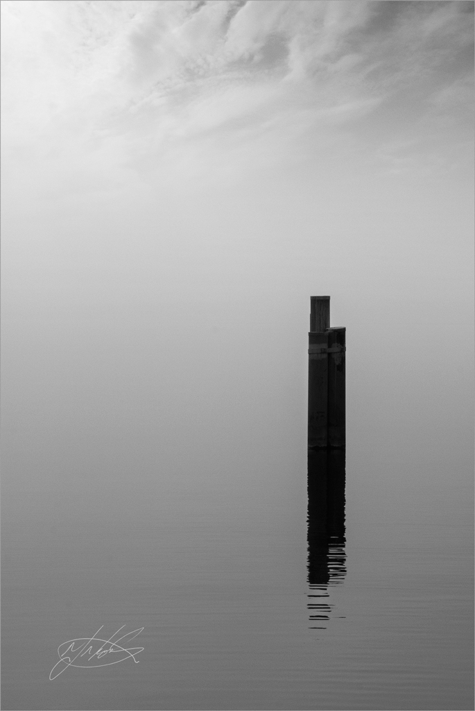
CLICK FOR BIG AND AGAIN FOR ZOOM..http://i.imgur.com/O8NDTN6.jpg
Rhodese.
Jim.
I do like this, you have bought the best out on the woodwork, and the foreground has detail.
You adding the horizon and sky has given it depth and it’s a good “ish” blend. To my eye, the grey of the upper sky should match the grey of the sea.
I even like the burnt out sun on the water, but the lesser-spotted web footed sea pigeon, it’s a Dodo sorry I mean no no.
Paul.
Apart from the crop, it’s very much like my own colour version, though I’m not liking the blocked out post.
So who shall it be? I would like to give it to both of you just for having a go, actually that’s just what I will do.
It’s a draw, so lets see an image from each of you, and both judge an overall winner from the torrent of entries ensuing.
You all did very well, have a
.My edit.
Ok.
As I remember it.( I only have the PSD layers to remind me.)
ACR.
I made three copies, 1> + 1.3 stops, 2> - 0.3 stops, 3> upped the vibrance sats, clarity and contrast to bring colours up.
Opened in PS, opening one first, two second and then three. Background, layer 1, layer 2.
Add a mask to layer 1 and applied a black grad from the top to just below the post. Still in the mask with a soft round brush, I painted black over the stump
Layer 2 drop opacity to 40% and add another mask and grad but not going so deep. Again painting over the stump.
Add a new layer, bring in the sky, (Taken at the same location on the same day two hours later.)
Crop to just the sky.
Add a mask. Add a black grad from the bottom up into the sky.
Add a colour lookup layer (Candlelight.) Drop the opacity to 35%.
Flatten, add signature and border.
CLICK FOR BIG AND AGAIN FOR ZOOM..http://i.imgur.com/qZ6cR8F.jpg
Make a B&W version.
Overlay a Kodak 400TX film grain.
CLICK FOR BIG AND AGAIN FOR ZOOM..http://i.imgur.com/O8NDTN6.jpg
Rhodese.
Last edited:
- Messages
- 3,194
- Name
- Paul
- Edit My Images
- No
A draw is cheating!! 
I'll have to remember my dropbox pwd now ...
I'll have to remember my dropbox pwd now ...
- Messages
- 1,154
- Edit My Images
- Yes
A draw is cheating!!
I'll have to remember my dropbox pwd now ...
Rhodese.
- Messages
- 3,194
- Name
- Paul
- Edit My Images
- No
OK, pwd remembered ...
here's a preview
 pp_game by PabloRosso, on Flickr
RAW here
https://www.dropbox.com/s/s6en7tt4u1xent7/kerry_titchfield_D600-6456.nef?dl=0
I'll let @Farmerjim decide when we call it ...
here's a preview
pp_game by PabloRosso, on FlickrRAW here
https://www.dropbox.com/s/s6en7tt4u1xent7/kerry_titchfield_D600-6456.nef?dl=0
I'll let @Farmerjim decide when we call it ...
- Messages
- 1,756
- Name
- Jim
- Edit My Images
- Yes
Thanks Rhodese, we could have more questions than answers with this test!
Got your RAW Paul, Ta. I'll be messing that up soon.
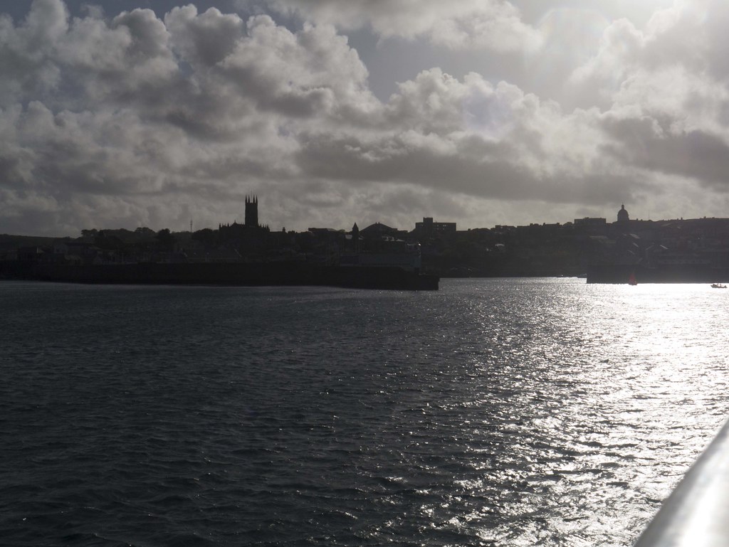
Here's mine. A shot of Penzance from the Scillies ferry.
Uh-oh, can't seem to upload files????
Here's the RAW
<a href="http://speedy.sh/pv6Fe/P1020293.RW2">Download at SpeedyShare</a>
Got your RAW Paul, Ta. I'll be messing that up soon.
Here's mine. A shot of Penzance from the Scillies ferry.
Uh-oh, can't seem to upload files????
Here's the RAW
<a href="http://speedy.sh/pv6Fe/P1020293.RW2">Download at SpeedyShare</a>
Last edited:
 P1020293a
 .
.