

You are using an out of date browser. It may not display this or other websites correctly.
You should upgrade or use an alternative browser.
You should upgrade or use an alternative browser.
Vdubster's Photo52 for 2011 Week 42 - Weave added!!! (Index in 1st post)
- Thread starter vdubster
- Start date
OP
- Messages
- 421
- Name
- James
- Edit My Images
- Yes
Hi, James, I'm not keen on the selective colour one and my, they are red roses!
You have a nice triangle going on and some nice shadows but nothing really grabs me.
Not sure what lens you used but a macro shot of the left hand rose from lower down would be nice to see.
Cheers.
I really like the selective colour version. I also like the 2nd version. I agree with andy with regards to the flower on the left hand side,
Thank you both for your comments, I may look at taking another shot at some point (Flower life dependent, lol) but i'm liking both submissions, so i dont think it's necessary.
Week 8's theme is not doing anything for me, might have to use a joker for this week (i've updated my OP with my Jokers rules)
But i'll see what the next few days brings as you never know what might happen around you.
James
- Messages
- 7,694
- Name
- Tina
- Edit My Images
- Yes
I really don't like selective colour so far prefer the colour version. The colours look true also. Your traditional triangular composition looks good but the picture is not striking. Maybe a closeup of one head would be better? Or different lighting? Sorry :shrug: I'm not much help 
drodd
Also loves to mass debate
- Messages
- 5,519
- Name
- Dawn
- Edit My Images
- No
Hiya James
The roses are a lovely colour red, although I think some of the outer petals are looking a bit past their time, which doesn't really help the image as my eyes are drawn to those parts.
I agree with others about perhaps selecting one, maybe the one on the left would have worked best for a close up because it is a bit more open and is more appealing.
I'm still not sure about the selective colouring though, it looks a bit 'graveyardish' if you know what I mean :shrug:
Apologies if that sounds a bit negative (not intended) as I would hope you would view it as constructive crit.
Cheers
Dawn
OP
- Messages
- 421
- Name
- James
- Edit My Images
- Yes
Hiya James
The roses are a lovely colour red, although I think some of the outer petals are looking a bit past their time, which doesn't really help the image as my eyes are drawn to those parts.
I agree with others about perhaps selecting one, maybe the one on the left would have worked best for a close up because it is a bit more open and is more appealing.
I'm still not sure about the selective colouring though, it looks a bit 'graveyardish' if you know what I mean :shrug:
Apologies if that sounds a bit negative (not intended) as I would hope you would view it as constructive crit.
Cheers
Dawn
Isn't that the idea of the theme :shrug:
But anyway thank you for the comments, i've had very mixed views alot of people saying they like the selective colour and some not, but thats what this is all about
Thanks again
James
drodd
Also loves to mass debate
- Messages
- 5,519
- Name
- Dawn
- Edit My Images
- No
Isn't that the idea of the theme :shrug:
But anyway thank you for the comments, i've had very mixed views alot of people saying they like the selective colour and some not, but thats what this is all about
Thanks again
James
Hiya James,
Good point, I hadn't looked at them that way, perhaps because I was looking at the flower as a whole being delicate in structure. But I see what you mean now, so fair play to you.
Cheers
Dawn
- Messages
- 8,398
- Name
- Lynne
- Edit My Images
- Yes
Hi James
I really love the 1st rose image , for me the selective color really works & emphasise's the delicacy ( is that even a word?) of the petals against the hard B&W background so a big up from me.
The 2nd shot is also fab it's just I have a soft spot for selective coloring
I really love the 1st rose image , for me the selective color really works & emphasise's the delicacy ( is that even a word?) of the petals against the hard B&W background so a big
up from me.The 2nd shot is also fab it's just I have a soft spot for selective coloring
Last edited:
OP
- Messages
- 421
- Name
- James
- Edit My Images
- Yes
Ok so the ideas i was able to come up with just haven't worked, so i'm playing a joker this week, + I'm working for the next two nights (10hr night shift) so not going to have time for anything.
Hope to have a better week next week.
Thanks
James
Hope to have a better week next week.
Thanks
James
Last edited:
OP
- Messages
- 421
- Name
- James
- Edit My Images
- Yes
Right forget my last post, as it's my Project 52 i'll make the rules and i had a play in photoshop today and created a Week 8 - Chaos submission.
Now uploading to Flickr.....
Right so Week 8 - Chaos
A bit late but this is how i'm feeling right now. It's actually a self portrait but with a Chaos/lost/confused touch.
Enjoy
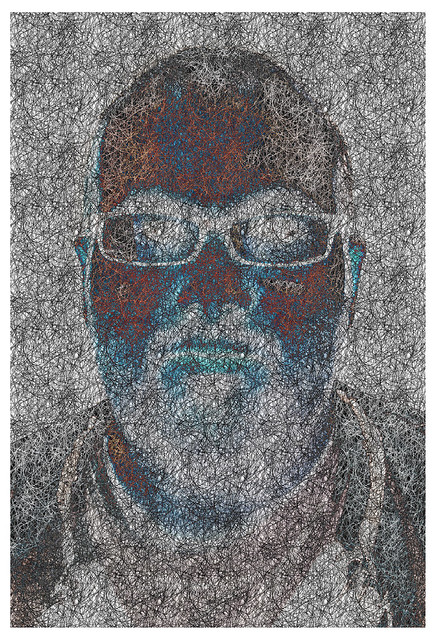
Chaos by j.fordham, on Flickr
Now uploading to Flickr.....
Right so Week 8 - Chaos
A bit late but this is how i'm feeling right now. It's actually a self portrait but with a Chaos/lost/confused touch.
Enjoy
Chaos by j.fordham, on Flickr
Last edited:
drodd
Also loves to mass debate
- Messages
- 5,519
- Name
- Dawn
- Edit My Images
- No
Hiya James,
to you for changing your mind about the joker and getting an image posted for Week 8.
As a big fan of post processing .... I really like this image and think it has worked really well here, especially on the top of your head where it looks like a lot of chaos going on up there
BTW rules are there to be broken (hence why I never make any )
)
So well done to you and I hope you get through your shifts without too much chaos.
Cheers
Dawn
to you for changing your mind about the joker and getting an image posted for Week 8.As a big fan of post processing .... I really like this image and think it has worked really well here, especially on the top of your head where it looks like a lot of chaos going on up there
BTW rules are there to be broken (hence why I never make any
)So well done to you and I hope you get through your shifts without too much chaos.
Cheers
Dawn
OP
- Messages
- 421
- Name
- James
- Edit My Images
- Yes
Hiya James,
As a big fan of post processing .... I really like this image and think it has worked really well here, especially on the top of your head where it looks like a lot of chaos going on up there
BTW rules are there to be broken (hence why I never make any
So well done to you and I hope you get through your shifts without too much chaos.
Cheers
Dawn
Thanks Dawn,
I really wasn't happy about playing a joker, i'd taken a few shots but couldn't decide on what i wanted. So i started thinking about the theme and looking on Google for ideas. This shot was a self portrait with the result of a lot of playing around in PS and i like how it came out and as you say a lot of Chaos in the frontal lobe, lol.
J
OP
- Messages
- 421
- Name
- James
- Edit My Images
- Yes
OK on to week 9 and "Finish" or What is another word for finish? Well end, stop, terminate, and cease are a few and all of those brings me to my week 9.
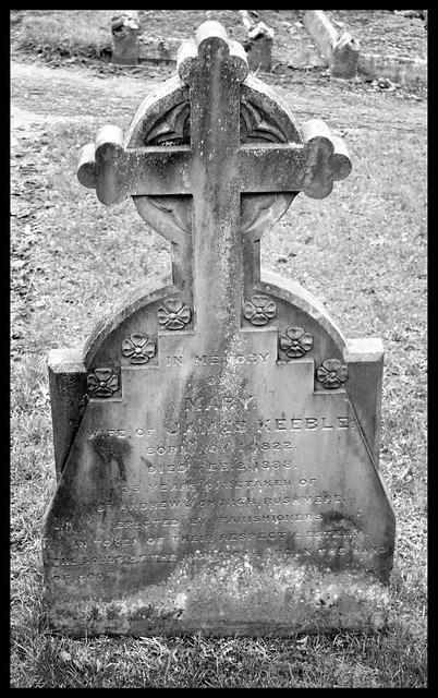
Finish - Week 9 by j.fordham, on Flickr
Taken at Rushmere St Andrew Church, a place i don't visit as often as i should.
C & C welcome as always.
James
Finish - Week 9 by j.fordham, on Flickr
Taken at Rushmere St Andrew Church, a place i don't visit as often as i should.
C & C welcome as always.
James
OP
- Messages
- 421
- Name
- James
- Edit My Images
- Yes
Week 10, sent me on a short drive to Old Felixstowe on a lovely bright sunny day it was however cold very cold, lol.
These are my 3 favorite shots from the trip and go well together in a Triptych i think.
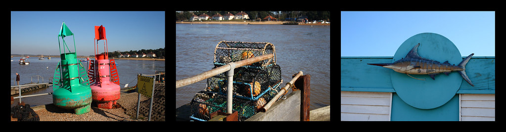
Trio - Week 10 by j.fordham, on Flickr
C & C welcome.
James
These are my 3 favorite shots from the trip and go well together in a Triptych i think.
Trio - Week 10 by j.fordham, on Flickr
C & C welcome.
James
Last edited:
drodd
Also loves to mass debate
- Messages
- 5,519
- Name
- Dawn
- Edit My Images
- No
Hiya James,
Aaaah! Glad I saw your thread pop up in my subscribed posts section .... I remember now that I had viewed your week 9 photo and was going to comment and even did an edit, but must have got distracted and forgot to get back to it .... so I'll start there:
Week 9: I like your thought process for the theme, and the photo is good although I think it would have benefitted from a much lower angle and looking upwards (tricky to do I realise as it is a graveyard and I'm not sure how much space you would have in front of the headstone). However, I think it would have then cut out the distracting bits in the background.
Also looks like you might have had to contend with a bit of harsh light that day as there are certain parts of the headstone that look a tak OE.
Hope you don't mind but I did a bit of an edit on the pic at the time I was looking at it, to show you the kind of idea I had for this image as you took it but with a bit of post processing (fortunately I still had the pic saved on in my TP other members folder ... which I normally clear out on a regular basis). Just say if you want me to remove the image from your thread to keep it tidy:

Week 10: I really like this triptych and all three photos compliment each other well and I like the sequence in which you have displayed them. The colours are great as is the lighting and composition of each (the far right could do with a slight straighten though). Otherwise a brilliant pic for this week
Look forward to keeping up with your project.
Cheers
Dawn
Aaaah! Glad I saw your thread pop up in my subscribed posts section .... I remember now that I had viewed your week 9 photo and was going to comment and even did an edit, but must have got distracted and forgot to get back to it .... so I'll start there:
Week 9: I like your thought process for the theme, and the photo is good although I think it would have benefitted from a much lower angle and looking upwards (tricky to do I realise as it is a graveyard and I'm not sure how much space you would have in front of the headstone). However, I think it would have then cut out the distracting bits in the background.
Also looks like you might have had to contend with a bit of harsh light that day as there are certain parts of the headstone that look a tak OE.
Hope you don't mind but I did a bit of an edit on the pic at the time I was looking at it, to show you the kind of idea I had for this image as you took it but with a bit of post processing (fortunately I still had the pic saved on in my TP other members folder ... which I normally clear out on a regular basis). Just say if you want me to remove the image from your thread to keep it tidy:
Week 10: I really like this triptych and all three photos compliment each other well and I like the sequence in which you have displayed them. The colours are great as is the lighting and composition of each (the far right could do with a slight straighten though). Otherwise a brilliant pic for this week
Look forward to keeping up with your project.
Cheers
Dawn
OP
- Messages
- 421
- Name
- James
- Edit My Images
- Yes
Hiya James,
Aaaah! Glad I saw your thread pop up in my subscribed posts section .... I remember now that I had viewed your week 9 photo and was going to comment and even did an edit, but must have got distracted and forgot to get back to it .... so I'll start there:
Week 9: I like your thought process for the theme, and the photo is good although I think it would have benefitted from a much lower angle and looking upwards (tricky to do I realise as it is a graveyard and I'm not sure how much space you would have in front of the headstone). However, I think it would have then cut out the distracting bits in the background.
Also looks like you might have had to contend with a bit of harsh light that day as there are certain parts of the headstone that look a tak OE.
Hope you don't mind but I did a bit of an edit on the pic at the time I was looking at it, to show you the kind of idea I had for this image as you took it but with a bit of post processing (fortunately I still had the pic saved on in my TP other members folder ... which I normally clear out on a regular basis). Just say if you want me to remove the image from your thread to keep it tidy:
Week 10: I really like this triptych and all three photos compliment each other well and I like the sequence in which you have displayed them. The colours are great as is the lighting and composition of each (the far right could do with a slight straighten though). Otherwise a brilliant pic for this week
Look forward to keeping up with your project.
Cheers
Dawn
Hi Dawn,
Thanks for the comments and yes i agree a different angle for the Week 9 shot would be an improvement, i might try it i get the chance.
And week 10 I've played with the whole image and took care of the far right picture.
Thanks again for your comments, hopefully as i've got this weeks shot done i'll get the chance to make some comments on other's 52's
J
- Messages
- 8,398
- Name
- Lynne
- Edit My Images
- Yes
Hi James
just having a catch up
Finish ....like the thinking behind your picture , certainly fits the theme well Think I'd prefer a combination of your shot & Dawn's edit , to me the writing & headstone detail looks better on the orignal but prefer the frame & misty touch applied in the edit
Really like your Trio shots , works well as a Triptych & lovely colors , possibly a slight straighten on the last will complete it .Great work
just having a catch up
Finish ....like the thinking behind your picture , certainly fits the theme well
Think I'd prefer a combination of your shot & Dawn's edit , to me the writing & headstone detail looks better on the orignal but prefer the frame & misty touch applied in the edit Really like your Trio shots , works well as a Triptych & lovely colors , possibly a slight straighten on the last will complete it .Great work
OP
- Messages
- 421
- Name
- James
- Edit My Images
- Yes
Really like your Trio shots , works well as a Triptych & lovely colors , possibly a slight straighten on the last will complete it .Great work
I have straightened it, lol. I got the top of the blue board straight but now the bottom looks off?
J
OP
- Messages
- 421
- Name
- James
- Edit My Images
- Yes
Yay a re-shoot card, which mean i can improve my week 1 shot for Accommodation.
I wasn't happy with the background and general look of my week 1 from the start so i've gone for an outside shot, i've tried to make it look like if you gave it a quick look you'd think it was a real camper and then actually see that it's only a toy.
And as i liked my last selective colour i did another one
As aways C & C welcome.
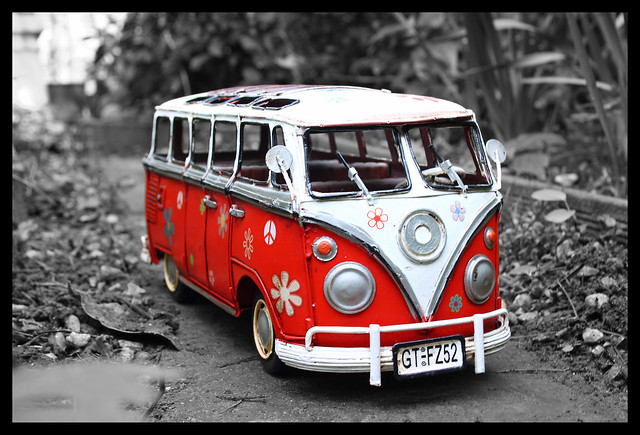
Accommodation RE-SHOOT 2 - Week 11 by j.fordham, on Flickr
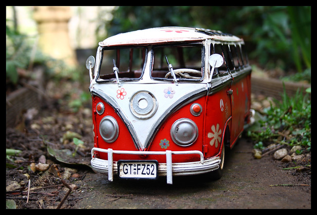
Accommodation RE-SHOOT - Week 11 by j.fordham, on Flickr
Now i'm undecided on posting a Knowledge shot i have a few ideas so I'll see how the turn out first.
Thanks for the comments so far everyone.
James
I wasn't happy with the background and general look of my week 1 from the start so i've gone for an outside shot, i've tried to make it look like if you gave it a quick look you'd think it was a real camper and then actually see that it's only a toy.
And as i liked my last selective colour i did another one
As aways C & C welcome.
Accommodation RE-SHOOT 2 - Week 11 by j.fordham, on Flickr
Accommodation RE-SHOOT - Week 11 by j.fordham, on Flickr
Now i'm undecided on posting a Knowledge shot i have a few ideas so I'll see how the turn out first.
Thanks for the comments so far everyone.
James
Last edited:
drodd
Also loves to mass debate
- Messages
- 5,519
- Name
- Dawn
- Edit My Images
- No
Hiya James,
First of all well done on the re-shoot, and 100% and improvement on the first accommodation post (although I still liked that one too).
This one just makes it look more realistic and yes it does look like a real van at first glance. That is one hell of a groovy van, now if only I could magic it alive and have it parked outside ready for me to go camping in (although I don't think my current camper van would be impressed with that idea ).
Actually you have reminded me that I need to take a photo of the camper model I have (which has a caravan trailer too) ... might do that for one of my 365 shots.
If I had to choose out of the two photos you posted, I would have to go with the first one because I like the way you have positioned the van and the selective colouring works a treat to make it stand out. My only crit would be the bit of blur in the lower left corner which is a tad distracting, but I reckon that could be easily cloned using some of the bracken from the left above.
The second image is good too, but think it would look better with a similar processing you used for #1.
I think you have pretty much covered 'knowledge' with this re-shoot as you applied what you have learned from comments and processing.
Well done
Cheers
Dawn
First of all well done on the re-shoot, and 100% and improvement on the first accommodation post (although I still liked that one too).
This one just makes it look more realistic and yes it does look like a real van at first glance. That is one hell of a groovy van, now if only I could magic it alive and have it parked outside ready for me to go camping in
(although I don't think my current camper van would be impressed with that idea ).Actually you have reminded me that I need to take a photo of the camper model I have (which has a caravan trailer too
) ... might do that for one of my 365 shots.If I had to choose out of the two photos you posted, I would have to go with the first one because I like the way you have positioned the van and the selective colouring works a treat to make it stand out. My only crit would be the bit of blur in the lower left corner which is a tad distracting, but I reckon that could be easily cloned using some of the bracken from the left above.
The second image is good too, but think it would look better with a similar processing you used for #1.
I think you have pretty much covered 'knowledge' with this re-shoot as you applied what you have learned from comments and processing.
Well done
Cheers
Dawn
OP
- Messages
- 421
- Name
- James
- Edit My Images
- Yes
Hiya James,
First of all well done on the re-shoot, and 100% and improvement on the first accommodation post (although I still liked that one too).
This one just makes it look more realistic and yes it does look like a real van at first glance. That is one hell of a groovy van, now if only I could magic it alive and have it parked outside ready for me to go camping in
Actually you have reminded me that I need to take a photo of the camper model I have (which has a caravan trailer too
If I had to choose out of the two photos you posted, I would have to go with the first one because I like the way you have positioned the van and the selective colouring works a treat to make it stand out. My only crit would be the bit of blur in the lower left corner which is a tad distracting, but I reckon that could be easily cloned using some of the bracken from the left above.
The second image is good too, but think it would look better with a similar processing you used for #1.
I think you have pretty much covered 'knowledge' with this re-shoot as you applied what you have learned from comments and processing.
Well done
Cheers
Dawn
Thank you Dawn,
Done a edit of each what do you think?
If you notice the blured part has been fixed, i actually use the other image for the clone
And SC'ed the other picture.And yes i think these will do for a knowledge shot also, i'm so happy with my progress so far i now look at every shot in a different way and try different setting as much as i can.
Thanks again
Before:
Accommodation RE-SHOOT 2 - Week 11 by j.fordham, on Flickr
After:
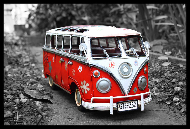
AccommodationRESHOOT2edit by j.fordham, on Flickr
Before:
Accommodation RE-SHOOT - Week 11 by j.fordham, on Flickr
After:
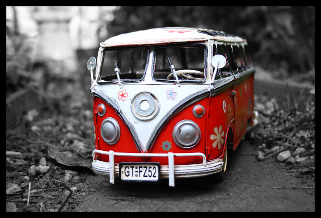
AccommodationRESHOOTedit by j.fordham, on Flickr
- Messages
- 8,398
- Name
- Lynne
- Edit My Images
- Yes
Hi James
I just love that camper van , great colors & detailing & much prefer your reshoot s to the original (sorry) & I'm a big fan of selective coloring
The pick of the bunch for me has to be the 2nd shot in your reply to Dawn...if you know which one I mean
I just love that camper van , great colors & detailing & much prefer your reshoot s to the original (sorry)
& I'm a big fan of selective coloring The pick of the bunch for me has to be the 2nd shot in your reply to Dawn...if you know which one I mean
drodd
Also loves to mass debate
- Messages
- 5,519
- Name
- Dawn
- Edit My Images
- No
Hiya James,
Spot on with the edit, I love both although if I had to choose it would still be #1 (edited), you have got the clone exact as I imagined it so well done there.
I also like the edit of #2 and it definitely looks better as a b&w with SC.
If you had got the side of #2 from a similar angle as #1 I would say this would make a fantastic set hung side by side, framed and on the wall.
Well done
Cheers
Dawn
Spot on with the edit, I love both
although if I had to choose it would still be #1 (edited), you have got the clone exact as I imagined it so well done there.I also like the edit of #2 and it definitely looks better as a b&w with SC.
If you had got the side of #2 from a similar angle as #1 I would say this would make a fantastic set hung side by side, framed and on the wall.
Well done
Cheers
Dawn
- Messages
- 218
- Name
- David
- Edit My Images
- Yes
Very interesting PP technique applied here and very striking.
OP
- Messages
- 421
- Name
- James
- Edit My Images
- Yes
Very interesting PP technique applied here and very striking.
Thanks, and to be honest i couldn't tell how i did it, lol. I was just messing around and it just worked out like that
Was just a case of different layers and such i think.J
OP
- Messages
- 421
- Name
- James
- Edit My Images
- Yes
Morning all,
Well after going through a number of ideas including Drinking in Moderation (always good to research ideas I though I would make use of this moderate weather we are enjoying (Let's hope it lasts)
Had to do a bit in Photoshop to remove the temporary method of fixing the thermometer to the post but that's it.
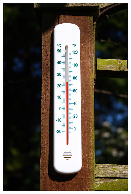
Moderation - Week 12 by j.fordham, on Flickr
Please let me know what you think.
James
Well after going through a number of ideas including Drinking in Moderation (always good to research ideas
I though I would make use of this moderate weather we are enjoying (Let's hope it lasts)Had to do a bit in Photoshop to remove the temporary method of fixing the thermometer to the post but that's it.
Moderation - Week 12 by j.fordham, on Flickr
Please let me know what you think.
James
- Messages
- 244
- Name
- Dan
- Edit My Images
- Yes
Ok, where are you with such lovely weather??
OP
- Messages
- 421
- Name
- James
- Edit My Images
- Yes
Ok, where are you with such lovely weather??
Sunny Suffolk (Ipswich)
OP
- Messages
- 421
- Name
- James
- Edit My Images
- Yes
Hi James, love the reshoot of the camper van. Much better well done mate. I like both the selective colour ones and full colour ones. I think the red contrasts well with the green of the plants.
Thank you, i'm very please with how they came out.
J
- Messages
- 8,398
- Name
- Lynne
- Edit My Images
- Yes
Hi James
Great idea for moderation , nice n simple but works well & a nice reminder that sometimes we have moderately good weather
Great idea for moderation , nice n simple but works well & a nice reminder that sometimes we have moderately good weather
kennysarmy
Yeah but can your army do this?
- Messages
- 7,312
- Name
- Jeff
- Edit My Images
- No
Admit it.....there is a mug of hot coffee just out of shot....
OP
- Messages
- 421
- Name
- James
- Edit My Images
- Yes
Admit it.....there is a mug of hot coffee just out of shot....
Not a hot beverage in sight
Although it is in direct sun light, lol. but i would say that only added 1-2c as i took the shot fairly quickly.
Now thinking of ideas for Week 13........
J
- Messages
- 6,704
- Name
- Colin
- Edit My Images
- No
Nice simple, sharp image. Well done James. Only thing I could think to maybe slightly improve is either removing the curved shadow to the top left of the thermometer or moving the thermometer further down the post for the shot. It's a very minor point but may make a slight difference.
As to ideas for this week I'm taking a shot of my head.
As to ideas for this week I'm taking a shot of my head.
OP
- Messages
- 421
- Name
- James
- Edit My Images
- Yes
Nice simple, sharp image. Well done James. Only thing I could think to maybe slightly improve is either removing the curved shadow to the top left of the thermometer or moving the thermometer further down the post for the shot. It's a very minor point but may make a slight difference.
As to ideas for this week I'm taking a shot of my head.
Thanks for the comments,
How's this edit?
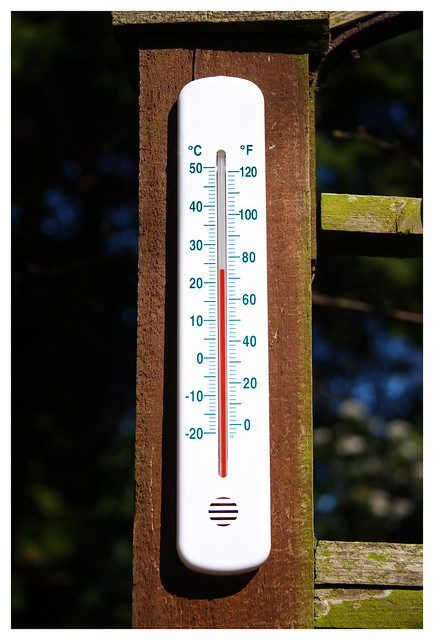
Moderation (Moderate) - Week 12 Edit by j.fordham, on Flickr
- Messages
- 6,704
- Name
- Colin
- Edit My Images
- No
I much prefer the edit, great job James.
OP
- Messages
- 421
- Name
- James
- Edit My Images
- Yes
Week 13, unlucky for some?
Had few ideas for this but a busy stat to the week meant i missed the best of the weather, but then it hit me. I've been looking at getting some of photo's printed and my photo this week is..... The Empty wall in my bedroom, which I hope to fill with some of my photography.
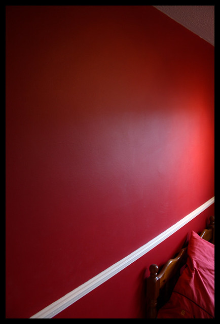
Empty - Week 13 by j.fordham, on Flickr
J
Had few ideas for this but a busy stat to the week meant i missed the best of the weather, but then it hit me. I've been looking at getting some of photo's printed and my photo this week is..... The Empty wall in my bedroom, which I hope to fill with some of my photography.
Empty - Week 13 by j.fordham, on Flickr
J