
You are using an out of date browser. It may not display this or other websites correctly.
You should upgrade or use an alternative browser.
You should upgrade or use an alternative browser.
Vdubster's Photo52 for 2011 Week 42 - Weave added!!! (Index in 1st post)
- Thread starter vdubster
- Start date
OP
- Messages
- 421
- Name
- James
- Edit My Images
- Yes
Hiya James
Well done on your Tropical fish .... that is excellent and very creative thinking
Cheers
Dawn
Thanks Dawn,
It was your Week 17 that gave me the idea, i didn't have enough different fruit for a shot like yours so i want the Tropical to comes from something else in the shot.
J
OP
- Messages
- 421
- Name
- James
- Edit My Images
- Yes
Now Dawn mentioned it..... very good.
I was like.... orange! oh wait what's the other fruit???? tropical!?!?!?!
Yeah ok Orange's aren't Tropical, but there's a banana in there for that
J
drodd
Also loves to mass debate
- Messages
- 5,519
- Name
- Dawn
- Edit My Images
- No
I was like.... orange! oh wait what's the other fruit???? tropical!?!?!?!
Yeah ok Orange's aren't Tropical, but there's a banana in there for that
J
Hiya James,
Actually, oranges are citric tropical fruits
Cheers
Dawn

- Messages
- 6,706
- Name
- Colin
- Edit My Images
- No
Brilliant James! I really like that. Artistic without a camera as well!
- Messages
- 8,398
- Name
- Lynne
- Edit My Images
- Yes
Excellent & creative idea & great shot for Tropical
OP
- Messages
- 421
- Name
- James
- Edit My Images
- Yes
Brilliant James! I really like that. Artistic without a camera as well!
~ BR~ILL~IANT idea! I like it!
Well done to get the shot before the bananas browned
Excellent & creative idea & great shot for Tropical
Lol. Love the tropical fish, what a creative & funny idea. Well done
Thanks everyone, very happy with how it came out.
Looking forward to week 18
J
- Messages
- 19,461
- Name
- Andy
- Edit My Images
- Yes
Hi, James, I agree with the others, fantastic interpretationa dn imaginative thought.
Reminds me of Giuseppe Arcimboldo paintings, don't you know...
Cheers.
Reminds me of Giuseppe Arcimboldo paintings, don't you know...
Cheers.
OP
- Messages
- 421
- Name
- James
- Edit My Images
- Yes
Was The 41st Ipswich to Felixstowe Historic Vehicle Run today and great weather (unlike last year!!!)
Saw the theme and through YES!!!! Then i saw my subject in the park and it just screamed POWER to me. So here he is

Power - Week 18 by j.fordham, on Flickr
Was actually waiting for it to transform into a robot but it never did, lol
Thanks again for the comments of the previous weeks.
James
Saw the theme and through YES!!!! Then i saw my subject in the park and it just screamed POWER to me. So here he is
Power - Week 18 by j.fordham, on Flickr
Was actually waiting for it to transform into a robot but it never did, lol
Thanks again for the comments of the previous weeks.
James
- Messages
- 8,398
- Name
- Lynne
- Edit My Images
- Yes
Hi James
I just love those monster american trucks , so much more appealing than the european ones , great shot for theme ,like the angle & the frame
I just love those monster american trucks , so much more appealing than the european ones , great shot for theme ,like the angle & the frame
SamuelSlade007
RENEGADE!!!!!!
- Messages
- 7,802
- Name
- Frank
- Edit My Images
- No
Was actually waiting for it to transform into a robot but it never did, lol
Damn...
- Messages
- 6,706
- Name
- Colin
- Edit My Images
- No
Brilliant composition. It certainly looks powerful.
OP
- Messages
- 421
- Name
- James
- Edit My Images
- Yes
Hello all,
Week 19 and another selective colour, lol. You know you love them really.
OK so Divided had a few ideas mostly around storage so what better subject for this idea than....... My DeviantART Camera Bag
It's not the biggest or the most expensive but i love it, with it's bright red interior and hidden rain cover, lol.
so without further ado Week 19
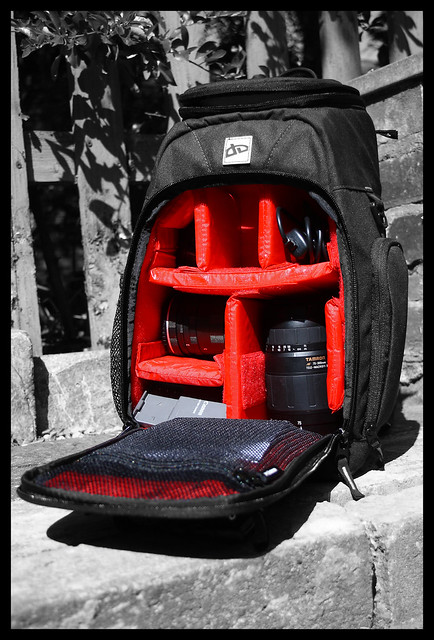
Divided - Week 19 by j.fordham, on Flickr
I also did a blurred background version but the selective colour is my favorite, but here it is anyway.

Divided2 by j.fordham, on Flickr
Thanks for looking
James
Week 19 and another selective colour, lol. You know you love them really.
OK so Divided had a few ideas mostly around storage so what better subject for this idea than....... My DeviantART Camera Bag
It's not the biggest or the most expensive but i love it, with it's bright red interior and hidden rain cover, lol.
so without further ado Week 19
Divided - Week 19 by j.fordham, on Flickr
I also did a blurred background version but the selective colour is my favorite, but here it is anyway.
Divided2 by j.fordham, on Flickr
Thanks for looking
James
OP
- Messages
- 421
- Name
- James
- Edit My Images
- Yes
Hi James, 2 great versions of your photograph, and I like them, but the selective coloured one would be my pick. I really like those red inserts, a smart camera bag indeed! Well done.
Thanks
I like the subject, bang on theme! But not a fan of selective colouring, so I'm sorry, don't like it
OK, can i ask what it is about selective colouring you don't like?
- Messages
- 7,694
- Name
- Tina
- Edit My Images
- Yes
I like the subject, bang on theme! But not a fan of selective colouring, so I'm sorry, don't like it
OK, can i ask what it is about selective colouring you don't like?
Good question. Perhaps it is that the image is composed to draw a ttention to a particular area (as your bag is open we automatically look in) the selective colour seems to just overdo the 'look at me'. Shades of protesting too much?
- Messages
- 8,398
- Name
- Lynne
- Edit My Images
- Yes
Hi James
I have a soft spot for SC so your 1st image gets the vote from me Brill looking bag as well...
I have a soft spot for SC so your 1st image gets the vote from me
Brill looking bag as well...
OP
- Messages
- 421
- Name
- James
- Edit My Images
- Yes
Good question. Perhaps it is that the image is composed to draw a ttention to a particular area (as your bag is open we automatically look in) the selective colour seems to just overdo the 'look at me'. Shades of protesting too much?
OK but you said you don't like selective colour, not that you think it doesn't work in this 1 picture. So the question is, is it selective colour as a whole you dislike or just how its been used here?
While I don't mind using PS for things like SC or adding "simple" boarders. I would say that a few photo's i have seen on this forum do go way ott with the use of effects, at the end of the day this was a picture of a camera bag and my use of SC was to highlight both the fact that i want you to see the "Divided" part of this bag but also highlight the bright red interior. Otherwise it's just a bag in front of a brick wall and wooded fence.
J
OP
- Messages
- 421
- Name
- James
- Edit My Images
- Yes
Hi James
I have a soft spot for SC so your 1st image gets the vote from me
Thanks
- Messages
- 7,694
- Name
- Tina
- Edit My Images
- Yes
OK but you said you don't like selective colour, not that you think it doesn't work in this 1 picture. So the question is, is it selective colour as a whole you dislike or just how its been used here?
While I don't mind using PS for things like SC or adding "simple" boarders. I would say that a few photo's i have seen on this forum do go way ott with the use of effects, at the end of the day this was a picture of a camera bag and my use of SC was to highlight both the fact that i want you to see the "Divided" part of this bag but also highlight the bright red interior. Otherwise it's just a bag in front of a brick wall and wooded fence.
J
I get your point about my blanket statement.
I feel the use of SC in this image is not adding to the power of th image. Your composition was good enough to ensure the eye was drawn to the purpose as even in the colour image the dividers are a strong element win the picture.
Thanks for not letting me be so lazy
- Messages
- 19,461
- Name
- Andy
- Edit My Images
- Yes
Hi, James, I quite like SC and in this one, any other colour but red wouldn't have worked for me - it really booms at me.
You've filled the frame but a bit too close I feel.
In #2, I quite like the contrast bewteen the red bag inner and the green leaves and blue railings.
You've done a decent job with adding the blur but it's just a tad off; I'm sure this will improve with practice.
You've filled the frame but a bit too close I feel.
In #2, I quite like the contrast bewteen the red bag inner and the green leaves and blue railings.
You've done a decent job with adding the blur but it's just a tad off; I'm sure this will improve with practice.
- Messages
- 6,706
- Name
- Colin
- Edit My Images
- No
Think Tina is right that your composition is very good and doesn't give the viewer any other option than to be drawn to the bag interior. I would also agree that the sc is not needed for that purpose. However I believe that it does enhance the image and possibly locks your attention to the bag interior.
The thing with selective colour in my opinion is that it can be applied to any image which it doesn't really suit and I believe I have seen more that don't work well than do. I don't comment on shots with sc that I don't like because of the divided opinions.
Think you got this one spot on.
The thing with selective colour in my opinion is that it can be applied to any image which it doesn't really suit and I believe I have seen more that don't work well than do. I don't comment on shots with sc that I don't like because of the divided opinions.
Think you got this one spot on.
OP
- Messages
- 421
- Name
- James
- Edit My Images
- Yes
Hello,
Thanks for all the comments so far.
OK week 20, had a few ideas and as i'm so into my music decided on this.

Promise - Week 20 by j.fordham, on Flickr
The lyrics to Placebo's "Broken Promise" (featuring Michael Stipe) from the album "Meds" I wanted this to have the look as if i had shot it at a gig (like on stage set list feel) in bad light hence the noise, thoughts? Not going to be everyone cup of tea, but thats what makes this fun
And here's another from the same set
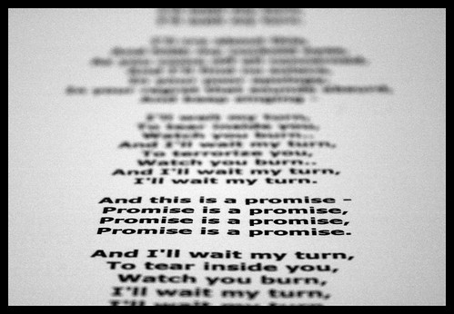
Promise2 - Week 20 by j.fordham, on Flickr
Thanks for all the comments so far.
OK week 20, had a few ideas and as i'm so into my music decided on this.
Promise - Week 20 by j.fordham, on Flickr
The lyrics to Placebo's "Broken Promise" (featuring Michael Stipe) from the album "Meds" I wanted this to have the look as if i had shot it at a gig (like on stage set list feel) in bad light hence the noise, thoughts? Not going to be everyone cup of tea, but thats what makes this fun
And here's another from the same set
Promise2 - Week 20 by j.fordham, on Flickr
Last edited:
- Messages
- 298
- Name
- Adie
- Edit My Images
- Yes
Great shot No2
A nice balance, with the field of focus on the bottom third of shot, and a nice soft gentle blur above and below it.
I think that works better for me, than shot one, where the field of focus at the top, unbalances the shot a little.
Great
Adie
A nice balance, with the field of focus on the bottom third of shot, and a nice soft gentle blur above and below it.
I think that works better for me, than shot one, where the field of focus at the top, unbalances the shot a little.
Great
Adie